The Statistical Lens: Analyzing Misleading Data Presentations in COVID-19 Mortality Reporting and the NPR Case Study

The summer of 2020 marked a critical juncture in the global struggle against the COVID-19 pandemic, a period characterized not only by a public health crisis but by an equally daunting "infodemic." During this time, the accuracy and clarity of data visualization became a cornerstone of public understanding and policy-making. As news organizations raced to provide real-time updates on infection rates and mortality figures, the methods used to present this data came under intense scrutiny. A prominent example of this complexity emerged in August 2020, when a report by National Public Radio (NPR) attempted to contextualize the United States’ standing in global mortality rankings, inadvertently sparking a debate over the ethics of data selection and the potential for misleading visualizations in mainstream journalism.
The Context: The Axios Interview and the Battle of Metrics
The catalyst for the surge in data-driven reporting during early August 2020 was a high-profile interview between then-President Donald Trump and Jonathan Swan of Axios, which aired on HBO on August 3, 2020. The exchange became a viral touchstone for the debate over how to measure a nation’s success or failure in managing the virus. During the interview, President Trump presented several printed charts to Swan, arguing that the United States was "lower than the world" in terms of COVID-19 impacts.
The tension in the interview arose from a fundamental disagreement over which statistical metric was most relevant. President Trump focused on the "case fatality ratio" (CFR)—the number of deaths divided by the number of confirmed cases. He argued that because the U.S. was conducting more tests and identifying more cases, a lower ratio of deaths to those cases indicated a superior medical response. Conversely, Swan emphasized "deaths per capita"—the number of deaths relative to the total population. Swan argued that the per capita rate provided a clearer picture of the disease’s actual toll on the American public regardless of testing volume.
When Swan pointed out that the U.S. death rate per capita was significantly higher than that of many other developed nations, the President responded with the now-famous line, "You can’t do that." However, epidemiologists and public health experts, including those from the Johns Hopkins University Bloomberg School of Public Health, have long maintained that both metrics are essential for a comprehensive understanding of a pandemic, provided they are presented with proper context.
The NPR Response: A Case Study in Data Omission
On August 5, 2020, NPR published an article titled "Charts: How the U.S. Ranks On COVID-19 Deaths Per Capita – And By Case Count," authored by Jessica Craig. The piece was intended to provide a neutral, fact-based analysis of the claims made during the Axios interview. However, the article’s use of specific data visualizations drew criticism for what some analysts called the "curse of the top 10"—a phenomenon where limiting a dataset to a small, arbitrary number of entries creates a distorted perception of the broader reality.
The NPR article featured two primary charts. The first focused on deaths per capita among countries with 50,000 or more reported cases. The second focused on case fatality ratios among the same group. While the intention was to provide clarity, the decision to limit these charts to only ten countries resulted in a narrative that appeared to favor the U.S. administration’s perspective more than the full dataset warranted.
The Per Capita Mortality Ranking
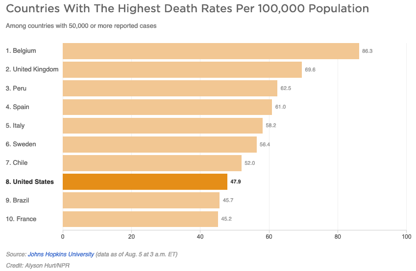
In the first chart regarding per capita deaths, the visualization showed the U.S. alongside nine other nations. In this specific "Top 10" view, the U.S. appeared to be performing better than several European counterparts, such as the United Kingdom, Italy, and Spain. To a casual observer, the chart suggested that the U.S. was roughly in the middle of the pack or even leaning toward the "better" end of the spectrum.
However, the reality of the data as of August 5, 2020, was far more sobering. At that time, approximately 45 countries had reported more than 50,000 COVID-19 cases. When the full list was considered, 37 of those 44 other countries were actually reporting lower per capita death rates than the United States. By narrowing the focus to a "Top 10" list, the visualization omitted the dozens of nations that were managing the virus more effectively, thereby shielding the U.S. from a direct comparison with the majority of its peers. Critics argued that if the chart had been limited to the top eight countries instead of ten, the U.S. would have appeared to be the "best" in the group, illustrating how easily data can be manipulated through arbitrary selection.
The Case Fatality Ratio (CFR) Misconception
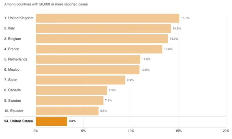
The second chart in the NPR report addressed the case fatality ratio. In this visualization, the U.S. was positioned at the bottom of the chart, which usually signifies a positive outcome in mortality rankings. This placement supported the President’s assertion that the U.S. was "leading the world" in terms of survival rates among those infected.
While the U.S. did indeed have a lower CFR than countries like the United Kingdom or Mexico at that time, the "Top 10" limitation again obscured the full picture. In a comprehensive ranking of all 45 countries with significant case counts, the U.S. was not at the bottom (the best position); it was firmly in the middle. The omission of the other 35 countries prevented readers from seeing that many nations with high case counts were achieving even lower fatality ratios than the U.S., despite the President’s claims of unrivaled success.
Technical Inaccuracies and the Definition of "Disease Burden"
Beyond the visual representation of data, the NPR article faced criticism for its handling of epidemiological terminology. The article cited Justin Lessler, an associate professor of epidemiology at Johns Hopkins University, to define the "per capita death rate" as an indication of the "overall disease burden in a country."
Analytical critiques of this statement point out two distinct issues:
- Proportional vs. Overall Burden: The per capita death rate measures the proportional burden—how the disease affects the population relative to its size. The overall disease burden is more accurately reflected by the total number of cases and total deaths, regardless of population percentage.
- The Definition of Disease Burden: The article provided a technical definition of "disease burden" as the impact of a disease in terms of "years of life lost and years lived with disability." Critics argued that this definition was irrelevant to the chart being discussed, as a simple per capita death rate cannot calculate "years lived with disability" or the nuanced "years of life lost" without age-stratified data and complex actuarial modeling.
The Role of External Factors in Mortality Data
To provide a complete picture, any analysis of COVID-19 mortality must account for variables that differ between nations. The NPR article did correctly identify several of these factors, which are essential for a fair comparison:
- Demographics and Age: COVID-19 disproportionately affects older populations. Countries with a higher median age, such as Italy or Japan, would naturally see higher mortality rates compared to countries with younger populations, even if their healthcare responses were identical.
- Healthcare Infrastructure: Access to Intensive Care Units (ICUs) and ventilators significantly impacts the case fatality ratio. Nations with overwhelmed healthcare systems or fewer resources saw higher death rates among the infected.
- Testing Volatility: The case fatality ratio is highly dependent on testing. A country that only tests symptomatic or hospitalized patients will have a much higher CFR than a country that conducts widespread asymptomatic testing, as the latter identifies more mild cases that survive.
The Broader Impact of Data Presentation in Media
The controversy surrounding the NPR article highlights a broader challenge in modern journalism: the tension between "balance" and "accuracy." In an effort to avoid appearing partisan, news outlets sometimes present data in a way that gives equal weight to conflicting claims, even when one claim is demonstrably less accurate.
In the case of the August 2020 mortality data, the attempt to provide an "even-handed" assessment of the Trump administration’s performance resulted in a visualization that softened the reality of the U.S. position. By failing to show the U.S. relative to all 45 countries with major outbreaks, the reporting inadvertently supported a narrative of success that was not supported by the full scope of available data.
Chronology of the Data Controversy
- Late July 2020: U.S. COVID-19 deaths surpass 150,000. Public debate intensifies over the federal response.
- August 3, 2020: The Axios interview airs. President Trump uses printed charts to argue the U.S. is "lower than the world" in death rates, focusing on CFR. Jonathan Swan counters with per capita data.
- August 5, 2020: NPR publishes "Charts: How the U.S. Ranks On COVID-19 Deaths Per Capita – And By Case Count." The article uses "Top 10" charts that place the U.S. in a relatively favorable light.
- Mid-August 2020: Data analysts and media critics begin dissecting the NPR charts, pointing out the "curse of the top 10" and the omission of 35 other high-case countries.
- Late 2020: The U.S. enters a massive winter surge, further complicating mortality metrics and reinforcing the need for transparent, comprehensive data reporting.
Conclusion: The Responsibility of the Messenger
The 2020 debate over COVID-19 mortality rankings serves as a lasting lesson in the power of data visualization. Information is not neutral; the way it is curated, filtered, and displayed can radically alter its meaning. For traditionally reliable sources like NPR, the incident underscored the importance of providing full context rather than arbitrary subsets of data.
In a global health crisis, the public relies on the media to translate complex statistics into an accurate reflection of reality. When charts omit the majority of relevant data points, they do more than just simplify a story—they risk misinforming the public on the efficacy of national policies and the true scale of a tragedy. Moving forward, the standard for "even-handed" reporting must remain rooted in the comprehensive disclosure of facts, ensuring that the "Top 10" never becomes a shield for the uncomfortable truths contained in the "Top 50."