The Critical Distinction Between Ordinal and Interval Scales in Data Science and Social Research

Human cognition is inherently wired to seek order within chaos. From the earliest stages of social development, individuals learn to categorize and rank the world around them, often as a survival mechanism or a means of simplifying complex environments. This drive manifests in nearly every facet of modern life: parents seek the "top-ranked" universities for their children; citizens prioritize their loyalties between faith, family, and nation; and corporations stack-rank their employees to determine bonuses and promotions. However, a fundamental error frequently occurs in the transition from qualitative observation to quantitative analysis. In the pursuit of precision, data analysts and researchers often conflate ordinal scales—which merely indicate a sequence—with interval scales, which provide a measurable distance between values. This conflation, while convenient for generating reports and "hard" numbers, can lead to significant distortions in data interpretation and policy-making.
The Taxonomy of Measurement: From Sequence to Magnitude
To understand the risks associated with data misinterpretation, one must first revisit the foundational levels of measurement. In 1946, psychologist Stanley Smith Stevens published a seminal paper in Science magazine titled "On the Theory of Scales of Measurement." In this work, Stevens established four levels of measurement that remain the gold standard in statistics today: nominal, ordinal, interval, and ratio. While nominal scales represent simple labels (e.g., eye color or gender), the distinction between ordinal and interval scales is where the most frequent analytical errors occur.
An ordinal scale provides a meaningful order of items but lacks a consistent degree of difference between those items. For example, in a race, the runners who finish first, second, and third are ranked ordinally. The ranking tells us that the first-place runner was faster than the second-place runner, but it does not reveal the margin of victory. The gap between first and second could be a fraction of a second, while the gap between second and third could be several minutes. The numbers "1, 2, 3" in this context are labels for a sequence, not quantities that can be added or averaged meaningfully.
In contrast, an interval scale is defined by having equal distances between adjacent points. Temperature measured in Celsius or Fahrenheit is a classic example. The difference between 20 and 30 degrees is the same magnitude as the difference between 30 and 40 degrees. Because the intervals are equal and standardized, the data is truly quantitative. One of the most ubiquitous interval scales in data analysis is time. The progression from the year 1990 to 2000 represents the same ten-year duration as the progression from 2010 to 2020. This uniformity allows for complex mathematical operations that are invalid when applied to ordinal data.

The Likert Scale and the Illusion of Quantification
The most common intersection of ordinal ranking and quantitative aspiration is the Likert scale. Developed by social psychologist Rensis Likert in 1932, this scale was designed to measure attitudes and opinions by asking respondents to rate their level of agreement or frequency on a balanced continuum. A typical Likert scale might range from "Never" (1) to "Always" (5).
In the modern corporate and academic world, these scales are used for everything from customer satisfaction surveys to mental health screenings. The convenience of the Likert scale lies in its ability to convert subjective human experience into a format that looks like data. However, assigning a number to a subjective feeling does not transform that feeling into a mathematical unit.
When a researcher asks a respondent how often they feel stressed—offering "Never," "Seldom," "Occasionally," "Frequently," and "Always"—the "distance" between "Never" and "Seldom" is psychologically and practically distinct from the distance between "Frequently" and "Always." Furthermore, a person who selects "Always" (5) cannot be mathematically proven to be five times more stressed than someone who selects "Never" (1). Despite this, it is common practice in social science to average these scores. A "depression score" of 4.2 is often cited in research papers as if it were a physical measurement like height or weight. Critics of this approach argue that this "ordinal quantification" lends an inflated sense of objectivity and precision to what is essentially a subjective qualitative assessment.
Chronology of Measurement Theory and the Quantification Trend
The history of measurement shows a clear trend toward increasing quantification, even in fields where it may not be entirely appropriate.
- Early 20th Century: The rise of psychometrics led to the development of standardized testing and attitude scales. Rensis Likert (1932) introduced his scale to capture nuances that simple "Yes/No" questions could not.
- Post-WWII Era (1946): S.S. Stevens formalized the levels of measurement, warning that applying certain statistical tests to the wrong type of scale would lead to "meaningless" results.
- The 1980s and 90s: The "Quality Revolution" in business, led by figures like W. Edwards Deming, emphasized data-driven decision-making. This led to the widespread adoption of Net Promoter Scores (NPS) and employee ranking systems.
- The 21st Century: The "Big Data" era has created a culture where if something cannot be measured, it is often ignored. This has led to the "gamification" of ordinal scales, where rankings (such as SEO rankings or Uber driver ratings) are treated as absolute quantitative truths.
Visualizing the Gap: How Rankings Mask Reality
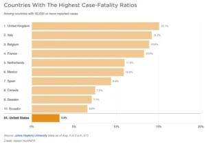
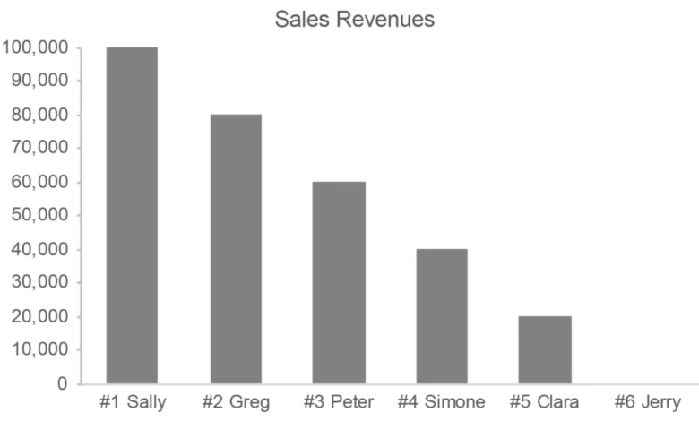
The danger of relying on ordinal rankings is perhaps best illustrated through data visualization. Consider a sales department that ranks its top five employees based on revenue. On an ordinal scale, John is #1, Mary is #2, and Sally is #3. If a manager looks only at the rank, they might assume a relatively even distribution of performance.

However, when the actual revenue figures (interval/ratio data) are plotted, the reality may be startlingly different. In one scenario, John might have generated $1,000,000 in sales, while Mary generated $995,000. Here, the difference between #1 and #2 is negligible. In another scenario, John might have generated $1,000,000 while Mary generated only $500,000. In both cases, Mary is ranked #2, but her actual value to the company is vastly different.
Similarly, educational rankings like the U.S. News & World Report Best Colleges list often cause significant shifts in enrollment and funding based on a school’s ordinal rank. If a university drops from #10 to #15, it may be perceived as a decline in quality. In reality, the quantitative score used to determine those ranks might have changed by only a fraction of a percentage point—a difference that is statistically insignificant but ordinally dramatic.
Expert Analysis: The Risks of Misinformed Metrics
The misapplication of ordinal data has real-world consequences for public policy and organizational health. In the healthcare sector, patient satisfaction scores (often Likert-based) are sometimes used to determine physician compensation. If the difference between a "4" and a "5" on a survey is treated as a quantitative metric rather than a qualitative preference, doctors may be unfairly penalized for factors outside their control, such as a patient’s mood or the hospital’s parking situation.
In the realm of social science research, the debate over "Parametric vs. Non-parametric" statistics continues. Parametric tests (like the t-test or ANOVA) assume that the data is measured on an interval or ratio scale. When these tests are applied to Likert-scale data, the results can be misleading. Dr. Geoff Norman, a professor of clinical epidemiology, has argued that parametric tests can be robust even with ordinal data, but many purists maintain that doing so violates the fundamental logic of mathematics.
The primary motivation for treating ordinal scales as quantitative is convenience. It is much easier to run a regression analysis on a set of numbers than it is to perform a nuanced qualitative analysis of sentiment. However, this convenience comes at the cost of accuracy. By stripping away the context of the "distance" between ranks, analysts risk making decisions based on an incomplete or distorted picture of reality.

Implications for Data Sensemaking
For data scientists, researchers, and decision-makers, the takeaway is clear: the scale of measurement dictates the limits of the analysis. While ordinal scales are invaluable for organizing and comparing items, they should not be used as a substitute for true quantitative measurement without extreme caution.
To improve the integrity of data sensemaking, organizations should:
- Always report the underlying values: When presenting a ranking, include the raw quantitative data that determined the rank to provide context on the magnitude of differences.
- Use appropriate statistical methods: Reserve parametric statistics for interval and ratio data, and utilize non-parametric methods (like the Mann-Whitney U test) for ordinal data.
- Acknowledge the subjectivity of Likert scales: When reporting on survey results, avoid treating averages as absolute truths. Instead, report on the distribution of responses (e.g., the percentage of "Always" vs. "Frequently").
In an era increasingly governed by algorithms and metrics, the ability to distinguish between a simple sequence and a measurable quantity is more than a technical skill—it is a requirement for objective truth. Whether evaluating a salesperson’s performance or a population’s mental health, the nuance lies not in the order of the items, but in the space between them.