Rethinking COVID-19 Mortality Data Visualization for Clarity and Public Understanding

The global spread of COVID-19 created an unprecedented demand for real-time data analysis, yet the surge in information often resulted in a secondary crisis of communication as analysts struggled to present complex statistics in a way that remained accessible to the general public. While the pandemic was defined by numbers—infection rates, hospitalizations, and mortality counts—the methods used to display these figures frequently obscured the reality of the situation rather than illuminating it. Comparing the effects of the virus across different nations proved particularly challenging, with many visualizations suffering from over-complication, poor scaling, and a lack of contextual nuance. Statisticians and data visualization experts have noted that even professional-grade charts often fell short of clarity, highlighting a critical need for simpler, more intuitive approaches to public health data.
The Complexity of Global Mortality Comparisons
One of the primary hurdles in pandemic reporting was the inherent difficulty of comparing mortality rates across international borders. Data analysts often found themselves caught between the desire for precision and the necessity of readability. Early attempts to map the trajectory of the virus often utilized raw numbers, which failed to account for the vast differences in population size between countries. Furthermore, the visual presentation of this data frequently relied on logarithmic scales or dense multi-line graphs that, while mathematically sound, were often misinterpreted by those without a background in statistics.
Expert critique of these early visualizations centered on the "cognitive load" placed on the viewer. When a graph includes dozens of overlapping lines representing different countries, the visual noise makes it nearly impossible to discern individual trajectories or compare relative magnitudes. This prompted a move toward more streamlined designs that prioritize the most essential metrics while acknowledging the limitations of the underlying data.
Addressing the Integrity of Pandemic Data
Before any visualization can be considered effective, the integrity of the data itself must be scrutinized. Throughout the pandemic, country-level comparisons of COVID-19 deaths were fraught with inconsistencies that no amount of graphic design could fully remedy. These discrepancies arose from varying national standards for recording causes of death and the immense pressure placed on medical infrastructure.
In many jurisdictions, including the United States, the distinction between a death "from" COVID-19 and a death "with" COVID-19 remained blurred. If a patient with the virus succumbed to secondary complications like pneumonia or heart failure, the recording of the primary cause of death on the certificate often depended on local protocols or the specific judgment of the attending medical personnel. During peak periods of the pandemic, medical staff were understandably focused on triage and life-saving measures rather than the administrative nuances of data entry.

Furthermore, the level of testing availability and the transparency of reporting varied significantly between nations. Some countries may have under-reported deaths due to limited diagnostic capacity in rural areas, while others faced accusations of political interference in data reporting. Recognizing these limitations is essential for any responsible analysis; while analysts must work with the best available data, they must also provide the necessary context to prevent the public from drawing false conclusions based on incomplete figures.
Design Principles for Accessible Health Data
To overcome the confusion caused by early pandemic charts, data visualization experts proposed a set of design choices aimed at maximizing clarity. The goal was to allow the general public to understand both the magnitude of the mortality rate and the patterns of change over time. These proposed standards included:
- Weekly Rather Than Daily Intervals: Daily data often contained significant "noise" due to reporting delays, weekend backlogs, and administrative cycles. Aggregating data into weekly intervals smoothed out these fluctuations, providing a clearer view of the actual trend.
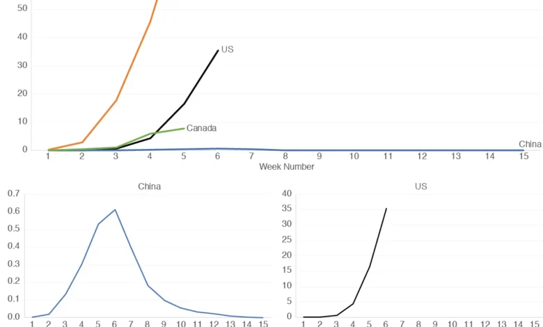
- Normalization Per Capita: Using a standard metric, such as deaths per 1 million people, allowed for a fair comparison between nations of different sizes. This eliminated the distortion caused by comparing a country like China to a country like Canada based solely on raw counts.
- Small Multiples for Scaling: Instead of forcing all data onto a single Y-axis where low-magnitude trends were flattened, analysts suggested using "small multiples"—a series of individual graphs for each country. This allowed each nation’s trajectory to be scaled independently, making the pattern of change visible regardless of the total number of deaths.
Case Studies in Trajectory Analysis
When applying these refined design principles to specific countries, such as the United States, China, Italy, and Canada, distinct narratives began to emerge. For example, a unified graph comparing these nations might show Italy with a significantly higher peak in mortality per million people compared to China. However, because China’s total population is so vast, its national mortality rate per million appeared as a nearly flat line at the bottom of the chart, making its internal trends unreadable.
By utilizing independent scaling for each country, the data revealed that the pattern of change in China during the early weeks of the outbreak was remarkably similar to the pattern seen later in Italy. Both nations experienced a sharp, exponential rise followed by a plateau and eventual decline as lockdown measures took effect. This comparison suggests that while the magnitude of the impact differed, the underlying behavior of the virus—and the effectiveness of certain interventions—followed a consistent logic across different geographies.
In North America, the comparison between the United States and Canada showed subtle but important differences. Early in the pandemic, mortality rates in Canada increased at a faster rate than in the U.S., but Canada saw a decrease in weekly deaths sooner. In contrast, the U.S. trajectory showed a more prolonged period of high mortality before reaching a clear downward trend. These insights are only possible when the data is presented in a way that respects the unique scale of each nation’s experience.
Chronology of Data Reporting Milestones
The evolution of COVID-19 data visualization followed the progression of the virus itself. The timeline of how this data was consumed by the public can be broken down into several key phases:

- January – February 2020: Data was primarily focused on Wuhan, China. Visualizations were simple, often using maps with circles of varying sizes to show the concentration of cases.
- March 2020: As the virus reached Italy and Iran, the "Flatten the Curve" graphic became the dominant visual metaphor for the pandemic. This was a conceptual graph rather than a data-driven one, designed to influence public behavior.
- April – May 2020: The rise of the "Data Dashboard." Websites like the Johns Hopkins Coronavirus Resource Center and Our World in Data became household names. This period saw the proliferation of complex multi-line graphs and the controversial use of logarithmic scales.
- Late 2020 and Beyond: A shift toward "Excess Mortality" reporting. Analysts realized that confirmed COVID-19 deaths did not capture the full picture. Visualizations began to compare current total deaths against historical averages to account for undiagnosed COVID deaths and the indirect effects of the pandemic on the healthcare system.
The Problem with Logarithmic Scales in Public Communication
One of the most debated aspects of pandemic visualization was the use of logarithmic scales. In a logarithmic scale, the distance on the Y-axis represents a percentage change rather than a fixed numerical value. While this is the standard way for statisticians to view exponential growth, it is notoriously difficult for the general public to interpret.
In a linear scale, a jump from 10 deaths to 100 deaths looks much smaller than a jump from 1,000 to 1,100. In a logarithmic scale, the jump from 10 to 100 is visually identical to the jump from 100 to 1,000. This can lead the public to underestimate the true magnitude of the crisis as the numbers get larger. By choosing to use small multiples with linear scales instead, analysts can preserve the readability of the trend without sacrificing the viewer’s intuitive understanding of the numbers.
Broader Impact and Policy Implications
The way data is visualized has real-world consequences for public policy and individual behavior. When charts are too complex, they can lead to "information fatigue," where the public stops paying attention to the data altogether. Conversely, when data is presented clearly, it can build public trust in health institutions and help justify necessary but difficult measures like social distancing and mask mandates.
The lessons learned from COVID-19 mortality tracking are now being applied to other areas of public health and climate change reporting. The move toward simplicity, per-capita normalization, and the use of small multiples represents a maturation of data journalism. As the world prepares for future health crises, the ability to communicate "the best available data" in a way that is both honest about its limitations and clear in its delivery will remain a cornerstone of effective crisis management.
In conclusion, while no single graph can capture every nuance of a global pandemic, the adoption of standardized, accessible design choices allows for a more meaningful dialogue between data analysts and the public. By focusing on weekly trends, per-capita rates, and appropriate scaling, we can transform a chaotic sea of numbers into a coherent narrative that informs, rather than confuses, the global community.