The Perils of Data Visualization: Evaluating How NPR and Public Discourse Framed COVID-19 Mortality Statistics

In the wake of the August 3, 2020, Axios interview between President Donald Trump and journalist Jonathan Swan, a significant debate emerged regarding the accuracy and presentation of COVID-19 mortality statistics. The exchange, which drew widespread attention for its direct confrontation over the severity of the pandemic in the United States, underscored a recurring tension between political narrative and data visualization. Following the interview, various media outlets, including NPR, attempted to contextualize these claims through graphical analysis. However, an examination of these visual representations reveals the complex challenges journalists face when distilling intricate epidemiological data for a general audience, particularly when the selection of data subsets can inadvertently distort public perception.
The Axios Interview and the Origins of the Debate
The tension that sparked this analysis occurred during a high-profile interview on HBO. When confronted by Jonathan Swan regarding the rising death toll in the United States, President Trump defended the administration’s performance by presenting a chart focusing on the "case fatality ratio"—the percentage of deaths relative to confirmed cases. Swan countered by emphasizing "deaths per capita," a metric that measures the mortality burden relative to the total population.
The disagreement highlighted a fundamental divergence in how policymakers and the public interpret pandemic data. The case fatality ratio is often influenced by testing capacity; if a country tests only the most severe cases, its ratio will appear artificially high. Conversely, per capita death rates offer a standardized view of the disease’s impact on a population, regardless of testing disparities. The President’s rejection of the per capita metric—“You can’t do that”—became a flashpoint for media scrutiny, leading organizations like NPR to publish their own interpretations of these metrics in an attempt to provide objective clarity.
The Challenge of Data Selection and the Top 10 Bias
On August 5, 2020, NPR published an analysis titled Charts: How the U.S. Ranks On COVID-19 Deaths Per Capita — And By Case Count. While the intent was to provide an objective counterpoint to the political rhetoric of the time, the resulting visualizations faced criticism for their selective framing.
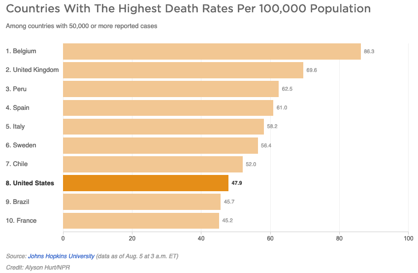
The NPR article utilized two primary charts to compare the United States against other nations with 50,000 or more reported cases. The first chart, focusing on per capita deaths, displayed only the top 10 countries. By limiting the scope to this specific subset, the visualization created a visual hierarchy that suggested the United States was performing relatively well compared to the entire global landscape. In reality, as of August 5, 2020, there were 45 countries with more than 50,000 cases. By excluding 35 of those countries, the chart effectively masked the fact that the vast majority of nations in that category had lower per capita death rates than the United States.
This phenomenon, often referred to by data scientists as the "curse of the top 10," creates an artificial benchmark. When a dataset is truncated without clear justification, the reader is left with an incomplete picture. In a global health crisis, where data is often used to hold governments accountable, the omission of significant data points—even those that do not fit neatly into a top-tier list—can significantly alter the viewer’s understanding of a country’s comparative performance.
Epidemiological Nuance: Defining Disease Burden
The NPR report also attempted to incorporate expert testimony to define the significance of these metrics. The article cited Justin Lessler, an associate professor of epidemiology at Johns Hopkins University, who noted that the per capita death rate is primarily an indication of the "overall disease burden" in a country.
From an epidemiological standpoint, this definition is subject to technical scrutiny. "Disease burden" is a specific term of art, typically measured by Disability-Adjusted Life Years (DALYs), which accounts for both years of life lost to premature mortality and years lived with disability. While mortality is a component of this, the per capita death rate is a measure of proportional mortality, not a comprehensive measure of disease burden. By conflating these terms, the report inadvertently complicated the public’s understanding of health metrics. Providing such technical definitions in a news summary requires precision; when the terminology is imprecise, it can lead to a misunderstanding of how public health experts quantify the impact of a pandemic.
The Second Chart: Case Fatality and Mid-Pack Reality
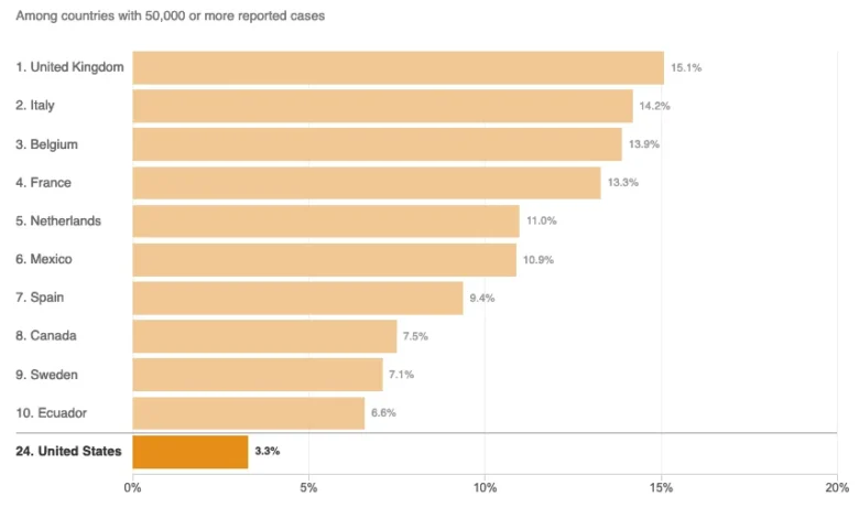
The second visualization presented by NPR focused on the case fatality ratio. In this chart, the United States appeared at the bottom of the list, which visually suggested a favorable ranking. However, when the data is viewed in the context of all 45 countries with over 50,000 cases, the United States occupies a position in the middle of the pack.
The reliance on a "best-to-worst" visual format often forces complex data into a linear narrative that the data itself may not support. When a news organization presents a truncated list, the viewer naturally assumes that the presented sample is representative of the whole. In this instance, the representation obscured the reality that the U.S. performance was neither the best nor the worst, but rather an outlier in neither direction.
Broader Implications for Media and Public Discourse
The situation underscores a broader trend in 21st-century journalism: the transition from narrative-based reporting to data-driven, visual storytelling. While this shift has empowered audiences to grasp complex trends, it has also introduced a new vulnerability. Visualizations are not merely neutral presentations of fact; they are products of design choices—the selection of axes, the number of data points, and the exclusion of outliers.
When major news outlets, typically regarded as bastions of accuracy, utilize truncated datasets, the implications are two-fold. First, it diminishes the public’s ability to engage in evidence-based policy discussions. If the data provided is framed to fit a specific narrative—even a counter-narrative intended to correct misinformation—the underlying credibility of the information is weakened. Second, it highlights the need for greater data literacy among both journalists and the reading public.
As the pandemic progressed, researchers and journalists began to move away from simplistic rankings, acknowledging that mortality rates are deeply affected by variables such as:
- Demographics: Countries with higher median ages, such as Italy or Japan, faced significantly different mortality profiles compared to younger populations.
- Testing and Reporting Protocols: Variations in how deaths are attributed to COVID-19—whether by clinical diagnosis or post-mortem testing—created massive discrepancies in international data.
- Healthcare Infrastructure: Access to ICU beds, ventilators, and early intervention protocols played a decisive role in outcome variances between nations.
Conclusion: The Responsibility of Clarity
The critique of the NPR article is not a suggestion of malicious intent, but rather a reflection on the high stakes of reporting during a global emergency. In an era where "fake news" and "data manipulation" are common accusations in political discourse, the responsibility of the press is to provide the most transparent view possible.
Journalists must navigate the fine line between simplifying information for public consumption and over-simplifying it to the point of distortion. When reporting on critical public health data, the inclusion of comprehensive datasets—even when they are large and difficult to visualize—is essential. The "top 10" format, while aesthetically pleasing and easy to digest, often serves to obscure the truth rather than illuminate it. To serve the public interest, media organizations must prioritize accuracy over the convenience of truncated charts, ensuring that every piece of data presented is contextualized with the appropriate level of transparency and technical rigor. As we move forward, the lesson remains clear: the integrity of our collective understanding of the world depends not just on the data we share, but on the transparency with which we share it.