Google Analytics Launches Drag-and-Drop Dashboards to Streamline Enterprise KPI Reporting

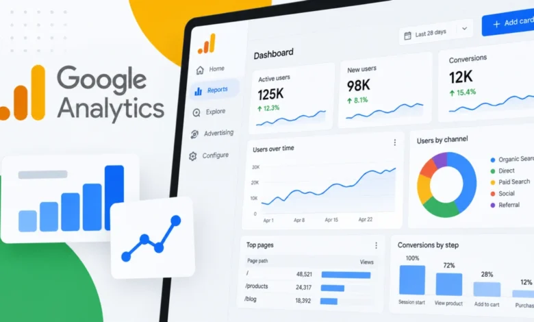
Google Analytics has officially introduced a robust new Dashboards feature, fundamentally transforming how organizations aggregate, visualize, and monitor their critical key performance indicators (KPIs). Designed to eliminate the friction of navigating fragmented reporting menus, the update empowers digital marketers, data analysts, and enterprise stakeholders to build fully customized, single-page command centers. By utilizing a flexible grid-based canvas and intuitive drag-and-drop mechanics, teams can now seamlessly merge disparate data streams into cohesive, high-impact performance reports directly within the Google Analytics ecosystem.
The rollout arrives at a time when data-driven decision-making is under immense pressure. Modern marketing operations often span multiple channels, requiring continuous tracking of paid acquisition, organic traffic, user engagement, and conversion pathways. Historically, gathering this information required users to toggle between numerous pre-built reports or export data to external visualization tools like Looker Studio. With the integration of native Dashboards, Google aims to minimize operational friction, keeping vital analytics workflows localized and efficient.
Evolution of Google Analytics Reporting and the Path to Dashboards
To understand the significance of the new Dashboards feature, it is helpful to examine the evolutionary trajectory of Google Analytics reporting platforms. When Google introduced Google Analytics 4 (GA4) to replace the legacy Universal Analytics, the platform prioritized event-based tracking and flexible data modeling. However, initial user feedback frequently highlighted a steep learning curve regarding custom report generation. While the GA4 "Explore" hub offered deep analytical capabilities, it often proved too complex for rapid, executive-level performance check-ins.
Over the subsequent years, Google rolled out incremental improvements to the user interface, aiming to bridge the gap between advanced data scientists and everyday marketing practitioners. The introduction of the new Dashboards feature represents the culmination of this user experience refinement. By shifting toward a visual, grid-based interface, Google has aligned its analytics suite with modern enterprise expectations, where speed, clarity, and collaborative visibility are paramount.
Anatomy of the New Dashboard Workspace
At the core of the new release is a dynamic, grid-based canvas that shifts reporting from a static menu selection to a fluid design process. Users possessing Editor or Administrator roles can now curate dedicated performance hubs by dragging dimensions and metrics directly onto the canvas. This capability eliminates the cumbersome multi-step process previously required to configure individual charts.

Once elements are placed on the canvas, creators can manually position, resize, and align visualizations to suit their organizational priorities. To accommodate diverse reporting needs, Google Analytics supports six distinct visualization types at launch:
- Scorecards: Ideal for tracking high-level KPIs at a glance, complete with percentage-change indicators when date comparisons are applied.
- Tables: Designed for granular, multi-dimensional data reporting and deep tactical analysis.
- Line Charts: Built for tracking performance trends over daily, weekly, and monthly intervals.
- Bar Charts: Optimized for direct comparisons across different categories, campaigns, or user segments.
- Donut Charts: Useful for understanding proportional breakdowns and categorical distributions.
- Funnel Charts: Critical for monitoring multi-step conversion processes, user progression, and drop-off points.
This diverse toolkit ensures that teams can tailor their views to match specific business models, whether they are managing an e-commerce storefront, a lead-generation funnel, or a content-driven publishing platform.
Publishing, Sharing, and Accessibility Controls
Governance and collaboration are central to the new Dashboards framework. Once an Editor or Administrator finalizes a layout, the dashboard can be published directly to the Reports left-hand navigation menu. This bypasses the traditional requirement of routing reports through the Google Analytics library, drastically shortening the path to discovery for everyday users.
Unlike some legacy sharing models that favored private, user-specific configurations, these dashboards are shared across the entire analytics property. Anyone with read access to the GA property can view the published dashboard through the standard Reports navigation. This democratization of data ensures that cross-functional teams—from content creators to executive leadership—rely on a single, synchronized source of truth during performance reviews.
However, the platform introduces specific structural boundaries to maintain system performance and data integrity. Standard Google Analytics properties are capped at 15 cards per dashboard, while premium properties benefit from an expanded limit of up to 30 cards. Additionally, certain advanced functionalities—such as direct API support, custom segments, and card-level comparisons—are not currently supported in this initial rollout, though industry analysts anticipate future updates may address these limitations.
Industry Implications and Strategic Value for Marketers
The integration of centralized, drag-and-drop dashboards carries significant operational implications for digital marketing agencies and enterprise analytics teams. In a typical corporate environment, marketing specialists waste valuable hours each week compiling performance metrics from various sources into presentation decks or disparate spreadsheets.

By consolidating core reporting inside Google Analytics, organizations can significantly accelerate routine performance monitoring. Teams tracking KPIs across multiple channels no longer need to jump between acquisition reports, engagement metrics, and conversion funnels. Instead, a single, purpose-built view provides immediate visibility into anomalies, growth trends, and campaign effectiveness.
Furthermore, this release represents a strategic shift by Google toward empowering self-service business intelligence within its core advertising and measurement ecosystem. By reducing reliance on external visualization suites for day-to-day monitoring, Google keeps users deeply engaged within its product interface. For agencies managing multiple client accounts, standardized dashboards offer a repeatable framework to audit health metrics swiftly and communicate value transparently.
Future Outlook and Ecosystem Integration
As organizations continue to adapt to evolving privacy regulations, first-party data strategies, and AI-driven automation, the demand for clear, instantaneous data visualization will only intensify. Google Analytics Dashboards provide a timely foundation for businesses striving to cut through data noise.
While the current iteration focuses on core visualization types, spatial canvas management, and property-wide sharing, industry observers expect Google to expand the feature set in upcoming quarters. Potential enhancements could include deeper API integration, automated insight callouts powered by machine learning, and advanced segmentation capabilities within individual cards.
For now, digital marketing professionals are encouraged to review their current reporting workflows, identify recurring KPI bottlenecks, and begin experimenting with the new drag-and-drop canvas. By translating raw analytics data into clean, centralized operational views, businesses can ensure their teams remain focused on strategic execution rather than manual data gathering.