Data Visualization in the Age of Pandemics: Analyzing the Risks of Selective Reporting in COVID-19 Mortality Statistics

The global COVID-19 pandemic has necessitated a reliance on data to navigate public health crises, evaluate government interventions, and inform personal risk assessments. In an era where information is both abundant and rapidly evolving, the accuracy of data presentation has become a cornerstone of public discourse. However, even established media organizations have faced scrutiny regarding how they select and visualize COVID-19 statistics. The tension between political rhetoric and epidemiological data reached a flashpoint in early August 2020, following an interview that underscored the complexities—and the potential for manipulation—inherent in comparing international mortality rates.
The Axios Interview and the Catalyst for Controversy
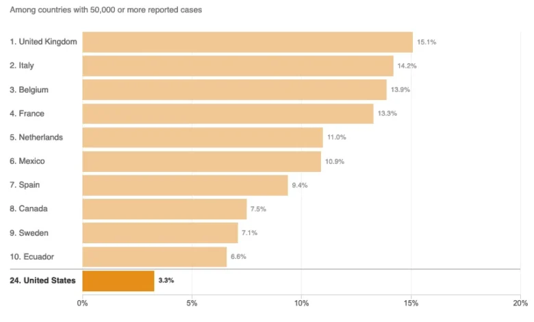
On August 3, 2020, HBO aired an interview between Axios reporter Jonathan Swan and then-President Donald Trump. The exchange became a landmark moment in political reporting, primarily due to a segment focused on the United States’ handling of the COVID-19 pandemic. During the discussion, President Trump asserted that the United States was performing better than any other nation in terms of COVID-19 mortality. When pressed by Swan on the validity of this claim, the President presented a chart focused on the "case fatality ratio" (CFR), which measures the proportion of deaths relative to confirmed cases.
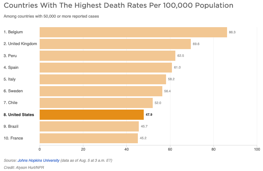
Swan countered by introducing the metric of deaths per capita, which measures mortality relative to a nation’s total population. The President’s dismissal of this metric—stating, "You can’t do that"—sparked a broader debate among data scientists and public health experts. While both the CFR and per capita death rates are standard epidemiological tools, their utility depends entirely on the context of the data provided. The subsequent attempt by news outlets, including National Public Radio (NPR), to visualize this debate through comparative charts highlighted the risks of selective data presentation, specifically the phenomenon known as the "curse of the top ten."
Chronology of Data Misrepresentation
Following the August 3 interview, public interest in comparative mortality statistics surged. On August 5, 2020, NPR published an article titled "Charts: How the U.S. Ranks On COVID-19 Deaths Per Capita — And By Case Count." The objective appeared to be a neutral examination of the metrics cited by the President and the interviewer. However, the resulting infographics were criticized by data visualization experts for their limited scope.
By restricting the comparison to only 10 countries, the charts inadvertently presented a skewed narrative. As of the date of publication, there were 45 countries that had reported 50,000 or more COVID-19 cases. By selecting a sample of 10, the charts failed to provide the full spectrum of global performance, leading to a visual representation that suggested the United States was performing better than it actually was relative to the broader international community.
The Methodology of Mortality Metrics
To understand the implications of this reporting, it is essential to distinguish between the two primary metrics at the heart of the debate:
- Case Fatality Ratio (CFR): This is calculated by dividing the number of deaths by the number of confirmed cases. This metric is heavily influenced by a country’s testing capacity. In nations where testing is limited, the denominator remains small, which can artificially inflate the CFR. Conversely, in countries with robust testing, the denominator is larger, potentially lowering the CFR even if the mortality impact is significant.
- Deaths Per Capita: This measures the number of deaths relative to the total population. This is often viewed by epidemiologists as a more stable metric for comparing the overall burden of the disease on a society, as it is not as susceptible to the fluctuations of testing volume.
The NPR article attempted to clarify these metrics but, according to critics, suffered from imprecise terminology. For instance, the report suggested that the per capita death rate indicates the "overall disease burden," a term typically reserved in public health for calculations involving Disability-Adjusted Life Years (DALYs). Using such terms interchangeably can lead to public confusion, as the total disease burden is fundamentally different from a raw mortality rate.
Broader Impact and Implications for Public Health Communication
The controversy surrounding the NPR charts illustrates a systemic issue in media reporting during the pandemic: the danger of "curated" data. When news organizations limit datasets to a small, arbitrary subset of countries—such as the top 10 or top 20—they prioritize design aesthetics or simplistic narratives over statistical accuracy.
The political implications of such reporting are significant. When media outlets use truncated data, they provide a platform for political actors to cherry-pick statistics that support specific policy narratives. If a chart only displays countries that make a specific nation look favorable, the visual impact often outweighs the explanatory text provided by the journalists. This effectively grants legitimacy to misleading claims, even if the intention of the report was to provide a "balanced" perspective.
Expert Analysis and Standards for Reporting
Data visualization experts argue that for a chart to be truly objective, it must include all relevant data points—in this case, all countries with a significant number of cases. By displaying all 45 countries that met the 50,000-case threshold, the reader would have been able to see that the United States was, in fact, in the middle of the pack, rather than appearing near the "best" in the category of per capita deaths or the "bottom" (or best) in the category of case fatality.
Furthermore, context is paramount. As noted in the reporting, mortality statistics are inextricably linked to variables such as:
- Median Age: COVID-19 disproportionately affects older populations. A country with an older demographic might naturally see higher per capita death rates than a country with a younger population.
- Healthcare Infrastructure: Access to ventilators, ICU beds, and specialized medical staff significantly influences outcomes.
- Testing Strategy: Differences in how nations count deaths (e.g., whether they include "probable" cases or only confirmed laboratory cases) can lead to vast discrepancies in data consistency.
Conclusion
The incident involving the August 2020 reporting underscores a critical lesson for modern journalism: the responsibility of the news organization extends beyond the content of the words to the integrity of the data visualizations. When reporting on complex, life-or-death topics like a pandemic, simplicity should never be prioritized at the expense of accuracy.
While the Axios interview served as a catalyst for political debate, the subsequent efforts to visualize those claims demonstrated that the media’s role as a gatekeeper of information requires a rigorous adherence to statistical transparency. The "curse of the top ten" serves as a cautionary tale for newsrooms globally. Future health crises demand that journalists move away from arbitrary data subsets and toward comprehensive, contextualized reporting that respects the complexity of the data and the intelligence of the audience. By presenting the full dataset, media outlets can ensure that their role as public information providers remains a bulwark against misinformation, rather than an unintended participant in its proliferation.