
Visualizing the Pandemic Improving Data Literacy and Comparative Analysis in COVID-19 Mortality Reporting
As the COVID-19 pandemic continues to exert a profound and deadly influence across the globe, the scientific and data science communities are grappling with the immense challenge of tracking its impact in a manner that is both accurate and accessible to the public. The urgency of the crisis has birthed a multitude of data visualizations, yet many of these attempts have fallen short of their intended goals. For data analysts and statisticians, the task of comparing mortality rates and infection trajectories among different nations is fraught with technical hurdles. Some of the most prominent visualizations currently in circulation have been criticized for being overly complex, cluttered, or inherently misleading, even to those with advanced training in mathematics and statistics.
The difficulty in creating effective data displays lies not only in the visual design but in the underlying quality of the data itself. Public health experts and data visualization specialists argue that the objectives of these displays can be achieved through simpler, more intuitive methods that prioritize clarity over aesthetic complexity. By refining how the world views pandemic data, analysts hope to provide clearer insights into the effectiveness of various national responses and the true scale of the crisis.
The Inherent Challenges of Cross-National Data Comparison
Before a more effective visualization can be proposed, it is necessary to acknowledge the systemic issues that plague international health data. Comparative analysis of COVID-19 mortality is inherently limited by discrepancies in reporting standards, diagnostic capabilities, and administrative transparency. Even in developed nations like the United States, the accuracy of death tolls is a subject of constant debate among epidemiologists.
A primary concern is the classification of cause of death. In many instances, a patient suffering from COVID-19 may ultimately succumb to secondary complications, such as pneumonia or organ failure. Without standardized international protocols, one jurisdiction may list the cause of death as COVID-19, while another might list it as pneumonia. During the height of a surge, medical personnel are understandably prioritized toward life-saving measures rather than the meticulous recording of statistical data. Consequently, the integrity of data varies significantly from country to country, influenced by political pressure, testing availability, and the robustness of local healthcare infrastructure. While these discrepancies mean that country-to-country comparisons will never be entirely reliable, data analysts must nevertheless strive to make sense of the best available information to guide public policy.
Chronology of Data Reporting and the Evolution of the Crisis
The timeline of the COVID-19 pandemic has been defined by distinct waves and varying national trajectories. In the early months of 2020, the world watched as China implemented unprecedented lockdown measures in Hubei Province. By March 2020, the World Health Organization (WHO) had declared a global pandemic, and the epicenter shifted rapidly to Europe, with Italy and Spain experiencing staggering mortality rates that overwhelmed their intensive care units.
By April 2020—the period during which many of these visualization challenges were first identified—the United States and Canada began to see their own domestic surges. During this phase, the public was inundated with charts and graphs, many of which utilized logarithmic scales to show exponential growth. While logarithmic scales are useful for scientists to see the rate of change, they are notoriously difficult for the general public to interpret, often masking the sheer magnitude of the loss of life. This period marked a critical turning point where the need for "data literacy" became a matter of public safety.

Strategic Design Choices for Enhanced Clarity
To improve the utility of pandemic visualizations for the general public, several key design choices have been proposed by experts in perceptual logic. If the goal is to compare the magnitude and patterns of change across different nations, the following principles are essential:
1. Normalization of Data
Raw death tolls are often misleading because they do not account for the total population of a country. Comparing the total deaths in the United States to those in a smaller nation like Canada provides little insight into the relative severity of the outbreak. Instead, data should be presented as "Weekly Deaths per 1 Million People." This normalization allows for a "level playing field" when observing how the virus is affecting different populations.
2. Temporal Alignment
Using a standard calendar date can be confusing because the virus reached different countries at different times. A more effective approach is to align the data based on the progression of the outbreak within each specific country—for example, "Week 1" being the first week a country reached a certain threshold of deaths.
3. Simplification of Visual Elements
Line graphs remain the most effective tool for showing change over time. By using distinct colors and avoiding unnecessary "chart junk," analysts can ensure that the reader’s focus remains on the trajectory of the lines rather than the decorative elements of the graph.
Comparative Analysis: Italy, China, the United States, and Canada
When these design principles are applied to real-world data—sourced from repositories such as Our World in Data—the resulting visualizations reveal striking differences and similarities in national experiences.
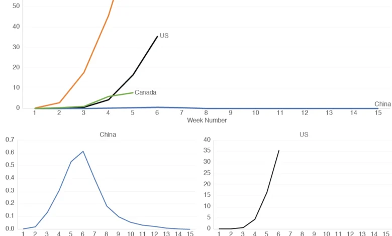
In an analysis of four distinct nations—the U.S., China, Italy, and Canada—Italy initially showed the most dramatic spike in mortality. During the early weeks of its outbreak, Italy’s weekly deaths per million people climbed to over 90, a figure that dwarfed the rates seen in other nations at that time. In contrast, the data for China appeared almost flat when placed on the same scale. While this might suggest that the virus had a negligible effect on China, it is more likely a reflection of China’s massive population and the fact that the outbreak was largely contained within Hubei Province. If the data were filtered to show Wuhan alone, the mortality rate would likely rival or exceed that of the hardest-hit European regions.
The comparison between the United States and Canada also offers valuable insights. In the initial weeks of the pandemic, mortality in Canada actually increased at a faster rate per capita than in the U.S. However, by the fifth week, Canada’s trajectory began to show a slight decrease, whereas the U.S. mortality rate continued to climb without an immediate sign of peaking. Such comparisons are vital for policymakers to determine which social distancing measures and healthcare interventions are yielding results.

The Problem of Scaling and the "Small Multiples" Solution
One of the most significant hurdles in data visualization is the "scaling problem." When one country (like Italy) has a very high mortality rate and another (like China) has a relatively low per capita rate, putting them on the same graph makes the lower-rate country’s data unreadable. The line representing China simply "hugs" the bottom of the graph, making it impossible to see the pattern of change.
While some analysts use logarithmic scales to solve this, a more accessible solution is the use of "small multiples." This involves presenting a series of separate, smaller graphs—one for each country—side-by-side. Each small graph is independently scaled to its own maximum value. This allows the viewer to see the "shape" of the curve for each country. When these small multiples are paired with a single, large comparative graph, the viewer gets the best of both worlds: they can see the relative magnitude of deaths in the large graph and the specific pattern of change in the individual small graphs.
Official Responses and the Quest for Data Integrity
The push for better data visualization has been met with mixed responses from official bodies. Organizations like the Centers for Disease Control and Prevention (CDC) and the WHO have faced criticism for the lag in their data reporting and the lack of user-friendly interfaces on their primary dashboards. In response, independent entities and academic institutions—most notably the Johns Hopkins University Coronavirus Resource Center—stepped in to fill the void, providing real-time, interactive maps and charts that became the global standard.
Statisticians and health experts have emphasized that the "infodemic"—the overabundance of information, some accurate and some not—is as much of a challenge as the virus itself. Dr. Anthony Fauci and other leading health officials have frequently noted that public compliance with health mandates often depends on the public’s understanding of the data. When the data is presented clearly, the rationale for difficult decisions, such as lockdowns or mask mandates, becomes more apparent.
Broader Implications and the Future of Public Health Reporting
The lessons learned from the COVID-19 data crisis extend far beyond the current pandemic. This era has highlighted a desperate need for improved data literacy among the general public and more rigorous standards for data visualization in journalism and government reporting.
The move toward population-adjusted data and the use of small multiples represents a shift toward more honest and transparent communication. As the world prepares for future health crises, the establishment of clear, international protocols for recording and displaying mortality data will be essential. Accurate visualization is not merely an academic exercise; it is a critical tool for global health. By making the invisible patterns of a virus visible and understandable, data analysts provide the clarity needed to save lives and navigate the complexities of a globalized world in crisis.
Ultimately, no single graph can tell the entire story of a pandemic. However, by choosing simplicity over complexity and clarity over clutter, we can ensure that the data serves as a guide rather than a source of confusion. The trajectories of the U.S., Italy, China, and Canada serve as a reminder that while the virus is a biological phenomenon, our understanding of it is entirely dependent on the quality and clarity of our information.


