CSS Container Queries represent one of the most significant paradigm shifts in modern web development, yet industry adoption lags behind their broad browser availability. Despite commanding approximately 94% global browser support as of 2026, empirical data from developer surveys indicates that a stark disconnect persists between awareness and practical implementation. While modern web applications increasingly rely on modular, component-driven architectures, many developers continue to approach responsive design through the narrow lens of viewport-based media queries. This reliance on outdated methodologies often leads to layout failures when reusable components are deployed in constrained environments, such as sidebars or complex grid systems. Understanding the fundamental architectural differences between container queries and media queries is essential for building genuinely adaptable, resilient user interfaces on the modern web.
The Historical Context of Viewport-Dependent Design
To understand the advent of container queries, one must examine the evolution of responsive web design over the past two decades. Introduced alongside flexible grids and fluid images in the early days of mobile-friendly development, media queries established the browser viewport as the ultimate source of truth for layout adaptation. By asking the browser how wide the screen was at any given moment, developers could successfully alter macro-level page structures—transitioning from multi-column desktop views to single-column mobile layouts.
However, as design systems evolved toward component-driven development frameworks like React, Vue, and Web Components, the limitations of viewport-centric logic became glaringly apparent. A UI component, such as a product card or a user profile widget, is no longer bound to a predictable page structure. Instead, modern web architecture encourages components to be portable, reusable units that can be dropped into a full-width hero section, a narrow sidebar, or a dense dashboard grid. Because traditional media queries remain entirely blind to the internal containment of elements, they cannot determine whether a component has adequate space to render its optimal layout. Consequently, developers frequently encounter scenarios where a component triggers a desktop-class breakpoint while trapped inside a narrow container, resulting in text overflow, cramped spacing, and broken interfaces.
Adoption Metrics and Industry Stasis
The slow uptake of container queries has been a subject of considerable discussion among frontend engineering circles. Industry analyses, including data gathered by the annual State of CSS surveys, reveal a paradoxical trend: while over 85% of developers express theoretical awareness of container queries, fewer than half actively utilize them in production environments. During industry events such as SmashingConf Amsterdam, prominent web development educators like Kevin Powell have underscored this sluggish adoption rate, characterizing it as a major bottleneck in modern CSS progression.

This hesitation largely stems from cognitive familiarity. Because container query syntax (@container) closely mirrors traditional media query syntax (@media), developers often mistakenly assume they serve interchangeable purposes. This superficial resemblance fosters a false sense of security, leading engineers to apply container queries with viewport-centric mental models. Furthermore, legacy codebases and established team workflows often default to trusted patterns, creating organizational friction against migrating toward container-based responsive logic.
Technical Mechanics: Looking Inward Rather Than Outward
The core architectural differentiator between the two systems lies in their directional focus. Media queries look outward, evaluating the macro environment of the browser window. Container queries look inward, evaluating the micro environment of a specific parent wrapper designated as a container.
To utilize container size queries, a developer must explicitly declare a container context on a parent element using the container-type property—typically set to inline-size to track horizontal constraints in left-to-right writing modes—alongside an optional container-name. Once registered, descendant elements can adapt dynamically to the exact dimensions of that specific wrapper, completely independent of the browser viewport.
This capability fundamentally alters how developers approach component design. Rather than designing components for abstract device thresholds—such as 768px for tablets or 1024px for desktops—engineers can now build components that respond intelligently to their immediate spatial availability. This aligns closely with the modern reality of web browsing, where analytics data demonstrates thousands of unique viewport sizes across fragmented mobile, foldable, and desktop devices, making hardcoded viewport breakpoints mathematically obsolete.
Advanced Capabilities and Practical Implementation
Beyond basic layout adjustments, container queries unlock advanced responsive patterns that were previously impossible to achieve using pure CSS. One prominent application is the implementation of component-level fluid typography. While traditional responsive typography relies on viewport units (vw, vh) via CSS clamp() functions, these units falter when a component is relocated to a confined sidebar. By leveraging container query length units—such as cqi (container query inline-size units)—developers can create fluid typography scales that tether font size directly to the component’s container rather than the global screen dimensions.

Additionally, container queries provide ingenious workarounds for persistent layout challenges, such as flexbox wrap detection. Standard CSS lacks native selectors or pseudo-classes to detect when flex items wrap onto a new line, historically forcing developers to rely on JavaScript-heavy ResizeObserver implementations. By combining flexbox wrapping logic with container queries on individual flex items, developers can automatically trigger layout restructurings the moment items shift rows, maintaining robust responsiveness entirely within the stylesheet.
Potential Side Effects, Limitations, and Caveats
Despite their profound utility, container queries introduce specific constraints and side effects that engineers must navigate carefully.
First, a container cannot query its own dimensions. Attempting to apply a container type and a container query to the exact same element creates a circular reference and an infinite calculation loop. Developers must always establish a clear parent-child DOM separation, applying the container declaration to a wrapper element while styling its nested descendants.
Second, querying a container’s complete two-dimensional size (container-type: size) forces the browser to calculate dimensions without factoring in the element’s internal children. If explicit height, minimum height, or aspect ratios are omitted, the container will instantly collapse to zero height, breaking the layout. Consequently, best practices strongly recommend sticking to inline-size queries unless vertical containment is strictly required.
Finally, container queries currently cannot accept CSS custom properties (variables) as threshold values. Because custom properties cascade dynamically through the DOM, allowing them inside queries could introduce recursive evaluation loops that destabilize rendering engines. Developers must continue to use static length values for their query breakpoints.
Strategic Framework for Choosing Query Types

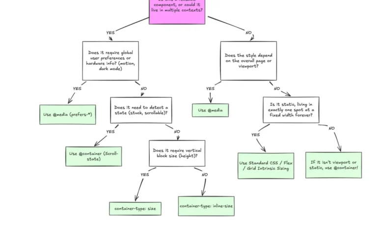
Rather than advocating for the wholesale replacement of media queries with container queries, industry consensus points toward a complementary coexistence based on a clear separation of concerns.
Media queries retain their indispensable value for macro-level layouts, system preferences, and hardware capabilities. Scenarios involving global page structure, full-window navigation bars, sticky headers, dark mode toggles (prefers-color-scheme), and touch-screen accessibility (pointer: coarse) remain firmly within the domain of the viewport.
Conversely, container queries should be the default mechanism for micro-level layouts—specifically, reusable components designed to function across multiple contexts throughout an application. Cards, widgets, modular forms, and modular data displays thrive under container query logic because their structural integrity depends entirely on their immediate spatial surroundings.
Conclusion
The underutilization of CSS Container Queries highlights a broader transition period within frontend development, where long-standing habits must adapt to the demands of component-driven engineering. By moving away from rigid, viewport-dependent assumptions and embracing context-aware design systems, developers can construct more resilient, future-proof user interfaces. Container queries do not render traditional media queries obsolete; rather, they complete the responsive design toolkit, offering a precise method for letting content dictate layout.