The Art of Quantitative Sensemaking: Navigating the Complexities of Proportional Communication

In the realm of data analysis and statistical reporting, the ability to interpret and communicate quantitative relationships is paramount to informed decision-making. Among the various metrics used to describe data—such as distribution, correlation, and time-series analysis—the concept of proportion stands out as both the most fundamental and the most frequently misunderstood. A proportion is essentially a comparative relationship between two quantities. Whether comparing the population of two cities or the efficiency of two manufacturing processes, a proportion serves as a bridge between raw numbers. However, when these relationships are poorly translated into public-facing narratives, they often lead to widespread statistical confusion, eroding public trust in data-driven reporting.
The Taxonomy of Proportions: Ratios, Rates, and Percentages
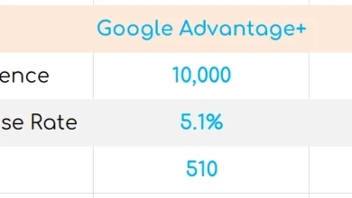
The primary source of confusion in quantitative communication arises from the sheer variety of ways a single proportion can be articulated. A relationship between two values, such as 20 and 10, can be expressed as a ratio (20:10 or 2:1), a fraction (20/10), a rate (2), or a percentage (200%). While mathematically equivalent, each format carries different implications for the reader.
A rate, defined as the result of division, provides a clean scalar value, while a percentage offers a standardized way to compare parts of a whole. Problems typically arise when communicators attempt to express these relationships using "greater than" or "less than" terminology. For instance, stating that a value is "200% of" another is mathematically sound, but claiming a value is "100% more" than another introduces a layer of linguistic ambiguity. If the point of reference is shifted—for example, comparing 10 to 20 rather than 20 to 10—the resulting rate becomes 0.5, or 50%. The failure to clearly identify the "base" or "point of reference" is a recurring failure in technical writing and news broadcasting, often leading to significant errors in public discourse.
Case Study: Analyzing Institutional Statistical Errors
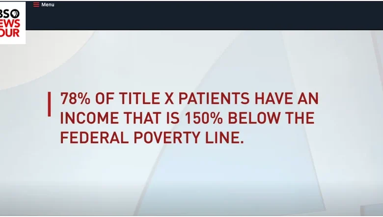
The risks of miscommunicating these relationships were highlighted in a September 2019 PBS Newshour segment regarding the federal funding of family planning services under Title X. During the broadcast, a graphic displayed the text "150% below the poverty line" in reference to patient income levels. From a statistical standpoint, this statement is conceptually impossible.
In mathematics, a value cannot be more than 100% "below" another, as that would imply a negative quantity, which is non-existent in the context of income. The error likely stemmed from a confusion between a percentage-based change and a threshold relative to the Federal Poverty Level (FPL). In 2019, the U.S. federal poverty guideline for a single-person household was $12,140. A common metric used by health agencies is 150% of that threshold—approximately $18,210. The intended message was likely that a significant majority of patients fall below this 150% income threshold. Instead, the phrasing suggested a deficit that defied logical bounds. This incident underscores a broader issue: even reputable news organizations can inadvertently disseminate misinformation by neglecting the rigorous standards required for proportional representation.
The Part-to-Whole Fallacy and Data Visualization
Beyond basic arithmetic, proportions are frequently used to express part-to-whole relationships, where the sum of parts must equal 100%. In corporate and government reporting, this is almost universally visualized through the pie chart. Despite its popularity, the pie chart is widely criticized by data scientists and statisticians for its inherent lack of clarity.
Human visual perception is highly efficient at comparing lengths or positions on a scale, but it is notoriously poor at accurately comparing the areas of circular segments. When a report uses a pie chart to display regional revenue or demographic splits, it forces the viewer to estimate the angle or surface area of a slice, rather than reading a discrete value. Consequently, when communicators rely on these visuals, they often exacerbate the existing confusion surrounding proportions. Modern data standards increasingly favor bar charts or bullet graphs, which allow for a more precise, linear comparison of proportional parts.
Chronology of Statistical Misinterpretation
The evolution of data reporting in the 21st century has seen a shift toward more complex, "big data" narratives, yet the foundational understanding of proportions has not kept pace.
- 2000–2010: The rise of online infographics leads to an explosion in visual data representation, often prioritizing aesthetic appeal over statistical accuracy.
- 2015: Academic research in data journalism begins to flag "percentage point" confusion as a major hurdle for public understanding of health and economic trends.
- 2019: The PBS Newshour incident serves as a high-profile example of how technical terminology (poverty levels vs. income percentages) can be garbled in a fast-paced media environment.
- 2020–Present: Public health reporting during the global pandemic forces a crash course in proportional literacy, highlighting the difference between absolute changes and relative percentage increases.
The Danger of Percentage Point Confusion
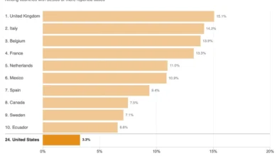
One of the most persistent issues in public policy reporting is the failure to distinguish between a "percentage increase" and a "percentage point increase." Consider the reported rise in obesity rates in the United States, currently cited at 42%. If an agency reports that the rate has "increased by 40% over 20 years," it creates a bifurcation in interpretation.
Does this mean the rate grew from 2% to 42% (a 40 percentage point jump), or did the rate rise from 30% to 42% (a 40% increase of the original 30%)? Without explicit context, the reader is left to guess. As demonstrated by common sense—as it is highly improbable that only 2% of the population was obese in the year 2000—the latter is the correct interpretation. However, the onus remains on the communicator to specify the change. Using phrases like "an increase from 30% to 42%" eliminates the ambiguity that "a 40% increase" invites.
Implications for Public Policy and Trust
The implications of these errors extend far beyond simple academic frustration. When government agencies or media outlets present data that is statistically incoherent, it provides fuel for those who wish to discredit objective reporting. Policy decisions—such as the allocation of Title X funding, the adjustment of poverty thresholds, or the implementation of public health measures—rely on the public’s ability to grasp the proportional relationship between a problem and its proposed solution.
When experts communicate with the general public, they must adhere to three core principles of proportional clarity:
- Transparency of Reference: Always explicitly state the base value (e.g., "Compared to the 2019 baseline…").
- Linguistic Precision: Distinguish clearly between percentage changes and percentage point changes.
- Visualization Suitability: Select charts that facilitate accurate comparison, avoiding circular or three-dimensional representations that distort the viewer’s perception of value.
Conclusion: Toward a More Literate Future
The goal of data sensemaking is not merely to perform calculations, but to translate quantitative reality into actionable knowledge. Proportions are the language of comparison, and like any language, they require a commitment to grammar and syntax. Whether one is a policymaker, a journalist, or a student of data, the responsibility remains the same: to communicate in a way that respects the complexity of the data while ensuring the message remains accessible.
As we move further into an era defined by data saturation, the ability to avoid the pitfalls of proportional confusion will be a defining skill for effective leadership and informed citizenship. By focusing on clarity, context, and the careful selection of analytical tools, we can ensure that the statistics we share serve to enlighten the public rather than obscure the truth. The objective is not to simplify data to the point of inaccuracy, but to express its inherent complexities with the precision they demand. In the end, the most powerful tool in any analyst’s kit is not an advanced software package, but the ability to articulate a clear, accurate, and defensible comparison.