
Statistical Volatility and the COVID-19 Pandemic: The Dangers of Misinterpreting Daily Case Counts in Financial and Public Policy Decisions
The intersection of public health data and financial market behavior reached a critical juncture in early April 2020, as the United States grappled with the first major wave of the COVID-19 pandemic. On April 6, 2020, the Dow Jones Industrial Average experienced a staggering surge, gaining 1,627.46 points, or approximately 7.73 percent. This dramatic rally was largely attributed to investor optimism sparked by a reported decline in new coronavirus cases over the preceding weekend. An article published in Investor’s Business Daily by Ed Carson, titled "Dow Jones Futures Jump As Virus Cases Slow; Why This Stock Market Rally Is More Dangerous Than The Coronavirus Market Crash," highlighted a specific table showing that U.S. cases jumped by 25,316 on Sunday, April 5, down from a record 34,196 on Saturday. This represented the first recorded drop in daily new cases since March 21, leading many to conclude that the pandemic had finally "turned the corner." However, a deeper statistical analysis suggests that such conclusions, drawn from single-day fluctuations in reported data, are not only premature but potentially hazardous to both economic stability and public health strategy.
The Illusion of the Downward Trend
The volatility observed in early April serves as a case study in the dangers of "noise" versus "signal" in data interpretation. When the Investor’s Business Daily report noted the decline from Saturday’s record to Sunday’s lower figure, it provided the market with a narrative of hope. However, the reliance on daily case counts as a real-time indicator of the pandemic’s trajectory is fundamentally flawed. In statistics, "noise" refers to random variation or error that obscures the underlying pattern, or "signal." In the context of a global pandemic, daily case counts are heavily influenced by administrative factors, testing availability, and reporting lags rather than the actual biological spread of the virus on that specific day.
For a meaningful response to be formulated, the methods used to collect, analyze, and report statistics must be scrutinized. The reported decline on April 5 was likely an artifact of the reporting process rather than a genuine reduction in viral transmission. By April 6, when the markets were rallying, the data for that day already began to show that the "drop" was an anomaly. When incorporating the data from April 6, it became clear that the upward trajectory of the pandemic remained intact. The steep increase observed on April 3, followed by the "significant" declines on April 4 and 5, was merely a fluctuation in a broader, still-climbing curve.

Chronology of Data and Market Reaction: April 2020
To understand the gravity of misinterpreting these figures, one must look at the specific timeline of events during the first week of April 2020. This period was characterized by extreme uncertainty and a desperate search for signs of "flattening the curve."
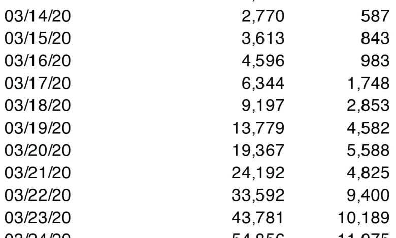
- April 1–2, 2020: The U.S. surpasses 200,000 confirmed cases. Public health officials warn that the coming two weeks will be the "hardest and saddest" for many Americans.
- April 3, 2020: Daily reported cases hit a new high. The CDC begins recommending the use of cloth face coverings in public.
- April 4, 2020 (Saturday): Reported new cases reach a record 34,196.
- April 5, 2020 (Sunday): Reported new cases "drop" to 25,316. This is the first decline in two weeks.
- April 6, 2020 (Monday): Financial markets react to the Sunday data. The Dow Jones surges over 1,600 points on the assumption that the peak has passed.
- April 7, 2020: Subsequent data reveals that the Sunday drop was a reporting lag; new cases continue to climb, and the U.S. records its highest daily death toll to date at that point.
This timeline illustrates a "bull trap" for investors—a false signal of a market recovery during an overall downtrend—driven by a misunderstanding of how medical data is processed and reported during a crisis.
Factors Contributing to Daily Data Volatility
The disconnect between "reported cases" and "actual infections" is vast. Several structural factors ensure that the date an infection is recorded in a national database rarely matches the date the infection actually occurred.
1. Testing Constraints and Bottlenecks
In April 2020, the United States faced a severe shortage of diagnostic tests. Testing was largely prioritized for symptomatic patients, healthcare workers, and those in high-risk categories. Consequently, the vast majority of mild or moderate cases were never tested and thus never appeared in official statistics. Furthermore, even when tests were administered, the "turnaround time" for lab results varied from 24 hours to over a week. A "new case" reported on a Sunday might represent a person who fell ill ten days prior.

2. The Weekend Effect in Reporting
A well-documented phenomenon in public health statistics is the "weekend effect." Many state and local health departments, as well as private laboratories, operate with reduced staffing on Saturdays and Sundays. This often results in a significant dip in reported cases on Sundays and Mondays, followed by a "catch-up" spike on Tuesdays and Wednesdays. The "drop" celebrated by the markets on Monday, April 6, was almost certainly a result of this administrative rhythm rather than a biological shift in the pandemic.
3. Asymptomatic Transmission
Scientific consensus eventually confirmed that a significant portion of COVID-19 transmissions were driven by asymptomatic or presymptomatic individuals. Since these individuals were rarely tested in the early stages of the pandemic, the "reported case count" served as a poor proxy for the true prevalence of the virus in the community.
The Necessity of Moving Averages
To filter out the daily noise and reveal the true trajectory of the pandemic, statisticians emphasize the use of moving averages. A 5-day or 7-day moving average smooths out the daily volatility by averaging the current day’s count with those of the preceding days.
When the CDC data from early April is viewed through a 5-day moving average, the "dramatic" decline of April 5 disappears. Instead of a sharp peak followed by a turnaround, the moving average shows a curve that is still rising, albeit at a slightly less aggressive rate. By smoothing the data, it becomes evident that the pandemic had not "turned the corner." The moving average provides a more sober and accurate overview, protecting decision-makers from making hasty conclusions based on a single day’s outlier.

Market and Policy Implications of Data Misinterpretation
The consequences of misreading pandemic statistics extend far beyond the trading floor. When financial markets rally on false pretenses, it creates a feedback loop that can influence public policy and individual behavior.
Economic Instability
Market rallies based on "noise" are inherently unstable. When the reality of the data eventually sets in—showing that cases are still rising—the subsequent market correction can be even more volatile. This creates a "sawtooth" pattern in the stock market that erodes investor confidence and complicates long-term economic planning.
Premature Reopening Pressure
In early 2020, there was intense political and social pressure to "reopen the economy." Proponents of a quick return to normalcy often pointed to single-day drops in case counts as evidence that mitigation efforts like social distancing were no longer necessary. However, as epidemiological models showed, relaxing these measures based on inaccurate interpretations of the "peak" could lead to secondary surges that are more damaging than the initial wave.
Public Complacency
When news outlets report that cases are "slowing" based on weekend data, it can lead to a decrease in public vigilance. If individuals believe the threat is receding, they may be less likely to adhere to masking and distancing guidelines, thereby inadvertently fueling the very spread they believe is ending.

Expert Analysis and Retrospective Insight
In retrospect, the statistical models used during the COVID-19 pandemic were, as many experts noted at the time, "educated guesses based on approximate data." The true trajectory of the pandemic could only be understood months later when backdated data—organized by the date of symptom onset rather than the date of report—became available.
Statistical experts argue that patience is the most critical tool in data analysis. The urge to find immediate meaning in daily numbers is a human instinct, but in the context of a complex biological event, it is a liability. The surge of the Dow Jones on April 6, 2020, stands as a historical reminder that the "wisdom of the crowd" in the stock market is only as good as the data it consumes.
As the pandemic progressed, the global community eventually learned to look toward more stable metrics, such as hospital admission rates and 7-day rolling averages of deaths, which, while still lagging, offered a less "noisy" picture of the crisis. The lesson of April 2020 remains relevant for any future crisis: hasty conclusions drawn from volatile data will inevitably be corrected by time, often at a high cost. Greater understanding is found not in the daily ups and downs, but in the disciplined observation of long-term trends. Retrospective analysis confirms that the pandemic’s true "peak" in the first wave did not occur until weeks after the April 6 rally, proving that the market’s optimism was built on a statistical mirage.


