
Data Presentation and the COVID-19 Pandemic: Analyzing the Accuracy of International Mortality Comparisons in the Media
The global COVID-19 pandemic has underscored the critical necessity for clear, accurate, and transparent data communication. As public health officials, policymakers, and the general public rely on news outlets to interpret complex epidemiological statistics, the manner in which this information is visualized can significantly alter public perception of the crisis. In August 2020, a high-profile exchange between then-President Donald Trump and Axios reporter Jonathan Swan highlighted a fundamental disagreement over how to measure a country’s success—or failure—in managing the virus. When subsequent media coverage, including reports from National Public Radio (NPR), attempted to provide context to this debate, it inadvertently raised questions about the ethics of data visualization and the potential for misleading narratives through the omission of relevant data.
The Axios Interview and the Metrics Debate
On August 3, 2020, HBO aired an interview conducted by Jonathan Swan of Axios with President Donald Trump. The segment regarding COVID-19 mortality rates became a focal point of international discussion. During the interview, President Trump presented several charts to argue that the United States was managing the pandemic more effectively than almost any other nation. Specifically, the President focused on the "case fatality ratio" (CFR), which measures the number of deaths relative to the number of confirmed positive cases.
Swan, conversely, pointed toward "deaths per capita," which measures the number of deaths relative to the total population of the country. This distinction is not merely semantic; it represents two entirely different ways of assessing a public health crisis. The case fatality ratio can be influenced heavily by the volume of testing; if a country tests aggressively and identifies many asymptomatic or mild cases, the ratio of deaths to cases naturally decreases. Per capita mortality, however, provides a clearer picture of the disease’s overall impact on the population at large, regardless of how many tests are administered.
When Swan noted that the U.S. death rate was significantly higher than that of many other developed nations on a per capita basis, the President responded, "You can’t do that." This exchange set the stage for a broader media effort to clarify these metrics for the public.
Chronology of Data Reporting: August 2020
The first week of August 2020 represented a volatile period in the pandemic’s timeline. By August 5, the United States had surpassed 4.7 million confirmed cases and 156,000 deaths. The "Sun Belt" surge was in full effect, with states like Florida, Texas, and Arizona seeing record-breaking hospitalizations. Globally, the pandemic was shifting; while Europe had largely stabilized after a devastating spring, Latin America and India were becoming the new epicenters.
On August 5, 2020, NPR published an article titled "Charts: How the U.S. Ranks On COVID-19 Deaths Per Capita – And By Case Count," authored by Jessica Craig. The article aimed to provide a factual baseline for the claims made during the Axios interview. However, the visualization choices made within the article—specifically the decision to limit charts to the "top 10" countries—sparked criticism regarding the potential for data distortion.
The "Curse of the Top 10" and Data Omission
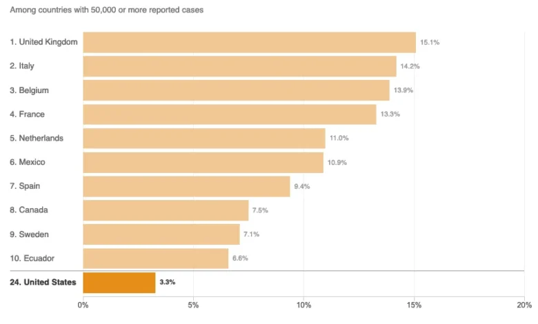
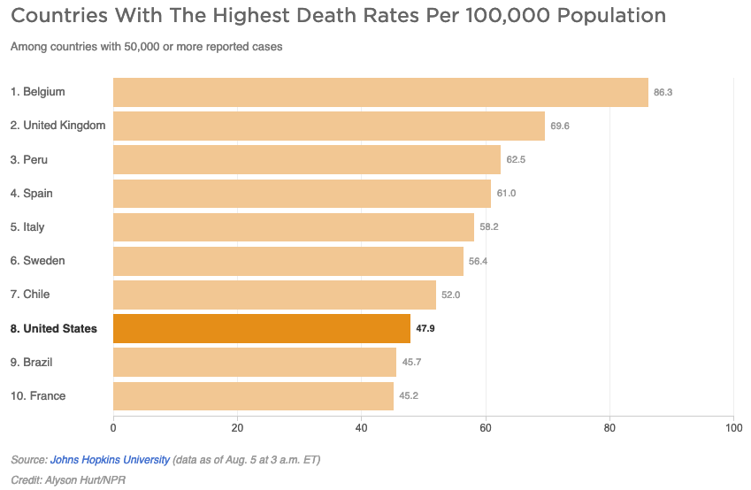
A primary concern raised by data analysts and media critics involves the arbitrary limitation of comparative charts. In the NPR report, two primary charts were used: one for per capita deaths and one for case fatality ratios. Both charts filtered the global data to include only those countries with 50,000 or more reported cases.
At the time of publication, 45 countries met this threshold. However, the NPR charts displayed only ten countries. In the per capita death rate chart, the U.S. appeared to be performing relatively well, with only Brazil and France showing "better" (lower) mortality rates among the small group selected. This presentation was statistically misleading. When looking at the full list of 45 countries with more than 50,000 cases, 37 of those countries actually had lower per capita death rates than the United States. By narrowing the field to ten, the chart omitted nearly 80% of the relevant peer group, creating an illusion of mid-to-high performance that was not supported by the full data set.
The second chart, focusing on case fatality ratios, placed the United States at the bottom of the list—a position that usually indicates the best performance in mortality rankings. While the U.S. did have a lower CFR than countries like the United Kingdom or Italy at that time, it was by no means the "best" in the world. In the broader context of all countries with significant outbreaks, the U.S. was positioned in the middle of the pack. The decision to present a "Top 10" list rather than a comprehensive ranking served to bolster the administration’s narrative, even if that was not the intended goal of the news outlet.
Analyzing Epidemiological Definitions: "Disease Burden"
The NPR report also delved into the concept of "disease burden," citing Justin Lessler, an associate professor of epidemiology at Johns Hopkins University. The article stated that the per capita death rate is primarily an indication of the overall disease burden in a country. However, this definition has been contested by some in the scientific community for lack of precision.
In public health, "disease burden" is a specific technical term often measured in Disability-Adjusted Life Years (DALYs). This metric combines years of life lost due to premature mortality and years lived with a disability due to the disease. Critics of the NPR phrasing argue that per capita death rates indicate the proportional burden of mortality rather than the overall disease burden. The overall burden would be more accurately represented by total case counts and long-term morbidity data, which were still being understood in the summer of 2020.
Furthermore, the technical definition of disease burden provided in the article—impact in terms of years of life lost and years lived with disability—is difficult to calculate in real-time during an active pandemic. Using this definition to explain a simple per capita death rate can confuse the audience rather than enlighten them, as it introduces variables (like long-term disability) that the death rate alone does not capture.
Supporting Data and International Context
To understand the magnitude of the data omission, one must look at the global landscape in August 2020. According to data from the Johns Hopkins University Coronavirus Resource Center, the following metrics were prevalent:
- United States: Approximately 47 deaths per 100,000 people.
- United Kingdom: Approximately 69 deaths per 100,000 people.
- Belgium: Approximately 86 deaths per 100,000 people.
- Germany: Approximately 11 deaths per 100,000 people.
- South Korea: Less than 1 death per 100,000 people.
By including only the hardest-hit European nations (like the UK, Italy, and Spain) in a "Top 10" list, the U.S. mortality rate appeared more favorable. If the chart had included a broader range of countries with over 50,000 cases—such as Germany, Russia, or South Africa—the U.S. position would have looked significantly more precarious. This highlights the "selection bias" that can occur in journalism when designers prioritize aesthetic simplicity or "rankings" over comprehensive data sets.
Official Responses and Media Responsibility
While NPR did not issue a formal retraction, the critique of their data visualization reflects a growing movement within "data journalism" to move away from arbitrary rankings. Proponents of clear communication argue that when the stakes involve public health and government accountability, the "Top 10" format is often insufficient.
The response from the scientific community emphasized that both case fatality ratios and per capita death rates are "useful but incomplete." Dr. Anthony Fauci, in various briefings during that same period, often noted that the U.S. was "not doing well" when compared to the global community, despite the President’s preference for the CFR metric. The consensus among epidemiologists was that while the CFR showed improvements in clinical care (better use of ventilators and dexamethasone), the per capita rate showed a failure in containment and public health policy.
Broader Impact and Implications for Science Communication
The controversy surrounding the NPR charts and the Axios interview serves as a case study in how information can be "factually correct but contextually misleading." The numbers presented in the NPR charts were accurate based on the source data; however, the selection of which numbers to show created a narrative that contradicted the broader reality of the pandemic.
In an era of high political polarization, the responsibility of media outlets to present data without "spin" is paramount. Misleading charts can be weaponized by political figures to justify policy decisions or to downplay the severity of a crisis. For the public, these visualizations are often the only way they consume complex data. If a chart suggests the U.S. is "at the bottom" (implying best) of a mortality list, it may lead to a false sense of security or a lack of compliance with safety measures like masking and social distancing.
Moving forward, the lessons learned from the 2020 pandemic data reporting suggest that journalists should:
- Avoid arbitrary limits on data sets (like Top 10 lists) when the full data set provides a different conclusion.
- Clearly define the limitations of metrics like Case Fatality Ratio, especially regarding testing availability.
- Provide interactive or comprehensive charts that allow users to see where their country stands in relation to the entire global community, rather than a curated subset.
The accuracy of information in news stories is not just about the numbers themselves, but about the context in which they are placed. As the world continues to navigate the aftermath of COVID-19 and prepares for future health crises, the clarity of data presentation remains a cornerstone of effective public health and informed democracy.


