Visualizing Global Health Crises: The Challenge of Accurately Mapping COVID-19 Mortality Data

The global dissemination of COVID-19 has triggered an unprecedented surge in data production, placing epidemiologists, public health officials, and data analysts at the center of a complex information landscape. As nations grapple with the clinical realities of the pandemic, the task of translating raw mortality figures into actionable intelligence has become a significant hurdle. Accurate data visualization is not merely an academic exercise; it is a critical tool for policymakers, healthcare administrators, and the public to comprehend the trajectory of a disease that respects no borders. However, the current methodology for comparing mortality rates across diverse countries remains fraught with inconsistency, technical ambiguity, and inherent data limitations that threaten to obscure rather than illuminate the crisis.
The Complexity of Comparative Mortality Data
When evaluating the impact of a global pandemic, analysts often face the "apples-to-oranges" dilemma. Comparing mortality across international borders is inherently complicated by disparate reporting standards, healthcare infrastructure, and testing capabilities. In the United States, for example, the determination of a "COVID-19 death" has been subject to evolving clinical guidelines. A patient admitted with respiratory failure who tests positive for SARS-CoV-2 may have their death certificate coded as pneumonia or acute respiratory distress syndrome (ARDS), depending on the regional reporting practices at the time.
This lack of standardization is not unique to any one nation. Medical personnel operating under the immense strain of a surging pandemic prioritize patient survival over the meticulous, standardized recording of clinical data. Consequently, the integrity of mortality datasets varies significantly between nations, making absolute comparisons scientifically tenuous. Even so, the imperative to synthesize these figures remains, necessitating a rigorous approach to data visualization that favors clarity and accessibility over complex, potentially misleading graphical representations.
A Chronology of Global Reporting Challenges
The early stages of the pandemic, beginning in late 2019 and accelerating through the first quarter of 2020, were characterized by a rapid learning curve in data collection.
- December 2019: The first clusters of pneumonia of unknown cause are reported in Wuhan, Hubei Province, China.
- January 2020: The World Health Organization (WHO) begins coordinating with international partners to establish standardized case definitions.
- February–March 2020: As the virus spreads to Europe and North America, countries begin implementing varied testing protocols. Some nations focus on symptomatic, hospitalized patients, while others adopt broader surveillance testing, leading to vastly different mortality reporting rates.
- April 2020: Data analysts note that common visualization methods, such as aggregated bar charts or cluttered line graphs, fail to account for the immense variance in population size and the different stages of the outbreak in each country.
The primary issue with many early visual models was their failure to account for scaling. When plotting the number of deaths per million people—a necessary metric for comparing countries of vastly different sizes like China and Italy—the resulting graphs often compressed smaller, yet significant, trends into flat lines.

The Technical Imperative: Scaling and Clarity
The challenge of visual representation lies in the human capacity to interpret scale. When a high-magnitude outlier, such as Italy during its initial peak, is graphed alongside a lower-magnitude country like China, the visual weight of the former often renders the latter unreadable.
Some analysts have turned to logarithmic scales to solve this, compressing the range of data so that exponential growth patterns can be observed across different magnitudes. However, for a general audience—including journalists, legislators, and the public—logarithmic scales are often counterintuitive and prone to misinterpretation. The misunderstanding of a log scale can lead to the false perception that a steep decline in a chart is a decline in reality, when in fact it may only represent a slight slowing in the rate of acceleration.
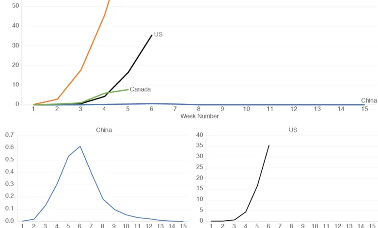
A more effective strategy involves the use of "small multiples"—a series of independent, side-by-side graphs that utilize the same scale for comparison but allow for distinct visual resolution. By decoupling the countries into individual panels, analysts can clearly delineate the "pattern of change" for each nation without losing the context of the total magnitude.
Comparative Analysis: U.S., Italy, Canada, and China
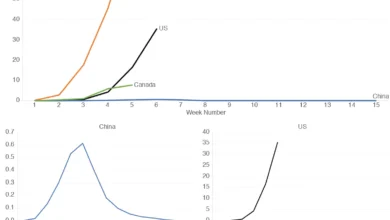
When applying the small-multiples approach to four distinct nations—the United States, China, Italy, and Canada—the utility of the design becomes apparent.
In a single, combined graph, China’s data appears as a near-horizontal line due to the massive population denominator and the lower relative death rate compared to the acute surges seen in Italy. By separating these into individual panels, the specific trajectory of the outbreak in China becomes visible, allowing for a direct comparison of the epidemic curve.
For instance, comparing the first seven weeks of the outbreak in Italy against the initial phase in China reveals remarkably similar geometric patterns in mortality increases. This suggests that while the total magnitude of the crisis differs due to population density, regional healthcare response, and initial timing, the viral spread follows predictable, observable patterns of growth.

Furthermore, the small-multiples technique reveals subtle divergences between North American neighbors. In the early weeks of the pandemic, Canada experienced a rapid escalation in mortality, followed by a noticeable cooling of the growth rate by the fourth and fifth weeks. Conversely, the United States, during this same comparative window, showed a sustained, linear increase that did not mirror the early stabilization seen in its northern neighbor. Such visual evidence allows public health experts to hypothesize about the effectiveness of non-pharmaceutical interventions (NPIs) implemented in different jurisdictions.
Institutional Responses and Data Integrity
The World Health Organization and the Centers for Disease Control and Prevention (CDC) have repeatedly emphasized that data is a living entity. Both organizations have issued guidance on the importance of "excess mortality" metrics—the difference between the observed number of deaths in specific time periods and the expected number of deaths in the same time periods—to better capture the true toll of the pandemic.
Official responses from health ministries have acknowledged the limitations of daily mortality counts. In many countries, the "backlog effect," where deaths occurring over several days are reported in a single batch, can cause significant volatility in daily graphs. This necessitates the use of smoothed data, such as seven-day rolling averages, to ensure that the visualization reflects the underlying trend rather than the reporting noise.
Broader Implications for Policy and Public Health
The reliance on clear, honest data visualization has profound implications for governance. When the public is presented with confusing or poorly scaled data, trust in institutional reporting erodes. Conversely, when data is presented in a way that respects the viewer’s intelligence while acknowledging the inherent flaws in the underlying statistics, it fosters a more informed public discourse.
The move toward standardized reporting, as encouraged by the International Health Regulations (IHR), is a step toward reducing the variance in international data. Yet, as long as reporting procedures remain decentralized, the responsibility for accurate representation rests with the analyst.
The primary lesson of the pandemic’s data crisis is that simplicity is not the enemy of accuracy. By utilizing techniques like small multiples and maintaining transparency regarding the limitations of the datasets, the scientific community can provide the public with the tools necessary to understand the situation as it evolves. As the global community moves forward, the integration of these visual standards into public health reporting will be essential for managing not only the current crisis but also future global health threats. The goal is not just to count the deaths, but to make those numbers meaningful in a way that informs policy, drives action, and ultimately, saves lives.