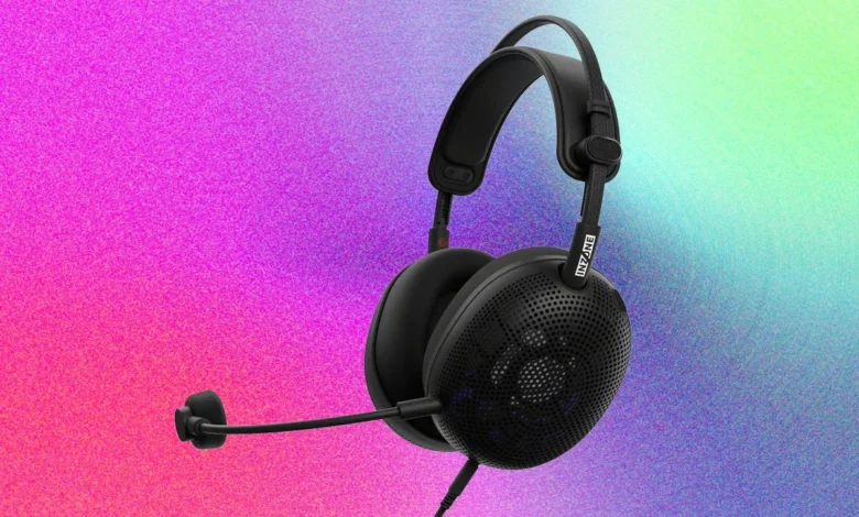
WordPress Ecosystem

Mastering Web Design Harmony: The 60/30/10 Color Rule Explained

The 60/30/10 rule stands as a cornerstone in effective visual design, a powerful color proportion guideline that systematically divides a design into three distinct parts: a dominant color occupying 60% of the visual space, a secondary color filling 30%, and an accent color reserved for the remaining 10%. This structured approach offers a clear visual hierarchy, streamlining design decisions and ensuring that a website communicates its message effectively without overwhelming the user. Its elegance lies in its simplicity, providing a robust framework that transcends subjective aesthetic preferences to deliver objective design efficacy.

Historical Roots: From Interiors to Interfaces

While widely adopted in digital design today, the 60/30/10 rule did not originate in the realm of pixels and screens. Its genesis can be traced back to interior design principles of the early 20th century, where designers sought to create balanced and harmonious living spaces. The logic was straightforward: walls, the largest surface area, would take the dominant color (60%); furniture and textiles would introduce the secondary color (30%); and decorative items like artwork, throw pillows, or lamps would provide the final accent (10%). This methodical distribution prevented visual clutter and guided the eye through a room with a natural flow.

Over time, this proportional wisdom migrated into other creative disciplines. Fashion designers embraced it to construct cohesive outfits, balancing primary garment colors with complementary pieces and subtle accessories. Graphic design then absorbed the rule, applying it to print layouts, branding materials, and advertisements to ensure readability and impact. The transition into User Interface (UI) and web design was a natural evolution, particularly as digital experiences grew more complex and the need for intuitive navigation became paramount. In the digital landscape, the "canvas" became the screen, "furniture" became structural elements like navigation and content blocks, and "accessories" transformed into interactive elements such as buttons and links. The underlying principle, however, remained constant: to create balance and direct attention by assigning each color a defined role and a specific spatial allocation. This historical progression underscores the rule’s versatility and its fundamental alignment with human visual perception across diverse mediums.

Deconstructing the 60/30/10 Rule: Roles and Responsibilities

The 60/30/10 Rule in Web Design: How to Use It (With Examples)

Understanding the specific function of each percentage is crucial for successful implementation. Each color plays a distinct role in establishing visual order and guiding user interaction.

  • The Dominant Color (60%): Setting the Stage
    This color forms the bedrock of your design, occupying the vast majority of the visual real estate. It establishes the overall mood, tone, and spaciousness of the website. Typically, the dominant color is applied to backgrounds, large section headers, and elements that serve as a canvas for all other content. For most contemporary websites, this often translates to neutral tones such as white, off-white, or various shades of light grey. These choices provide a clean, unobtrusive backdrop, allowing content to stand out. In the case of dark-mode designs, the 60% might be a deep charcoal, a rich navy, or a near-black, maintaining the same principle of providing a consistent, expansive background. The primary objective here is to create a stable, non-distracting environment that supports, rather than competes with, the information presented.

  • The Secondary Color (30%): Providing Structure and Contrast
    The secondary color acts as the supporting player, providing necessary contrast and structure without vying for primary attention. It’s used for elements that organize and divide content, such as navigation bars, sidebars, card backgrounds, section breaks, and sometimes body text or subheadings. This color should complement the dominant hue, offering enough visual separation to define distinct areas of the page while maintaining overall harmony. Its purpose is to add depth, establish hierarchy, and guide the user’s eye through different content zones. A common pitfall here is choosing a secondary color that is too vibrant or too similar to the accent, thereby diluting the accent’s impact or creating visual noise.

  • The Accent Color (10%): Guiding Action and Highlighting Key Information
    This is the smallest but arguably most impactful proportion. The accent color is strategically deployed to draw immediate attention to critical interactive elements and key information. Think call-to-action (CTA) buttons, highlighted text, crucial icons, and links. Its role is to tell the visitor precisely where to look, what to click, and what action to take next. Given its small allocation, the accent color needs to possess significant visual energy relative to the rest of the palette. It’s the "pop" that stands out, designed to create a focal point and drive user engagement. This is where color psychology plays a most direct role, as the chosen hue can significantly influence conversion rates and user behavior.

The Psychology of Color: Guiding User Perception and Action

Color is far more than mere decoration; it is a powerful communication tool that deeply influences human perception and behavior. Research consistently demonstrates that people form snap judgments about products, brands, and websites within a mere 90 seconds of initial exposure, with 60-90% of that assessment being based on color alone. This means visitors are making subconscious decisions about a brand’s trustworthiness, professionalism, and relevance before they even read a single word of copy.

The 60/30/10 Rule in Web Design: How to Use It (With Examples)

Different colors carry distinct psychological associations, which are often culturally influenced but also rooted in universal human experiences. For example:

  • Blue: Often associated with trust, reliability, calmness, and professionalism. Widely used in corporate, finance, and tech sectors.
  • Green: Evokes nature, growth, health, freshness, and prosperity. Common in environmental, health, and financial industries.
  • Red: Signals urgency, passion, excitement, and importance. Effective for sales, warnings, or high-energy brands.
  • Yellow: Communicates optimism, warmth, and cheerfulness, but can also signify caution.
  • Orange: A vibrant, energetic color often linked to creativity, enthusiasm, and warmth. Highly effective for CTAs due to its visibility and perceived friendliness.
  • Purple: Represents luxury, creativity, wisdom, and ambition.
  • Black: Conveys sophistication, power, and elegance.
  • White: Symbolizes purity, simplicity, cleanliness, and modernity.

These psychological underpinnings have profound implications for applying the 60/30/10 rule. If a website’s dominant 60% is a deep navy blue, it immediately conveys authority and trustworthiness. Conversely, a bright red as the dominant color might feel overwhelming and urgent, suitable for a limited-time sale but exhausting as a permanent background. This is precisely why many businesses opt for neutrals (whites, greys, muted tones) for their 60% dominant color: they are versatile and allow the secondary and accent colors to carry the emotional weight and brand personality without visual conflict.

The accent color (10%) bears the heaviest psychological burden, as it is tasked with driving user action. Studies in A/B testing consistently show that certain colors perform better for Call-to-Action (CTA) buttons. For instance, orange and red often lead to higher conversion rates due to their high visibility and sense of urgency or energy. If a brand operates in health or finance, a green or blue accent color reinforces user expectations of growth, security, and well-being. The deliberate choice and restrained application of the accent color are paramount to its effectiveness in guiding the user’s eye and influencing their behavior.

Strategic Application: A Step-by-Step Guide for Web Designers

Applying the 60/30/10 rule efficiently requires a systematic approach, often simplifying what can otherwise be an overwhelming process of color selection.

  1. Define Your 60% First: The Foundation of Your Palette
    Begin by selecting your dominant color. This color will occupy the largest portion of your design and sets the fundamental tone. For most websites, a neutral — white, off-white, or a very light grey — serves this purpose admirably, providing a clean, spacious canvas. For dark-mode designs, a deep charcoal or near-black becomes the default. The critical factor is that this color creates a consistent, non-distracting backdrop. Ask yourself: "What overall mood or atmosphere should my site convey before any specific content is even processed?" The answer will guide your 60% choice.

    The 60/30/10 Rule in Web Design: How to Use It (With Examples)
  2. Choose Your 30%: The Structural Layer
    Next, select your secondary color. This color will define the site’s structure, appearing on elements like navigation bars, sidebars, card containers, and secondary content blocks. It needs to provide sufficient contrast with your 60% dominant color to create clear visual separation without competing for attention. A practical test involves squinting at your design from a distance; if the secondary color "jumps out" as much as your accent color should, it’s likely too strong and needs to be adjusted in saturation or brightness.

  3. Select Your 10% Accent: The Action Driver
    Finally, determine your accent color. This is where strategic thinking regarding color psychology and user experience is most critical. Your accent color should feel energetic and distinct from the rest of your palette. It will be reserved exclusively for interactive elements such as call-to-action buttons, links, highlighted text, and key icons.
    Accessibility is non-negotiable here. Ensure your accent color provides sufficient contrast against both your dominant and secondary backgrounds to be easily readable for users with visual impairments. Tools like WebAIM’s Contrast Checker are invaluable for quick verification, with the Web Content Accessibility Guidelines (WCAG) recommending a minimum contrast ratio of 4.5:1 for normal text. Ignoring accessibility not only limits your audience but can also undermine the clarity and effectiveness of your design.

  4. Test Before You Commit: The Distance Check
    Once your three colors are roughed into a design mockup, physically step away from your screen. View the design from a distance of several feet. Does your eye naturally gravitate towards the areas where the accent color is applied? If the accent color is performing its role effectively, you should feel instinctively pulled towards the CTAs and key interactive elements without consciously trying to find them. This "distance test" is a powerful way to gauge the visual hierarchy and impact of your chosen palette. Tools like Coolors and Adobe Color can assist in generating harmonious palettes and previewing how your selected three colors interact before extensive implementation.

Real-World Mastery: Exemplary Digital Implementations

Observing the 60/30/10 rule in practice makes its theoretical benefits tangible.

  • Hipcamp: Nature’s Call to Action
    Hipcamp, a platform for outdoor accommodations, presents a stellar example of the 60/30/10 rule in action. Their dominant 60% is a serene light grey-white, providing an expansive, airy backdrop that perfectly aligns with their nature-focused brand identity. This neutral canvas allows other elements to breathe. The brand’s signature green serves as the secondary 30%, appearing in text, interactive elements, and subtle graphical accents. Because the rest of the palette is so understated, this green carries substantial visual weight, reinforcing the connection to nature and growth. Crucially, a vibrant orange is strategically deployed as the 10% accent color, guiding users towards the primary search function – the core business objective. This disciplined application ensures that the user’s eye is drawn precisely to where action is desired, creating a harmonious yet highly functional interface.

    The 60/30/10 Rule in Web Design: How to Use It (With Examples)
  • Apple News+: Pristine Clarity and Focused Interaction
    Apple News+ exemplifies a minimalist application of the rule. Pure white dominates at 60%, serving as an utterly neutral and expansive canvas. This choice places all visual emphasis on typography, imagery, and content itself, consistent with Apple’s clean aesthetic. A dark charcoal functions as the structural 30%, consistently used for navigation items, headings, and body text. This near-black provides exceptional legibility and establishes a clear information hierarchy without introducing extraneous color. The accent color is a striking coral-pink, used with extreme restraint. It appears exclusively on high-priority interactive elements: the "Try it free" button in the navigation, the prominent hero CTA, and a subtle brand label. This rigorous discipline means that whenever a user encounters the coral-pink, they instantly understand it signifies an actionable element, reinforcing the brand’s premium, intuitive user experience.

  • WooCommerce: Soft Hues, Strong Direction
    WooCommerce, the popular e-commerce platform, offers a nuanced interpretation of the 60/30/10 rule. Their dominant 60% is classic white, providing a clean and professional foundation. The secondary 30% is a soft lavender, ingeniously applied not as flat sections but as large, organic, blob-like shapes behind the hero content. This creative use provides visual interest and a sense of depth without overwhelming the user or competing with the content. The lavender adds a unique brand touch while still fulfilling its structural role. A medium purple is then meticulously reserved for every interactive element: the logo, login link, primary CTA buttons, and all text links. This consistent application ensures that as users scroll through the page, the purple color unfailingly highlights elements designed for interaction, making the 10% accent feel highly intentional and purposeful.

Integrating the Rule into Modern Web Development Workflows

For those working within content management systems (CMS) like WordPress, implementing the 60/30/10 rule effectively means leveraging global styling capabilities. This approach ensures consistency and simplifies maintenance across an entire website.

  • Elementor: Within the Elementor page builder, Global Colors are defined in Site Settings. By setting your three core palette colors here, any element (text, buttons, backgrounds) that uses these global definitions will automatically update site-wide when the global color is modified. This eliminates the need to manually adjust individual widget settings, enforcing the 60/30/10 discipline efficiently.
  • GeneratePress & Beaver Builder: Themes and builders like GeneratePress and Beaver Builder also integrate global color settings directly into their customizers or dedicated palette interfaces. This allows designers to establish a structured color system from the outset, ensuring that the dominant, secondary, and accent colors are consistently applied across all theme-level elements and builder modules.
  • Block Themes (Full Site Editing): For modern WordPress block themes utilizing Full Site Editing, the theme.json file is the central hub for defining the site’s color palette. By declaring your three primary colors (and any derived shades/tints) within this file, they become the default preset options available throughout the block editor. This "system-level" definition is the most robust way to maintain color consistency, ensuring that content creators inadvertently stray from the established palette.

The overarching principle across all these platforms is to define your three core colors once at the highest system level possible. This discipline ensures that the 60/30/10 rule is consistently applied across every page and component, solidifying brand recognition and user trust, not just on the homepage.

Navigating Exceptions: When to Adapt the 60/30/10 Framework

The 60/30/10 Rule in Web Design: How to Use It (With Examples)

While the 60/30/10 rule offers a powerful framework, it is a guideline, not an immutable law. There are specific design contexts where flexibility and thoughtful adaptation are necessary.

  • Photography-Heavy Sites: Websites built predominantly around full-bleed photography, such as portfolio sites, travel blogs, or image galleries, represent the most common exception. In these cases, the images themselves carry a significant portion of the visual information and color palette. Attempting to rigidly assert a 60/30/10 color distribution across the layout can clash with the imagery. The effective strategy here is to shift towards a minimalist, near-neutral interface (often very light or very dark), allowing the photography to become the de facto dominant visual element. Interface elements like navigation and text would then adopt a secondary and accent color that complements the average tones of the images, rather than dictating the overall color space.

  • Monochromatic Designs: Monochromatic designs intentionally use variations of a single base color through different tones, shades, and tints, rather than three distinct hues. The spirit of the 60/30/10 rule can still apply. The lightest or most desaturated tone of the chosen color would serve as the dominant 60%, providing the overall canvas. A mid-tone variation would then provide structure as the 30% secondary color, while the deepest or most saturated version of the hue would act as the 10% accent, drawing attention to interactive elements. This approach maintains visual hierarchy while adhering to a focused color scheme.

  • High-Energy or Campaign-Specific Pages: Certain pages, particularly those designed for urgent campaigns, product launches, or special promotions, might benefit from a more energetic or impactful color palette that slightly deviates from the strict 60/30/10 proportions. For instance, a sale landing page might push for a 50/30/20 split, or even introduce a fourth color as a secondary accent to amplify excitement or urgency. The key here is that any deviation must be deliberate and context-driven. Even with more color, there must still be a clear visual hierarchy, with one color unequivocally guiding the user’s primary action. Such pages are often temporary, mitigating the risk of long-term visual fatigue.

Avoiding Common Pitfalls: Maintaining Color Discipline

Even with a clear understanding of the 60/30/10 rule, several common mistakes can undermine its effectiveness:

The 60/30/10 Rule in Web Design: How to Use It (With Examples)
  • Overuse of the Accent Color: This is perhaps the most frequent misstep. When the 10% accent color starts to occupy 20% or 25% of the layout, it ceases to be an accent. Its distinctiveness diminishes, and it begins to compete with the secondary color, flattening the visual hierarchy and losing its ability to guide the eye effectively.
  • Insufficient Contrast or Saturation Similarity: If the dominant, secondary, and accent colors are too similar in tone, saturation, or brightness, the visual hierarchy collapses. The user’s eye won’t know where to focus, leading to a confusing and unstructured experience. Each color needs to play its distinct role with adequate visual separation.
  • Ignoring Imagery in the Color System: Photography and illustrations are powerful visual elements that contribute significantly to a page’s overall color impression. If a website’s color distribution is meticulously planned but the hero images or embedded graphics introduce clashing or overly saturated colors, they will override the established palette. Visual assets must either be consistent with the chosen palette or deliberately neutral to avoid conflict.
  • Inconsistent Application Across Pages: A common issue, particularly in websites built over time by multiple contributors, is a lack of global color discipline. The homepage might adhere to one palette, while the blog uses a slightly different shade for its accent, and the e-commerce section introduces its own set of colors. This inconsistency erodes brand trust and creates a disjointed user experience. The 60/30/10 rule builds recognition and trust only when applied uniformly across every page of a site.

Conclusion: The Enduring Power of Proportional Color in Web Design

The 60/30/10 rule, while seemingly simple, provides a profoundly effective framework for achieving visual harmony and strategic communication in web design. It doesn’t guarantee a "good" design in isolation — that still requires meticulous attention to typography, layout, content, and user experience. What it does, however, is systematically eliminate one of the most common points of failure: a confusing, cluttered, or ineffective color scheme.

By consciously getting the proportions right, selecting colors that resonate with brand identity and user psychology, and applying this system consistently across an entire digital presence, designers can transform a merely "functional" website into one that communicates trust, professionalism, and actionable direction before a single word is read. Leveraging global color settings in modern web development platforms is the cleanest and most efficient path to enforcing this critical discipline. The power of proportional color lies in its ability to quietly, yet powerfully, guide the user’s journey, making the digital experience more intuitive, engaging, and ultimately, more successful.

Frequently Asked Questions: Clarifying the 60/30/10 Rule

  • What is the 60/30/10 rule in web design?
    In web design, the 60/30/10 rule is a color distribution guideline where 60% of the visual space is allocated to a dominant background color that sets the overall tone, 30% to a secondary color for structure and contrast (e.g., navigation, card containers), and 10% to an accent color reserved for crucial interactive elements like CTAs and links. It creates an intuitive visual hierarchy that directs user attention.

  • What is the 60/30/10 rule in UI design?
    For UI design, the same proportions apply but at a granular level. The 60% dominant color forms the interface background, establishing mood. The 30% secondary color is used for UI components like sidebars, modals, and distinct sections. The 10% accent color is specifically for interactive elements such as buttons, active states, notifications, and links, signaling actionability.

    The 60/30/10 Rule in Web Design: How to Use It (With Examples)
  • Do neutrals count in the 60/30/10 rule?
    Absolutely. Neutrals like white, off-white, light grey, or dark near-black tones are frequently used as the dominant 60% color in effective web designs. They provide a versatile, non-distracting canvas that allows secondary and accent colors to convey brand personality and emotional weight. Neutrals can also function in the secondary 30% role, particularly in dark themes where structure is defined through subtle tonal shifts.

  • How many colors should I use in a web design?
    The 60/30/10 rule suggests using three distinct colors as your core palette. While you can extend each of these through various shades and tints to add depth, introducing more than three distinct colors often leads to visual clutter and dilutes the effectiveness of the hierarchy. If a fourth color feels necessary, it often indicates that one of the initial three is not fully performing its designated role.

  • What are good tools for building a 60/30/10 color palette?
    Excellent tools for generating and refining color palettes include Coolors.co for quick harmonious combinations and Adobe Color for more controlled exploration using color theory principles. Once potential colors are selected, always use accessibility checkers like WebAIM’s Contrast Checker to ensure sufficient contrast ratios for text and interactive elements.

  • Can you apply the 60/30/10 rule to dark-mode designs?
    Yes, the 60/30/10 rule is fully applicable to dark-mode designs. In this context, the dominant 60% would be a deep background color (e.g., charcoal, dark navy). The secondary 30% would be a slightly lighter or differently saturated tone for structural elements, providing visual elevation. The accent 10% typically needs to be a more vivid and higher-contrast color than in a light design to ensure it stands out clearly against the darker backdrop and guides user interaction effectively.

Related Articles

Leave a Reply

Your email address will not be published. Required fields are marked *

Back to top button
VIP SEO Tools
Privacy Overview

This website uses cookies so that we can provide you with the best user experience possible. Cookie information is stored in your browser and performs functions such as recognising you when you return to our website and helping our team to understand which sections of the website you find most interesting and useful.