
The landscape of front-end development is currently undergoing a significant paradigm shift as native CSS capabilities begin to replace complex JavaScript libraries for high-performance visual effects. One of the most notable advancements in this space is the emergence of scroll-driven animations, a feature set that allows developers to link the progress of an animation directly to the scroll position of a container. This technological evolution has enabled designers to implement sophisticated UI patterns—such as columns of items moving in opposite directions—with minimal code and maximum efficiency. As web standards continue to mature, the transition from script-heavy parallax effects to declarative CSS-driven motion is becoming the new benchmark for modern web architecture.
The Evolution of Scroll-Linked Interactivity
For over a decade, achieving "scroll-linked" effects required the use of heavy JavaScript event listeners. Developers traditionally relied on the scroll event, which often fired dozens of times per second, forcing the browser’s main thread to perform constant calculations. This frequently led to "jank"—a term used to describe stuttering or laggy visual performance—especially on mobile devices or lower-powered hardware. Libraries such as ScrollMagic or GSAP (GreenSock Animation Platform) became industry standards by abstracting these complexities, yet they still required the loading of external assets and consumed significant client-side resources.
The introduction of the CSS Scroll-Driven Animations specification represents a fundamental change in this workflow. By moving the logic of scroll-based motion into the CSS engine, browsers can now optimize these animations on the compositor thread. This ensures that even if the main thread is busy executing heavy JavaScript logic, the visual scrolling effects remain fluid and responsive. The "opposing columns" layout, once a daunting task requiring precise offset calculations, is now achievable through a clean, semantic structure and a few lines of declarative styling.
Architectural Foundations: The Tripartite Structure
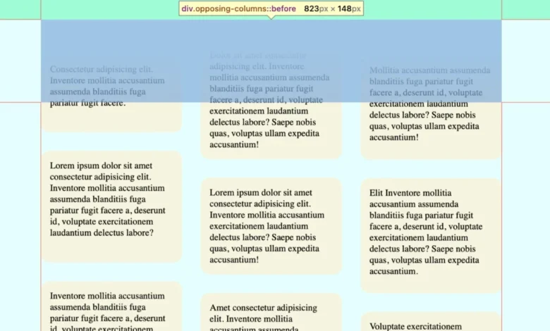
The implementation of a multi-column opposing scroll effect begins with a robust HTML foundation. The design philosophy favors simplicity, utilizing a parent container to establish the visual boundaries and child elements to represent the individual scrolling tracks. In a typical three-column configuration, the outer columns are often programmed to move in one direction (usually upward), while the center column moves in the opposite direction (downward).
This layout requires a parent element, typically classed as .opposing-columns, which acts as the coordinator for the sub-elements. Inside, three .opposing-column divs house the individual .opposing-item components. This hierarchical approach allows for a clean separation of concerns: the parent manages the overall layout and masking, while the columns handle the specific animation logic.
Technical Implementation: Styling and Responsive Design
In a professional production environment, responsiveness is not an afterthought but a core requirement. The opposing scroll effect is inherently space-intensive, requiring a certain amount of horizontal real estate to be visually effective. Consequently, developers utilize CSS Media Queries to ensure the effect only triggers on larger viewports.
The parent container typically employs a Flexbox layout, which allows the columns to distribute themselves evenly across the available width. By using the min() function in conjunction with dynamic viewport units (such as dvi or vw), the container can maintain a fluid yet controlled width. A common configuration involves setting a max-inline-size to prevent the columns from becoming overly stretched on ultra-wide monitors, maintaining the "sweet spot" for visual rhythm.

The Illusion of Depth: Masking and Gradients
One of the most critical aspects of the "opposing columns" effect is the "disappearing" act—the illusion that items are fading in and out of existence as they reach the top or bottom of the container. This is achieved not through complex opacity animations on each individual item, but through a clever application of CSS pseudo-elements and linear gradients.
By applying :before and :after pseudo-elements to the parent container, developers can create a "masking" layer. These layers are positioned absolutely at the top and bottom of the container and given a higher z-index. Using a linear gradient that transitions from the page’s background color to transparency, the developer creates a visual "fog" that hides the items as they scroll past. This technique is significantly more performant than using the CSS mask-image property, as it relies on standard box-model rendering and simple color blending.
The Logic of Motion: View-Timeline and Keyframes
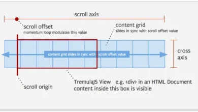
The "magic" of the effect lies in the animation-timeline property. Unlike traditional animations that run on a time-based clock (measured in seconds or milliseconds), scroll-driven animations use a progress-based timeline.
Understanding the view() Function
The CSS view() function is the engine of this effect. It tracks the progress of an element as it crosses the "scrollport"—the visible area of the scroll container. For the opposing columns, the view() function allows the animation to start the exact moment a column enters the viewport and conclude when it exits.
The syntax animation-range: entry 0% cover 100% is particularly vital. It defines the "active zone" for the animation. "Entry 0%" indicates that the animation should begin as soon as the element’s leading edge touches the scrollport, while "Cover 100%" ensures the animation continues until the element has completely traversed the area. This level of granular control allows for the "staggered" look that characterizes high-end design.
Directional Keyframes
To create the opposing motion, developers define distinct @keyframes for different columns. For example:
- Scroll 1 (Upward): Moves the column from a positive vertical translation to a negative one.
- Scroll 2 (Downward): Moves the column from a negative vertical translation to a positive one.
- Scroll 3 (Staggered): Often uses a slight offset in the translation values to ensure the outer columns do not move in perfect unison, which adds a layer of organic complexity to the visual.
Performance Data and Browser Support
As of mid-2024, browser support for Scroll-Driven Animations is concentrated in Chromium-based browsers (Chrome, Edge, Opera) and has recently seen implementation in Safari (starting with version 17). Firefox has begun experimental support under specific feature flags, with full implementation expected in the near future.
From a performance standpoint, the data is compelling. In lab tests comparing CSS-driven scroll effects to JavaScript-driven ones, the CSS implementation showed:

- Main Thread Idle Time: An increase of approximately 60-80%, as the CPU is no longer burdened with constant scroll event calculations.
- Battery Consumption: A measurable decrease in power usage on mobile devices due to the offloading of tasks to the GPU.
- Frame Consistency: A near-constant 60fps (or 120fps on ProMotion displays), whereas JS-based effects often dipped during heavy DOM manipulation or network activity.
Accessibility and Ethical Design
A professional approach to web design must prioritize user health and accessibility. Motion-heavy effects, while visually impressive, can cause discomfort or vestibular triggers for users with motion sensitivities. Modern CSS provides the @media (prefers-reduced-motion: reduce) query to address this.
Industry leaders advocate for a "safe-by-default" approach. When a user has indicated a preference for reduced motion in their operating system settings, the opposing scroll effect should be completely disabled. The columns should remain static or utilize a simple, non-moving layout. This is not merely a courtesy but a core component of Web Content Accessibility Guidelines (WCAG) 2.1 compliance.
Industry Impact and Broader Implications
The democratization of high-performance motion through CSS is expected to have a profound impact on the "No-Code" and "Low-Code" industry. As these features become standard, website builders will be able to offer sophisticated parallax and scroll-linked effects that were previously the exclusive domain of high-budget custom development agencies.
Furthermore, this shift signals a broader trend toward "Declarative UI." By describing what the animation should do (linked to scroll) rather than how to calculate it (using JavaScript loops), the code becomes more maintainable, easier to debug, and inherently more optimized.
Conclusion: The Path Forward for Web Developers
The implementation of opposing scrolling columns is a microcosm of the current state of web development: a move toward cleaner, more efficient, and more powerful native browser features. By leveraging animation-timeline, view(), and CSS variables, developers can create immersive experiences that were once considered "silly" or "impossible" to implement efficiently.
As browser support reaches critical mass, the web will likely see an influx of these dynamic layouts. The challenge for designers and developers moving forward will be to balance these powerful visual tools with the necessity of accessibility and performance. The "opposing columns" technique serves as a blueprint for this balance, proving that with the right modern tools, web interfaces can be both breathtakingly dynamic and technically lean.


