
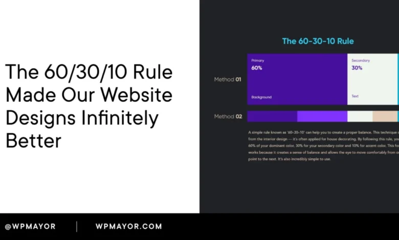
The 60/30/10 rule is a foundational color proportion guideline that meticulously divides a design into three distinct parts: 60% dominant color, 30% secondary color, and 10% accent color. This principle offers a robust framework for establishing a clear visual hierarchy on any website, significantly streamlining design decisions and enhancing user experience. Its inherent simplicity belies its profound impact, providing a logical and intuitive system for color distribution that prevents visual clutter and guides user attention effectively.
The efficacy of this rule became acutely apparent during a recent product website redesign. The initial layout, while technically sound in its components, suffered from a perplexing lack of visual cohesion. A critical observation from a seasoned design professional pinpointed the issue: an indiscriminate use of multiple colors at roughly equal visual weight. This common pitfall results in an interface where the user’s eye has no discernible path, leading to confusion and a diminished aesthetic appeal. Upon applying the precise 60/30/10 split, the transformation was almost instantaneous, with the entire design clicking into place within a remarkably short timeframe, underscoring the rule’s immediate and tangible benefits.
The Historical Trajectory and Universal Application of the 60/30/10 Rule
While widely adopted in digital design today, the 60/30/10 rule did not originate in the digital realm. Its roots are firmly planted in interior design, where it has long been employed to create balanced and harmonious living spaces. In this context, the dominant 60% typically encompasses the walls and large surfaces, establishing the overall mood and backdrop of a room. The secondary 30% is then allocated to furniture, drapes, and rugs, providing contrast and structure. Finally, the accent 10% is reserved for decorative accessories, artwork, and smaller elements that inject personality and draw attention to specific focal points.
This enduring logic proved universally applicable, subsequently migrating to fashion design to dictate the proportion of colors in an outfit, and then into graphic design for layout and branding. Its eventual adoption in UI (User Interface) and web design was a natural progression, driven by the increasing demand for intuitive and aesthetically pleasing digital experiences. Across all these disciplines, the underlying principle remains constant: achieving visual balance and guiding perception by assigning each color a defined role and a specific allocation of visual real estate. This consistent application ensures that regardless of the medium, the human eye instinctively understands where to focus.

Deconstructing the 60/30/10 Rule: Roles and Responsibilities of Color
Understanding the specific function of each percentage is crucial for successful implementation:
-
The Dominant Color (60%): Setting the Stage
This color occupies the largest portion of the design, acting as the primary background and foundational canvas. Its role is to establish the overarching tone, mood, and spaciousness of the website. For most web designs, this often translates to neutral tones such as white, off-white, light grey, or conversely, deep dark tones like charcoal or near-black for dark-mode interfaces. The deliberate choice of a dominant color dictates the initial emotional response users have to the site, subtly influencing their perception before they even engage with the content. A calm, expansive dominant color fosters a sense of clarity, while a deeper, richer tone can convey sophistication or intensity. -
The Secondary Color (30%): Providing Structure and Contrast
The secondary color serves to support and complement the dominant color, providing essential contrast and structural definition without overpowering the overall aesthetic. It is typically applied to elements that organize and divide the page, such as navigation bars, sidebars, card backgrounds, section breaks, and secondary content blocks. This color helps to segment information, create visual interest, and guide the user’s eye through different areas of the layout. It should offer sufficient distinction from the dominant color to be noticeable, yet remain harmonious enough not to compete for primary attention. -
The Accent Color (10%): Directing Action and Highlighting Key Elements
This is arguably the most critical color in terms of user interaction and conversion. The accent color is reserved for high-impact elements that demand immediate attention and prompt user action. Think call-to-action (CTA) buttons, important links, highlighted text, interactive icons, and notifications. Its limited use ensures that when it does appear, it carries significant visual weight, effectively telling the visitor precisely where to look and what to do next. The strategic deployment of the accent color is a powerful tool for guiding user journeys and achieving specific business objectives.
The Psychology of Color: Communication Beyond Aesthetics

Underestimating the power of color in web design is a common oversight. Color is not merely decorative; it is a potent form of communication. Extensive research consistently demonstrates that users form snap judgments about a product or brand within a mere 90 seconds of initial exposure, with a significant portion of this assessment attributed solely to color. Visitors make subconscious decisions about a brand’s trustworthiness, professionalism, and relevance long before they read a single word of copy.
Different colors inherently carry distinct psychological associations, and these are far from arbitrary. For instance:
- Blue: Often associated with trust, stability, professionalism, and calm. Commonly used in finance, tech, and healthcare.
- Green: Evokes nature, growth, freshness, and health. Popular with environmental brands, health products, and financial institutions signifying growth.
- Red: Signifies urgency, passion, excitement, and importance. Effective for sales, warnings, or high-energy brands.
- Yellow: Represents optimism, cheerfulness, and caution. Can be used to highlight attention-grabbing elements or convey warmth.
- Orange: Often linked to enthusiasm, creativity, and friendliness. Frequently used for calls-to-action due to its energetic yet inviting nature.
- Purple: Conveys luxury, creativity, and wisdom. Often chosen by brands aiming for sophistication or uniqueness.
- Black: Associated with sophistication, power, and elegance. Common in luxury goods and minimalist designs.
- White: Symbolizes purity, cleanliness, and simplicity. A popular choice for dominant backgrounds due to its versatility and ability to make other colors pop.
These associations have profound implications for how the 60/30/10 rule is applied. The choice of color matters just as much as its proportion. A dominant 60% in a deep navy blue, for example, instantly imbues a site with an authoritative and trustworthy feel. Conversely, a bright red dominant background, while effective for a temporary sale, would likely prove exhausting and overwhelming as a permanent fixture. This is why many businesses opt for neutral tones for their 60% — they offer versatility, allowing the secondary and accent colors to carry the primary emotional weight without visual conflict.
The accent color, though occupying only 10% of the visual space, bears the heaviest responsibility for driving user action. Strategic color psychology is paramount here. For brands in health or finance, a green or blue accent reinforces user expectations of reliability and well-being. For driving conversions, A/B testing across various industries consistently shows that energetic colors like orange and red often outperform others for call-to-action buttons, demonstrating their power to compel interaction. This is not coincidental but a direct result of ingrained psychological responses to color.
Implementing the 60/30/10 Rule in Practice: A Step-by-Step Guide
Applying the 60/30/10 rule systematically can significantly accelerate the design process. Breaking it down into three concrete decisions simplifies what might otherwise feel overwhelming.

-
Selecting Your 60% Dominant Color:
Begin by choosing the dominant color, your canvas. This color will cover the most visual real estate, so it must be unobtrusive and harmonious with any content placed upon it. For the majority of websites, this will be a neutral such as white, off-white, or a very light grey. For dark-mode designs, it shifts to a deep background color like charcoal, near-black, or a dark desaturated tone. The key is to create a consistent, non-distracting backdrop. A critical question to ask is: "What fundamental mood should my site convey when no specific content is being actively engaged with?" The answer provides your 60%. -
Defining Your 30% Secondary Color:
The secondary color forms the structural layer of your design. It will be applied to elements that organize and segment the page, such as sidebars, navigation backgrounds, card containers, and secondary section fills. This color needs to provide sufficient contrast with your dominant color to create visible separation and hierarchy, but not so much that it competes for attention. A practical test is to squint at your design from a distance; if the secondary color jumps out as much as your accent color should, it’s likely too strong and needs to be toned down. -
Choosing Your 10% Accent Color:
This is where deliberate strategic thinking around color psychology comes into play. Your accent color should feel energetic and vibrant relative to the rest of the palette. It will appear on critical interactive elements: buttons, links, highlighted callouts, and any UI component intended to prompt user engagement. Accessibility is paramount here. Ensure your accent color provides sufficient contrast against both your dominant and secondary backgrounds to be clearly readable for users with visual impairments. Tools like WebAIM’s Contrast Checker are invaluable for quick verification, with the WCAG (Web Content Accessibility Guidelines) minimum contrast ratio for normal text set at 4.5:1.
Testing and Iteration: Refining Your Color Palette
Once your three colors are initially defined, a crucial testing phase begins. A time-honored designer’s trick involves stepping away from your screen, ideally two meters or more. From this distance, observe if your eye is naturally drawn to the correct interactive areas of the page. If your accent color is performing its role effectively, you should instinctively feel pulled towards the CTAs and key interactions without conscious effort.
Digital tools can significantly aid this process. Platforms like Coolors and Adobe Color are highly beneficial for generating complementary palettes and previewing how different color combinations interact before committing to implementation. They allow for rapid experimentation and ensure harmonious color relationships.

Real-World Manifestations: The 60/30/10 Rule in Action
Observing the 60/30/10 rule in live websites makes its abstract principles tangible.
-
Hipcamp: This outdoor booking platform offers a pristine example of the rule’s effective application. Its dominant 60% is a clean, airy light grey-white, establishing a neutral backdrop that allows content to breathe. The brand’s signature green serves as the secondary color, appearing in text, subtle interactive elements, and parts of the navigation. This green carries significant visual weight due to the restrained palette and aligns perfectly with Hipcamp’s nature-focused identity. The accent color, a vibrant orange, is strategically deployed to guide users towards the crucial search action, a primary business objective. This combination creates a fresh, inviting, and action-oriented experience.
-
Apple News+: Apple’s design philosophy consistently champions minimalism and clarity, and Apple News+ exemplifies the 60/30/10 rule with precision. Pure white accounts for the full 60%, serving as an impeccably neutral canvas that foregrounds content and typography. A sophisticated dark charcoal handles the structural 30%, consistently used for navigation items, headings, and body text, providing legibility and hierarchy without visual noise. The coral-pink accent is meticulously reserved for just a few critical interactive elements: the "Try it free" button in the navigation, the prominent hero CTA, and the "Apple News+" label beneath the logo. This extreme restraint ensures that the pink instantly communicates "this is where you act," creating a powerful and unambiguous call to engagement.
-
WooCommerce: The e-commerce platform WooCommerce presents an interesting variation. Its dominant 60% is a classic white canvas. However, its secondary 30% isn’t a flat color block but a soft lavender used in large, organic "blob" shapes behind the hero content. This innovative application provides visual interest and depth without competing with the primary content. The medium purple accent color is meticulously reserved for every interactive element on the page: the logo, the "Log in" link, the primary CTA button, and various text links. This disciplined approach ensures that as users scroll, the purple consistently signals clickable or engageable elements, reinforcing its intentional role as the action driver.
Integrating the Rule into Modern Web Development Workflows

For those working within content management systems like WordPress, applying the 60/30/10 rule consistently across a site is streamlined through global color management.
- Elementor: Users of Elementor can define their three core palette colors within Global Colors in Site Settings. This ensures that every instance where these global colors are applied across widgets and sections automatically updates, eliminating the need to manually adjust individual elements.
- GeneratePress: This popular WordPress theme includes Global Colors directly within its Customizer, making it an excellent choice for building a structured color system from the ground up.
- Beaver Builder: Similar to Elementor, Beaver Builder offers its own dedicated color palette settings, allowing designers to manage their core colors centrally.
- Block Themes (Gutenberg): For sites leveraging modern block themes, the
theme.jsonfile is the central repository for defining the site’s color palette. Setting the three colors here ensures they appear as preset options throughout the block editor, providing the cleanest and most consistent approach for enforcing the color system.
The fundamental principle across all these platforms is to define your three primary colors once at the system level and then apply them consistently. The effectiveness of the 60/30/10 rule as a design discipline hinges on its uniform application across every page, not just the homepage.
When the Rule Requires Flexibility: Exceptions and Nuances
While a powerful framework, the 60/30/10 rule is a guideline, not an immutable law. There are specific scenarios where flexibility is warranted.
- Photography-Heavy Websites: Sites built predominantly around full-bleed photography, such as portfolio sites, travel blogs, or image galleries, represent a common exception. In these cases, the imagery itself carries an immense amount of visual information and color. Attempting to strictly enforce a color distribution across the layout becomes counterproductive. The more effective strategy is to shift to a nearly neutral interface (either very light or very dark) for the UI elements, allowing the photography to become the de facto dominant "palette."
- Monochromatic Designs: These designs intentionally utilize a single core color, explored through various tones, shades, and tints, rather than three distinct hues. However, the spirit of the 60/30/10 rule still applies. The lightest tone typically dominates at 60%, a mid-tone provides structure at 30%, and the deepest or most saturated version of that single hue handles the accent role at 10%, maintaining visual hierarchy.
- High-Energy or Campaign-Specific Pages: Certain pages, particularly those for sales, events, or product launches, benefit from a more aggressive color application to convey urgency or excitement. In such instances, a slight deviation towards a 50/30/20 split or even the introduction of a fourth, supplementary accent color might be effective. The critical caveat is that a clear visual hierarchy must still be maintained, ensuring one color consistently guides the user’s eye towards the primary objective.
Common Pitfalls and Best Practices for Color Harmony
Even with the rule in mind, several common mistakes can undermine its effectiveness:

- Overuse of the Accent Color: When the 10% accent color expands to cover 20% or 25% of the layout, it ceases to be an accent and essentially becomes a secondary color. This flattens the visual hierarchy, diminishing its intended urgency and directional impact. The power of the accent lies in its scarcity.
- Lack of Saturation Contrast: If the dominant, secondary, and accent colors possess similar tones and brightness levels, the visual hierarchy collapses. The eye struggles to differentiate between elements, leading to a flat and unengaging design. Sufficient contrast between the roles is as crucial as the proportions themselves.
- Disregarding Image Palettes: A perfectly calibrated color distribution can be instantly overridden if hero images or other visual assets introduce conflicting, saturated colors that clash with the established palette. It is imperative to select or create photography that either harmonizes with your chosen palette or is deliberately neutral to avoid visual dissonance.
- Inconsistent Application Across the Site: This is a prevalent issue, particularly on websites developed over time by multiple contributors. A homepage adhering strictly to one palette, a blog section employing a slightly different accent shade, and an e-commerce store with its own distinct color scheme creates a fragmented brand experience. The 60/30/10 rule fosters trust and brand recognition only when applied with unwavering consistency across every single page of the website.
Frequently Asked Questions About the 60/30/10 Rule
What is the 60/30/10 rule in web design?
In web design, it’s a color proportion guideline: 60% dominant background color (setting the tone), 30% secondary color (providing structure and contrast), and 10% accent color (for CTAs and key interactive elements). It creates an intuitive visual hierarchy that directs user attention.
What is the 60/30/10 rule in UI design?
For UI design, the same proportions apply but more granularly. The 60% dominant color is the interface background, the 30% secondary color is used for UI components like sidebars and modals, and the 10% accent color highlights interactive elements such as buttons, active states, and links, signaling actionability.
Do neutrals count in the 60/30/10 rule?
Yes, absolutely. Neutrals like white, off-white, light grey, or dark near-black tones are often the best choices for the dominant 60% color. They provide versatility and allow the secondary and accent colors to define the brand’s personality. Neutrals can also be effectively used in the secondary role, especially in dark-themed designs where subtle tone shifts create structure.
How many colors should I use in a web design?
The 60/30/10 rule is built around three distinct colors. While you can extend each of these through shades and tints (lighter and darker versions of the same hue) to add depth, introducing more than three distinct colors generally leads to visual noise and dilutes the hierarchy. If a fourth color feels necessary, it often indicates that one of your primary three isn’t fulfilling its role adequately.
What are good tools for building a 60/30/10 color palette?
Tools like Coolors are excellent for generating harmonious palettes quickly. Adobe Color provides more granular control over color relationships using a color wheel. Once you have a selection, always verify their accessibility against WCAG standards using tools like WebAIM’s Contrast Checker.

Can you apply the 60/30/10 rule to dark-mode designs?
Certainly. In dark-mode, the dominant 60% will be a deep background color (e.g., charcoal, dark navy). The secondary 30% will be a slightly lighter or differently saturated tone to create surface elevation for cards and containers. The accent 10% typically needs to be more vivid and higher contrast than in a light design to ensure it stands out clearly against the dark backdrop.
Wrapping Up: The Enduring Value of Proportion
The 60/30/10 rule, while not a panacea for all design challenges, acts as a powerful safeguard against one of the most common points of failure: a chaotic and competing color palette. It won’t single-handedly guarantee exceptional design, as strong typography, thoughtful layout, and compelling content remain indispensable. However, by establishing a clear, consistent, and psychologically informed color system, it removes a significant barrier to effective communication.
When the proportions are meticulously applied, and the chosen colors resonate with the desired user experience and brand message, a website transcends mere functionality. It transforms from a page that looks "fine" into a powerful communication tool that conveys brand identity, builds trust, and guides user action, all before a single word is consciously read. For WordPress users, leveraging global color settings at the theme or page builder level is the most efficient and disciplined way to enforce this system, ensuring uniformity and scalability across the entire digital presence. The mastery of color proportion is, ultimately, a mastery of silent communication.
Related posts:


