CSS container queries represent a paradigm shift in web development, fundamentally altering how front-end engineers approach responsive design. Despite achieving widespread implementation across modern web browsers—currently hovering near 94 percent global compatibility—container queries remain surprisingly underutilized. Data compiled in the recent State of CSS survey indicates that while 86 percent of developers are aware of this feature, only 41.4 percent actively incorporate it into their production workflows. This sluggish adoption rate highlights a persistent knowledge gap within the development community. Many practitioners continue to evaluate container queries through the lens of legacy media queries, misinterpreting their core mechanics, intended use cases, and architectural advantages in component-driven web applications.
Background Context and Evolution of Responsive Web Design
The methodology of responsive web design has relied heavily on the viewport as its primary reference point since its inception. Introduced broadly in the early 2010s, CSS media queries empowered developers to adapt page layouts based on device characteristics, most notably screen width. By asking the browser how wide the screen was at any given moment, developers could alter macro-level layouts—transitioning from a multi-column desktop grid to a single-column mobile view.
However, the digital landscape has evolved dramatically. Modern web development heavily emphasizes component-based architectures using frameworks like React, Vue, and Angular, where user interface elements are designed for high reusability across diverse contexts. A card component, for instance, might need to function effectively inside a sprawling 1920-pixel desktop hero section, a narrow sidebar, or a compact mobile device screen.
Traditional media queries are structurally incapable of handling this complexity. Because media queries only observe the external browser window, a component placed inside a 300-pixel sidebar on a high-resolution monitor will still receive styling rules intended for large viewports if the browser window itself exceeds the media query threshold. This mismatch frequently causes layout deformations, text overflows, and cramped interfaces. Industry experts, including prominent web educator Kevin Powell during discussions at recent developer conferences, have repeatedly emphasized that media queries lack contextual awareness regarding internal component constraints, leaving a significant void that container queries were specifically engineered to fill.

Chronology and Implementation Timeline
The journey toward container-level responsiveness spans nearly a decade of community lobbying and specification drafting.
- 2019: Component-based sizing topped CSS feature wishlists across major developer forums, including CSS-Tricks, as single-page applications and modular design systems exposed the limitations of viewport-only responsiveness.
- 2021–2022: Browser vendors began experimental implementations of the CSS Containment Module Level 3 specification, introducing container size and style queries.
- 2023–2024: Baseline browser support stabilized across Chrome, Safari, and Firefox, bringing overall compatibility past the 90 percent threshold.
- 2025–2026: Despite near-universal browser support, industry adoption metrics, such as the State of CSS surveys, revealed a persistent gap between feature awareness and practical implementation, prompting renewed educational efforts across the web development community.
Macro Versus Micro Layouts: Understanding the Difference
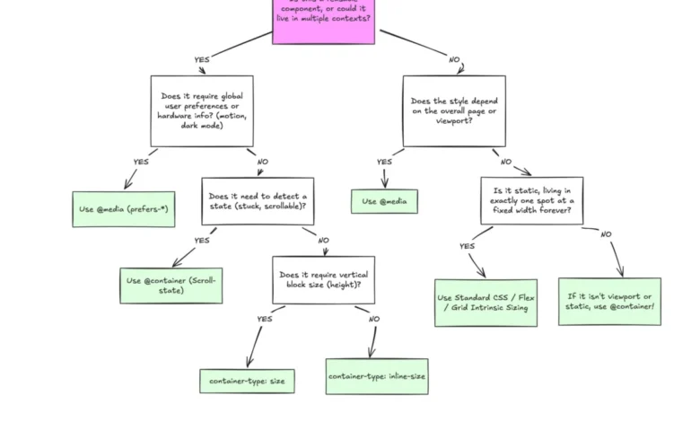
To deploy modern CSS effectively, developers must distinguish between macro layouts and micro layouts, aligning each design layer with the appropriate query mechanism.
Macro layouts govern the overarching structure of a web page. This includes primary grid systems, full-width headers, sticky footers, and global layout frameworks. Media queries remain the optimal tool for macro layouts, as these structural elements exist in direct relationship to the browser viewport. Furthermore, media queries handle environmental system preferences—such as prefers-color-scheme for dark mode or hardware input capabilities like touch screens—which are inherently global browser states.
Micro layouts, conversely, govern the internal architecture of individual components, such as cards, widgets, form controls, and navigation modules. Container queries are specifically designed for micro layouts. Instead of asking how wide the screen is, a container query asks how much horizontal or vertical space is currently allocated to that specific component wrapper. By registering a parent element with a container-type (such as inline-size), developers empower child elements to adapt dynamically to their immediate surroundings rather than the global viewport.

Technical Implications of Container-Specific Units
Container queries also unlock advanced styling capabilities through dedicated relative length units, including cqi (container query inline size) and cqb (container query block size). Traditional responsive typography often relies on viewport-relative units like vw (viewport width) within a clamp() function. While effective for full-screen hero text, viewport units fail when a component is relocated to a constrained container like a sidebar, causing typography to scale inappropriately.
By pairing container query units with CSS functions, developers can achieve true component-level fluid typography:
.card-title
  font-size: clamp(1rem, .5rem + 3cqi, 2rem);
This self-contained approach ensures that text scales proportionally relative to the component’s direct parent wrapper, maintaining visual hierarchy regardless of where the component is rendered on the page.
Advanced Capabilities: Flexbox Wrap Detection
One of the most notable advantages of container queries is their ability to indirectly observe internal layout states that were previously inaccessible through pure CSS. Flexbox layouts frequently utilize flex-wrap: wrap to automatically shift items to a new row when space becomes restricted. Historically, detecting whether a flex item had wrapped required JavaScript solutions, such as employing a ResizeObserver, because media queries are blind to internal DOM reflow events.

By nesting container queries within flex items, developers can implement pure CSS wrap detection. When a parent container shrinks and forces items to wrap, the individual item’s inline dimensions change. Registering the flex item as a container allows the style sheet to evaluate its new width and apply appropriate horizontal or vertical internal layouts automatically without script intervention.
Known Caveats and Side Effects
While container queries offer robust architectural benefits, they introduce specific technical constraints that developers must navigate:
- Self-Querying Restrictions: An element cannot serve as its own container while simultaneously querying its own dimensions. Doing so would create an infinite calculation loop. Developers must establish a distinct parent wrapper to declare the container rules before styling descendent elements.
- Layout Collapse with Block Sizing: Querying a container’s full block size (
container-type: size) without specifying an explicit height, minimum height, or aspect ratio will cause the container to collapse to zero pixels, as the browser calculates dimensions independently of the children’s intrinsic content. Developers typically default toinline-sizequeries to avoid this pitfall. - Custom Property Limitations: Container queries currently do not accept CSS custom properties (variables) directly within their conditional parameters (e.g.,
@container (min-width: var(--breakpoint-lg))). This restriction prevents circular dependencies where a query could alter a variable that subsequently modifies the query threshold itself.
Broader Industry Impact and Best Practices
The integration of container queries into modern web design systems signifies a mature shift toward genuinely modular architecture. Industry consensus emphasizes that container queries are not intended to replace media queries entirely. Instead, successful modern codebases maintain a clear separation of concerns: media queries handle global, viewport-dependent structural changes, while container queries manage component-level adaptability based on available spatial context.
As the web ecosystem continues to fragment across an ever-growing array of device form factors, screen resolutions, and multi-window operating system environments, relying exclusively on viewport proxies is no longer sufficient. By adopting container queries for reusable components, development teams can build more resilient, adaptable user interfaces that respond naturally to their immediate environments, ensuring consistent presentation across any context.