The evolution of responsive web design has long been bound to the physical constraints of the device screen. For over a decade, developers relied exclusively on media queries to dictate how digital layouts adapt to varying viewports. However, as modern web development shifted toward modular architecture and reusable component-driven frameworks, the limitations of viewport-based styling became increasingly apparent. Today, despite achieving a robust 94 percent global browser support rate, CSS container queries remain surprisingly underused, highlighting a significant disconnect between modern web standards and everyday development practices.
Background Context and Historical Adoption
To understand the current state of container queries, one must examine the trajectory of CSS layout evolution. Media queries were introduced as part of the CSS3 specification, giving developers the ability to apply styles based on device characteristics such as screen width, height, and orientation. While revolutionary for its time, the viewport-based approach treated the browser window as the sole source of truth for layout decisions.
As applications grew more complex, developers frequently encountered scenarios where a standardized component—such as a user profile card or a product widget—behaved unpredictably when moved between different structural containers, such as a full-width main content area versus a narrow sidebar. The inability of components to query their immediate parent containers rather than the global viewport sat atop developer wishlists for years.
Despite the eventual implementation of container queries across all major browsers, adoption rates have lagged significantly behind expectations. Industry metrics, including data from the State of CSS surveys, indicate that while awareness of container queries exceeds 85 percent among engineering professionals, actual implementation hovers near the 40 percent mark. Speaking at prominent industry events such as SmashingConf Amsterdam, software advocates like Kevin Powell pointedly highlighted this sluggish uptake, noting that adoption figures remain remarkably low given the feature’s anticipated utility.

Chronology of Container Query Development
The path from conceptualization to standardization involved years of technical debate within the World Wide Web Consortium (W3C) and the CSS Working Group:
- 2015–2018: The web community intensifies discussions around component-based design systems, highlighting the friction caused by relying solely on global media queries for modular UI components.
- 2019: Component-scoped responsiveness consistently ranks among the most requested features in annual developer surveys and CSS community wishlists.
- 2021–2022: Initial implementations of container size queries begin landing in experimental browser builds, establishing the syntax for inline-size and block-size containment.
- 2023–2024: Broad, stable support rolls out across major browser engines, including Chrome, Safari, and Firefox, pushing global compatibility past the 90 percent threshold.
- 2025–Present: Industry analysis reveals a persistent adoption gap, prompting educational initiatives to help developers transition away from treating container queries as mere replacements for media queries.
Technical Mechanics: Looking Inward Versus Looking Outward
The primary barrier to adoption is not a lack of browser compatibility, but rather a conceptual hurdle. At a glance, container queries share a syntax remarkably similar to traditional media queries, leading many developers to assume they serve interchangeable purposes.
A traditional media query asks the browser a macro-level question: "How wide is the screen right now?" If a developer sets a breakpoint at 1024 pixels, the browser checks the viewport dimensions. If a card component is placed inside a 300-pixel grid cell on a 1920-pixel desktop monitor, the media query still evaluates the global viewport, triggering desktop styles despite the severe spatial restriction. This frequently results in layout overflows, cramped typography, and broken UI elements.
Container queries, conversely, perform micro-level evaluations. By registering a parent element with a container-type (such as inline-size), the child component queries its immediate wrapper rather than the window. This shifts the design paradigm from macro layouts governed by screen sizes to component layouts governed by available spatial context. Consequently, a card component can dynamically adapt its display properties—shifting from a vertical stack to a horizontal layout—based strictly on whether its container provides sufficient width.

Supporting Data and Layout Implications
The modern web environment further necessitates this shift. Recent data mapping viewport fragmentation reveals over 2,300 unique viewport sizes currently in active use across desktop, mobile, and alternative devices. Accounting for every possible screen dimension via traditional media queries is increasingly inefficient.
Furthermore, container queries introduce specialized relative units—such as cqi (container query inline-size) and cqb (container query block-size)—which allow for advanced fluid typography and spacing. When paired with CSS functions like clamp(), these units ensure that internal component elements scale relative to their container rather than the global viewport. This capability also extends to complex layouts, such as detecting flexbox wrap states without relying on heavy JavaScript-based ResizeObservers.
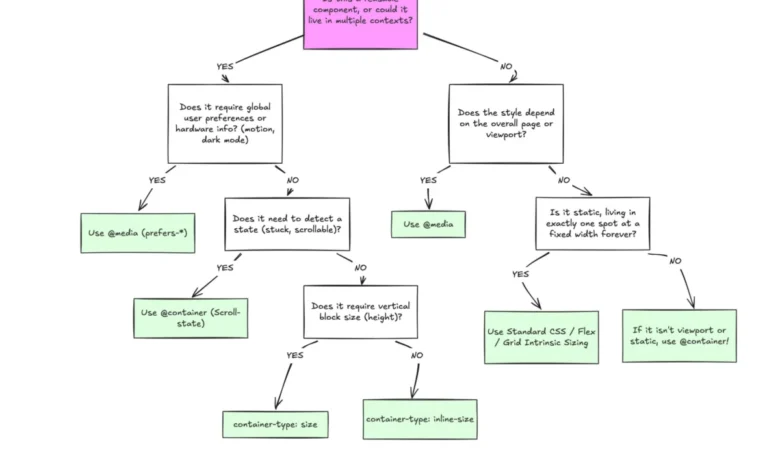
However, industry experts emphasize that container queries are not a universal replacement for media queries. Proper architectural implementation relies on understanding the distinct domains of each tool:
- Macro Layouts: Media queries remain the optimal choice for page-level structural concerns, global navigation bars, system preferences (
prefers-color-scheme), and overall window-dependent viewports. - Micro Layouts: Container queries are tailored for reusable, modular components—such as cards, widgets, and form elements—that exist across multiple contextual containers within a single application.
Potential Side Effects and Caveats
While powerful, container queries introduce specific constraints that developers must navigate. First, a container cannot query its own dimensions directly; attempting to apply containment and query the same element can create recursive logic loops. An intermediate wrapper element is required to establish the container-child relationship.

Second, querying a container’s block-size without defining explicit dimensions can cause layout collapses, as the browser calculates height independently of child content. Best practices generally recommend utilizing inline-size containment to avoid unintended height compression. Additionally, container queries currently cannot accept CSS custom properties (variables) directly within their conditional parameters, owing to complexities surrounding the DOM cascading order.
Broader Impact on Web Architecture
The underutilization of container queries reflects a transitional phase in front-end engineering. As design systems become more decentralized and component libraries are shared across vastly different applications, the reliance on viewport proxies is gradually giving way to content-driven responsive design.
Industry analysts suggest that closing the adoption gap will require a shift in educational frameworks—moving away from treating container queries as alternative syntax and toward viewing them as fundamental tools for component autonomy. By aligning layout logic with the immediate container rather than the external screen, developers can build resilient, highly adaptable user interfaces capable of withstanding the extreme fragmentation of the modern digital landscape.