The Misleading Presentation of COVID-19 Mortality Data in Public Discourse

The COVID-19 pandemic has necessitated a global reliance on data to gauge the efficacy of public health interventions, governmental policy, and clinical management. As nations strive to mitigate the impact of SARS-CoV-2, the presentation of epidemiological statistics has become a focal point of intense political and social debate. Because these figures often determine the perception of a country’s success or failure in managing the crisis, the clarity and context provided by news organizations are of paramount importance. However, recent analysis of reporting by prominent media outlets, including NPR, suggests that even generally reliable sources can inadvertently or intentionally present data in ways that obscure the full reality of the pandemic’s impact.
Contextualizing the Axios Interview and Political Scrutiny
The discourse surrounding COVID-19 mortality reached a boiling point in early August 2020. On August 3, 2020, an interview between then-President Donald Trump and journalist Jonathan Swan of Axios aired on HBO. During the exchange, the President presented a series of charts intended to demonstrate that the United States was performing better than any other nation in managing COVID-19 deaths.
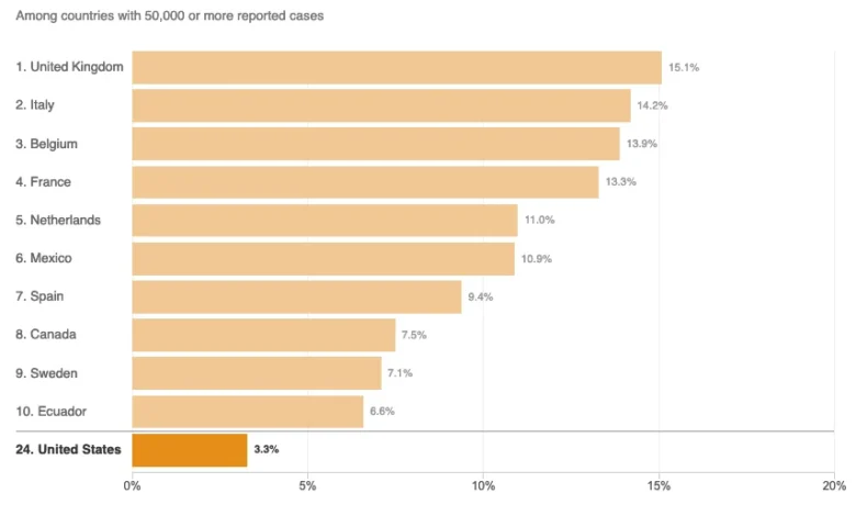
The President’s argument relied heavily on the "case fatality ratio"—the number of deaths divided by the number of confirmed infections. When challenged by Swan, who argued that per capita mortality rates—deaths relative to the total population—provided a more accurate picture of the disease’s burden, the President famously dismissed the metric, stating, "You can’t do that." This assertion prompted widespread fact-checking and media analysis, as public health experts have long maintained that both case fatality ratios and per capita mortality are essential, though distinct, metrics for evaluating pandemic performance.
Analyzing the NPR Data Presentation
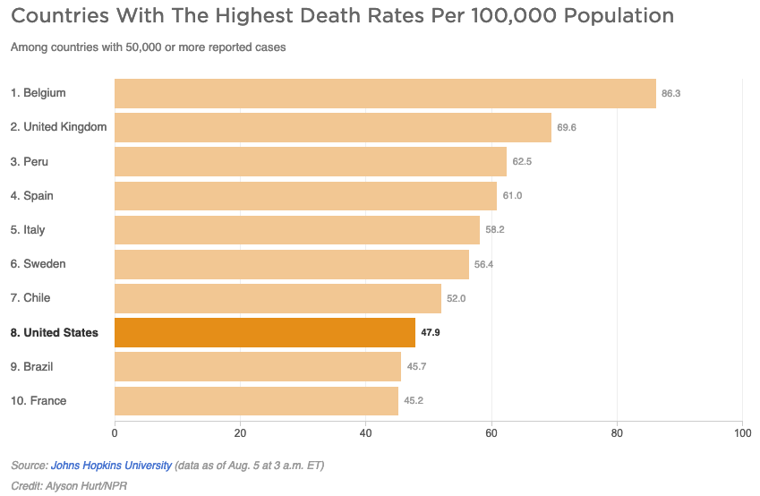
In response to the confusion generated by the Axios interview, NPR published an article on August 5, 2020, titled Charts: How the U.S. Ranks On COVID-19 Deaths Per Capita — And By Case Count. While the stated goal of the report was to clarify the comparative standing of the United States, data visualization experts have pointed to critical flaws in the methodology used to display the comparative charts.
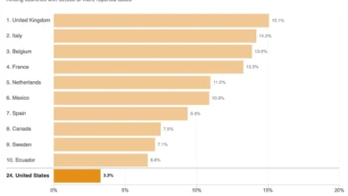
The primary issue involves the use of "top 10" lists for both per capita death rates and case fatality ratios among countries with 50,000 or more reported cases. As of the report’s publication date, there were 45 nations that met the 50,000-case threshold. By truncating the data to show only the ten nations with the highest or lowest figures, the article created a visual representation that excluded 35 other nations, thereby providing a fragmented and potentially misleading view of the U.S. position in the global rankings.
The Problem with Curated Data Sets
The "curse of the top 10" is a well-documented pitfall in data journalism. By arbitrarily limiting a dataset, a publication can inadvertently—or deliberately—alter the narrative. In the case of the NPR chart on per capita deaths, the limited scope suggested that only two countries, Brazil and France, were performing better than the U.S. in specific metrics. However, when the full set of 45 countries is considered, it becomes clear that 37 of those nations maintained lower per capita death rates than the United States.
This truncation creates a significant distortion of the public’s understanding of the pandemic’s progression. When media outlets curate data in this manner, they risk validating partisan arguments rather than providing a holistic view of global health outcomes. If the dataset were reduced to eight nations, the United States might appear as the top performer, a visual framing that aligns closely with the President’s claims but ignores the broader statistical reality of the pandemic.
Epidemiology and the Definition of Disease Burden
The NPR report also included commentary from Justin Lessler, an associate professor of epidemiology at Johns Hopkins University, who noted that the per capita death rate serves as an indicator of "overall disease burden." However, this terminology has faced scrutiny from public health statisticians.
"Disease burden" is technically defined by the World Health Organization and other medical bodies as the impact of a health problem as measured by financial cost, mortality, morbidity, or other indicators, often expressed in terms of Disability-Adjusted Life Years (DALYs). Per capita death rates are a measure of proportional mortality, not a total measure of disease burden. Total case counts, when adjusted for testing capacity and demographic factors, are more indicative of the absolute scale of the pandemic within a population. Misusing these terms in media reports, even when citing academic sources, can lead to widespread public confusion regarding how epidemiological impact is measured.
The Impact of Demographic and Systemic Factors
While the reporting in question did identify secondary factors that influence mortality—such as a country’s median age and access to advanced medical infrastructure like ventilators and intensive care units—the analysis often lacked the necessary nuance to distinguish between policy success and demographic variance.
Countries with older populations, for instance, naturally face higher COVID-19 mortality rates regardless of the stringency of their lockdown policies. Conversely, countries with robust, accessible healthcare systems may report higher case counts due to extensive testing, which in turn can artificially lower their case fatality ratios. By failing to integrate these variables into a comprehensive visual analysis, media outlets often provide "snapshots" that are easily misinterpreted by a general audience.
Broader Implications for Media Integrity
The implications of these reporting failures are significant. During a public health crisis, the public relies on journalistic institutions to filter and synthesize complex information. When those institutions prioritize "even-handed" visual presentations—such as attempting to find a middle ground between scientific consensus and political rhetoric—they risk compromising their role as objective observers.
The assertion that the United States was "doing better than any other country" was a claim not supported by any standard metric of mortality. By providing charts that allowed for a selective interpretation of this claim, NPR and similar outlets inadvertently provided a platform for misinformation. The responsibility of the press, particularly in the digital age, is to ensure that data visualizations are exhaustive enough to prevent cherry-picking by political actors.
Conclusion: Moving Toward Transparency
The events of 2020 served as a stark reminder that data literacy is a vital component of modern journalism. The reliance on incomplete charts and imprecise terminology not only obscures the reality of a pandemic but also erodes public trust in both scientific institutions and the media.
Moving forward, reporting on complex global health crises requires a commitment to full-dataset visualization. If a chart is meant to demonstrate a global trend, it should encompass all relevant participants rather than a curated subset. Furthermore, the use of terminology—specifically regarding disease burden and fatality ratios—must adhere to strict epidemiological standards. As the world continues to navigate the long-term impacts of the COVID-19 pandemic, the accuracy of the historical record will depend on the willingness of media organizations to prioritize clarity and statistical integrity over the aesthetics of balanced, yet misleading, data presentation. The role of the press is not merely to report the claims of the powerful, but to rigorously verify those claims against the full weight of the available evidence, ensuring the public is informed by facts rather than fragmented figures.