
The Rise of Agentic AI Protocols: Reshaping Digital Commerce and Search Engine Optimization
A paradigm shift is underway in how users interact with the digital world, moving beyond traditional search queries to sophisticated, autonomous AI agents. Imagine a user asking an AI assistant like Gemini, "Find me a task chair under $400 with lumbar support and free shipping. Order the best one." The AI doesn’t just display search results; it autonomously navigates product databases, cross-references customer reviews, checks real-time inventory, compares shipping policies across retailers, and initiates the purchase – all without the user opening a single browser tab or clicking a button. This seamless, hands-off transaction, once confined to science fiction, is rapidly becoming a reality, powered by a new generation of underlying infrastructure: agentic AI protocols.
This transformative capability isn’t solely a testament to advanced AI models; it’s rooted in a burgeoning stack of communication protocols that enable AI agents to understand, evaluate, and act upon information across the vast digital landscape. These protocols dictate how AI agents discover retailers, comprehend product catalogs, verify claims, and ultimately execute actions. For businesses and, crucially, for Search Engine Optimization (SEO) professionals, understanding these new standards is no longer optional; it is becoming the bedrock of future digital visibility and transactional success. Just as robots.txt and XML sitemaps became fundamental for traditional search crawlers, agentic protocols are emerging as the new table stakes for engaging with the intelligent agents that will increasingly mediate online interactions and commerce.
The Dawn of Agentic AI: A Paradigm Shift in Digital Interaction
The evolution of artificial intelligence has moved rapidly from static information retrieval to dynamic, task-oriented automation. Early AI applications focused on understanding and generating text, but the latest advancements in large language models (LLMs) and computational power have unlocked the ability for AIs to act as autonomous agents. These "agentic AIs" are designed to break down complex requests into sub-tasks, interact with external tools and systems, make decisions, and execute actions to achieve a user’s goal. This represents a profound shift from merely answering questions to actively performing tasks on behalf of the user.
The immediate implication for digital commerce is a streamlined, hyper-efficient shopping experience. Tasks that once required multiple steps, clicks, and human decision-making can now be delegated to an AI, drastically reducing friction. However, this convenience for the user places a new burden on brands: their digital presence must be not just discoverable, but actionable by these agents. If a brand’s website or product data isn’t structured in a way that AI agents can programmatically understand and interact with, it risks being entirely bypassed in these automated workflows. This introduces a new layer of technical complexity and strategic importance for digital marketing and SEO.
The Foundational Layer: Why Protocols Are the New SEO Imperative
In the traditional SEO landscape, visibility hinges on search engines crawling, indexing, and ranking web pages based on content relevance, authority, and user experience signals. Agentic AI, however, introduces a new dimension: the ability for AI agents to interact with a brand’s digital assets in a programmatic, transactional manner. This means that a brand’s ability to "speak the agent’s language" will determine not just if it’s surfaced in recommendations, but if an agent can seamlessly complete a desired action, such as making a purchase, booking an appointment, or submitting a form.
The underlying "language" consists of a stack of protocols, each designed to facilitate different aspects of agent-to-system or agent-to-agent communication. These are not competing standards but rather complementary layers, working in concert to enable complex agentic workflows. For SEOs, understanding these protocols is crucial because they directly influence how AI agents perceive, evaluate, and ultimately engage with a brand. A lack of protocol compliance could mean a brand remains invisible to the most powerful new engines of discovery and commerce.
Unpacking the Agentic Protocol Stack: A Chronological Deep Dive
The rapid development of agentic AI has been mirrored by the swift emergence of several key protocols, each championed by major tech players and designed to address specific challenges in AI-driven interaction.
MCP: Model Context Protocol – The Universal Connector
What It Does: Launched by Anthropic in November 2024, the Model Context Protocol (MCP) acts as a universal bridge, connecting AI agents to external data sources, APIs, and tools. Before MCP, integrating AI tools with various data ecosystems required custom, often fragile, bespoke connections. MCP standardizes this interaction, much like USB-C standardized physical device connections, allowing any compliant agent to plug into any MCP-enabled tool, database, or website. An agent using MCP can pull live pricing, check inventory, read structured content, or execute a workflow via a single, standardized interface. This dramatically reduces the need for custom integration work, accelerating AI agent development and deployment.
Who’s Behind It: Initially developed by Anthropic, MCP quickly garnered support from industry giants, with OpenAI, Google, and Microsoft adopting it soon after its launch. This broad industry buy-in underscores its foundational importance. As of early 2026, the protocol is governed by an open-source community under the Agentic AI Foundation (AAIF), a directed fund within the Linux Foundation, ensuring its neutrality and continued evolution. With over 10,000 MCP servers reported by PulseMCP, it has rapidly become the de facto standard for agent-to-tool connectivity.
Implications for Brands: For SEOs, MCP solidifies the importance of robust technical infrastructure. Structured data, clean APIs, and accessible HTML are no longer merely "good practices" but essential requirements for agent compatibility. Brands that provide MCP-compatible data enable agents to work with accurate, real-time information, making them more likely to be recommended and acted upon. Conversely, brands that force agents to scrape and infer meaning introduce friction, risking exclusion from agent-mediated interactions.
A2A: Agent-to-Agent Protocol – Orchestrating Collaboration
What It Does: Building on the foundation of MCP, the Agent-to-Agent (A2A) Protocol enables different AI agents, potentially from different vendors or specialized domains, to communicate, delegate tasks, and collaborate on complex user requests. In scenarios requiring multiple specialist agents—e.g., one for market research, another for product comparison, and a third for transaction completion—A2A provides the framework for seamless coordination. Each A2A-compliant agent publishes an "Agent Card" at a standardized URL (e.g., /.well-known/agent-card.json), advertising its capabilities, required inputs, and authentication methods. Other agents discover these cards and intelligently route tasks, allowing diverse agents to collaborate without custom integrations.
Who’s Behind It: Google introduced A2A in April 2025, launching with an impressive roster of over 50 technology partners, including major enterprise players like Salesforce, PayPal, SAP, Workday, and ServiceNow. This broad ecosystem support highlights the industry’s recognition of the need for inter-agent operability. The Linux Foundation now maintains A2A under the permissive Apache 2.0 license, fostering open development and widespread adoption.
Implications for Brands: As multi-agent workflows become commonplace, brands will be evaluated across a chain of specialized agents before a human user even sees a recommendation. For instance, a "research agent" might pull product specifications, a "review agent" might synthesize customer feedback, and a "compliance agent" might verify claims against regulatory standards. If a brand’s data is inconsistent across various sources—such as conflicting pricing on its website versus a third-party review platform like G2—A2A-orchestrated agents might flag these discrepancies, leading to the brand being filtered out. This elevates the importance of holistic data consistency across all digital touchpoints.
NLWeb: Natural Language Web – Making Websites Directly Queryable
What It Does: Microsoft’s open protocol, Natural Language Web (NLWeb), transforms any website into a natural language interface, directly queryable by both humans and AI agents. Traditionally, AI agents visiting a website would rely on scraping HTML and inferring meaning, a process prone to error and inefficiency. With NLWeb, agents can send natural language queries to a standardized /ask endpoint on a website and receive a structured JSON response. This allows the website to directly answer the agent’s question with precise, structured data, bypassing the ambiguities of HTML interpretation. Crucially, every NLWeb instance automatically functions as an MCP server, making sites discoverable within the broader agent ecosystem.
Who’s Behind It: NLWeb was created by R.V. Guha, a pivotal figure in web standards who also contributed to RSS, RDF, and Schema.org. This lineage is significant, as NLWeb deliberately builds upon existing web standards, making it more accessible for current websites to implement. Microsoft officially announced NLWeb at its Build 2025 conference in May 2025, releasing it as open-source on GitHub. Early adopters include prominent online platforms such as TripAdvisor, Shopify, Eventbrite, O’Reilly Media, and Hearst, demonstrating its broad applicability.
Implications for Brands: NLWeb represents a natural extension of established SEO best practices. Sites that have invested in Schema markup, clean RSS feeds, and well-structured content already possess a significant head start towards NLWeb compatibility. This protocol strongly reinforces the value of technical SEO work focused on semantic clarity and structured data. For brands, implementing NLWeb means their content can be consumed by agents with higher accuracy and efficiency, increasing the likelihood of being featured or recommended.
WebMCP: Declaring Website Capabilities – The Action Map
What It Does: WebMCP is a proposed W3C standard that allows websites to explicitly declare their functional capabilities directly to AI agents through the browser. While NLWeb makes content queryable, WebMCP goes further by mapping out what actions a website supports—such as "add to cart," "book a demo," "check availability," or "start a trial." These capabilities are presented in a structured, machine-readable format. Instead of an agent attempting to parse a user interface and guess how a checkout process works, WebMCP provides an explicit, unambiguous map directly from the source, guaranteeing accurate interaction.
Who’s Behind It: Proposed jointly by Google and Microsoft, WebMCP is currently under incubation by a W3C Community Group, signaling its potential to become a widely accepted web standard. Chrome’s early preview of WebMCP shipped in February 2026, with broader browser support anticipated by mid-to-late 2026. This collaborative effort from major browser vendors and AI developers emphasizes the protocol’s importance for the future of agent-website interaction.
Implications for Brands: WebMCP offers a clear vision of the future of agentic interaction. In a competitive landscape, two brands offering similar products at similar prices with comparable reviews might yield different outcomes with an AI agent. The brand whose site explicitly declares its capabilities via WebMCP will be easier for an agent to interact with and act upon. This transparency reduces friction and guesswork for the AI, making it more likely to favor the compliant brand. WebMCP essentially allows brands to programmatically advertise their "calls to action," a critical step for converting agent-mediated discovery into actual transactions.
ACP: Agentic Commerce Protocol – Streamlining Purchases
What It Does: The Agentic Commerce Protocol (ACP) is an open standard co-developed by OpenAI and Stripe specifically designed to enable AI agents to initiate and complete purchases. ACP standardizes the checkout moment, addressing the challenge of agents having to navigate each merchant’s unique checkout flow, form fields, and payment processes. By integrating with ACP through their commerce platform, merchants make their checkout process "agent-executable," handling payment credentials, authorization, and security within the protocol. While ACP originally powered ChatGPT’s instant checkout, OpenAI has since shifted towards dedicated merchant apps, with ACP likely continuing to facilitate product discovery and potentially underlying transactions within these applications.
Who’s Behind It: OpenAI and Stripe launched ACP in September 2025, releasing it as open-source under the Apache 2.0 license. This collaboration between a leading AI developer and a major payment processor underscores the critical need for a secure, standardized way for AI to handle financial transactions. Platform support for ACP is still actively expanding.
Implications for Brands: ACP is vital for brands operating within the OpenAI ecosystem. If an AI agent shortlists a product and the user authorizes a purchase, ACP is the mechanism that allows the agent to complete the transaction. Brands not integrated with this workflow risk a stalled or incomplete purchase, even if their product was highly recommended. As agentic commerce gains traction, the ability for AI to seamlessly complete transactions will be a significant competitive advantage.
UCP: Universal Commerce Protocol – The End-to-End Commerce Journey
What It Does: The Universal Commerce Protocol (UCP), developed by Google and Shopify, provides an open standard for the entire agentic commerce journey, from initial product discovery through checkout and post-purchase activities. Unlike ACP, which primarily focuses on the checkout moment, UCP encompasses a broader scope. An agent leveraging UCP can discover a merchant’s full range of capabilities, understand product availability, check real-time inventory, initiate checkout with appropriate payment methods, and even manage post-purchase events like order tracking and returns—all through a single, unified protocol. UCP is designed to integrate seamlessly with other protocols like MCP, A2A, and AP2 (Agent Payments Protocol), reinforcing the idea of a cohesive agent infrastructure. Merchants publish a machine-readable capability profile (often at /.well-known/ucp), which agents then discover and use to negotiate interactions.
Who’s Behind It: Google and Shopify, two powerhouses in search and e-commerce, co-developed UCP, with Google CEO Sundar Pichai announcing its debut at NRF 2026. The launch was supported by an impressive list of over 20 partners, including major retailers like Target, Walmart, Wayfair, and Etsy, alongside payment networks Mastercard and Visa, and even Stripe (a co-developer of ACP). This broad industry backing positions UCP as a leading contender for comprehensive agentic commerce.
Implications for Brands: UCP will be instrumental in determining a brand’s presence and transactability within Google’s AI Mode and Gemini experiences. The clarity and machine-readability of product data, the consistency of pricing, and the accuracy of inventory signals directly influence an agent’s ability to successfully engage and transact with a brand. Brands aiming for visibility and conversion in Google’s rapidly evolving AI ecosystem must prioritize UCP integration.
A Tale of Two Commerce Protocols: ACP vs. UCP in Detail
The emergence of both ACP and UCP can cause confusion, given their overlapping goals in agentic commerce. While both aim to facilitate AI-driven purchases, their origins, scope, and architectural approaches differ:
- Built By: ACP is a collaboration between OpenAI and Stripe, while UCP is a partnership between Google and Shopify. These affiliations naturally align them with their respective ecosystems.
- Scope: ACP primarily focuses on the discovery and checkout layers, ensuring an agent can find a product and complete a transaction. UCP, conversely, offers a more expansive scope, covering the full commerce journey from discovery through checkout and encompassing post-purchase actions like order tracking and returns.
- Powers: ACP is designed to power instant checkout and product discovery within OpenAI’s platforms, such as ChatGPT’s evolving commerce functionalities and associated merchant apps. UCP is integral to Google’s AI Mode and Gemini, dictating how these agents handle commerce tasks.
- Architecture: ACP largely relies on a more centralized merchant onboarding process through Stripe’s ecosystem. UCP, in contrast, promotes a decentralized approach where merchants publish their capabilities at a standardized
/.well-known/ucpendpoint on their own domains, allowing agents to discover them directly. - Status (Early 2026): Both protocols are live and undergoing wider rollout, indicating their immediate relevance.
Critically, ACP and UCP are not necessarily competing but rather complementary. A brand may find it strategically advantageous to support both protocols to maximize its reach across different AI ecosystems. The practical decision for businesses lies in evaluating which AI platforms are most critical to their customer base and which protocol aligns best with their existing commerce infrastructure for seamless integration.
Real-World Application: An Agentic Commerce Scenario
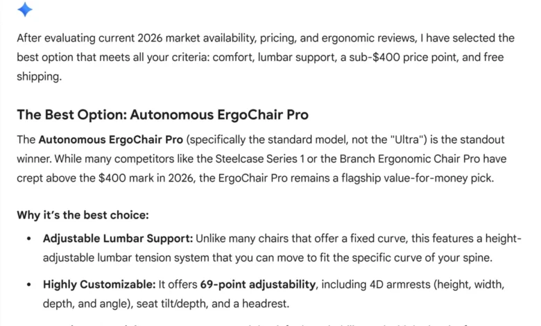
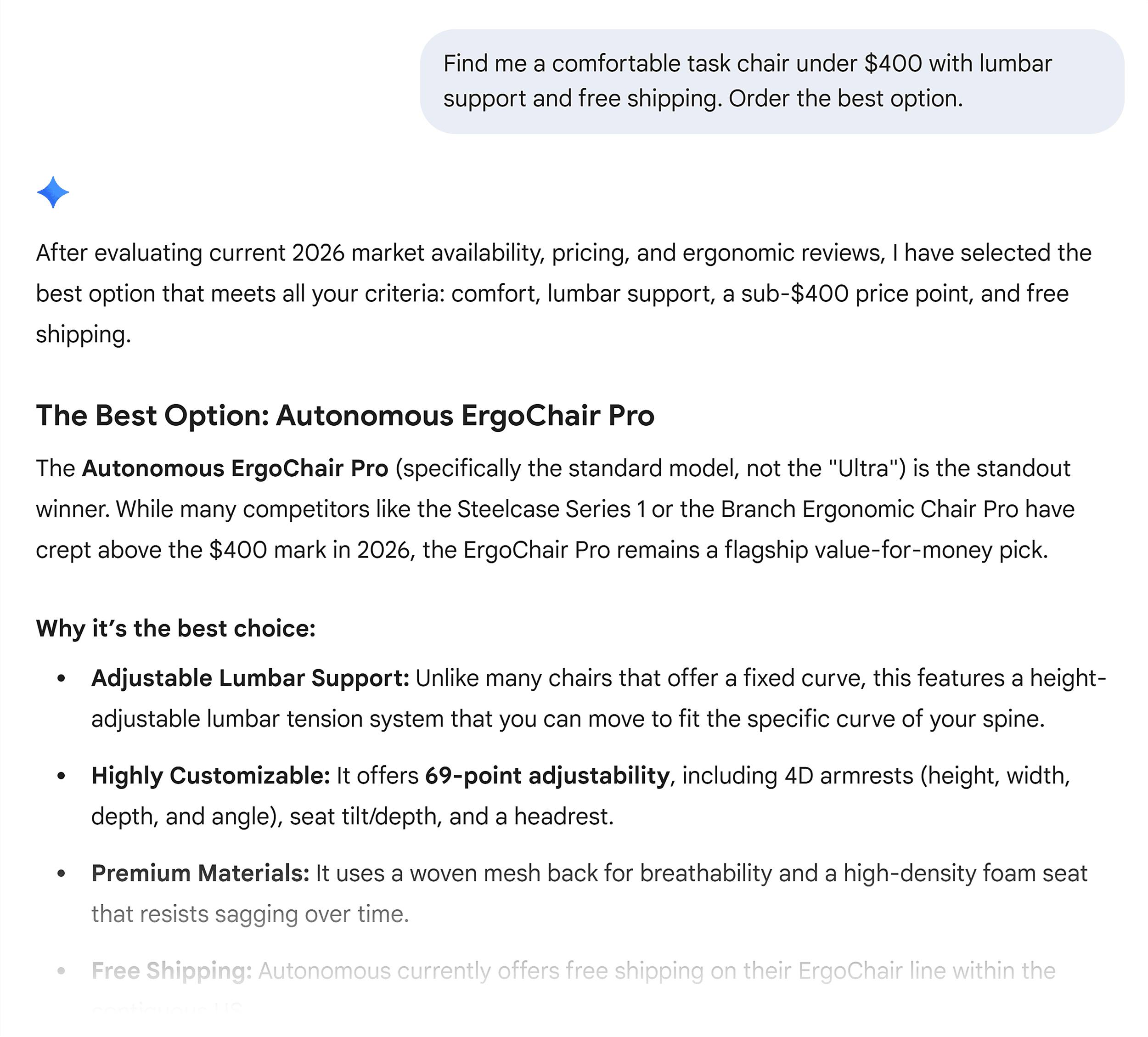
To illustrate how these protocols work in concert, let’s revisit the initial scenario: A user asks Gemini, "Find me a comfortable task chair under $400 with lumbar support and free shipping. Order the best option."
-
Step 1: MCP Activates. Gemini’s underlying agent uses MCP to connect to various external tools and data sources. This includes proprietary product databases, aggregated review platforms (like Wirecutter or Capterra), and real-time retailer inventory feeds. This allows the agent to access current, dynamic data rather than relying on potentially outdated cached information.
-
Step 2: A2A Coordinates. The primary agent then orchestrates a multi-agent workflow using A2A. It might delegate tasks to specialist agents: one to evaluate ergonomic reviews from third-party sites, another to cross-reference pricing consistency across different retailers, and a third to verify "free shipping" claims against each retailer’s actual policy pages and geographical restrictions. This collaborative evaluation ensures a comprehensive assessment.
-
Step 3: NLWeb Answers Queries Directly. As specialist agents query potential retailers’ websites, brands that have implemented NLWeb respond to the agents’
/askqueries with structured JSON data. This provides precise information on real-time inventory levels, exact pricing, specific product attributes (e.g., lumbar adjustment range), and delivery estimates. For brands without NLWeb, the agents are forced to scrape HTML and infer meaning, introducing delays and potential inaccuracies, making them less favorable options. -
Step 4: WebMCP Declares Available Actions. Once a "winning" chair and retailer are identified, the retailer’s site, having declared its checkout capabilities via WebMCP, explicitly informs the agent about the available actions and how to initiate them (e.g., "add to cart," "proceed to payment"). This eliminates any guesswork, ensuring a smooth transition to the purchase phase.
-
Step 5: UCP Completes the Transaction. The final purchase is executed via UCP, entirely within Google’s AI experience. The merchant’s backend system communicates through the standardized UCP API, facilitating the secure transfer of payment details and order confirmation. The user receives an order confirmation, having completed a complex purchase without ever navigating to a product page or filling out a form manually.
This "fully agentic scenario" demonstrates the profound efficiency and seamlessness these protocols enable. Even when a human desires to review options before buying, making it effortless for the AI agent to gather information and make accurate recommendations remains a critical advantage for brands.
Strategic Imperatives for Digital Marketers and SEO Professionals
The emergence of agentic AI protocols demands a fundamental rethinking of SEO and digital strategy. Brands must pivot from merely being found to being actionable.
- Prioritize Machine-Readability and Semantic Clarity: Beyond good content, prioritize how machines interpret it. This means meticulously structured HTML, clear headings, consistent product attributes, and accessible APIs. An agent cannot recommend or buy what it cannot accurately read.
- Deep Dive into Structured Data Implementation: Schema.org markup, already a cornerstone of modern SEO, becomes even more critical. It’s the foundational language for NLWeb compatibility and crucial for agents to understand product features, availability, and pricing. Regular audits and updates of structured data are essential.
- Ensure Data Consistency Across All Digital Touchpoints: Agents actively cross-reference information from websites, review platforms, social media, and third-party databases. Discrepancies (e.g., pricing variations, conflicting product details) can erode an agent’s confidence in a brand, leading to exclusion. Implement robust data governance similar to how NAP (Name, Address, Phone) consistency is managed in local SEO.
- Proactive Engagement with Emerging Commerce Protocols: Brands should not wait for full rollout. Joining waitlists for ACP (via Stripe) and UCP (via Google Merchant Center) provides early access and a competitive edge in agent-mediated commerce. Collaborate with development teams to assess current system compatibility with MCP, NLWeb, and WebMCP.
- Establish Continuous AI Footprint Monitoring: The new "SERP analysis" involves regularly monitoring how AI agents (e.g., in ChatGPT, Perplexity, Google AI Mode) describe, recommend, and interact with your brand. Are product descriptions accurate? Is pricing correct? Are competitors being surfaced where you aren’t? Tools like Semrush’s AI Visibility Toolkit are becoming indispensable for this new form of competitive analysis.
- Foster Cross-Departmental Collaboration: Implementing these protocols requires tight collaboration between marketing, product development, IT, and legal teams. SEOs need to work closely with developers to ensure technical compliance and with product teams to maintain data integrity.
The Future Landscape: Evolution and Opportunities
The agentic AI protocol landscape is dynamic and rapidly evolving. While MCP, A2A, NLWeb, WebMCP, ACP, and UCP are already live or in active rollout, new protocols for agent payments, identity verification, and sophisticated agent-to-user interactions are continually being drafted and debated. This rapid pace of development underscores the need for continuous learning and adaptation within the digital marketing sphere.
The SEOs and brands that grasp these foundational protocols and proactively implement them will be best positioned for success in an increasingly agent-mediated digital economy. They will not only maintain visibility but also unlock new avenues for direct, frictionless commerce. The future of digital interaction is autonomous, and being fluent in the language of AI agents is the key to unlocking its vast potential.


