Fixing Cumulative Layout Shift: How Real-World Performance Monitoring Transformed DavidWalshBlog

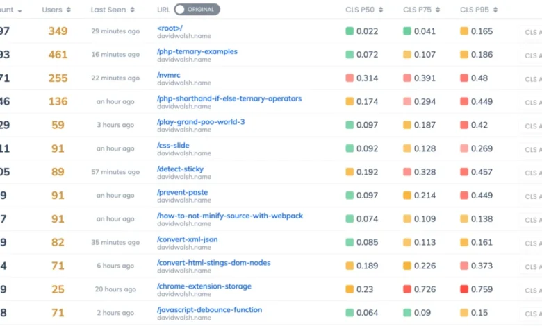
Every month, more than 50,000 developers from around the globe visit DavidWalshBlog, a cornerstone resource for JavaScript tutorials, code optimization, and web development troubleshooting. While the platform serves as a vital knowledge hub, recent performance audits revealed that a significant portion of its international audience was encountering sluggish load times and jarring visual disruptions. To address these technical bottlenecks, the site’s infrastructure team initiated a comprehensive performance review, focusing specifically on the Core Web Vitals—a set of standardized metrics established by Google to quantify user experience on the web.
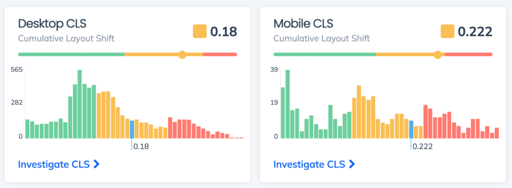
The primary culprit identified in this investigation was Cumulative Layout Shift (CLS). CLS is a critical performance metric that tracks the sum total of all individual layout shift scores for every unexpected layout shift that occurs during the entire lifespan of a page. Unlike load time or time-to-first-byte, which measure the technical speed of a server, CLS measures stability. When a page shifts unexpectedly—often due to images loading without predefined dimensions or dynamic content injecting itself into the DOM—users experience a frustrating “jumping” effect. This instability not only detracts from the professional quality of a site but is also a documented signal in Google’s search ranking algorithms, directly impacting organic traffic for bloggers, e-commerce platforms, and digital publishers.
The Myth of Synthetic Testing
The initial stage of the investigation relied on Google Lighthouse, a widely used open-source, automated tool for improving the quality of web pages. When the audit team first ran a Lighthouse report, the results were deceptively positive, displaying a perfect performance score. This discrepancy highlights a growing concern in the web development industry: the gap between synthetic testing and Real User Monitoring (RUM).
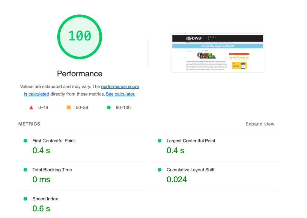
Lighthouse reports represent a "lab" environment. These tests are conducted under idealized conditions: a high-speed fiber connection, a powerful modern processor, and a fixed geographic location. In the case of DavidWalshBlog, the lab test utilized a high-end machine in the United States, failing to account for the actual, diverse reality of the site’s global readership. Real users connect via varying network strengths—ranging from 3G mobile connections in developing regions to unstable Wi-Fi in urban centers—using hardware that spans from flagship smartphones to budget-conscious devices. Because the lab environment does not account for these variables, it provides a false sense of security. To accurately diagnose the CLS issues, the team pivoted to using Request Metrics, a tool designed to capture performance data directly from the browsers of actual visitors.
Identifying the Root Cause: The Mechanics of Layout Shift
By analyzing RUM data, the team was able to move beyond site-wide averages and investigate performance on a page-by-page basis. The findings indicated that while the homepage maintained acceptable stability, specific long-form articles—notably those containing high-density media—were suffering from severe layout instability.
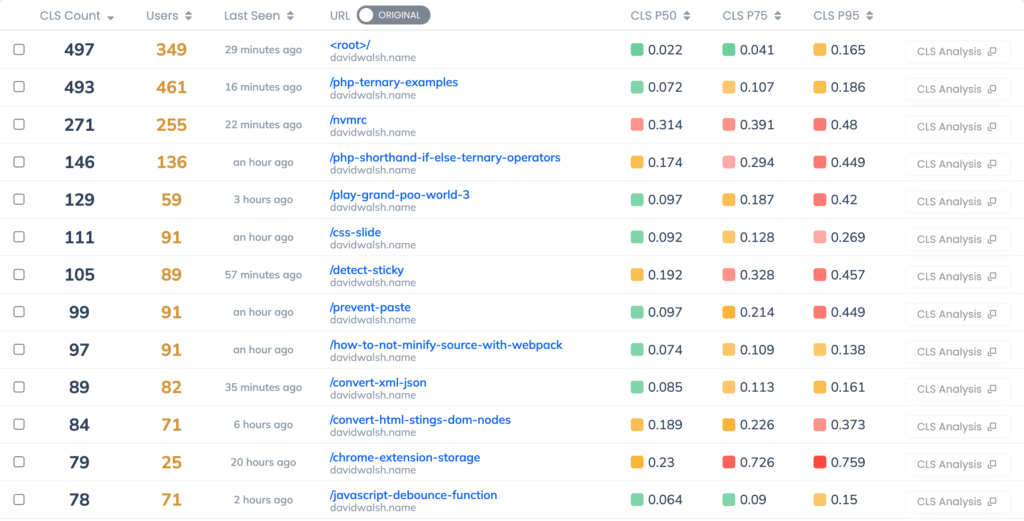
Upon closer inspection of the DOM structure, it was observed that the elements most frequently shifting were paragraphs nested within the main article container. The technical analysis concluded that the instability was primarily driven by image loading behavior. In modern web browsers, when an image is requested without explicit width and height attributes, the browser reserves zero space for it until the metadata is downloaded and the image dimensions are calculated. Once the image dimensions are known, the browser must force a reflow, pushing the existing text content down to make room for the visual asset. In articles with multiple images, this process repeats dozens of times as the user scrolls, creating a cumulative effect that degrades the user experience and triggers a poor CLS score.
Technical Remediation and Implementation
The resolution required a structural change in how the site handles image delivery. The standard industry solution to prevent layout shift is to provide the browser with "aspect ratio boxes" or explicit dimension hints. By including width and height attributes in the <img> tag, developers instruct the browser to reserve a proportional space on the screen before the image file is actually downloaded.
For a platform like DavidWalshBlog, which operates on the WordPress content management system, this implementation was streamlined by leveraging the wp_image_src_get_dimensions function. By automating the injection of these attributes into the image markup, the site ensured that every image rendered on the front end carried its metadata, effectively eliminating the browser’s need to "guess" the layout requirements. It is important to note that these attributes act only as a blueprint for the browser; developers can still apply responsive CSS rules to adjust the image’s scale for different screen sizes without losing the stability provided by the intrinsic dimension attributes.
Quantitative Results and Broader Industry Implications
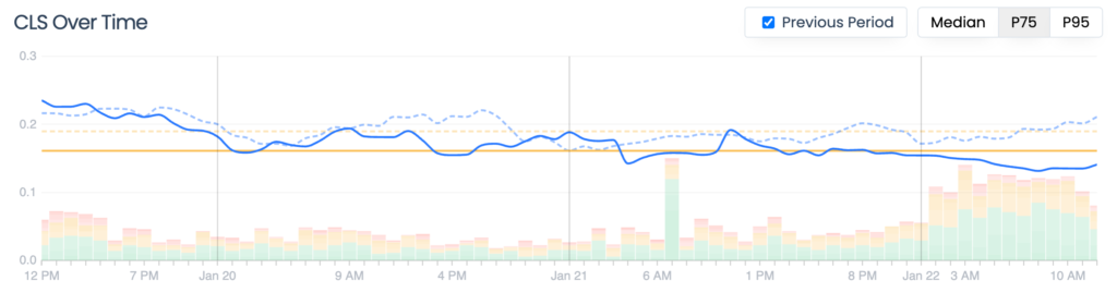
Following the deployment of these fixes, the performance data showed a clear, measurable improvement. Within days, the site’s aggregate CLS score improved by 20%, bringing it within the threshold defined by Google as "Good" (a score of 0.1 or less). This optimization is not merely an aesthetic win; it serves as a critical defense for the site’s search engine optimization (SEO) strategy.

The implications for the broader web development community are significant. As search engines continue to prioritize user experience, the distinction between "lab" performance and "real-world" performance will become the primary differentiator between high-ranking content and neglected pages. The experience of DavidWalshBlog underscores that even experienced developers can be misled by synthetic testing tools.
Moving forward, the site’s infrastructure team intends to address secondary performance inhibitors, specifically the impact of web fonts on rendering speeds. Web fonts often cause a "Flash of Unstyled Text" (FOUT) or a "Flash of Invisible Text" (FOIT), both of which can influence layout stability metrics.

Lessons for Digital Publishers
For webmasters and content creators, the incident offers three clear takeaways:
- Prioritize Real User Monitoring: Synthetic tests are useful for debugging specific code errors but are insufficient for measuring actual user experience. Relying on data collected from real devices provides the only accurate picture of how a site performs in the wild.
- Dimensioning is Non-Negotiable: The "set and forget" approach to images is a primary cause of modern performance degradation. Ensuring that images have reserved space is a fundamental requirement for responsive, stable web design.
- Core Web Vitals are Business Metrics: Performance is no longer a niche technical concern—it is a business imperative. A site’s ability to remain stable and responsive directly influences its visibility in search results and its ability to retain an audience.
As the digital landscape becomes increasingly competitive, the ability to balance high-quality content with a frictionless, stable, and fast-loading interface will remain the definitive benchmark for success. The efforts to optimize DavidWalshBlog serve as a practical case study in the necessity of ongoing performance maintenance and the importance of using data-driven insights to refine the user experience. By focusing on the tangible metrics that define the browser’s interaction with the DOM, developers can ensure that their platforms remain both accessible and optimized for the next generation of global users.