The evolution of responsive web design has long been bound to the dimensions of the browser window. For more than a decade, media queries have served as the foundational pillar for adapting web layouts to varying screen sizes, from mobile devices to ultra-wide desktop monitors. However, as modern web development increasingly prioritizes component-driven architecture and modular design, the limitations of viewport-based styling have become glaringly apparent. Enter CSS container queries—a powerful layout feature boasting roughly 94 percent global browser support, yet suffering from a paradox of high awareness and remarkably low utilization across the industry.
According to recent data from the State of CSS survey, approximately 86 percent of developers are fully aware of container queries, yet only 41.4 percent actively implement them in production environments. This discrepancy highlights a broader friction point in front-end engineering: treating container queries as direct replacements for traditional media queries rather than recognizing them as an entirely different paradigm for component responsiveness. To understand why adoption has lagged behind expectations, industry analysts and web standards advocates must examine the structural differences between macro and micro layouts, the historical context of viewport proxies, and the specific technical constraints that continue to trip up even seasoned developers.
The Historical Context and the Viewport Proxy Problem
To trace the origins of container queries, one must examine the limitations of media queries, which were introduced alongside CSS3 to solve the burgeoning problem of mobile browsing. Media queries introduced the concept of conditional styling based on environmental characteristics, most notably screen width. When a developer writes a media query such as @media (min-width: 1024px), the browser is queried for a single piece of information: the current width of the viewport.
While this approach revolutionized web design in the early 2010s, it created a fundamental architectural dependency. The viewport acts as a proxy for the environment, creating an illusion that screen width alone dictates how a user interface should behave. This proxy works well for macro-level page structures—such as transforming a multi-column dashboard into a single-column mobile view. However, it fails entirely when applied to micro-level components.

Consider a reusable card component designed to switch from a vertical stack to a horizontal layout when sufficient space becomes available. If that card is placed inside a narrow sidebar on a massive 1920-pixel desktop monitor, a viewport-based media query will still evaluate the overall screen width as 1920 pixels. Consequently, the card will attempt to render its wide-format horizontal layout inside a constrained 300-pixel grid cell, resulting in text overflow, cramped elements, and broken interfaces. As prominent web developer Kevin Powell noted during discussions at recent front-end conferences, media queries are fundamentally uninformed about internal component constraints, leaving developers to seek more intelligent alternatives.
Chronology of Adoption and Industry Reactions
The journey of container queries from a conceptual wishlist item to a finalized web standard spans several years of intensive specification work within the World Wide Web Consortium (W3C) CSS Working Group. For years, "element queries"—the precursor concept to container queries—sat atop community wishlists on platforms like CSS-Tricks as the most requested missing feature in modern CSS.
The technical challenge was formidable: calculating styles based on an element’s parent container rather than the root viewport created potential infinite layout loops, where a style change could alter the container’s size, thereby invalidating the query and triggering perpetual recalculations. Solving this computational bottleneck required sophisticated layout containment algorithms, which were eventually standardized under the CSS Containment Module Level 3.
Despite browsers rolling out stable support for container size queries starting in late 2022 and early 2023, industry adoption has crawled. At major technical symposiums such as SmashingConf Amsterdam, industry educators highlighted container query adoption rates as uniquely sluggish compared to other modern CSS features like CSS Grid or Flexbox. Analysts attribute this lag to perceptual inertia. Because the syntax of container queries closely mirrors that of media queries—utilizing familiar conditional blocks and relational operators—developers often assume they are interchangeable. This false equivalence leads to common anti-patterns, such as attempting to query an element’s own dimensions or misconfiguring container types, which subsequently discourages developers from integrating them into daily workflows.
Macro Layouts Versus Micro Layouts: Defining the Boundaries
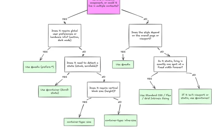
To effectively utilize container queries, developers must draw a clear line between macro layouts and micro layouts. This distinction forms the cornerstone of modern responsive architecture:

- Macro Layouts (Viewport-Dependent): These govern the overall structure of a web page. They include global navigation bars, major page grid templates, sticky footers, and system-level preferences such as dark mode (
prefers-color-scheme). Because these elements exist at the root level and must respond to the physical boundaries of the device screen, media queries remain the correct tool for the job. - Micro Layouts (Container-Dependent): These govern individual components living inside the macro structure, such as cards, widgets, form controls, and modular content blocks. These elements should never care whether they are being viewed on a smartphone or a high-end desktop workstation; instead, they must respond exclusively to the immediate spatial allocation provided by their direct parent container.
With modern web statistics revealing more than 2,300 unique viewport sizes across fragmented consumer devices, hardcoding rigid pixel breakpoints into media queries is no longer sustainable. Relying on container queries shifts the responsibility of layout adaptation from the global window to the local component content.
Practical Implementation: Fluid Typography and Flexbox Detection
Adopting container queries unlocks advanced CSS capabilities that were previously impossible without heavy JavaScript intervention. Two primary examples include component-scoped fluid typography and flexbox wrap detection.
Component-Scoped Fluid Typography
Traditional fluid typography often relies on viewport-relative units like vw (viewport width) combined with the clamp() function. While effective for full-screen hero text, viewport units fail when a component is relocated to a sidebar. Container queries solve this by introducing dedicated container-relative length units, including cqi (container inline size) and cqb (container block size). By pairing these units with clamp(), developers can create typography that scales fluidly relative to the component’s immediate environment:
.card-title
  font-size: clamp(1rem, 0.5rem + 3cqi, 2rem);
Flexbox Wrap Detection
Flexbox is exceptional at wrapping items when a row runs out of space, but CSS historically lacked a native mechanism to detect when a wrap event occurred. Previously, developers had to rely on JavaScript ResizeObserver APIs to monitor element dimensions and toggle modifier classes. By leveraging container queries on individual flex items, developers can now achieve pure CSS wrap detection without writing a single line of script. Registering a flex item with container-type: inline-size allows the internal child elements to evaluate their state and adjust their layout automatically as the wrapping state changes.
Known Limitations, Side Effects, and Caveats
Despite their utility, container queries introduce specific architectural constraints that developers must navigate carefully:

- Self-Querying Prohibition: An element cannot query its own dimensions to change its own styles, as this would create an infinite computational loop. To apply container queries, a separate parent wrapper must be explicitly registered as a container using
container-type: inline-size, while its child elements receive the conditional styling. - Layout Collapse with Block Size Queries: Querying a container’s block (vertical) size using
container-type: sizerequires explicit height declarations on the container element. Without an explicit height, min-height, or aspect-ratio, the browser will compute the container’s height as zero, causing the layout to collapse. Best practices recommend defaulting to inline-size queries unless vertical dimension querying is strictly required. - Incompatibility with Custom Properties: At present, container queries cannot directly evaluate CSS custom properties (CSS variables) as breakpoints (e.g.,
@container (min-width: var(--breakpoint))), due to the complexities of how cascading variables resolve across the DOM tree.
Broader Implications and Strategic Outlook
The underutilization of container queries represents a transitional phase in front-end web engineering. As design systems grow increasingly modular and component-driven libraries dominate modern web development frameworks, the reliance on viewport-centric styling will likely decline.
Industry experts emphasize that container queries are not intended to render media queries obsolete. Instead, both tools must coexist within a symbiotic design ecosystem. By correctly categorizing layout logic into macro structures governed by media queries and micro components governed by container queries, development teams can build resilient, truly responsive interfaces capable of weathering the infinite fragmentation of modern device ecosystems.
Related posts: