Why Web Developers Are Still Struggling to Adopt CSS Container Queries Despite 94 Percent Browser Support

CSS container queries have been widely available across modern web browsers for several years, yet their adoption among front-end developers remains surprisingly low. Despite achieving approximately 94 percent global browser support, a stark disconnect persists between technical capability and daily implementation. Industry surveys, such as the State of CSS, indicate that while a vast majority of developers are aware of container queries, fewer than half actively use them in production environments. This phenomenon highlights a broader challenge in web development: transitioning from viewport-centric responsive design to component-driven layout logic.
Background Context and the Limitations of Media Queries
For decades, media queries served as the primary mechanism for responsive web design. Introduced alongside CSS3, media queries allowed developers to apply styles based on the physical dimensions of a user’s screen or browser viewport. By asking the browser how wide the screen was at any given moment, developers could alter page layouts—shifting from single-column mobile views to multi-column desktop displays.
However, media queries possess an inherent architectural limitation: they are fundamentally decoupled from the actual components they style. A media query assesses the macro layout of the entire window, remaining completely blind to the micro layout of individual components. For instance, a complex card component designed to expand horizontally when given sufficient space will misfire if placed inside a narrow sidebar on a high-resolution desktop display. Because the viewport width remains wide, the media query triggers horizontal styling, causing the card’s contents to cramp, overflow, or deform within its constrained container.

As modern web applications shifted toward modular, component-driven architectures—pioneered by frameworks like React, Vue, and Angular—the mismatch between viewport-based media queries and reusable component design became increasingly problematic. Web designers found themselves managing thousands of unique viewport combinations, making it mathematically impossible to predict every context in which a single component might appear.
The Chronology of Container Queries
The concept of container queries is not a recent development. For years, the ability for an element to respond to the size of its parent wrapper topped community wishlists on platforms like CSS-Tricks. Following extensive discussions within the World Wide Web Consortium (W3C) and implementation efforts by major browser engine contributors, CSS container queries officially landed in baseline browser software, securing robust cross-browser compatibility by 2023.
Despite this milestone, adoption lagged. During industry gatherings such as SmashingConf Amsterdam, prominent web development educators like Kevin Powell highlighted the stagnation in container query adoption rates. Surveys conducted through 2025 and 2026 confirmed that while awareness hovered near 86 percent, active utilization lingered at roughly 41 percent. Analysts attribute this lag primarily to cognitive familiarity: because container queries share a syntax resembling traditional media queries, many developers initially assumed they served identical functions, leading to widespread misapplication and eventual abandonment.
Supporting Data and Technical Mechanics

To understand why container queries represent a paradigm shift, one must examine their operational mechanics. Unlike media queries, which look outward toward the browser viewport, container queries look inward, evaluating the available space within a specific parent element.
.card-wrapper
  container-name: card;
  container-type: inline-size;


@container card (min-width: 450px)
  .card
    display: flex;
    flex-direction: row;
In this implementation, the .card component evaluates its immediate parent wrapper rather than the user’s screen size. If the container provides at least 450 pixels of inline space, the component rearranges itself accordingly. This behavior supports true component encapsulation, allowing developers to drop the exact same card into a full-width grid or a cramped sidebar without modifying global stylesheets.
Furthermore, container queries introduced specialized relative length units—such as cqi (container query inline size) and cqb (container query block size). When paired with the CSS clamp() function, these units enable fluid typography that scales relative to the component’s boundaries rather than the global viewport:
.card-title
  font-size: clamp(1rem, .5rem + 3cqi, 2rem);
Industry Analysis and Side Effects
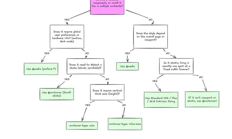
While container queries solve numerous architectural problems, their implementation introduces specific constraints that developers must navigate. Industry experts emphasize that container queries are not a universal replacement for media queries, but rather a complementary tool suited for micro layouts.

- Self-Referential Limitations: An element cannot serve as its own container while simultaneously querying its own dimensions for layout adjustments, as this creates an infinite calculation loop. Proper implementation requires a dedicated wrapper element to house the container context.
- Layout Collapse Risks: Querying a container’s full size (
container-type: size) without specifying explicit block dimensions can cause elements to collapse to zero height, as browsers calculate boundaries independently of child content. Developers are generally advised to rely oninline-sizeunless block-level queries are strictly necessary. - Custom Property Restrictions: Current specifications do not allow container queries to evaluate CSS custom properties (variables) directly within the query condition, preventing dynamic breakpoint definitions via CSS variables due to potential cascading recursion issues.
Broader Impact and Implications for the Future of Web Design
The division between macro and micro layouts forms the core philosophy of modern responsive architecture. Macro layouts—governing page structure, global navigation bars, headers, footers, and system preferences like dark mode (prefers-color-scheme)—remain the proper domain of media queries. Conversely, micro layouts—encompassing cards, widgets, form controls, and modular interface components—benefit directly from container queries.
As the web ecosystem continues to fragment across an expanding array of device form factors, foldables, and window-management systems, reliance on rigid viewport thresholds is proving unsustainable. By shifting layout responsibility from the global browser window to localized component containers, developers can build more resilient, truly modular interfaces. The ongoing challenge for the web development community is not technical capability, but overcoming entrenched habits formed during the early eras of responsive web design.
Related posts: