
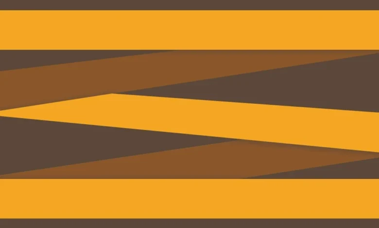
The evolution of web design has transitioned from rigid, table-based structures to fluid, dynamic arrangements that prioritize both aesthetics and user experience. Among these emerging patterns, the zigzag layout—a staggered, cascading arrangement of elements—has gained significant traction in editorial design, portfolio showcases, and product galleries. Unlike standard grid formations where items are aligned in uniform rows and columns, the zigzag layout introduces a rhythmic vertical displacement, creating a visual flow reminiscent of a waterfall. Achieving this effect through Cascading Style Sheets (CSS) requires a sophisticated understanding of the CSS Grid Layout Module and the nuances of CSS Transforms, particularly how they interact with the browser’s rendering engine and the document object model (DOM).
The Evolution of CSS Layout Paradigms
To understand the technical significance of the zigzag layout, one must first consider the historical trajectory of web positioning. In the early era of the internet, developers relied on HTML tables to force elements into specific regions of a page, a method that was notoriously inflexible and inaccessible. The subsequent shift to CSS floats allowed for more fluid layouts but introduced significant "clearfix" hurdles and lacked true two-dimensional control.
The introduction of the Flexible Box Layout (Flexbox) in 2009 revolutionized one-dimensional layouts, allowing for the distribution of space and alignment of items in a predictable way, even when their size was unknown or dynamic. However, the zigzag layout presents a unique challenge for Flexbox. While a developer could theoretically use flex-direction: column combined with flex-wrap: wrap to create staggered columns, this approach creates a fundamental disconnect between the visual order and the DOM order. In such a scenario, the "tab order" for keyboard users would jump vertically down the first column before returning to the top of the second, violating the Web Content Accessibility Guidelines (WCAG) regarding meaningful sequences.
The emergence of CSS Grid Layout (Level 1) in 2017 provided the first native two-dimensional layout system for the web. Grid allows developers to define both rows and columns simultaneously, providing the structural foundation necessary for complex patterns like the zigzag without compromising the underlying HTML structure.
Technical Architecture of the Zigzag Grid
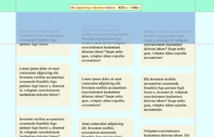
The construction of a robust zigzag layout begins with a semantic HTML structure and a well-defined grid container. By utilizing a two-column grid, developers can establish a baseline where items are positioned in a standard alternating pattern. The "zigzag" effect is then achieved not by altering the grid’s structural placement, but by applying visual offsets to specific elements.
The CSS Grid Configuration
The foundation of the layout involves a container—often referred to as a "wrapper"—that utilizes the display: grid property. By defining grid-template-columns: 1fr 1fr, the container is divided into two equal fractions of the available space. A crucial component of this setup is the gap property, which defines the gutters between the items. To ensure mathematical precision in later calculations, modern developers frequently store this value in a CSS custom property (variable), such as --gap: 16px.
.wrapper
  --gap: 20px;
  display: grid;
  grid-template-columns: 1fr 1fr;
  gap: var(--gap);
  max-width: 1200px;
  margin: 0 auto;
By setting the box-sizing property to border-box globally, developers ensure that borders and padding are included in the element’s total width and height, preventing the common "layout shift" issues that occur when borders expand an element beyond its intended grid cell.
The Implementation of CSS Transforms
The defining characteristic of the zigzag layout is the vertical shift of every second item. This is achieved using the :nth-child pseudo-class. While nth-of-type is a common choice, the more modern :nth-child(even of .item) selector provides greater precision by filtering specifically for elements with the designated class, regardless of their tag name.
The displacement is executed via transform: translateY(). A critical distinction in CSS logic is how percentages function within transforms versus other properties. In standard positioning (like top or left), a percentage refers to the dimensions of the parent container. However, within a transform property, a percentage refers to the dimensions of the element itself. Therefore, translateY(50%) instructs the browser to move the element downward by exactly half of its own height.
This behavior is rooted in the CSS Visual Formatting Model. Transforms are applied in the "post-layout" phase of the rendering pipeline. The browser first calculates the positions and sizes of all elements—the "box model"—and then applies the transform as a visual modification. Because the transform happens after the layout is finalized, it does not trigger a "reflow" of the surrounding elements, making it a high-performance choice for animations and visual offsets.
Mathematical Precision and the Gap Correction
A common pitfall in implementing staggered layouts is the failure to account for the grid gap in the vertical shift. When an item is translated by 50%, it aligns its midpoint with the bottom of the adjacent item, but it ignores the empty space created by the gap property.
To achieve a perfectly symmetrical zigzag, the translation must account for half of the vertical gutter. The formula calc(50% + var(--gap) / 2) ensures that the item moves down by half of its own height plus half of the gap distance. This mathematical alignment ensures that the vertical spacing between staggered items remains consistent with the horizontal spacing, maintaining the visual integrity of the design across various screen sizes.
Managing Container Overflow and Document Flow
One of the most significant challenges in using CSS Transforms for layout effects is that they are "invisible" to the parent container. Since transforms do not occupy space in the document flow, a translated element may spill out of its parent container, potentially overlapping with subsequent sections of the webpage or being clipped if the parent has overflow: hidden.
In a zigzag layout with an even number of items, the final item in the second column will be shifted downward, extending beyond the bottom border of the grid container. To resolve this, developers must manually reserve space within the container using padding. This requires the height of the items to be known or defined as a variable. By applying padding-bottom: calc(var(--item-height) / 2 + var(--gap) / 2) to the wrapper, the container expands to accommodate the visually shifted content, ensuring a clean transition to the next element on the page.
Accessibility and User Experience Standards
From a journalistic and technical standpoint, the zigzag layout’s greatest advantage over previous methods is its adherence to accessibility standards. The World Wide Web Consortium (W3C) emphasizes the importance of maintaining a logical relationship between the visual presentation of a page and its underlying source code.
Screen Reader Compatibility
Because the zigzag effect is achieved through visual transforms rather than DOM reordering, screen readers and other assistive technologies process the content in its original, logical sequence. A user navigating with a screen reader will encounter the items in the order they were written in the HTML (Item 1, Item 2, Item 3, etc.), which matches the natural left-to-right, top-to-bottom reading pattern of the zigzag.
Focus Management
For keyboard users, the "focus ring" follows the DOM order. In this grid implementation, the focus moves from the first item in the top-left to the second item in the top-right (which is shifted down), then back to the third item in the second row. This creates a predictable "Z-pattern" that aligns with the visual layout, preventing the cognitive dissonance that occurs when the focus indicator jumps erratically across the screen.
Motion Preferences
While the zigzag layout is typically static, developers often apply entrance animations to enhance the "waterfall" effect. Industry best practices dictate the use of the prefers-reduced-motion media query to respect user settings. For users with vestibular disorders or motion sensitivity, these transforms should remain static or use non-moving transitions like opacity fades.
Comparative Analysis: Grid vs. JavaScript Solutions
Before the widespread adoption of CSS Grid, developers frequently relied on JavaScript libraries such as Masonry.js or Isotope to create staggered layouts. While these libraries offer powerful features, they come with significant performance costs. JavaScript-based layouts require the browser to download a script, parse it, and then calculate the position of every element on the page, often leading to "Cumulative Layout Shift" (CLS)—a metric used by Google’s Core Web Vitals to measure visual stability.
The CSS Grid approach described here is "native," meaning it is handled by the browser’s internal engine without the need for external scripts. This results in faster "Largest Contentful Paint" (LCP) times and a more stable user experience. According to data from "Can I Use," CSS Grid is currently supported by over 97% of global browser traffic, including all modern versions of Chrome, Firefox, Safari, and Edge, making it a production-ready solution for the vast majority of web projects.
Industry Impact and Design Implications
The ability to create complex, non-linear layouts using pure CSS has empowered designers to move away from the "Bootstrap-era" aesthetic of uniform blocks. The zigzag layout is now a staple in high-end digital storytelling and e-commerce. Brands use this staggered rhythm to slow down the user’s scrolling speed, encouraging more engagement with individual items rather than a rapid scan of a uniform grid.
Furthermore, this technique demonstrates the increasing sophistication of CSS as a programming language. The use of custom properties, the calc() function, and advanced pseudo-selectors allows for a "set and forget" logic where the layout remains resilient regardless of content changes. If a content manager adds a tenth or twentieth item to the grid, the CSS logic automatically applies the transform and padding, maintaining the zigzag pattern without further developer intervention.
In conclusion, the zigzag layout is more than a visual trend; it is a testament to the power of modern web standards. By leveraging the specific behaviors of CSS Grid and Transforms, developers can create visually stimulating, accessible, and high-performance interfaces that bridge the gap between traditional print design and the dynamic nature of the digital web. As browser engines continue to evolve, the reliance on heavy JavaScript for layout is expected to diminish further, cementing CSS Grid as the primary architect of the modern web experience.
Related posts:


