
Leveraging the CSS Corner-Shape Property to Streamline Advanced Folded Corner Design in Modern Web Development
The landscape of web design is currently undergoing a significant shift as browser engines begin to implement more granular controls over element geometry, specifically through the introduction of the CSS corner-shape property. For years, developers seeking to create sophisticated UI elements, such as folded paper effects or chamfered edges, were forced to rely on complex SVG backgrounds, multiple nested div elements, or the versatile but often cumbersome clip-path property. However, recent advancements in Chromium-based browsers have brought corner-shape to the forefront, offering a declarative and highly maintainable method for manipulating the aesthetics of box-model corners beyond the standard curvature of border-radius.
This emergence follows a long period of experimentation within the front-end community. Notably, developers like Kitty Giraudel have popularized techniques using clip-path and the modern shape() function to achieve "dog-ear" or folded corner effects. While effective, these methods often require a deep understanding of coordinate systems and can be difficult to animate or adjust responsively. The transition toward corner-shape represents a move toward more "logical" CSS, where the intention of the design—such as a bevel or a notch—is explicitly stated in the code rather than being a byproduct of geometric clipping.
The Technical Evolution of Web Borders and Shaping
To understand the impact of corner-shape, one must look at the chronology of CSS layout capabilities. In the early 2000s, rounded corners were achieved through "sliding doors" techniques using multiple background images. The introduction of border-radius in CSS3 revolutionized the industry, allowing for native curvature. Yet, border-radius remained limited to circular or elliptical arcs. The developer community has long advocated for a way to define the shape of the corner itself—whether it be a straight line (bevel), an inner curve (scoop), or a more complex notch.

The current implementation in Chrome leverages the corner-shape property in tandem with border-radius. While border-radius defines the distance from the corner where the transformation begins, corner-shape dictates the path taken between those two points. By default, this property is set to round, maintaining backward compatibility with traditional CSS. However, by setting this to bevel, developers can create a perfectly straight diagonal cut across the corner, providing the foundational geometry for a folded corner effect without the need for external assets or complex math.
Dissecting the Methodology: A Technical Chronology
The process of creating a dynamic, animatable folded corner using modern CSS can be broken down into five distinct phases of development. Each phase highlights the integration of new CSS features that have recently reached "Baseline" status or are currently in the experimental pipeline.
Phase 1: Defining the Geometric Variables
The modern approach relies heavily on CSS Custom Properties (variables). By establishing --x-coord and --y-coord, developers create a central point of control. These variables determine the depth and width of the fold. Unlike static values, using variables allows the fold to be easily modified via JavaScript or media queries, ensuring the design remains fluid across different screen sizes.
Phase 2: Establishing the Primary Cut
The "bevel" value is applied to the specific corner—most commonly the top-right—using corner-top-right-shape: bevel. This instruction tells the browser to ignore the standard arc and instead draw a straight line between the points defined by the border-top-right-radius. This creates the visual illusion of a piece of paper with a corner clipped off.

Phase 3: Generating the "Flip Side" via Pseudo-elements
To create the "folded over" portion of the paper, the ::before pseudo-element is employed. This element inherits the background of the parent but is sized according to the same --x-coord and --y-coord variables. The use of inherit for the background ensures that if the main element’s color changes (for instance, during a theme switch), the fold remains visually consistent. To add depth, a box-shadow is applied, with a blur radius calculated dynamically based on the fold’s dimensions.
Phase 4: Precise Positioning and Overflow Management
The relationship between the parent element and the pseudo-element is managed through absolute positioning. By setting position: relative on the container and inset: 0 0 auto auto on the ::before element, the "fold" is pinned exactly to the top-right corner. Crucially, the parent element must utilize overflow: clip. This ensures that only the half of the pseudo-element that "covers" the beveled cut remains visible, while the rest is discarded by the browser’s rendering engine.
Phase 5: Realism through Container Style Queries
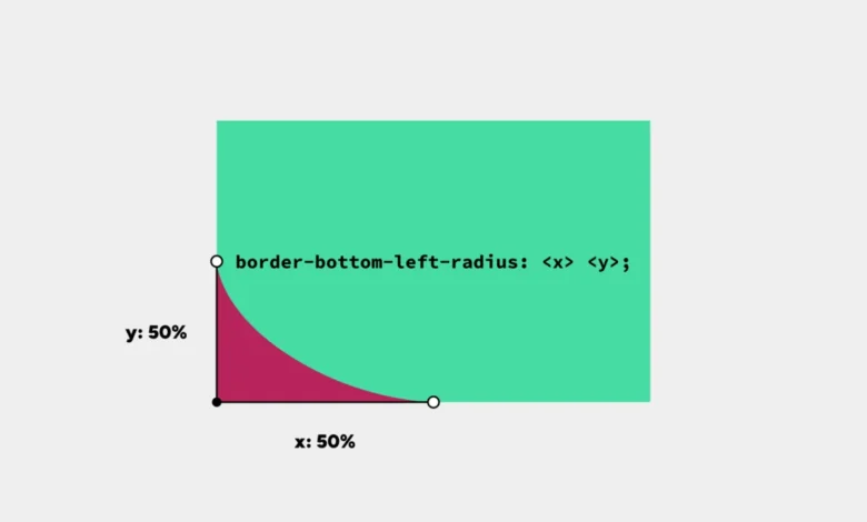
Perhaps the most advanced aspect of this technique is the use of Container Style Queries. As the dimensions of the fold change, the perspective of the "crease" must also change to remain realistic. By using the range syntax (e.g., @container style(--x-coord < --y-coord)), the CSS can automatically adjust the border-bottom-left-radius of the fold itself. This creates a responsive shadow and crease that reacts to the aspect ratio of the fold, simulating how real paper would behave when bent at different angles.
Supporting Data and Performance Metrics
The shift toward native CSS shaping properties is driven by more than just aesthetic preference; it is a matter of performance optimization. According to recent web performance audits, CSS-based shapes offer several advantages over traditional methods:

- Reduced Payload: A CSS-based folded corner requires approximately 0.5KB of code, whereas a high-resolution SVG or PNG background can range from 5KB to 50KB.
- Memory Efficiency: Browsers handle CSS properties like
corner-shapedirectly within the rendering pipeline. In contrast,clip-pathcan sometimes trigger expensive "paint" operations, especially during animations on mobile devices. - Accessibility and SEO: Because the effect is achieved on a single
divcontaining actual text, there is no risk of "broken image" icons or accessibility issues where screen readers might struggle with complex nested structures used for decoration.
Data from the "State of CSS 2024" survey indicates that 62% of front-end developers are actively looking for better ways to handle complex borders and shapes. The corner-shape property directly addresses this demand, scoring high in "developer satisfaction" metrics during early trials in Chrome Canary.
Industry Responses and Implementation Challenges
The reaction from the web development community has been largely positive, though tempered by the reality of browser fragmentation. While Google’s Chrome team has taken the lead in implementing corner-shape, Firefox and Safari have yet to enable the feature by default in their stable releases.
"The move toward declarative corner shapes is a win for maintainability," says a spokesperson from the CSS Working Group (CSSWG). "It moves the web away from ‘hacks’ and toward a standardized language for design. However, developers must remain mindful of the ‘Baseline’ status of these features."
Currently, the corner-shape approach includes a built-in fallback. In browsers that do not support the property, the element simply renders with a standard rounded corner. While this loses the "folded" look, it maintains the functional integrity of the layout, a principle known as "progressive enhancement."

Broader Impact and Future Implications
The introduction of corner-shape is indicative of a broader trend: the "componentization" of CSS. As web applications become more complex, the ability to create "utilities" that build effects based on a few variables is becoming essential. This technique demonstrates how a single set of coordinates can drive the geometry, the shadow, the positioning, and the responsive logic of a UI component.
Looking forward, the integration of corner-shape with other upcoming features like the if() function and scroll-driven animations suggests a future where web design is more organic and interactive. Imagine a document where the corners "curl" as the user scrolls down the page, or a card that "folds" when hovered over. By moving these calculations into the CSS engine rather than relying on heavy JavaScript libraries, the web becomes faster, more accessible, and easier to develop.
For now, the folded corner effect serves as a powerful proof-of-concept for the potential of corner-shape. It represents a convergence of several high-level CSS features—Custom Properties, Pseudo-elements, Container Style Queries, and Logical Properties—working in harmony to solve a design challenge that has persisted for decades. As browser support expands, this streamlined approach is expected to become the industry standard for geometric UI manipulation.


