Bridging the Gap Between Data and Design: Why Modern Dashboards Require a UX-Driven Approach

In contemporary corporate environments, the availability of enterprise data has reached unprecedented volumes. Organizations routinely generate performance decks, telemetry streams, and analytical metrics across nearly every operational sector, from sales pipelines and marketing funnels to product development and human resources. Concurrently, the software ecosystem for visualizing this information has become remarkably democratized, allowing virtually any team member to spin up a dynamic chart or an interactive dashboard in a matter of minutes.
Despite this abundance of information and tooling, a persistent operational inefficiency continues to plague boardrooms and weekly stand-up meetings. Teams gather to review quarterly metrics, review rows of data, and exchange nods of acknowledgment, only for the meeting to conclude without a definitive strategic direction, actionable takeaway, or concrete decision.
When corporate meetings stall in the presence of comprehensive data, the blame is routinely misassigned to the information itself. Analysts and stakeholders frequently conclude that the datasets lacked sufficient granularity, that historical tracking windows were incomplete, or that additional exploratory research is mandatory before a business maneuver can be executed. However, operational audits consistently reveal that the underlying data is rarely the root cause of the paralysis.
Instead, the core systemic failure lies in the design methodology: the dashboard was constructed to display available data rather than to answer a specific operational question. The audience was assumed rather than researched, and the ultimate objective—identifying precisely what actions should change as a result of viewing the visualization—was never established during the project’s inception.
The Convergence of Data Visualization and User Experience
Data visualization and user experience (UX) design share a unified fundamental objective: both disciplines strive to deliver the correct information to the appropriate stakeholder in a format that instigates meaningful behavioral change. While their specialized vocabularies differ substantially—analysts speak of regression lines, data-ink ratios, and variance, whereas UX practitioners discuss mental models, information architecture, and cognitive friction—the underlying architectural challenge remains identical.

Treating data visualization as an extension of user experience design transforms dashboards from passive, static repositories of historical charts into functional, proactive decision-making engines. This operational shift requires shifting priorities away from purely aesthetic or technically correct chart generation toward human-centric communicative design.
To understand the operational necessity of this convergence, it is instructive to examine historical precedents in statistical communication. In 1973, renowned statistician Francis Anscombe published a landmark paper demonstrating the diagnostic limitations of raw numerical summaries. Anscombe constructed four distinct datasets that yielded identical statistical properties across every standard metric: they shared the identical mean, identical variance, identical correlation coefficient, and identical regression line.
When evaluated purely through raw numbers, the four datasets appeared indistinguishable. Yet, when plotted visually on scatterplots, they revealed entirely contrasting structural patterns. Anscombe’s Quartet famously demonstrated that visualization serves a vital diagnostic function, exposing operational truths and structural anomalies that raw tabular statistics routinely conceal.
Moving Beyond Diagnosis to Communication
While Anscombe established the diagnostic value of visual plotting, modern organizational needs demand a step further: effective communication. A chart must not only reveal truth to an analyst; it must translate complexity into a compelling narrative for decision-makers.
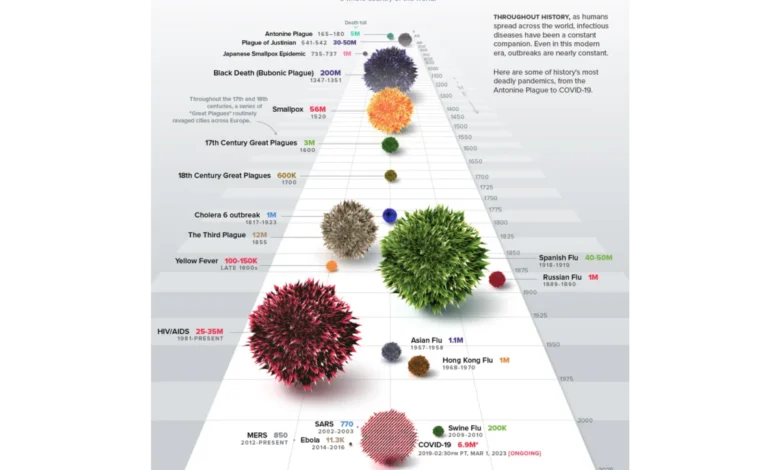
A prominent contemporary example of communicative visualization is Visual Capitalist’s History of Pandemics timeline. Rather than confronting readers with an exhaustive, dense data table cataloging historical casualty counts, the project utilizes a proportional bubble layout distributed across a unified chronological axis. Before the human brain processes a single numerical data point, the visual system instantly registers the massive comparative scale of the Black Death relative to all other historical outbreaks. Effective data design eliminates unnecessary cognitive friction, making the primary takeaway unavoidable.
In the late 20th century, statistician Edward Tufte codified a foundational philosophy for visual presentation known as the data-ink ratio. Tufte argued that every graphical mark on a chart must serve the data directly, minimizing non-data-ink and decorative elements to prioritize visual hygiene. While Tufte’s principle remains a vital cornerstone for charts analyzed in complete isolation, enterprise dashboards operate under vastly different conditions.

In a corporate setting, a chart is evaluated by human actors operating within specific operational contexts and under considerable professional pressure. Stripping a visualization down to its absolute minimalist form can inadvertently remove critical layers of contextual metadata required by executives to make high-stakes financial commitments. Consequently, the governing principle for enterprise dashboards is not unyielding simplicity, but appropriate complexity tailored to the specific user.
The Upstream Architecture: The 80% Rule
Industry research indicates that approximately 80 percent of the work required to ensure a dashboard’s operational success occurs upstream—long before a single chart is drawn, a dataset is queried, or a visualization tool is opened. This high-leverage phase relies on answering three fundamental questions before design execution begins: context, audience, and insight.
Context: Defining the Core Operational Question
Most data initiatives initiate projects in reverse. Development teams extract metrics readily available within internal analytics tools and construct visual interfaces around them, leaving the foundational purpose of the data unexamined. This backward approach occurs because teams anchor their initial scope to whatever data is immediately accessible, treating those boundaries as absolute limits.
Establishing a concrete goal requires moving far beyond vague mandates such as "display product performance." A functional operational goal must incorporate three distinct elements: a specific metric, a defined population, and an implied operational action. For instance, transitioning a request from "show me user activity" to "identify which specific feature interactions drive long-term retention among users who completed onboarding in the first quarter" transforms an open-ended exploration into a constrained, answerable design problem.
Audience: Navigating Literacy and Accountability
Designing an effective data interface requires evaluating two core audience dimensions: data familiarity and professional accountability.
Familiarity measures the audience’s native data literacy. Presenting a dense, multi-layered exploratory network graph to a senior executive whose daily workflow relies on high-level summaries introduces unnecessary cognitive friction. While the underlying data is entirely accurate, the interface fails because it is misaligned with the user’s cognitive habits.

Accountability dictates how the audience processes risk and consequence. A data visualization indicating a 12 percent decline in conversion carries vastly different emotional and professional weight for an executive whose departmental budget depends on that metric than it does for an analyst whose sole responsibility is reporting the figure. Understanding these stakes allows designers to calibrate information density accurately, balancing deep diagnostic exploration for data specialists with high-level summaries for executive leadership.
Insight: Translating Information into Action
A pervasive misconception in dashboard development is the assumption that accuracy and clarity naturally produce insight. In practice, information and insight represent entirely distinct operational states. Information is an objective record of what the data displays, whereas insight is the specific decision, behavioral shift, or strategic course correction executed as a consequence of viewing that information.
If a dashboard lacks an explicit connection to a prospective business decision, it defaults to passive reporting. When a core metric unexpectedly drops by 15 percent, a poorly designed informational dashboard merely sounds an alarm without offering diagnostic depth, frequently triggering panic and costly, misdirected corporate fire drills. Conversely, a dashboard engineered for insight maps the drop against correlated variables—such as newly launched marketing campaigns or shifting traffic acquisition channels—instantly clarifying whether the decline represents a technical platform failure or an intentional dilution caused by low-intent click traffic.
Enterprise Implementation: A Case Study in B2B SaaS
The practical application of these principles can be observed in enterprise software deployments, such as a recent UX overhaul for a client-facing B2B SaaS platform specializing in enterprise talent management and competency tracking. The platform captured extensive daily user telemetry, prompting an initial ambiguous directive from leadership: "We have an immense archive of user activity; design an interface that presents it to enterprise teams."
Rather than constructing a data graveyard of every available telemetry metric, the design team restructured the project around user-centric operational needs.
Contextualizing Performance Metrics
While time-spent-on-platform is a ubiquitous metric easily integrated into standard dashboards, it functions merely as a proxy for presence rather than competency acquisition. To deliver genuine value, the team pivoted toward measuring specific competency scores, certification completion trajectories, and historical performance milestones. Time-spent data was retained solely as a supporting signal to help managers identify underutilized learning modules that correlated with lagging competency scores.

Furthermore, the interface architecture addressed the divergence in user granularity. Frontline individual contributors required a self-directed workspace to track daily pacing and personal skill gaps, whereas team managers required an aggregated macro pulse check to identify systemic vulnerabilities across entire departments before critical project bottlenecks occurred.
Visualizing Multi-Dimensional Data: The Radar Chart Selection
To solve the core design challenge—enabling an individual user to evaluate proficiency across eight distinct competency areas at a single glance—the team rejected traditional linear bar charts in favor of a concentric radar chart layout.
While bar charts require viewers to scan multiple separate columns and mentally calculate variance, a radial layout maps multi-dimensional variables across axes radiating from a central point. The resulting geometric shape provides instant cognitive recognition: an even, balanced polygon signifies well-rounded proficiency, while a sharply skewed polygon immediately highlights critical skill vulnerabilities. Combined with a robust, brand-aligned color system integrated directly into the underlying data model, the interface enabled users to interpret complex skill distributions instinctively without formal training.
Measurable Operational Impact
Following the deployment of the redesigned, UX-driven dashboards and side-by-side team comparison tools, platform analytics revealed a measurable increase in weekly active engagement. Enterprise managers transitioned from viewing static reports on a monthly retrospective basis to utilizing the dashboard every Monday morning for proactive operational planning.
Furthermore, qualitative feedback indicated a fundamental shift in management culture. Rather than utilizing retrospective data to dissect underperforming months after the fact, team leaders leveraged real-time visual insights to identify slipping performance indicators and initiate supportive coaching sessions proactively. Customer churn across the platform declined to record lows over subsequent quarters, illustrating the tangible business value of treating data visualization as an upstream user experience architecture.
Conclusion
Data visualization achieves its highest organizational utility when treated as an intentional, upstream architectural discipline rather than a downstream cosmetic formatting step. By integrating structured user experience methodologies into the data design process, organizations can transform static, reactive reporting tools into active decision-making engines.

As analytics capabilities continue to expand across global industries, the defining competitive advantage will not belong to organizations that accumulate the largest volumes of data, but to those that design the clearest pathways from raw numbers to human understanding.