The evolution of responsive web design has long been bound to the viewport, a limitation that web developers have navigated using media queries for over a decade. Despite widespread browser implementation reaching approximately 94 percent globally, CSS container queries continue to experience surprisingly low adoption rates across professional development teams. Industry metrics, including data from the 2025 State of CSS survey, reveal a significant gap between awareness and practical utilization: while 86 percent of surveyed developers report familiarity with the feature, only 41.4 percent actively integrate container queries into production environments. This paradox raises critical questions regarding how modern front-end architectures approach component reuse, layout logic, and the fundamental differences between macro and micro design systems.
Background Context and Historical Development
To understand the current state of layout design, one must examine the origins of responsive web design. Introduced formally in 2010 by Ethan Marcotte, responsiveness relied heavily on relative units, fluid grids, and CSS media queries. The @media rule granted developers the ability to query the physical dimensions of a user’s browser viewport, tailoring layouts for mobile devices, tablets, and desktop displays.
However, as component-driven development frameworks such as React, Vue, and Angular revolutionized front-end engineering, the architectural paradigms shifted. Components were no longer designed solely for specific pages; instead, they were built to be modular, reusable entities capable of living in vastly different contexts—such as a wide main content area, a narrow sidebar, or a compact modal window.

Under this new paradigm, media queries revealed structural limitations. Because media queries evaluate only the outer browser window, they remain entirely blind to the localized constraints of a component’s parent container. A card component programmed via media queries to display in a multi-column flex layout at a specific pixel threshold will break or overflow if placed inside a constrained grid cell on a massive desktop monitor. Recognizing this friction, developers spent years placing container-aware layouts at the top of CSS wishlists, culminating in the formal specification and rollout of CSS Container Queries.
Timeline of Adoption and Industry Analysis
The journey of container queries from conceptual proposals to standard web architecture spans several critical milestones:
- 2019–2020: Component-level responsiveness dominates front-end community wishlists, prompting the W3C and browser vendors to draft specifications for containment and size queries.
- 2022–2023: Major browser vendors—including Chromium, Safari, and Firefox—achieve stable implementations, bringing global browser support above the 90 percent threshold.
- 2025–2026: Despite universal browser availability, adoption lags behind expectations. During industry gatherings such as SmashingConf Amsterdam 2026, prominent web developers and educators like Kevin Powell highlighted that container query adoption metrics remain alarmingly low relative to their utility.
Industry analysts attribute this sluggish adoption curve to psychological and syntactical familiarity. Because container queries visually mimic traditional media queries, developers frequently mistake them for drop-in replacements rather than an entirely distinct paradigm. This misapplication often results in layout bugs, leading teams to default back to familiar media query workflows.
Architectural Differences: Macro Layouts Versus Micro Layouts
A primary technical hurdle in adopting container queries is shifting from a viewport-centric mindset to a container-centric framework. Experts categorize this distinction through the lenses of macro and micro layouts.

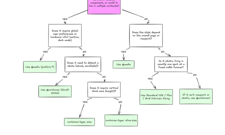
Macro layouts govern the overarching structure of an application—global headers, sticky footers, main grid foundations, and system-level preferences like dark mode via prefers-color-scheme. For macro layouts, media queries remain the correct architectural tool because the entire document viewport serves as the definitive reference point.
Micro layouts, conversely, dictate the internal behavior of self-contained components such as cards, widgets, form controls, and navigation menus. These elements require fluid adaptability based on their immediate spatial allocation. By applying a container context using container-type: inline-size and utilizing container query units (cqi, cqw, cqb), developers allow components to react autonomously to their surroundings. For instance, fluid typography scaled via container units (clamp(1rem, .5rem + 3cqi, 2rem)) ensures text proportions respond directly to the width of the card’s wrapper rather than the user’s screen size.
Furthermore, advanced layout techniques—such as flexbox wrap detection—demonstrate the superiority of container queries in handling internal state changes. While traditional CSS lacks a native pseudo-class to detect when flex items wrap onto a new line, nesting container queries inside flex items creates a reliable workaround. When a parent container shrinks, forcing items to wrap, the container query registers the dimensional shift and applies compensatory styling without requiring expensive JavaScript ResizeObservers.
Technical Caveats and Side Effects
While container queries offer robust solutions for component reusability, adopting them requires careful consideration of specific side effects and constraints:

- Self-Querying Restrictions: A container cannot query its own dimensions to alter its own styles directly, as this would create an infinite calculation loop. Developers must establish a distinct parent-child wrapper hierarchy where the outer wrapper acts as the registered container.
- Layout Collapse via Size Queries: Querying a container’s block (vertical) size using
container-type: sizeforces the browser to calculate dimensions independently of child contents. Without an explicit height, min-height, or aspect-ratio, the container collapses to zero pixels. Consequently, developers are generally advised to rely oninline-sizeunless block-axis measurement is strictly necessary. - Exclusion of Custom Properties: Container queries currently cannot evaluate expressions against CSS custom properties (variables) due to potential cascade and circular dependency conflicts within the DOM tree.
Broader Impact and Future Implications
The integration of container queries marks a mature phase in modern CSS architecture. By decoupling component responsiveness from the global viewport, developers can build resilient, highly modular design systems capable of adapting to over 2,300 unique viewport sizes identified across modern devices.
As front-end engineering continues to prioritize component portability and design system scalability, overcoming the adoption barrier for container queries is essential. Organizations that successfully transition from viewport-dependent thinking to container-aware development will achieve greater code maintainability, reduced reliance on JavaScript layout scripts, and more predictable user interfaces across diverse digital environments.
Related posts: