The evolution of responsive web design has long been bound to the physical dimensions of the user’s device screen. For over a decade, developers have relied exclusively on media queries to dictate how digital layouts adapt to varying viewport sizes. However, as modern web architecture shifted toward modular design systems and reusable components, the limitations of viewport-based scaling became increasingly apparent. Although CSS container queries were introduced to solve this exact architectural mismatch—allowing components to respond dynamically to their immediate parent containers rather than the browser window—industry adoption has lagged significantly behind expectations.
Recent developer surveys and technical analyses indicate that while browser compatibility for container queries has stabilized at approximately 94% globally, actual implementation rates remain strikingly low. This disconnect highlights a fundamental transition period in front-end development, where powerful new layout primitives are available, yet traditional patterns continue to dominate daily workflows.
Background and Technical Evolution of Responsive Design
Since the introduction of responsive web design in the late 2000s, media queries have served as the foundational mechanism for adapting user interfaces. By querying the browser viewport via parameters such as min-width or max-width, developers could restructure entire pages, transforming multi-column desktop layouts into single-column mobile views.
However, media queries possess an inherent structural limitation: they are fundamentally disconnected from the actual components they style. A media query evaluates the entire screen width, remaining entirely blind to the localized constraints of individual page elements. For instance, a complex card component designed to expand horizontally at a breakpoint of 1,024 pixels will attempt to do so even if it is placed inside a narrow sidebar grid cell measuring only 300 pixels wide. This mismatch frequently leads to layout deformations, text overflows, and cramped interfaces.

To address these architectural challenges, the World Wide Web Consortium (W3C) and browser vendors developed CSS container queries. Unlike media queries, which look outward toward the viewport, container queries look inward. They evaluate the available inline or block space of a specific parent wrapper, enabling true component-driven responsiveness. Despite reaching baseline interoperability across all major browsers, the feature has struggled to secure widespread integration in production environments.
Adoption Metrics and Industry Feedback
Industry data underscores the slow integration of container queries into mainstream development pipelines. According to comprehensive metrics from the annual State of CSS survey, developer awareness of container queries stands at an impressive 86%. Yet, despite this high level of recognition, only 41.4% of surveyed developers actively utilize the feature in production applications.
This sluggish adoption rate was a central point of discussion at major industry gatherings, including SmashingConf Amsterdam, where prominent web development educators highlighted the stark contrast between developer demand and actual implementation. Historically, the ability for a component to adapt independently to its outer container ranked consistently at the top of community feature wishlists. Yet, when the technology finally materialized with robust cross-browser support, utilization figures remained modest.
Industry analysts attribute this hesitation not to a lack of utility, but to patterns of misuse and perceptual bias. Because container query syntax bears a striking visual resemblance to traditional media queries, many developers initially assume they function identically. Consequently, practitioners often attempt to apply container queries using the same mental models developed for viewport-scale layouts, leading to implementation errors, unexpected side effects, and eventual abandonment of the feature in favor of familiar, albeit less efficient, legacy methods.
Macro Versus Micro Layouts: Understanding the Paradigm Shift
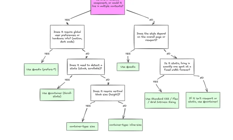
A primary hurdle in container query adoption involves redefining how developers categorize layout responsibilities within modern design systems. Web architecture can generally be separated into two distinct operational tiers: macro layouts and micro layouts.

Macro layouts govern the overarching structure of a document. These include top-level page grids, full-width headers, sticky footers, global navigation bars, and system-level preferences such as prefers-color-scheme. Because these elements scale directly with the browser window, traditional media queries remain the optimal tool for managing macro layout transitions.
Conversely, micro layouts encompass the modular components housed within the macro framework—elements such as interactive cards, widget modules, isolated forms, and localized component navigation. These elements are designed for reuse across multiple contexts, appearing simultaneously in sprawling main content areas and constrained sidebar modules. Container queries are purpose-built for this micro tier, allowing individual components to query their immediate bounding boxes and adjust their internal presentation based entirely on locally available space rather than abstract device breakpoints.
Furthermore, modern web environments feature an extraordinary degree of screen fragmentation, with over 2,300 unique viewport dimensions recorded across contemporary devices. Attempting to anticipate every possible combination of screen size, device orientation, and container placement using media queries alone is mathematically impractical. Container queries mitigate this complexity by decoupling component styling from the global viewport.
Advanced Capabilities and Practical Implementation
Beyond basic dimensional checks, modern container query specifications introduce advanced capabilities that significantly expand what is possible using pure CSS, reducing reliance on JavaScript-based observation tools.
One notable advancement is the inclusion of dedicated container length units—such as cqi (container query inline size) and cqb (container query block size). When combined with CSS functions like clamp(), these units enable true fluid typography within modular components. Rather than scaling font sizes relative to the screen width via vw units—which can cause typography to break when a component is relocated to a narrower container—fluid typography tied to container units ensures that text scales harmoniously in direct proportion to the component’s immediate environment.

Additionally, container queries provide novel workarounds for internal state detection, such as identifying when flexible box items wrap onto new lines. Standard CSS lacks native pseudo-classes to detect layout wrapping events, historically forcing developers to implement JavaScript ResizeObserver scripts to monitor element dimensions. By nesting container queries within flex items and carefully managing inline sizes, developers can construct purely declarative CSS rules that update component styling the moment wrapping occurs, entirely without scripting overhead.
Technical Limitations and Side Effects
Despite their utility, container queries introduce specific rendering behaviors and technical constraints that developers must navigate carefully.
- Self-Querying Restrictions: A container cannot query its own dimensions to alter its own styles directly, as this would create an infinite calculation loop. To apply container-based adjustments, developers must establish a distinct parent wrapper registered with
container-type, applying style modifications exclusively to descendant elements within that container. - Layout Collapse Risks: When utilizing container size queries (
container-type: size), the browser calculates dimensions along both the inline and block axes independently of child content. If an explicit height, minimum height, or aspect ratio is not defined on the container, the element may collapse to zero height. To avoid this, developers frequently rely on inline-size queries (container-type: inline-size), which restrict dimensional evaluation to the horizontal axis in left-to-right writing modes. - Custom Property Incompatibility: Container queries cannot currently evaluate custom CSS properties (CSS variables) directly within their conditions. Because CSS variables cascade dynamically and can be modified by the very rules they influence, allowing queries to depend on variable values risks circular reference complications during the browser layout calculation phase.
Broader Implications and Future Outlook
The slow transition toward container queries reflects a broader, ongoing evolution in web standards, where declarative component-driven architecture steadily replaces legacy document-centric design patterns. While media queries will retain an indispensable role for macro-level page structures and device-level preferences, container queries represent a maturation in how developers handle responsive design at scale.
As design systems grow increasingly complex and multi-contextual, the imperative for self-contained, context-aware components will only intensify. Understanding the precise boundaries between viewport-driven macros and container-driven micros allows development teams to write more resilient, maintainable stylesheets. As educational resources catch up with the technical specification, industry adoption is projected to rise, signaling a permanent shift away from rigid viewport assumptions toward truly fluid, content-driven web architecture.