Visualizing the Global COVID-19 Crisis: Challenges and Best Practices in Data Communication

The global COVID-19 pandemic has necessitated an unprecedented reliance on data analytics to track the spread of the virus and the effectiveness of public health interventions. As governments and international health organizations scramble to compile mortality rates, infection surges, and recovery trends, data analysts face a significant hurdle: how to communicate complex, volatile information to a general public that is increasingly reliant on visual representations to understand the severity of the crisis. While various dashboards and infographics have emerged to meet this demand, the quality and accessibility of these visual tools vary drastically, often leading to confusion rather than clarity.
The Inherent Complexity of Pandemic Data
Before addressing the aesthetics of data visualization, it is essential to acknowledge the fundamental instability of the data itself. Comparing mortality statistics across international borders is fraught with inconsistencies that no amount of refined chart design can fully resolve. Reporting methodologies differ significantly by nation, and even within countries, the criteria for assigning a COVID-19 death on a medical certificate are inconsistent.
For instance, in the early months of 2020, medical professionals faced the difficult task of distinguishing between deaths primarily caused by SARS-CoV-2 and those exacerbated by the virus, such as cases where pneumonia was the secondary complication. This ambiguity created a "data integrity gap." As healthcare systems became overwhelmed, the priority shifted from meticulous reporting to patient survival. Consequently, the data provided to global databases, such as those maintained by Our World in Data or the World Health Organization (WHO), often reflects a patchwork of reporting capabilities rather than a uniform standard. Analysts must therefore approach these datasets with a degree of caution, recognizing that they serve as indicators of trends rather than absolute, immutable facts.
A Chronology of the Data Surge
The early stages of the pandemic, specifically from January to April 2020, were characterized by a rapid escalation in data reporting. In early January 2020, reports emerged from Wuhan, China, regarding a cluster of pneumonia-like illnesses. By mid-January, the first international cases were identified, and by late January, the World Health Organization declared a Public Health Emergency of International Concern.
As the virus moved through Europe and eventually into the Americas, the sheer volume of incoming data began to overwhelm traditional analytical tools. February saw Italy become the epicenter of the European outbreak, prompting a desperate need for clear comparative metrics. By March, the United States recorded its first significant surge, leading to a scramble for comparative graphs that could help policymakers understand whether they were following the trajectories of Asian or European counterparts. This period of rapid escalation proved that visual literacy—the ability to interpret and extract meaning from charts—was no longer a niche skill for statisticians, but a prerequisite for public understanding of governmental lockdown measures.

The Pitfalls of Poor Design
Common failures in data visualization during the pandemic have often stemmed from "chart junk" or inappropriate scaling. When analysts attempt to display disparate data points—such as the massive death counts in Italy compared to the relatively low figures in smaller or less-affected regions—the resulting visuals often render smaller, but equally important, trends invisible.
One frequent error is the use of non-linear scales without proper labeling. While logarithmic scales can be useful for statisticians to compare the rate of growth between countries, they are notoriously difficult for the layperson to interpret correctly. A move from 10 to 100 on a log scale looks identical to a move from 100 to 1,000, which can lead to significant misinterpretations of the acceleration of the virus. When visuals are designed without a primary focus on the user’s cognitive load, the result is a loss of trust in the data itself.
Best Practices for Comparative Visualizations
To achieve greater clarity, data professionals recommend several best practices for comparing multi-country health outcomes:
- Normalization of Data: Deaths should always be reported per capita (e.g., per 1 million people) to account for the massive disparities in population size between countries like China and Italy.
- Time-Alignment: Instead of plotting by calendar date, charts should be aligned by "Day 0" or "Week 1" of the outbreak to allow for a true comparison of the virus’s trajectory in different regions.
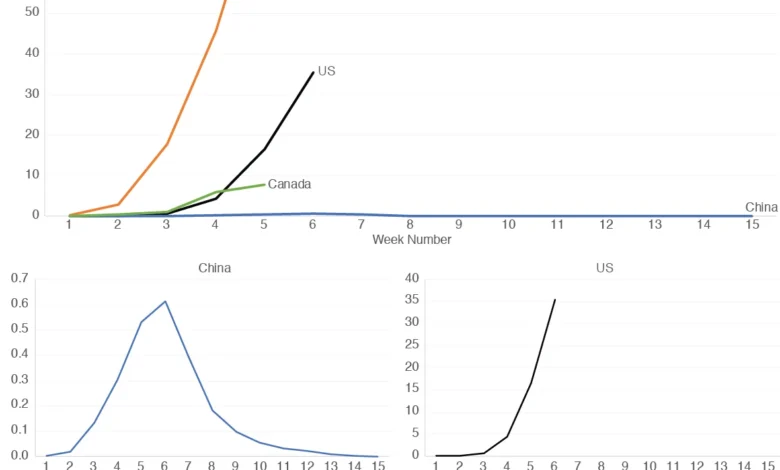
- Modular Displays: Rather than forcing all countries onto a single, cluttered line graph, analysts should utilize "small multiples"—a series of separate, small, and uniformly scaled graphs. This technique allows for the direct comparison of patterns (the slope of the curve) while maintaining the legibility of individual country data.
Analyzing the Trajectories
By employing a modular design, observers can draw far more sophisticated conclusions. For example, comparing the weekly mortality rates of the United States, China, Italy, and Canada reveals distinct phases of the pandemic. In the first seven weeks of the recorded data, the patterns in China and Italy showed striking similarities, suggesting that despite geographical and cultural differences, the virus followed a predictable path within the population.
Conversely, comparing the U.S. and Canada during the same period reveals subtle, yet critical, differences. While both nations saw rising mortality rates, Canada’s data began to show a stabilization by the fifth week, whereas the U.S. curve continued to ascend. These nuances are only visible when the graphs are independently scaled, preventing the "flattening" effect that occurs when a high-mortality country dominates the Y-axis of a combined chart.
Official Responses and the Role of Transparency
Public health agencies, including the Centers for Disease Control and Prevention (CDC) and the European Centre for Disease Prevention and Control (ECDC), have continuously updated their data portals to address these concerns. Their response has evolved from providing raw, often confusing, daily dumps to creating interactive, curated dashboards.

Government officials have repeatedly emphasized that these metrics are not static. "We are monitoring the data in real-time," noted one public health spokesperson during the 2020 briefings. "The trends are more important than the exact daily count." This shift in focus—from absolute precision to trend analysis—underscores the importance of the design choices discussed herein. The goal of public-facing data is to inform policy compliance and public behavior, both of which require an intuitive understanding of the "curve."
Broader Implications for Global Health
The lessons learned from the COVID-19 pandemic regarding data visualization have implications that extend well beyond epidemiology. As climate change, economic volatility, and other global crises continue to generate massive, complex datasets, the ability to communicate these findings clearly is essential for democracy.
When the public cannot interpret the information provided to them, they are susceptible to misinformation and confusion. A well-designed graph is more than just a representation of numbers; it is a tool for civic engagement. By prioritizing simplicity, consistency, and contextualization, data analysts can bridge the gap between complex scientific findings and the public’s need for actionable information.
Moving forward, the field of data journalism must continue to refine these tools. The COVID-19 pandemic served as a global stress test for data communication, proving that when the stakes are at their highest, the clarity of a visual display is as critical as the accuracy of the data it represents. Whether through improved web design, more intuitive interactive features, or the standardizing of global reporting metrics, the focus must remain on ensuring that the truth—as best as it can be measured—is communicated in a way that respects the viewer’s time and intelligence. The pandemic demonstrated that we are all, in a sense, data analysts now; providing the public with the tools to see the trends clearly is the most effective way to foster an informed and resilient society.
Related posts: