The Peril of Data Visualization in the Age of Global Pandemics: A Critical Review of Statistical Reporting

In the wake of the global COVID-19 pandemic, the presentation of epidemiological data has become a critical public interest issue. As governments, health organizations, and media outlets attempt to quantify the impact of the virus, the methodology used to visualize this information often determines public perception. A recent case study involving an NPR analysis highlights the potential for cognitive bias and the distortion of facts through the selective presentation of data, particularly when such visualizations are used to contextualize political discourse.
The Axios Interview and the Context of Public Debate
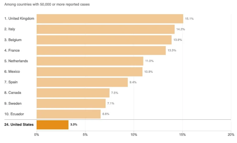
On August 3, 2020, an interview between then-President Donald Trump and Axios journalist Jonathan Swan brought the discourse surrounding COVID-19 mortality rates to the forefront of the American political conversation. During this exchange, the President asserted that the United States was performing significantly better than other nations regarding COVID-19 fatalities. When presented with contrary evidence by Swan, the President cited "case fatality ratios"—the number of deaths relative to the number of confirmed infections—to justify his claim.
This exchange underscored a fundamental tension in public health reporting: the difference between case fatality rates (CFR) and per capita mortality rates. While the White House sought to emphasize the CFR to portray the U.S. response in a positive light, public health experts generally advocate for per capita metrics to understand the total burden of the disease on a population. The ensuing debate was not merely a matter of political posturing but a reflection of the broader difficulty in accurately communicating complex statistical trends to a lay audience.
The Mechanics of Selective Data Presentation
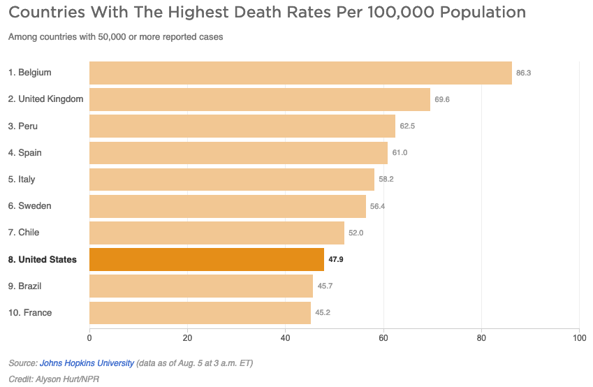
Following the August 3 interview, National Public Radio (NPR) published an article titled Charts: How the U.S. Ranks On COVID-19 Deaths Per Capita — And By Case Count. While the article aimed to provide clarity, a structural examination of the charts included in the report reveals the dangers of what statisticians often refer to as the "curse of the top ten."
By limiting the scope of the comparison to only ten countries, the charts inadvertently presented a misleading narrative. As of August 5, 2020, there were at least 45 countries with more than 50,000 reported COVID-19 cases. By omitting 35 of those nations, the NPR charts failed to capture the broader reality of the pandemic. In the case of the per capita death rate chart, the visualization implied that only two countries, Brazil and France, were performing worse than the United States. In reality, had all 45 eligible countries been included, it would have been evident that 37 countries were recording fewer deaths per capita than the U.S.
This phenomenon of arbitrary truncation is a known pitfall in data journalism. When a data set is truncated to a small, non-representative sample, it creates a "ranking" that lacks statistical validity. Such visual aids, while aesthetically pleasing, can inadvertently reinforce the very narratives they are intended to scrutinize.
Defining Epidemiological Metrics: Burden vs. Rate
The complexity of COVID-19 reporting is further compounded by the terminology used to describe mortality data. In the NPR report, the distinction between "disease burden" and "per capita mortality" was blurred. Epidemiologists define "disease burden" as the total impact of a condition, often quantified in Disability-Adjusted Life Years (DALYs). This metric accounts for years of life lost and years lived with disability.
The NPR article erroneously suggested that the per capita death rate is the primary indicator of a country’s overall disease burden. This is a technical misclassification. Per capita death rates measure the frequency of mortality within a population, whereas total case counts or aggregate mortality figures are more reflective of the total societal burden. By conflating these terms, news outlets risk providing an incomplete picture of the pandemic’s impact, leading to confusion among the public regarding the severity of the health crisis.
Chronology of Public Health Messaging (2020)
- January–March 2020: Global reporting focuses on case counts and the rapid spread of the virus across international borders.
- April 2020: Mortality rates become the primary metric of concern as healthcare systems in countries like Italy and Spain face overwhelming pressure.
- August 3, 2020: The Axios interview with Donald Trump intensifies public debate over which metric—CFR or per capita deaths—most accurately reflects a nation’s management of the pandemic.
- August 5, 2020: NPR releases its analysis of global COVID-19 rankings, sparking discussions regarding the ethical responsibilities of media in visualizing health data.
- Late 2020: Public health agencies, including the CDC and WHO, begin standardizing reporting practices to mitigate the confusion caused by varied national data sets.
Implications for Journalistic Integrity
The ethical responsibility of a news organization, particularly when reporting on a public health crisis, is to provide context that prevents misinterpretation. When journalists rely on incomplete data sets—even from reputable sources—they risk facilitating the spread of misinformation. The "top ten" approach is frequently criticized in data science because it forces a binary perception of "best" and "worst" onto data that is fundamentally multivariate.
Furthermore, the journalistic endeavor to remain "even-handed" can sometimes backfire if the quest for neutrality results in the validation of false claims. In the case of the August 2020 reporting, the attempt to provide a balanced look at the President’s claims regarding mortality rates inadvertently gave credence to a statistical framework that did not align with the broader consensus of epidemiological data.
Statistical Best Practices for Future Reporting
To ensure accuracy in future crises, media organizations must adopt more rigorous standards for data visualization. These should include:
- Completeness: Data sets should include all relevant comparable entities rather than a truncated list, unless the truncation is explicitly justified by a clear, non-arbitrary methodology.
- Contextual Annotation: Charts should be accompanied by explanatory notes regarding the variables being measured, such as the impact of median age, healthcare infrastructure, and population density on mortality rates.
- Peer Review: The integration of data science professionals in the editorial process is essential to catch logical fallacies before publication.
- Clarity of Purpose: Outlets must clearly define whether a metric is intended to measure governmental performance, biological vulnerability, or total societal impact.
Conclusion
The challenge of reporting on a pandemic is as much about mathematical literacy as it is about traditional journalism. While NPR remains a trusted source for news, the 2020 analysis serves as a cautionary tale for the industry. The incident underscores that data visualization is not a neutral act; it is an interpretive one. By failing to present the full spectrum of available data, even the most well-intentioned reporting can obscure the truth, ultimately undermining the public’s ability to evaluate the state of a global crisis. As the world moves forward, the demand for transparency and statistical rigor in media reporting will remain an essential pillar of public health communication.