
Statistical Noise and the Dangers of Overinterpreting Daily COVID-19 Case Counts
The intersection of public health data and financial market volatility reached a critical juncture in early April 2020, as investors and policymakers scrambled to identify the "peak" of the first wave of the COVID-19 pandemic. On April 6, 2020, a notable surge in the United States stock market—highlighted by a 1,627.46-point gain in the Dow Jones Industrial Average—was widely attributed to a perceived slowing in the rate of new coronavirus infections. This reaction was sparked by reports, including an analysis by Investor’s Business Daily, which noted that new case counts on Sunday, April 5, had dropped for the first time since mid-March. However, a deeper examination of statistical reporting methods, the inherent lag in medical data, and the volatility of daily metrics suggests that such optimistic interpretations were premature and potentially dangerous for both public health strategy and economic forecasting.
The Market Surge and the Statistical Mirage
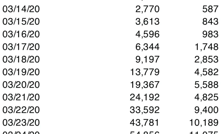
The financial rally on April 6, 2020, represented a 7.73% increase for the Dow Jones, one of the most significant single-day gains in the index’s history. The catalyst was a specific set of figures: U.S. coronavirus cases had reportedly jumped by 25,316 on Sunday, April 5, bringing the total to 336,673. Crucially, this daily increase was lower than the record 34,196 new cases reported the previous Saturday. Market analysts and media outlets seized upon this decline as the "first drop" in new cases since March 21, interpreting it as a signal that social distancing measures were effectively "flattening the curve."
While the market’s response was a reflection of a desperate hope for a turnaround, epidemiologists and data scientists warned that daily fluctuations in reported cases are often "noise" rather than "signal." The reliance on a single day’s data to predict the trajectory of a global pandemic ignores the complex logistics of medical reporting and the biological reality of viral transmission. In reality, the "drop" observed on April 5 was an artifact of reporting cycles rather than a genuine reduction in the spread of the virus.

Chronology of Data Reporting in the Early Pandemic
To understand why the April 5 data was misleading, one must look at the timeline of the pandemic’s progression in the United States during the spring of 2020:
- March 1–15, 2020: Testing capacity was severely limited. Reported cases were largely a reflection of testing availability rather than the actual prevalence of the virus in the community.
- March 16–31, 2020: As commercial labs began processing tests, reported cases surged exponentially. The narrative of "flattening the curve" became the primary goal of state-level lockdowns.
- April 3–4, 2020: New case reports reached new heights, peaking near 34,000 in a single day.
- April 5, 2020 (Sunday): Reported new cases dipped to approximately 25,000.
- April 6, 2020 (Monday): The stock market rallied based on the Sunday dip. However, by the end of the day, new reports showed that the downward trend had already reversed, with cases climbing back toward previous highs.
This chronology highlights a recurring pattern in public health data: the "weekend effect." Throughout the pandemic, case numbers reported on Sundays and Mondays consistently appeared lower because many local health departments and laboratories operated with reduced staff or closed entirely over the weekend. The data reported on a Sunday typically reflects tests processed on Friday or Saturday, and the administrative delay in uploading those results often creates a temporary, artificial trough in the data.
The Gap Between Infection and Reporting
The fundamental flaw in interpreting daily case counts lies in the distinction between the date an infection occurs and the date it is recorded in a national database. For a case to be "counted" on a specific day, several logistical hurdles must be cleared, each introducing a variable amount of delay:
- Incubation Period: A person is infected but remains asymptomatic for 2 to 14 days.
- Symptom Onset and Seeking Care: The individual must develop symptoms significant enough to seek a test, or have access to proactive screening.
- Testing Availability: In April 2020, testing was often restricted to those with severe symptoms or frontline workers, meaning the "total case count" was always a massive undercount of the true infection rate.
- Laboratory Processing: In the early stages of the pandemic, lab backlogs meant that test results could take anywhere from 24 hours to two weeks to be returned.
- Administrative Reporting: Once a positive result was confirmed, it had to be reported to the county health department, then the state, and finally the Centers for Disease Control and Prevention (CDC).
Because of these factors, the "new cases" reported on April 5 likely represented infections that occurred in mid-to-late March. Consequently, using a single day of reported data to make real-time decisions about the economy or public health is akin to looking at a star and assuming it exists in its current state, when in fact you are seeing light that left its source years ago.

Statistical Smoothing: The Role of Moving Averages
To filter out the daily volatility and "noise" caused by reporting delays and weekend lulls, statisticians prefer the use of moving averages. A 5-day or 7-day moving average takes the mean of the current day and the preceding days, providing a smoother line that more accurately represents the underlying trend.
When the data from early April 2020 is viewed through a 5-day moving average, the "dramatic drop" of April 5 disappears. Instead of a sharp peak followed by a decline, the moving average shows a steady, albeit slightly slowing, upward trajectory. By smoothing the data, it becomes clear that the pandemic had not yet "turned the corner." The moving average remained on an incline well through the first half of April, proving that the daily dip was a statistical outlier rather than a change in the pandemic’s momentum.
Market Psychology and the Risk of Hasty Conclusions
The financial market’s reaction to the April 5 data underscores the psychological pressure on investors to find "green shoots" of recovery during a crisis. In a period of extreme uncertainty, the human brain is wired to seek patterns, often finding them where they do not exist. This phenomenon, known as apophenia, can lead to significant financial risk.
Investors who entered the market on the strength of the April 6 rally were operating on an incomplete data set. When the reporting caught up on April 7 and 8, showing that cases were still rising, the market was forced to reckon with the reality that the crisis was far from over. This "bull trap"—where a temporary recovery lures investors back into a declining market—is a classic danger of overreacting to short-term data points.

Expert Reactions and Public Health Implications
Public health officials, including members of the White House Coronavirus Task Force at the time, frequently cautioned against reading too much into day-to-day fluctuations. Dr. Anthony Fauci and other experts repeatedly emphasized that the "trendline" was more important than any single day’s report.
The danger of misinterpreting these statistics extends beyond the stock market. If the public perceives that the pandemic is easing based on a single day of "good news," compliance with social distancing and masking mandates may drop. This behavioral shift can lead to a resurgence in infections, effectively creating a self-fulfilling prophecy where premature optimism leads to a prolonged crisis.
Broader Impact and Policy Lessons
The events of April 2020 serve as a case study in the importance of data literacy in the modern age. As statistics become more accessible to the general public through real-time dashboards and news alerts, the responsibility to interpret that data correctly falls on journalists, analysts, and citizens alike.
The primary lesson for future crises—whether biological, economic, or environmental—is the necessity of patience and the use of robust statistical models. Policy decisions and investment strategies should never be based on a single "noisy" data point. Instead, a multi-faceted approach that considers moving averages, positivity rates, and hospital capacity provides a more reliable picture of reality.

In retrospect, the true trajectory of the first COVID-19 wave was only understood weeks after the fact. The "peak" was not a single point but a jagged plateau. As the world continues to navigate the aftermath of the pandemic and prepares for future challenges, the ability to distinguish between a meaningful trend and statistical noise remains one of the most vital skills for navigating a complex, data-driven world. Patience in interpretation is not merely a scientific virtue; it is a prerequisite for sound governance and financial stability.


