The evolution of responsive web design has long been bound to the viewport, relying on browser screen dimensions to dictate layout transformations. However, the modern web ecosystem features modular, highly reusable component architectures that frequently clash with rigid, window-based constraints. Although CSS container queries have achieved widespread implementation status—boasting approximately 94 percent global browser compatibility—industry adoption data reveals a significant lag between technological availability and practical application. Frontend developers continue to depend primarily on traditional media queries, a habit rooted in legacy workflows and a fundamental misunderstanding of how container-based logic diverges from viewport-based constraints.
Background Context and Industry Adoption Metrics
Introduced to resolve a long-standing developer wishlist item, container queries allow individual components to adapt to the physical dimensions of their immediate parent containers rather than the outer browser window. Despite this capability addressing one of the most persistent frustrations in CSS layout design, adoption figures remain disproportionately low.
According to the 2025 State of CSS survey, while 86 percent of surveyed developers express theoretical awareness of container queries, only 41.4 percent actively implement them in production environments. Industry experts have highlighted this discrepancy at major developer conferences, noting that the web development community has been remarkably slow to integrate container-driven styling into everyday workflows. This hesitation persists despite the emergence of more than 2,300 unique viewport sizes on the modern web, a level of device fragmentation that renders traditional screen-width breakpoints increasingly unreliable for component-level responsiveness.

Chronology of Layout Logic: Media Queries vs. Container Queries
For decades, media queries served as the foundational pillar of responsive design, functioning as a proxy for environmental adaptation. By asking the browser how wide the screen is at any given moment, developers could apply macro-level adjustments to entire page structures, such as shifting from a multi-column desktop grid to a single-column mobile layout.
@media (min-width: 1024px)
  .card
    display: flex;
While effective for macro layouts, media queries lack situational awareness regarding internal component placement. When a card component configured to expand at a 1024px screen threshold is subsequently embedded within a narrow 300px sidebar on an ultra-wide desktop display, the media query still evaluates the full 1920px viewport width. Consequently, the component attempts to apply expansive styles within an insufficient container, leading to visual overflow, cramped text, and broken layouts.
Container queries invert this paradigm by shifting the observational focus inward. Instead of querying the global viewport, a container query evaluates the horizontal or vertical space allocated to a specific wrapper element in real time.
.card-wrapper
  container-name: card;
  container-type: inline-size;


@container card (min-width: 450px)
  .card
    display: flex;
    flex-direction: row;
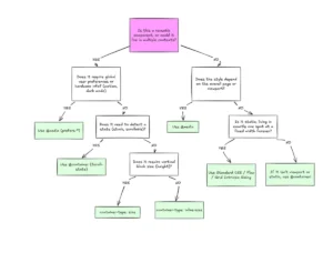
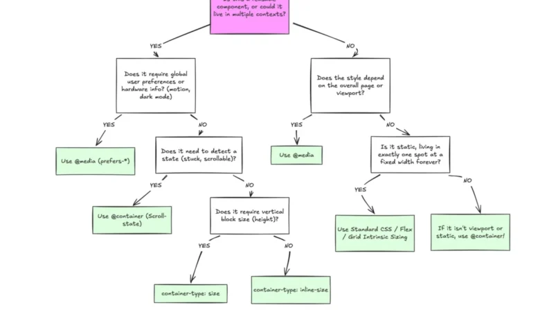
This structural shift establishes a clear separation of concerns: media queries govern macro layouts (page-level architecture, global navigation, and system preferences like dark mode), while container queries dictate micro layouts (self-contained components, widgets, and cards that must adapt dynamically to varying structural contexts).

Advanced Implementation: Fluid Typography and Flexbox Integration
Beyond basic structural adjustments, container queries enable advanced CSS techniques that were previously reliant on JavaScript or restrictive viewport units.
Responsive typography traditionally utilizes viewport-relative units such as vw or vh paired with the clamp() function. While effective for full-screen headers, these units cause scaling discrepancies when components are relocated to sidebars or restricted grid columns. Container queries introduce native relative units—such as cqi (container query inline-size)—allowing fluid typography to scale strictly in relation to the component’s immediate container rather than the browser window.
.card-title
  font-size: clamp(1rem, .5rem + 3cqi, 2rem);
Furthermore, container queries provide a CSS-native workaround for detecting internal layout state changes, such as Flexbox wrapping. Standard CSS cannot natively detect when flex items wrap onto a new line, historically forcing developers to employ JavaScript ResizeObserver APIs to monitor layout shifts. By registering a flex item as a container and pairing it with inline-size queries, developers can automate layout transitions when content wraps, eliminating the need for external scripts.
.flex-layout
  display: flex;
  flex-wrap: wrap;


.flex-item
  container-type: inline-size;
  flex: 1 1 390px;


@container (min-width: 600px)
  .card
    flex-direction: row;
    align-items: center;
Technical Caveats and Implementation Side Effects
Despite their utility, container queries introduce specific architectural constraints that developers must navigate:

- Self-Querying Limitations: An element cannot serve as its own container while simultaneously querying its own dimensions, as this creates an unresolved style dependency loop. Establishing an explicit parent-child wrapper hierarchy is mandatory.
- Layout Collapse Risks: Utilizing
container-type: sizeevaluates both block and inline dimensions, which can cause elements to collapse to a zero-pixel height if an explicit height or aspect ratio is not defined. Best practices generally favor queryinginline-sizeto prevent unintended layout destruction. - Custom Property Restrictions: Container queries currently cannot evaluate custom CSS properties (CSS variables) directly within their conditions due to potential circular dependencies in the cascade.
Broader Impact and Industry Implications
The slow adoption of container queries highlights a broader transitional phase in front-end development, moving away from document-centric design and toward component-driven architectures. As design systems scale across diverse digital products—spanning mobile applications, desktop dashboards, embedded widgets, and foldable hardware—relying solely on viewport dimensions creates fragile codebases.
The industry consensus emphasizes that container queries do not render media queries obsolete. Instead, robust modern web development requires a hybrid strategy: utilizing media queries for macro-level page scaffolding and container queries for micro-level component reusability. Bridging the knowledge gap in container query implementation remains a primary hurdle for engineering teams seeking to optimize modern, resilient web interfaces.