Usability Research Reveals Why the Caret Icon Remains the Gold Standard for Accordion Menus

The design of modern user interfaces often balances on a razor’s edge between aesthetic innovation and functional clarity. Among the most ubiquitous interface patterns on the web is the accordion menu—a vertically stacked list of headers that can be clicked to reveal or hide associated content. Despite their widespread use across e-commerce platforms, corporate websites, and digital publishing tools, accordions frequently suffer from poor implementation, particularly regarding the choice of expansion icons and navigation architecture. Recent comprehensive UX research from the Nielsen Norman Group (NN/g) sheds light on these persistent usability pitfalls, offering empirical guidance on how to optimize interface patterns, eliminate user friction, and establish safer design standards.
Main Facts and the Core Problem of UI Misinterpretation
At the heart of the NN/g investigation is a fundamental question that has vexed product designers for decades: Which icon reliably signals expansion and collapse, and how do users interpret subtle variations among carets, chevrons, arrows, and plus-minus signs?
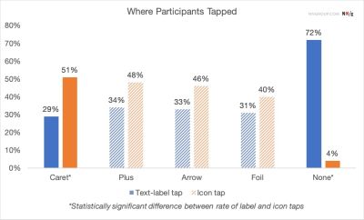
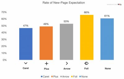
The research findings emphasize that visual signifiers dictate user expectations across the entire hit area of a menu item. When an interface element lacks an icon entirely, users overwhelmingly assume that tapping the label will immediately navigate them to a new, distinct page. Conversely, the introduction of non-standard or custom graphical icons often fails to communicate accordion functionality. Users tend to distribute their interaction clicks fairly evenly between the text label and the accompanying icon, meaning that any ambiguity in the visual signifier compromises the entire interactive region.
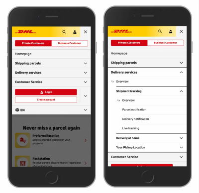
Furthermore, the data points to the profound dangers of "split menus"—patterns where a text label links directly to an independent URL while a secondary icon controls the accordion dropdown. Usability tests consistently demonstrate that split menus are harmful, frequently resulting in user error, misclicks, and frustration. When a user intends to expand a menu to view nested sub-categories but accidentally triggers a full page reload, the navigation paradigm breaks down. Instead of separating these actions, standard UX best practices now dictate that the primary menu item should control the accordion state, while direct navigation links (such as an "Overview" page) should be housed securely within the expanded drawer itself.
Chronology and Context of the Accordion Evolution
To understand how digital interfaces arrived at this crossroads, it is necessary to examine the evolution of web navigation patterns. In the early days of desktop web design, sidebars and drop-down menus relied heavily on explicit text links or native HTML <details> and <summary> elements. As responsive web design gained dominance in the early 2010s, mobile-first design systems required space-saving paradigms, catapulting the accordion menu into prominence.

During this transition, designers experimented wildly with iconography. Skeuomorphic designs favored glossy, three-dimensional arrows, while flat design revolutions popularized minimalist plus (+) and minus (-) symbols, as well as thin-stroke chevrons. However, because these icons were adopted arbitrarily without standardized guidelines, user mental models fractured. A plus sign, historically used in mathematics for addition, was co-opted in digital spaces to mean "expand," "add to cart," "zoom in," or "save for later." This semantic overloading created cognitive overhead for everyday web users, particularly in complex, multi-level directory structures where several tiers of content remained expanded simultaneously.
By the mid-2020s, empirical UX research institutions like the Nielsen Norman Group began systematically testing these assumptions through quantitative eye-tracking and task-based user studies. The resulting data provided a definitive reality check for the design community, proving that familiarity and semantic clarity must always supersede novelty in interface design.
Supporting Data and Behavioral Analysis of Icon Variants
The NN/g study evaluated several distinct icon categories, categorizing user behavior based on tap accuracy, expectation of page navigation, and cognitive load. The findings provide a granular look at how specific symbols perform in real-world environments:
-
No Icon: As established, the absence of an icon reliably signals page navigation. If a header is meant to take a user to a new URL, omitting an icon and applying a standard underline is the most foolproof method. While minimalist designers sometimes resist underlines as dated, research proves they work flawlessly because users have decades of conditioned behavior recognizing underlined text as a hyperlink.
-
Arrows and Chevrons (Right-Facing ➔ and Down-Facing 🔻): Right-facing arrows traditionally imply lateral movement or progression to a new view, whereas down-facing arrows suggest vertical disclosure. However, when used interchangeably in accordions, they frequently confuse users regarding whether clicking will trigger a page load or an inline expansion.
-
Plus (+) and Minus (-) Signs: While widely understood in isolation, plus-minus indicators suffer from contextual ambiguity. In multi-level menus where multiple accordions are open at once, a column of plus signs can visually clutter the interface and miscommunicate system state. Furthermore, users frequently mistake a plus sign for an action that adds an item to a shopping cart or bookmarks content, rather than simply revealing hidden text.
-
The Caret (Triangles Pointing Down 🔻 / Up 🔺 / Sideways ➔): Emerging as the clear victor in the empirical data, the caret is mathematically and semantically the safest choice. A downward-facing caret universally signals that content is collapsed and can be revealed downward, while rotating it upward or sideways dynamically communicates state change upon interaction. Users demonstrate the highest degree of intuitive accuracy when interacting with carets, frequently tapping directly on the icon with confidence.

Industry Implications and Real-World Applications
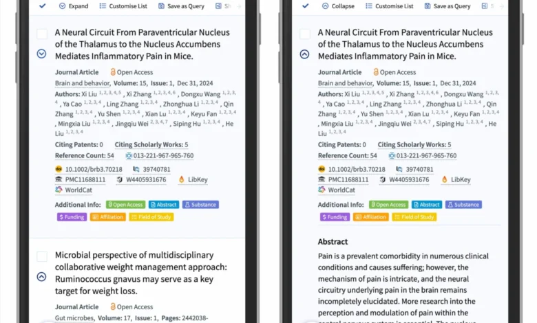
Major digital platforms and logistics giants have begun realigning their design systems to reflect these usability insights. For example, enterprise platforms like DHL and scholarly search engines like Lens.org have streamlined their mobile and desktop navigation frameworks. By stripping away redundant, decorative arrows and eliminating confusing split-button architectures, these organizations have reduced user error rates and improved accessibility for screen-reader and keyboard-only users.
From a development and design systems perspective, the implications of this research are profound. UI/UX teams are increasingly codifying strict rules within their design token libraries:
- Accordion headers must toggle state via a uniform caret icon.
- Interactive states must animate smoothly to reinforce the mental model of opening and closing.
- Direct links must be explicitly underlined to eliminate ambiguity.
- Split-menu patterns must be deprecated entirely in favor of clear, hierarchical nesting with dedicated "Overview" links inside the dropdown container.
Official Responses and Broader Industry Reactions
While user experience researchers champion these findings as a victory for functional design, the broader web development community acknowledges the ongoing tension between creative expression and utilitarian standardization. Design purists often argue that strict adherence to standard icons limits brand differentiation. However, accessibility advocates and usability experts strongly counter that navigation should never be a canvas for artistic reinvention.
"When users visit a website, they bring mental models formed by thousands of hours spent on other digital products," notes a prominent voice in the accessibility community. "If we force them to decode a novel icon system just to read a FAQ section or navigate a product catalog, we have failed in our primary duty as designers: reducing friction."
Looking Ahead: The Future of Accessible Navigation
As the digital landscape matures, the emphasis on inclusive, predictable, and accessible design continues to grow. Regulatory frameworks, such as the European Accessibility Act and updated WCAG standards, increasingly emphasize predictability in user interface components. Accordions, being interactive widgets that rely heavily on proper ARIA attributes and visual signifiers, are a primary focus of compliance audits.
Ultimately, the research reaffirms a timeless adage in engineering and design: simpler is almost always better. By relying on proven signifiers like the caret, avoiding the pitfalls of split menus, and respecting user mental models, digital architects can build cleaner, faster, and more intuitive web experiences for a global audience.