The Distortion of COVID-19 Data: How Selective Reporting Misleads the Public on Pandemic Mortality

The ongoing COVID-19 pandemic has necessitated a global reliance on data to gauge the efficacy of public health responses. As governments and health agencies track infection rates, hospitalizations, and mortality, the presentation of these statistics has become a focal point of intense political and social debate. The accuracy and clarity of data visualization are paramount in this process, as they inform public perception and policy priorities. Recently, however, prominent news organizations have faced scrutiny for their methodology in presenting COVID-19 data, with critics arguing that the omission of relevant comparative metrics can inadvertently—or intentionally—distort the reality of a nation’s performance relative to its peers.
The Axios Interview and the Context of National Comparisons
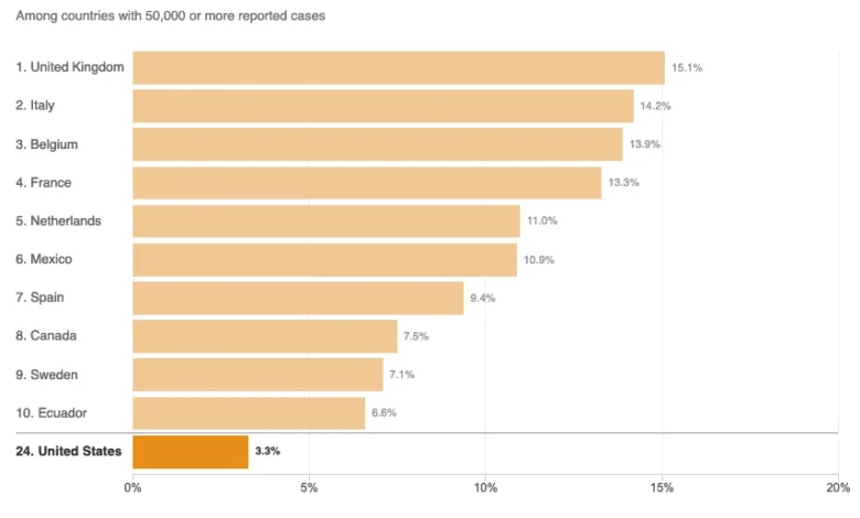
On August 3, 2020, an interview conducted by Jonathan Swan of Axios with then-President Donald Trump brought the complexities of pandemic data reporting to the forefront of national discourse. During the exchange, the President characterized the U.S. response as superior to that of other nations, specifically referencing "case fatality ratios"—the percentage of confirmed cases that result in death. When Swan shifted the focus to "deaths per capita"—a metric that adjusts for population size to show the broader impact on the citizenry—the President dismissed the utility of the metric, stating, "You can’t do that."
This exchange sparked a wider debate regarding which statistical models most accurately reflect the severity of the pandemic. While the case fatality ratio (CFR) measures the lethality of the virus among those already diagnosed, it is heavily influenced by testing capacity and the demographic profile of the infected population. Conversely, the per-capita death rate provides a snapshot of the total population’s risk, serving as a primary indicator of how effectively a country has contained the spread of the virus across its entire citizenry.
Chronology of Statistical Scrutiny
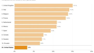
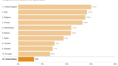
The controversy intensified on August 5, 2020, when NPR published an article titled "Charts: How the U.S. Ranks On COVID-19 Deaths Per Capita — And By Case Count." The piece aimed to provide context to the President’s claims by presenting visual comparisons of the U.S. against other nations. However, data analysts quickly noted that the article’s methodology for selecting comparison countries—specifically limiting charts to the "top 10" nations with over 50,000 cases—created a misleading narrative.
By August 2020, there were 45 nations that had reported more than 50,000 cases of COVID-19. By restricting the visual representation to only ten countries, the NPR charts failed to provide a comprehensive view of the U.S. ranking. In the case of the per-capita death chart, the exclusion of the other 35 eligible countries made it appear as though the U.S. was performing better than the vast majority of its peers, when in fact, the U.S. ranked significantly lower on the global scale of pandemic mortality management.
The Problem with "Top 10" Data Visualization
The "curse of the top 10" is a well-documented phenomenon in data journalism where analysts arbitrarily truncate datasets to fit a specific visual format. While this approach is often intended to simplify information for a general audience, it carries the inherent risk of selection bias. In the context of global health metrics, excluding relevant data points creates a "cherry-picking" effect.
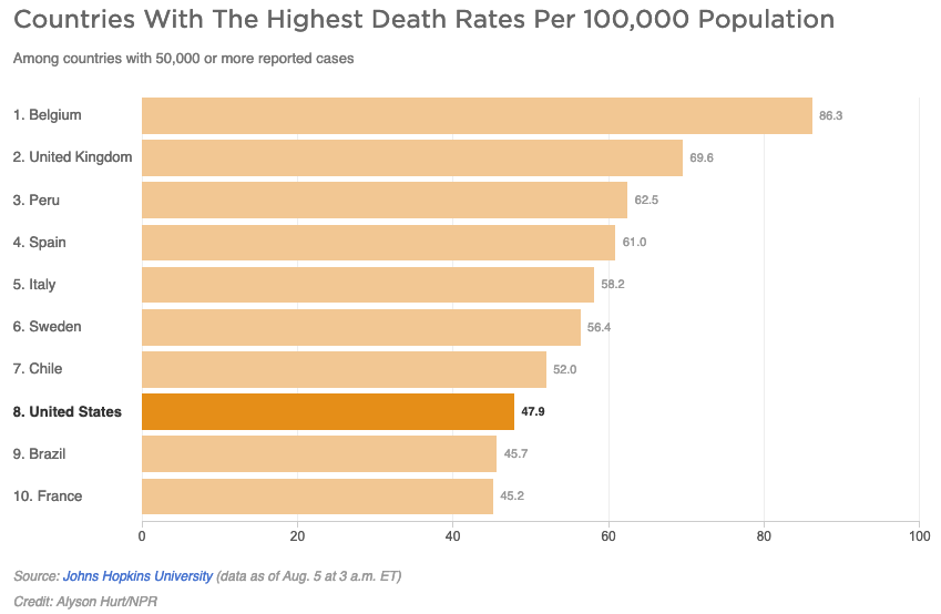
If a chart includes only a subset of countries, the resulting visual hierarchy is dictated by the inclusion criteria rather than the full reality of the data. For instance, if 45 countries meet the threshold of a significant outbreak, showing only 10 allows the audience to perceive a country as being at the "bottom" or "top" of a list based on an incomplete sample size. When applied to the COVID-19 pandemic, this technique obscures the relative success of countries that managed to maintain lower mortality rates, thereby skewing the public’s understanding of how different government interventions—such as lockdowns, contact tracing, and healthcare capacity—actually performed in practice.
Expert Perspectives on Disease Burden and Metrics
The definition of "disease burden" is central to understanding why experts often prioritize per-capita metrics over case-fatality ratios. The NPR article cited an epidemiologist from Johns Hopkins University who defined the per-capita death rate as an indicator of "overall disease burden." However, technical experts argue that this terminology requires precision.
The overall disease burden is typically defined by total volume—the sheer number of lives lost—whereas the per-capita rate represents the proportional burden relative to the population. Furthermore, in clinical epidemiology, "disease burden" often encompasses "years of life lost" (YLL) and "years lived with disability" (YLD). Because COVID-19 disproportionately impacts the elderly and those with pre-existing conditions, a nuanced analysis of mortality requires looking at age-adjusted mortality rates alongside raw per-capita figures. Simply stating that a country is doing "better" based on one metric without acknowledging these variables ignores the multifaceted nature of public health data.
Institutional Responses and Public Impact
Following the publication of the NPR charts, data scientists and media critics expressed concern that even highly reputable institutions were falling into the trap of using data as a tool for political narrative rather than objective reporting. The broader implication of this is a degradation of public trust. When news outlets present data that appears to confirm or refute a political claim by omitting contradictory evidence, the audience is left with a fragmented understanding of the crisis.
Furthermore, the "positive spin" sometimes applied to these statistics by political figures is amplified when media outlets inadvertently validate that spin through incomplete data. By not clearly identifying the U.S. ranking within the full set of 45 countries, the reporting failed to challenge the President’s assertion that the U.S. was the best in the world. Instead, it created an "even-handed" appearance that arguably served to obscure the underlying facts.
The Need for Rigorous Standards in Data Journalism
As the world continues to navigate the aftermath of the pandemic, the incident serves as a case study for the necessity of transparency in data journalism. Best practices in this field suggest:
- Inclusivity of Data: Unless the dataset is prohibitively large, all relevant entities (in this case, all countries meeting the criteria) should be included.
- Standardization: Metrics like per-capita deaths and case-fatality ratios should be presented with clear explanations of their limitations.
- Contextualization: Reporters should avoid drawing binary conclusions (e.g., "better" or "worse") without explaining the role of external variables like median age, population density, and healthcare infrastructure.
The goal of public interest journalism during a global crisis is to provide the public with the tools to understand complex events. When the presentation of data—whether through charts, graphs, or statistical analysis—is truncated or improperly framed, it risks misinforming the very people who rely on that information to make decisions about their health and safety. The case of the August 2020 reports highlights that even in the pursuit of balanced coverage, the fundamental obligation of the press remains the rigorous and exhaustive presentation of the facts. As society moves forward, the demand for higher standards in the visual communication of scientific and public health data will continue to be a cornerstone of a well-informed citizenry.
Related posts: