
Optimizing Web Visuals: A Deep Dive into Responsive Images and WordPress Performance
The digital landscape is a mosaic of devices, each presenting web content in its own unique way. One user might be viewing a website on a pristine 27-inch monitor with a high-resolution display, while another navigates the same site on a five-year-old Android phone connected via a fluctuating 4G network. If a website indiscriminately serves a static, large 1200px image to both, it creates a profoundly inefficient and frustrating experience for at least one of these users. The larger monitor user might see a slightly degraded image quality, while the mobile user faces excessive data consumption and prolonged loading times. This disparity highlights a critical challenge in modern web development, one that responsive images are specifically designed to address.
The Evolving Web: A Foundation for Responsive Design
The concept of responsive web design gained prominence in the early 2010s, notably popularized by Ethan Marcotte’s seminal article in A List Apart in 2010. This paradigm shift acknowledged the explosion of diverse screen sizes and resolutions, moving away from fixed-width layouts towards flexible, adaptive designs. At its core, responsive design aimed to deliver an optimal viewing experience across a wide range of devices, from desktops to mobile phones. However, merely adapting layouts with CSS wasn’t enough; the heavy assets, particularly images, also needed to adapt.
Prior to responsive image techniques, developers often resorted to serving the largest possible image and relying on CSS to scale it down. While visually acceptable, this approach was a significant drain on bandwidth and processing power for smaller devices. Users on mobile data plans would download megabytes of unnecessary pixel data, contributing to slow page loads, increased bounce rates, and a subpar user experience. The advent of high-density "Retina" displays further complicated matters, demanding images with twice the pixel information for crisp rendering, yet without penalizing standard-display users with oversized files.
WordPress’s Native Approach to Responsive Images: A Milestone in Accessibility
Recognizing the growing imperative for image optimization, WordPress, the world’s most popular content management system powering over 43% of all websites, integrated built-in responsive image support with version 4.4 in December 2015. This was a significant step, democratizing a complex technical challenge for millions of site owners. The core idea behind a responsive image is that it adapts not just visually via CSS scaling, but fundamentally in terms of file size and resolution, tailored to the specific device receiving it.
When an image is uploaded to the WordPress Media Library, the system automatically generates several scaled-down variants. These default sizes typically include:

- Thumbnail: A small square crop, often 150×150 pixels.
- Medium: A mid-sized version, usually around 300 pixels on the longest side.
- Medium Large: Introduced later, often 768 pixels wide.
- Large: A larger variant, typically 1024 pixels wide.
- Full: The original uploaded image size.
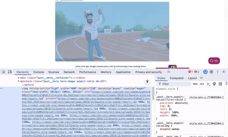
These predefined sizes serve as a pool of options from which browsers can choose. WordPress then leverages two crucial HTML attributes, srcset and sizes, to communicate these options to the browser.
The srcset attribute lists all available image variants along with their intrinsic widths (e.g., image-300x200.jpg 300w, image-768x512.jpg 768w). The w descriptor indicates the width of each image file in pixels. This provides the browser with a catalogue of image sources at different resolutions.
The sizes attribute, on the other hand, acts as a hint to the browser, describing how wide the image will actually be rendered at various viewport sizes. For example, (max-width: 600px) 100vw, (max-width: 1024px) 768px, 1024px tells the browser: "If the viewport is up to 600px wide, the image will take up 100% of the viewport width. If it’s between 601px and 1024px, the image will be 768px wide. Otherwise, it will be 1024px wide."
Armed with both srcset (available image files) and sizes (how the image will be displayed), the browser intelligently selects the most appropriate image variant. It considers the user’s viewport size, device pixel ratio, and even network conditions to fetch the most efficient image – one that is large enough to look good but not excessively large, thus conserving bandwidth. This entire markup generation process happens automatically when images are inserted through the block or classic editor, abstracting the complexity from the content creator.
Core Web Vitals: The Performance Imperative
The importance of efficient image delivery has been significantly amplified by Google’s Core Web Vitals initiative, which became a key ranking factor for search results starting in May 2021. Core Web Vitals measure real-world user experience and are comprised of three main metrics:
- Largest Contentful Paint (LCP): Measures perceived load speed, marking the point when the main content of the page is likely loaded. For image-heavy pages, the LCP element is almost invariably an image or a video poster image. Serving oversized images is one of the most direct ways to degrade LCP scores.
- First Input Delay (FID): Measures interactivity, quantifying the time from when a user first interacts with a page to the time the browser is actually able to respond to that interaction. While less directly tied to images, heavy image processing can block the main thread and impact FID.
- Cumulative Layout Shift (CLS): Measures visual stability, quantifying unexpected layout shifts of visual page content. Images that load without explicit
widthandheightattributes can cause significant CLS, as the browser reserves space for them only after they begin loading, causing surrounding content to jump.
Responsive images directly address LCP by ensuring smaller, faster-loading images are served where appropriate. By reducing the overall data transfer, they also indirectly contribute to better FID by freeing up network and processing resources. Furthermore, WordPress’s automatic inclusion of width and height attributes for media library images helps prevent CLS, provided images are inserted correctly. These metrics underscore that responsive images are no longer just a best practice but a fundamental requirement for discoverability and user satisfaction in the modern web.
Navigating the Nuances: When WordPress’s Default Falls Short

While WordPress’s native responsive image support provides a robust foundation, several edge cases and inherent limitations mean that it doesn’t always work perfectly out of the box. Understanding these nuances is crucial for truly optimized image delivery.
Theme Control over the sizes Attribute:
The sizes attribute is a crucial hint, but its accuracy heavily relies on the theme’s layout. WordPress generates a default sizes attribute based on common content area widths, but it cannot predict the exact rendered width of an image within a specific theme’s CSS. A full-width hero image, for instance, will behave very differently from a small thumbnail embedded in a sidebar. If a theme is not well-constructed or is older, it might not filter WordPress’s default sizes output to reflect the actual display widths. This can lead to browsers selecting a larger image variant than strictly necessary, negating some of the optimization benefits. Developers for high-quality themes often use the wp_calculate_image_sizes filter to ensure the sizes attribute accurately reflects the image’s layout in various breakpoints.
Legacy Themes and Missing srcset:
The responsive image features were introduced in WordPress 4.4. Websites running on themes that predate this version, or custom themes developed without explicit responsive image support, may not have the srcset and sizes attributes generated at all. A quick check involves right-clicking an image on the live site and inspecting its HTML. If only a single src attribute is present without srcset or sizes, the theme is not utilizing WordPress’s native responsive image capabilities. In such scenarios, updating the theme is the ideal solution. If that’s not feasible, specific plugins can retroactively add these crucial attributes.
Browser Behavior Inconsistencies:
Despite being a W3C specification, the implementation of srcset can vary slightly across different browsers. Most browsers strive to select the image variant closest to the actual display width and device pixel ratio. However, some might prioritize a cached version of a larger file even if a smaller, more appropriate one is available, or make different decisions based on network conditions or user preferences. This inconsistency means that the outcome of a responsive image setup might not be perfectly identical across all user agents. For this reason, srcset is best used for resolution switching (serving the same image content at different sizes). If the goal is "art direction" – showing a different crop, aspect ratio, or entirely different image composition for mobile versus desktop – the picture element offers explicit control. The <picture> element allows developers to define multiple <source> elements, each with its own media query, providing precise control over which image file is loaded under specific conditions.
Image Dimensions for Visual Stability (CLS):
As discussed with Core Web Vitals, preventing Cumulative Layout Shift (CLS) is paramount. For images, this means the browser needs to know how much space to reserve before the image file has fully loaded. WordPress automatically includes width and height attributes on <img> tags for images uploaded through the Media Library, provided they are inserted using the block editor or classic editor. However, if images are embedded manually via custom code, or if a site uses third-party image solutions that don’t adhere to this practice, explicit declaration of width and height attributes becomes critical to avoid content shifts.
Addressing High-DPI and Retina Displays
Beyond adapting to viewport width, modern web design must also account for high-DPI (Dots Per Inch) or "Retina" displays. These screens, common on premium smartphones, tablets, and laptops, pack significantly more physical pixels into the same physical space. A standard 1x image on a 2x Retina display will be upscaled by the browser, resulting in a noticeably softer or blurrier appearance compared to content rendered at native resolution.
WordPress’s default responsive image setup primarily focuses on serving images based on width (e.g., image-300w, image-768w). It does not, by default, generate or include 2x variants in the srcset for high-DPI screens. To ensure images appear crisp on Retina displays, a higher-resolution version (typically twice the pixel density of the standard version) is required.

This gap is effectively filled by dedicated plugins like Perfect Images (formerly WP Retina 2x). This plugin automatically generates 2x variants of images upon upload and seamlessly integrates them into the srcset attribute. When a high-DPI device accesses the page, the browser detects its pixel density and requests the appropriate 2x image variant, ensuring visual fidelity. However, 2x images are inherently larger in file size than their 1x counterparts. This makes efficient compression of these high-resolution variants equally important to prevent them from becoming a new source of performance bottleneck.
Beyond Core: The Indispensable Role of Optimization Plugins
While WordPress’s built-in responsive image support is a solid starting point, achieving truly stellar image performance often requires extending its capabilities with specialized plugins. Two critical areas where core WordPress leaves room for improvement are image compression and dynamic adaptive serving.
Comprehensive Image Compression:
WordPress generates multiple size variants, but it does not perform any file size compression on them. Every scaled-down variant is stored at the same quality level as the original uploaded image. This means that while a browser might fetch a smaller dimension image, that image could still be unnecessarily large in file size due to a lack of compression.
Image optimization plugins like ShortPixel Image Optimizer are designed to address this. These tools process all image variants (original, thumbnail, medium, large, and any custom sizes generated by the theme or other plugins) to significantly reduce their file sizes without noticeable loss in visual quality. They achieve this through various techniques, including:
- Lossy, Glossy, and Lossless Compression: Offering different levels of compression to balance file size reduction with image quality.
- Conversion to Modern Formats: Automatically converting images to next-gen formats like WebP or AVIF, which offer superior compression ratios compared to traditional JPEG or PNG, and serving these formats conditionally to browsers that support them.
- Metadata Stripping: Removing unnecessary EXIF data and comments from image files.
By compressing all generated image sizes, ShortPixel compounds the savings dramatically, leading to much faster page loads and reduced bandwidth consumption across the board. This is especially crucial for the larger 2x variants generated for Retina displays, which would otherwise contribute significantly to page weight.
True Adaptive Image Serving:
WordPress’s srcset and sizes approach is a static method; it creates a fixed set of image sizes on upload and provides hints to the browser. However, it cannot dynamically determine the exact pixel width of an image container at the moment a page is requested by a visitor. This often results in browsers downloading an image variant that might still be 50-150 pixels wider than the actual rendered space, leading to marginal but cumulative inefficiencies.
ShortPixel Adaptive Images takes a more advanced, dynamic approach. Instead of relying on predefined sizes, it analyzes the image container’s dimensions in real-time at the point of request. It then generates an exactly-sized version of the image and delivers it from a global Content Delivery Network (CDN). This replaces the static size guesswork with a dynamic, precise solution. Benefits include:

- Exact Sizing: Every image is delivered at the precise dimensions required, eliminating over-delivery.
- Global CDN Delivery: Images are served from the closest server to the user, significantly reducing latency and improving load times.
- Automatic WebP/AVIF Conversion: Dynamically serves modern image formats based on browser support.
- Lazy Loading Integration: Further optimizes initial page load by delaying the loading of off-screen images.
For websites where image performance is a top priority—such as e-commerce sites, photography portfolios, or news publications—ShortPixel Adaptive Images offers the most comprehensive solution for responsive and optimized image delivery, pushing performance beyond what core WordPress can achieve. It effectively eliminates the guesswork inherent in the sizes attribute and ensures every visitor receives the truly most useful and efficient version of an image for their specific context.
Broader Implications and Future Outlook
The commitment to responsive images extends beyond technical best practices; it directly impacts key business and user experience metrics.
- Search Engine Optimization (SEO): As emphasized by Core Web Vitals, faster loading times and a stable visual experience are critical ranking signals. Well-implemented responsive images contribute directly to higher LCP and better CLS scores, improving a site’s visibility in search results.
- User Experience (UX): Faster loading pages lead to lower bounce rates, higher engagement, and increased user satisfaction. Users are less likely to abandon a site that loads quickly and displays content smoothly.
- Conversion Rates: For e-commerce sites, every second saved in page load time can translate to significant increases in conversion rates. Responsive images are a fundamental component of this optimization.
- Bandwidth and Hosting Costs: By serving optimized images, websites consume less bandwidth, which can lead to reduced hosting costs and a more sustainable web presence.
Looking ahead, the evolution of image formats (e.g., AVIF gaining wider support) and advanced browser capabilities will continue to refine how responsive images are delivered. The interplay between core CMS features, theme implementations, and specialized plugins will remain crucial in harnessing these advancements for optimal web performance.
Conclusion
WordPress provides a commendable foundation for responsive images straight out of the box, thanks to its implementation of srcset and sizes since version 4.4. This automatic generation of multiple image sizes and the communication of these options to browsers is a vital step towards efficient web content delivery. However, the default setup has identifiable gaps that, if left unaddressed, leave significant optimization potential on the table.
For a truly optimized and high-performing website, several factors require attention: ensuring the theme accurately filters the sizes attribute to reflect actual layout widths, checking for srcset support in older or custom themes, generating 2x variants for high-DPI screens, and crucially, applying comprehensive compression across all image variants. None of these tasks are overly complicated once the underlying mechanics are understood. A simple right-click and "Inspect Element" on any image on your site can immediately reveal whether srcset is present and what size options WordPress is offering the browser.
In an era where diverse devices and user expectations demand instantaneous and visually perfect experiences, mastering responsive images is no longer optional. It’s a fundamental requirement for delivering a high-quality, performant, and future-proof website.


