Why Developers Are Still Misunderstanding and Underusing CSS Container Queries Despite 94 Percent Browser Support

CSS container queries represent one of the most significant paradigm shifts in modern web development, yet industry adoption remains surprisingly low. Despite reaching approximately 94 percent global browser support, a stark disconnect persists between awareness and practical implementation. While veteran and junior developers alike recognize the technological leap forward that container queries offer, many continue to treat them as mere drop-in replacements for traditional media queries. This fundamental misunderstanding limits the true potential of component-driven architecture on the modern web, leading to rigid layouts and unnecessary code complexity.
Main Facts and Current Adoption Rates
The disparity between feature availability and real-world utilization is starkly highlighted by annual developer surveys. According to data from the State of CSS survey, an impressive 86 percent of developers are fully aware of container queries. However, only 41.4 percent actively incorporate them into production environments. During presentations at industry gatherings such as SmashingConf Amsterdam, prominent web development educators like Kevin Powell have noted that adoption rates have lagged significantly behind the enthusiasm that once dominated developer wishlists.
For years, the ability for an individual UI component to adapt intelligently to the size of its immediate parent container rather than the global viewport sat at the very top of the CSS community wishlists. Yet, when the specification officially shipped and achieved near-universal browser compatibility, utilization numbers failed to match expectations. Industry analysts attribute this stagnation to a psychological barrier: because container query syntax closely mirrors that of media queries, developers naturally assume they serve the same operational logic.
Chronology and Evolution of Responsive Design
To understand why container queries are so widely misapplied, it is necessary to examine the evolution of responsive web design. The introduction of @media queries in the late 2000s revolutionized how websites adapted to different screens, shifting the paradigm from rigid desktop layouts to fluid, multi-device experiences. For over a decade, the viewport acted as the sole proxy for environmental awareness. Developers asked the browser a single question: How wide is the screen right now?

As the web transitioned toward modular, component-based frameworks like React, Vue, and Web Components, the limitations of viewport-driven design became increasingly apparent. A modular card component designed to look pristine in a wide multi-column layout could easily be dropped into a narrow sidebar on a massive 1920-pixel desktop monitor. Because the global viewport remained wide, the media query would trigger full desktop styling, forcing the card into a cramped, broken visual state inside its 300-pixel wrapper.
The modern web ecosystem features over 2,300 unique viewport sizes, rendering rigid, screen-width breakpoints increasingly obsolete. Recognizing this fragmentation, the W3C and CSS working groups advanced container queries through the specification pipeline, ultimately establishing a robust system where components look inward at available space rather than outward at the browser window.
Technical Analysis: Macro Versus Micro Layouts
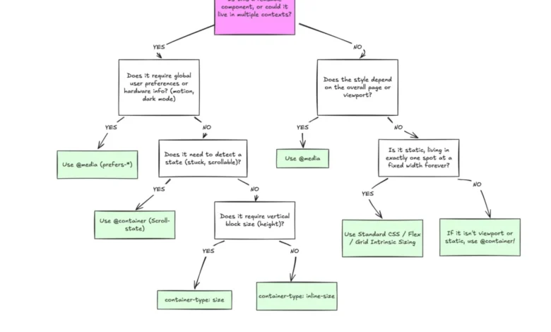
The core distinction between traditional media queries and modern container queries lies in the scope of their application: macro layout versus micro layout.
Media queries are engineered for macro layouts. They govern the overarching structure of an entire web document. This includes global page grids, headers, footers, system-level preferences such as prefers-color-scheme, and device capabilities like touch input detection. They evaluate global conditions that remain true for the entire page.
Container queries, conversely, are designed for micro layouts—the intricate components that reside within the macro architecture. By registering a parent element with container-type: inline-size, developers instruct the browser to monitor the horizontal space allocated specifically to that container.

.card-wrapper
  container-name: card;
  container-type: inline-size;


@container card (min-width: 450px)
  .card
    display: flex;
    flex-direction: row;
In this architecture, the .card component evaluates its own immediate environment. If the wrapper provides at least 450 pixels of inline space, the component shifts to a horizontal layout; otherwise, it defaults to a standard block stack. This decoupling from the viewport ensures true component portability, allowing the exact same UI element to thrive identically whether it occupies a full-width container or a constricted sidebar.
Advanced Applications: Fluid Typography and Flexbox Wrap Detection
The utility of container queries extends far beyond basic structural changes, unlocking advanced design patterns that previously required JavaScript intervention.
Traditionally, responsive typography relied heavily on viewport-relative units such as vw combined with the CSS clamp() function. While effective for page-level scaling, viewport units fail when a component changes context. If a title scales based on the global screen width, placing that component into a narrow container causes the typography to break proportions.
Container queries introduce relative container lengths, including cqi (container query inline-size) and cqb (container query block-size). By pairing these units with clamp(), typography becomes entirely self-contained:
.card-title
  font-size: clamp(1rem, .5rem + 3cqi, 2rem);
Furthermore, container queries solve long-standing layout dilemmas such as flexbox wrap detection. Historically, CSS lacked the capability to determine when flex items wrapped onto a new line, forcing developers to rely on JavaScript ResizeObserver APIs. By nesting container queries inside flex items, developers can establish native conditional styling that responds the moment an item’s layout state shifts due to spatial constraints.

Limitations and Technical Trade-offs
Despite their power, container queries introduce specific architectural constraints and side effects that developers must navigate carefully:
- Self-Referential Restrictions: An element cannot serve as its own container while simultaneously querying its own dimensions. Doing so would create an infinite calculation loop. Developers must implement an explicit parent wrapper to house the container definition separately from the queried child.
- Layout Collapse Risks: Querying a container’s block size (
container-type: size) without defining an explicit height, minimum height, or aspect ratio will cause the browser to calculate the container’s vertical dimensions as zero, effectively collapsing the layout. Best practices recommend defaulting toinline-sizeunless block-size queries are strictly required. - Custom Property Restrictions: Container queries currently cannot evaluate custom CSS properties directly within their conditions due to cascading logic complexities, preventing developers from passing dynamic breakpoint variables straight into
@containerstatements.
Broader Impact and Industry Implications
The stagnation in container query adoption highlights a broader challenge within frontend engineering: overcoming entrenched habits built over decades of viewport-centric design. Media queries are not obsolete; they remain vital tools for managing overarching document structure and global environmental states. However, treating container queries as direct substitutes for media queries misses their true architectural purpose.
As design systems become increasingly modular and component-driven, the responsibility for responsiveness must shift from the global browser window to the local container. Industry experts emphasize that achieving widespread adoption requires a fundamental shift in how engineering teams conceptualize layout logic. By aligning component behavior with available local space rather than arbitrary screen widths, developers can build more resilient, truly reusable interfaces capable of adapting gracefully to the ever-expanding fragmentation of modern digital devices.