Why Developers Are Failing to Adopt CSS Container Queries Despite Universal Browser Support

The landscape of modern web development has undergone a paradigm shift over the past decade, moving away from rigid, page-level design toward modular, component-driven architecture. Yet, the tooling used by front-end engineers to handle responsive design has lagged behind this architectural evolution. Despite achieving global browser compatibility nearing 94 percent, CSS container queries remain severely underutilized across the web development industry. This paradox highlights a persistent friction between legacy methodologies and modern engineering capabilities, forcing a critical re-evaluation of how developers approach responsive layouts in multi-device environments.
The Evolution of Responsive Design and the Limitations of Viewport Queries
To understand the current adoption crisis surrounding container queries, one must examine the historical trajectory of responsive web design. Introduced formally in 2009 via W3C media queries recommendations, @media queries revolutionized web development by allowing developers to apply CSS styles based on device characteristics, most notably the width of the browser viewport. For years, this mechanism served as the foundational pillar of adaptive design, enabling websites to gracefully scale from desktop monitors down to mobile handsets.
However, media queries possess an inherent structural limitation: they are fundamentally bound to the external browser window rather than the internal layout environment of individual components. When a developer writes a media query checking for a min-width of 1024 pixels, the browser is strictly querying the dimensions of the screen itself.
This macro-level observation creates profound vulnerabilities in modern component-based frameworks like React, Vue, and Angular, where UI elements such as cards, widgets, and navigation bars are designed to be reused across disparate contexts. A card component engineered to expand horizontally at a 1024-pixel breakpoint will function correctly when placed inside a full-width container on a desktop screen. However, if that exact same card is subsequently dropped into a 300-pixel-wide sidebar on the same 1920-pixel desktop monitor, the media query remains blissfully unaware of the spatial constraint. Because the viewport width still exceeds the threshold, the card attempts to render its expansive layout, resulting in text overflows, clipped images, and broken user interfaces.

Industry Adoption Metrics and Developer Hesitancy
Data gathered by major industry barometers, including the authoritative State of CSS survey, underscores a stark disconnect between technical availability and practical application. While roughly 86 percent of front-end developers report theoretical awareness of container queries, only 41.4 percent actively incorporate them into production environments.
This tepid uptake was a prominent point of discussion at industry gatherings such as SmashingConf Amsterdam, where prominent developer advocates highlighted the sluggish transition. Analysts attribute this hesitation primarily to conceptual inertia. Because container queries share a remarkably similar syntax to traditional media queries, many developers mistakenly assume they operate on the same foundational logic. Encountering what appears to be a redundant feature for viewport sizing, engineers frequently bypass container queries in favor of familiar, albeit flawed, legacy patterns.
Furthermore, the fragmentation of modern device ecosystems exacerbates the inadequacy of viewport-centric design. Contemporary research tracking web viewports has cataloged over 2,300 unique screen dimensions in active circulation. Attempting to manually reconcile thousands of distinct viewport sizes using global media queries is an increasingly untenable engineering strategy, reinforcing the urgent need for local, component-aware layout logic.
Technical Mechanics: How Container Queries Shift the Paradigm
Container queries fundamentally invert the traditional responsive paradigm by directing the browser to look inward rather than outward. Instead of asking how much space the entire device possesses, a container query asks a precise localized question: How much horizontal or vertical space is available to this specific component right now?
Implementing this capability requires a two-step CSS declaration. First, a parent wrapper must be designated as a containment context using the container-type property—typically set to inline-size to track horizontal boundaries—alongside an optional identifier via container-name.

.card-wrapper
  container-name: card;
  container-type: inline-size;


@container card (min-width: 450px)
  .card
    display: flex;
    flex-direction: row;
In this architecture, the .card component is entirely emancipated from the viewport. It evaluates its rendering state solely based on the dimensions of its immediate parent wrapper. If the parent container expands beyond 450 pixels, the component dynamically transitions to a horizontal layout, regardless of whether that container resides in a mobile app view or a cramped desktop sidebar.
This localized responsiveness extends naturally into typography and internal layout tracking. Utilizing dedicated container query length units—such as cqi (container query inline-size percentage)—developers can construct fluid typography systems using CSS clamp() functions that scale harmoniously with the component itself, avoiding the unpredictable scaling artifacts associated with viewport-relative vw units.
Architectural Trade-Offs and Side Effects
Despite their utility, container queries introduce specific constraints and side effects that engineers must navigate carefully. A primary architectural rule is that an element cannot query its own dimensions; doing so would create an infinite rendering loop. Consequently, implementing container queries frequently necessitates the inclusion of dedicated wrapper elements in the HTML DOM to establish a clear parent-child separation of concerns.
Additionally, utilizing the broader container-type: size property—which monitors both inline and block dimensions—can inadvertently collapse layout geometry to zero pixels if the container lacks explicit height declarations, as the browser calculates dimensions independently of the container’s children. For this reason, industry best practices heavily favor inline-size containment for standard layout adjustments.
Another notable limitation involves custom properties. At present, container queries cannot directly evaluate CSS custom variables (CSS variables) within their conditional statements. This restriction prevents developers from defining dynamic breakpoints via global variables, stemming from the cyclical nature of cascading style evaluation where a queried element could theoretically alter the very variable it is monitoring.

Macro Versus Micro Layouts: Defining the Modern CSS Strategy
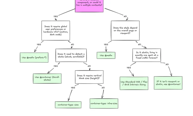
Leading front-end architects emphasize that the emergence of container queries does not render traditional media queries obsolete. Rather, the two systems serve fundamentally different layers of modern application architecture, mapping cleanly to the distinction between macro and micro layouts.
Macro layouts govern the overarching structure of an application—global page grids, header bars, window-spanning footers, system-level preferences like dark mode (prefers-color-scheme), and physical device capabilities such as touch interfaces. These structural elements remain inextricably linked to the physical viewport, making media queries the optimal tool for their control.
Micro layouts, conversely, govern the internal anatomy of reusable components—cards, widgets, form controls, and modular navigation elements. These components require context-agnostic flexibility to adapt seamlessly to any spatial allocation they encounter. By decoupling component logic from the global viewport, development teams can build more resilient, maintainable design systems that scale predictably across increasingly diverse digital surfaces.
As the web engineering community continues to modernize its tooling, bridging the adoption gap for container queries will be essential for reducing technical debt and eliminating brittle layout bugs. Moving beyond viewport-centric thinking represents a vital step toward a truly modular, content-driven future for web design.