The rapid advancement of web technologies continues to reshape the landscape of front-end development, as evidenced by the latest developments in CSS specifications, accessibility standards, and browser-native UI components. As the industry moves further into 2026, the focus has shifted from reliance on heavy JavaScript frameworks to utilizing robust, native CSS features that offer superior performance and maintainability. This shift is highlighted by the emergence of boundary-aware styling, the resolution of long-standing layout challenges such as full-bleed containers, and the ongoing debate regarding the accessibility of non-linear grid layouts. These updates represent a significant milestone in the maturity of the web platform, providing developers with the tools necessary to create highly dynamic, responsive, and inclusive digital experiences without the overhead of traditional polyfills or external libraries.
Advancements in Boundary-Aware Styling and Scroll-Driven Interactions
One of the most significant technical breakthroughs discussed in recent industry reports is the implementation of boundary-aware CSS using the view() function. Expert analysis by Preethi Sam has illuminated how this function allows elements to respond dynamically to their position within the viewport or a specific scroll container. This capability is part of the broader Scroll-Driven Animations specification, which has seen widespread adoption among major browser engines including Chromium and WebKit.
By leveraging view(), developers can trigger styles based on the visibility and intersection of elements with their boundaries. This eliminates the need for Intersection Observer API implementations in many common use cases, such as revealing navigation bars, animating scroll-progress indicators, or applying contextual styling to elements as they enter the "active" zone of the screen. The implications for performance are substantial, as offloading these calculations to the browser’s compositor thread reduces the main-thread workload, leading to smoother frame rates and improved battery life on mobile devices.
Furthermore, the discussion regarding "invisible but accessible" interactive elements has gained traction. Current methodologies often struggle to balance the visual requirement of hiding an element with the functional requirement of keeping it available for assistive technologies like screen readers. Industry experts suggest that the current binary nature of the hidden attribute is insufficient. There is a growing consensus within the World Wide Web Consortium (W3C) that a new value for the hidden attribute or a specific CSS property is required to allow elements to remain in the accessibility tree while being visually omitted from the layout, potentially standardizing the "sr-only" class pattern used by frameworks like Tailwind and Bootstrap.
The Accessibility Crisis in Grid Lanes and Masonry Layouts
The transition of "Masonry" layouts into the formalized "Grid Lanes" specification has sparked a rigorous debate within the web standards community. While the visual appeal of Pinterest-style staggered grids is undeniable, the underlying document object model (DOM) order often conflicts with the visual presentation, creating a "tabbing trap" for keyboard users and confusion for screen reader users. Dan Holloran’s recent exploration of native grid lanes highlights the technical ease with which these layouts can now be implemented, yet accessibility advocates like Manuel Matuzović warn that the current implementation is fundamentally flawed from an inclusive design perspective.
The core of the issue lies in the discrepancy between the source order and the rendered order. In a grid lanes layout, an element that appears second visually might be the tenth element in the DOM. To address this, the reading-flow property has been proposed as a CSS-native solution. This property would instruct the browser to follow the visual layout order rather than the DOM order when navigating with a keyboard or screen reader. However, as of mid-2026, this feature remains in the experimental phase and lacks comprehensive cross-browser testing. The industry remains at a crossroads, awaiting a standardized method to ensure that sophisticated layouts do not come at the cost of accessibility compliance.
Temporal Design and the Integration of Time-Based APIs
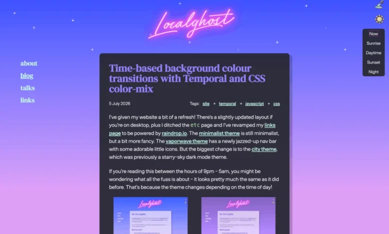
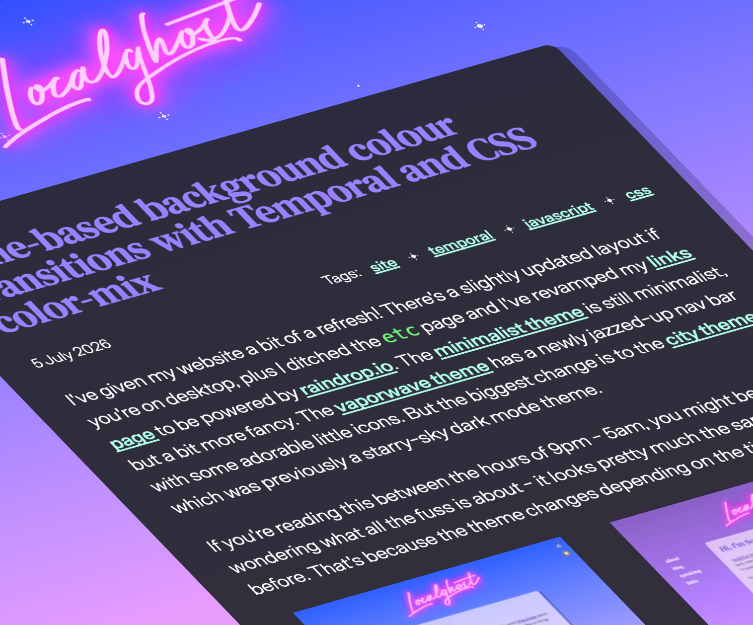
The introduction of the Temporal API has revolutionized how developers handle time and date calculations within the browser environment. Unlike the legacy Date object, which was frequently criticized for its mutable nature and lack of timezone support, the Temporal API provides a robust, immutable framework for time manipulation. Sophie Koonin recently demonstrated the practical application of this API by combining it with the CSS color-mix() function to create "time-based" website designs.
This approach allows a website’s aesthetic—such as background gradients, typography colors, and ambient lighting effects—to transition seamlessly based on the user’s local time of day. By calculating a "daylight percentage" via the Temporal API and passing that value to a CSS variable, developers can use color-mix() to blend between "Golden Hour," "Noon," and "Midnight" color palettes. This level of dynamic theming mimics the functionality found in modern operating systems, such as macOS’s dynamic wallpapers, and marks a move toward "living" design systems that adapt to the user’s environmental context.
Solving Structural Layout Challenges with Modern CSS Units
For over a decade, creating "full-bleed" sections—elements that span the entire width of the viewport while nested inside a constrained central container—required complex hacks involving negative margins and vw units. However, these methods often failed when scrollbars were present, leading to unwanted horizontal overflows. David Bushell has recently popularized a definitive fix for this issue using Container Query Units.
By utilizing cqw (container query width) units instead of vw (viewport width) units, developers can accurately calculate the available space relative to the nearest defined container. This approach ensures that breakout elements align perfectly with the edges of the screen regardless of scrollbar behavior. Additionally, the emergence of the border-shape property has introduced new possibilities for "breakout decorations," allowing developers to define complex shapes that extend beyond the traditional box model boundaries without breaking the layout flow.
The "FixCSS" Initiative and Technical Debt in Standards
As the web platform matures, the industry has become increasingly vocal about the "mistakes" embedded in early CSS specifications. The CSS Working Group maintains an official list of historical naming conventions and behaviors that would be changed if the language were rebuilt today. This has led to the creation of projects like "FixCSS" by Declan Chidlow, which aims to provide a more intuitive syntax for modern development.
One notable example is the proposed transition from border-radius to corner-radius. While border-radius is the established standard, critics argue the name is semantically inaccurate as it affects the shape of the corners rather than the border itself. While "FixCSS" currently operates as a conceptual or post-processor-driven layer, it reflects a broader desire within the community to streamline the language and reduce the cognitive load for new developers entering the field.
Enhancing Native UI Components: The Case for Customizable Selects
The "Open UI" initiative has made significant strides in making native HTML elements more customizable, with the <select> element being a primary focus. Historically, developers replaced native select menus with custom JavaScript-heavy dropdowns to achieve specific branding requirements, often sacrificing accessibility and mobile usability in the process.
Jake Archibald’s recent research into the user experience (UX) of customizable selects has highlighted the importance of "Goldilocks" sizing—ensuring that dropdown menus are neither too small for touch targets nor too large for the available viewport space. The new standards for <select> allow for the styling of the <option> elements and the dropdown container itself using standard CSS, while the browser retains the underlying logic for keyboard navigation and screen reader support. This development is expected to significantly reduce the dependency on third-party library "Select2" or "Chosen" equivalents by the end of 2026.
Google I/O 2026 and the Roadmap for the Web Platform
The latest updates from Google I/O 2026, presented by Bramus Van Damme and Una Kravets, have cataloged 35 new features that are currently entering the "Baseline" status. This status indicates that a feature is supported by all major browser engines (Chrome, Firefox, Safari, and Edge), signaling to developers that it is safe for production use without extensive fallbacks.
Key features highlighted include:
- Anchor Positioning: Allowing elements to be positioned relative to other elements on the page, simplifying the creation of tooltips and popovers.
- CSS Functions and Mixins: Bringing programming-like logic directly into stylesheets.
- Light-Dark Mode Property: A streamlined way to handle color scheme switching without complex media query nesting.
The rapid progression of these features suggests that the web platform is entering a period of unprecedented stability and capability. The focus for the remainder of the year will likely center on the refinement of these tools and the establishment of best practices for their implementation in enterprise-scale applications.
Implications for the Global Development Ecosystem
The enrichment of the CSS ecosystem and the stabilization of new web APIs have profound implications for the global tech industry. Organizations can expect a reduction in development time as native solutions replace custom-built components. Furthermore, the emphasis on accessibility within these new standards ensures that the next generation of web applications will be more inclusive by default.
As browser engines continue to converge on a unified set of high-performance features, the "browser wars" of the past have been replaced by a collaborative effort to advance the web as a first-class application platform. For developers, the challenge now lies in staying abreast of these rapid changes and unlearning the "hack-based" mentalities of previous decades in favor of a more structured, standards-compliant approach to web architecture. The "What’s Important" series continues to serve as a vital pulse-check for an industry that is evolving at an exponential rate.