The evolution of responsive web design has long been bound to the dimensions of the user’s viewport. For over a decade, developers have relied exclusively on media queries to dictate how digital interfaces adapt across varying screen sizes. However, the introduction of CSS container queries fundamentally shifted this paradigm by allowing individual components to respond dynamically to their immediate parent containers rather than the global browser window. Despite achieving robust, near-universal browser support approaching 94% globally, adoption rates among frontend engineers remain surprisingly low, pointing to a broader industry hesitation in moving away from legacy layout mentalities.
Background Context and Evolution of Responsive Web Design
When responsive web design first emerged as a dominant methodology in the early 2010s, media queries served as the definitive standard for multi-device adaptation. By interrogating the browser window via properties such as min-width and max-width, developers successfully solved the macroeconomic challenge of transforming multi-column desktop layouts into single-column mobile experiences. Yet, as web architecture evolved toward component-driven frameworks—such as React, Vue, and Angular—the limitations of viewport-based queries became increasingly apparent.
Components that were engineered to look pristine in a full-width container often collapsed, clipped, or overflowed when placed inside narrower structural elements, such as sidebars, dashboard widgets, or grid cells. Because media queries lack structural awareness of internal DOM hierarchies, they remain entirely blind to where a component actually resides. Recognizing this friction, the web development community placed component-aware styling at the absolute top of various CSS wishlists for years, culminating in the formal specification and subsequent implementation of CSS container queries across all major browser vendors.
Adoption Metrics and Industry Disconnect

Data from recent industry surveys underscores a stark paradox between feature availability and practical implementation. According to the 2025 State of CSS survey, while approximately 86% of surveyed developers report awareness of container queries, only 41.4% actively utilize them in production environments. This lag in adoption was a central topic of discussion at prominent industry gatherings, including SmashingConf Amsterdam, where web development expert Kevin Powell highlighted the surprisingly sluggish transition toward container-based responsive logic.
Industry analysts attribute this hesitation not to a lack of utility, but to visual and syntactical familiarity. Because container size queries utilize a syntax structurally identical to traditional media queries—relying on conditional blocks and sizing parameters—developers frequently misinterpret them as interchangeable tools rather than a completely distinct architectural concept. This superficial resemblance has fostered widespread misconceptions, leading many teams to default to legacy media query patterns even when building highly modular, reusable component libraries.
Macro Versus Micro Layouts: Understanding the Functional Divide
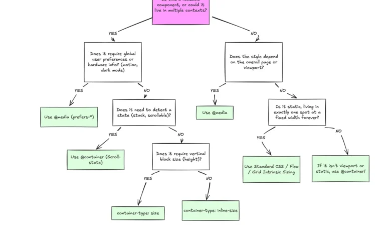
To effectively leverage container queries, development teams must draw a sharp conceptual distinction between macro layouts and micro layouts. Media queries are inherently designed for macro-level structural adjustments. They evaluate global environmental parameters, including entire viewport dimensions, system-level user preferences such as prefers-color-scheme, and hardware capabilities like touch-screen interactions.
Conversely, container queries govern micro-level layouts. They empower individual user interface elements—such as cards, form controls, and navigation widgets—to ask a fundamental question: How much space is currently allocated to this specific component within its immediate environment? By shifting layout logic from the external viewport to the internal container, developers can decouple component behavior from specific device breakpoints. This is particularly crucial in the modern digital landscape, where analytics indicate the existence of over 2,300 unique viewport sizes, rendering rigid, device-specific breakpoints mathematically unsustainable.
Advanced Implementation: Fluid Typography and Flexbox State Detection

Beyond basic dimensional shifting, container queries unlock advanced responsive capabilities that were previously unattainable using pure CSS. One significant advancement involves fluid typography. Historically, developers relied on viewport-relative units like vw to scale font sizes dynamically. However, when these components were repositioned into restricted spaces like sidebars, viewport-based typography frequently failed to scale appropriately, resulting in oversized or unreadable text.
Modern CSS addresses this by pairing container-relative length units—such as cqi (container query inline-size)—with the clamp() function. This allows typography to scale proportionally relative to the component’s container rather than the global browser window, ensuring typographic consistency regardless of placement.
Furthermore, container queries provide a CSS-only workaround for flexbox wrap detection. While CSS flexbox automatically wraps items when horizontal space is exhausted, stylesheets historically lacked a native mechanism to detect when a wrap event occurred, forcing developers to rely on JavaScript-based ResizeObserver APIs. By registering a flex item as a container, developers can successfully trigger style modifications precisely when the container reaches specific dimensional thresholds, automating complex multi-state component transitions without external script overhead.
Side Effects, Limitations, and Architectural Caveats
Despite their robust utility, container queries introduce specific architectural constraints that developers must navigate. Chief among these is the strict prohibition against self-querying. A container cannot evaluate its own dimensions to alter its own styles, as this creates an infinite computational loop. Consequently, implementing container queries often requires introducing explicit wrapper elements in the DOM markup to establish a clear parent-child relationship between the querying container and the targeted child component.
Additionally, querying a container’s block-size (vertical dimensions) without explicit height declarations can cause layout collapses, forcing developers to default to inline-size queries unless vertical measurements are strictly defined. Container queries also currently lack the ability to accept CSS custom properties (variables) directly within their conditions, primarily due to the complex cascading nature of variables down the DOM tree.

Strategic Implications for Modern Frontend Architecture
Industry consensus increasingly suggests that container queries are not intended to completely replace media queries, but rather to complement them in a dual-layer responsive strategy. Standard engineering guidelines recommend reserving media queries for overarching page structures, global navigation systems, and major layout grids, while deploying container queries for modular, reusable components that exist across multiple contexts.
As web applications continue to prioritize component reusability and design system modularity, the adoption of container queries represents a maturation of CSS as a layout language. By aligning layout logic directly with content availability rather than arbitrary device dimensions, developers can build more resilient, adaptable user interfaces capable of withstanding the extreme fragmentation of modern screen sizes.