Misleading Data Representation in COVID-19 Reporting: A Critique of NPR’s Comparative Visualizations

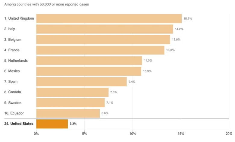
The global response to the COVID-19 pandemic has been shaped significantly by the interpretation of complex datasets, making the clarity and accuracy of news reporting a matter of vital public interest. Throughout 2020, as nations grappled with varying infection rates and mortality figures, the role of media outlets in synthesizing this information became paramount. However, even established journalistic institutions faced scrutiny for how they visualized data. A notable instance occurred in August 2020, when National Public Radio (NPR) published an analysis of United States mortality rates that critics argued utilized misleading chart structures, potentially obscuring the true standing of the U.S. relative to the rest of the world. The article, titled "Charts: How the U.S. Ranks On COVID-19 Deaths Per Capita – And By Case Count," authored by Jessica Craig and published on August 5, 2020, serves as a case study in the challenges of pandemic data journalism and the risks associated with data omission.
The Catalyst: The Axios Interview and the Statistical Debate
The impetus for the NPR report was a high-profile interview between then-President Donald Trump and Axios reporter Jonathan Swan, which aired on HBO on August 3, 2020. During the exchange, a sharp disagreement arose regarding the metrics used to evaluate the success of the U.S. pandemic response. President Trump presented charts focusing on the "case fatality ratio" (CFR)—the proportion of deaths among confirmed COVID-19 cases—to argue that the U.S. was performing better than almost any other nation.
In contrast, Swan pointed to "deaths per capita," which measures the number of deaths relative to the total population of the country. Swan argued that the per capita rate provided a more accurate reflection of the virus’s impact on the American public. The President’s dismissal of the per capita metric—famously stating, "You can’t do that"—sparked a nationwide debate among epidemiologists and journalists. While both metrics are mathematically valid, they provide different insights: CFR often reflects the quality of clinical care and the breadth of testing, while per capita mortality reflects the success of public health measures in preventing the spread of the virus to the general population.
Chronology of Data Reporting (August 2020)
To understand the context of the NPR critique, a timeline of the data landscape in early August 2020 is essential:
- August 3, 2020: The Axios interview airs, highlighting the tension between different mortality metrics. At this time, the U.S. had surpassed 150,000 confirmed COVID-19 deaths.
- August 4, 2020: Major news outlets begin fact-checking the President’s claims, with many noting that while the U.S. CFR was improving due to increased testing, its per capita death rate remained among the highest in the world.
- August 5, 2020: NPR publishes the article in question, intending to provide a visual comparison of how the U.S. ranked against other nations using both the CFR and per capita metrics.
- August 5–10, 2020: Data analysts and visualization experts begin to critique the NPR charts, specifically the decision to limit the comparison to only ten countries.
The "Top 10" Visualization Critique
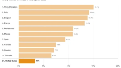
The primary criticism leveled against the NPR report concerns its use of "Top 10" charts. By arbitrarily limiting the visualization to a small subset of countries, the charts arguably created a distorted perception of the U.S. position.
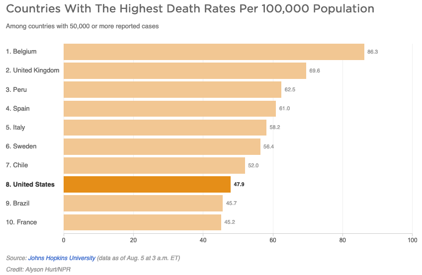
In the first chart, which displayed deaths per capita for countries with 50,000 or more reported cases, the U.S. appeared to be performing relatively well, with only a few countries appearing "worse" in that specific visual window. However, as of August 5, 2020, there were 45 countries globally that had reported more than 50,000 cases. Statistical analysis of the full dataset revealed that 37 out of those 44 other countries actually had lower per capita death rates than the United States. By selecting only ten countries for the graphic, the visualization omitted the vast majority of nations that were managing the pandemic more effectively, thereby shifting the U.S. from the bottom quartile of performers to a seemingly "middle-of-the-pack" position.
The second chart addressed the case fatality ratio. In this visualization, the U.S. appeared at the bottom of the list, which in this context indicated a lower (and therefore better) ratio. While the U.S. did indeed have a lower CFR than many European nations at that time—partially due to a younger demographic of infected individuals and more aggressive testing protocols—the "Top 10" format again failed to show that the U.S. was not the global leader in this category. When all 45 countries with 50,000+ cases were factored in, the U.S. occupied a median position rather than an elite one.
Misinterpretation of Epidemiological Terms
Beyond the visual data, the NPR article faced criticism for its explanation of "disease burden." The report quoted Justin Lessler, an associate professor of epidemiology at Johns Hopkins University, stating that the per capita death rate is an indication of the "overall disease burden."
However, technical critics pointed out two primary issues with this framing. First, per capita death rates indicate the proportional burden relative to population size, whereas the overall burden is typically represented by total case counts and total deaths. Second, the article provided a technical definition of "disease burden" as the "impact of a particular disease in terms of years of life lost and years lived with disability" (often measured in DALYs—Disability-Adjusted Life Years).
Epidemiologists argue that per capita death rates alone cannot determine the DALYs, as the latter requires data on the age of the deceased and the long-term health impacts on survivors (often referred to as "Long COVID"). By conflating these terms, the reporting risked oversimplifying the metrics used by scientists to evaluate the long-term societal impact of the virus.
Supporting Data: The Global Context in August 2020
To provide a more comprehensive view than the "Top 10" charts offered, it is necessary to look at the broader data from the Johns Hopkins University Coronavirus Resource Center available at that time.
In early August 2020, the U.S. per capita death rate was approximately 48 deaths per 100,000 people. While this was lower than the rates in the United Kingdom (69 per 100,000), Spain (61 per 100,000), and Italy (58 per 100,000), it was significantly higher than in many other developed and developing nations. For example, Germany’s rate was approximately 11 per 100,000, and Canada’s was 24 per 100,000. In the Asia-Pacific region, countries like South Korea and Japan maintained rates well below 2 per 100,000.
By excluding these lower-rate countries from the "50,000+ cases" comparison, the NPR charts focused exclusively on the hardest-hit nations, which analysts argue provided an overly generous context for the U.S. performance.
Implications for Media Literacy and Data Journalism
The critique of the NPR article highlights a broader issue in data journalism: the power of "framing." When news organizations choose which data points to include and which to omit, they implicitly guide the reader toward a specific conclusion. In the case of the 2020 pandemic, where public trust in institutions was already polarized, the need for transparent and exhaustive data representation was higher than ever.
Data visualization experts suggest that to avoid the "curse of the top 10," journalists should:
- Show the Full Distribution: Use scatter plots or comprehensive bar charts that include all relevant data points within a defined category.
- Provide Contextual Benchmarks: Include the global average or the median of a specific peer group (such as G7 or OECD nations) to provide a baseline for comparison.
- Explain Metric Limitations: Clearly state what a metric (like CFR) does and does not represent, particularly regarding how it is influenced by testing rates and demographic shifts.
Conclusion
The controversy surrounding the August 2020 reporting on COVID-19 mortality rates serves as a reminder that data is not a neutral entity; its presentation is a choice that carries significant weight. While NPR is widely regarded as a reliable source of information, the decision to use truncated charts in the wake of the Axios interview was seen by some as a failure to provide the full scope of the U.S. standing in the global pandemic.
As the world continues to navigate public health crises, the lessons from 2020 remain relevant. For information to be truly useful, it must be presented not just accurately, but comprehensively. Avoiding arbitrary limits on data and ensuring technical terms are used with precision are essential steps in maintaining the integrity of science communication and ensuring the public is equipped with the facts necessary to understand the world around them.
Related posts: