
The 2026 English Local Elections: Scenario Modelling Reveals Uncertainty Outweighs Predicted Shocks
A groundbreaking analysis of potential outcomes for the 2026 English local elections has revealed a surprising conclusion: even the most aggressive hypothetical scenarios show shifts that are dwarfed by the inherent uncertainty derived from historical forecasting errors. Across 64 English authorities and six distinct future scenarios, the strongest modelled shock accounted for only 13% of the median uncertainty band. In simpler terms, the predicted movements in election results based on specific assumptions were less impactful than the historical fluctuations the model has already demonstrated in past elections. This finding challenges conventional expectations of scenario analysis, suggesting that the focus should shift from definitive predictions to understanding the boundaries of possibility.
This extensive project, the second installment of a larger initiative examining English local electoral data, builds upon previous work that corrected a significant data normalization bug. The initial phase identified and rectified an error that had reversed the headline findings of an earlier report. This corrected baseline then served as the foundation for the current investigation, which pivots to address a new, critical question: given the measured historical volatility, which 2026 scenarios are truly worth modelling, and how should these scenarios be interpreted when the projected uncertainty is wider than the potential shocks themselves?
Unpacking the 2026 Electoral Landscape: What Was Modelled
The upcoming 2026 English local elections are slated for Thursday, May 7, 2026. This analysis focuses on 64 active authorities scheduled to hold elections on that day, encompassing 32 London boroughs, 27 metropolitan boroughs, and five authorities in West Yorkshire. To explore potential future outcomes, six distinct scenarios were developed, each applying different assumptions to the same historical baseline data. For each scenario and authority combination, the model computed four key metrics: volatility_score, delta_fi (a measure of party fragmentation), swing_concentration (how localized or widespread electoral swings are), and turnout_delta (changes in voter turnout). The resulting model generated 1,536 output rows, each providing not only a point estimate but also calibrated P10 (10th percentile), P50 (median), and P90 (90th percentile) values derived from 2,000 draws of the empirical error distribution.
The six scenarios modelled are as follows:
- S0: The Baseline Scenario: This scenario posits no new swing is applied, serving as a control to understand historical uncertainty only.
- S1: Continuation of Challenger Patterns: This scenario assumes that the challenger party patterns observed between 2018 and 2022 will continue.
- S2: Partial Recovery of Major Parties: This scenario models a situation where major parties experience a partial recovery of their lost electoral share.
- S3: Aggressive Challenger Surge: This is a stress test scenario, projecting a significant surge for challenger parties, specifically a +4 percentage point increase.
- S4: Deprivation-Linked Turnout Rise: This scenario explores the potential impact of increased turnout in more deprived areas, assuming a +3 percentage point rise in turnout in Index of Multiple Deprivation (IMD) deciles 1-3.
- S5: London Volatility Capped by History: This scenario introduces an upper-tail cap on London’s volatility score, based on historical data.
Each scenario represents a controlled perturbation of the baseline, with labels describing the underlying assumptions rather than guaranteed outcomes. The project’s findings are presented through an interactive dashboard on Tableau Public, allowing for deeper exploration of the data.
Two crucial definitions underpin this analysis: scenario shock refers to the deviation of a scenario’s point estimate from the baseline, while uncertainty width is defined as the interval between the P10 and P90 values, calibrated from historical forecast error. The headline figure of 13% represents the scenario shock divided by this uncertainty width.
A Novel Approach to Uncertainty: Backtesting Errors as an Empirical Distribution
Traditionally, backtests in data science serve as a pass/fail mechanism, assessing whether a model’s predictions align with actual past outcomes. While this approach validates the model’s accuracy, it often overlooks the valuable information contained within the errors themselves. This project adopts a second, more nuanced use of backtests: treating the residuals – the differences between predicted and actual results – as an empirical distribution of uncertainty.

By analyzing how a model has been wrong in the past – in terms of direction, magnitude, and spread – it’s possible to construct a more realistic picture of future uncertainty. This allows predictive bands to move beyond theoretical assumptions about error behavior and instead be bootstrapped from observed historical performance. In this model, the empirical sample for future uncertainty bands is drawn from the historical errors of the 2014-2018 training window and the 2018-2022 backtest period. Essentially, the model aims to determine what magnitude of change would be considered genuinely unusual when compared to its own historical noise.
Two key design choices shape this calibration process. Firstly, errors are pooled at the tier level (London, Metropolitan, West Yorkshire) rather than at the individual borough level. Individual boroughs typically have too few historical observations to reliably characterize a residual distribution. Pooling at the tier level maintains a sufficiently large sample size while preserving the distinct historical behaviors of different geographical areas. Secondly, errors are mean-centered before sampling. This critical step disentangles historical bias from the dispersion of uncertainty. Without mean-centering, the P50 of an uncertainty band could be skewed by the model’s average historical error, conflating its track record of being slightly off with the true dispersion of outcomes. After centering, the band accurately reflects uncertainty around the scenario assumption, independent of the model’s systemic bias.
It is important to note that while mean-centering removes average historical bias, it does not guarantee that the bootstrap median will precisely equal the scenario’s point estimate. In cases where residual pools are skewed or bounded (such as the swing_concentration metric, which has a lower bound of 1.0), the P50 can still deviate slightly from the assumption. Reporting P10, P50, and P90 separately, rather than relying on mean and standard deviation, helps to preserve the visibility of this asymmetry. The use of 2,000 draws ensures stable percentile estimates while keeping the overall output manageable for analysis.
The core data science takeaway from this methodology is profound: backtest errors are not merely a measure of past performance; they are a vital resource for calibrating future uncertainty, providing a more grounded and empirically derived understanding of potential deviations.
The Striking Result: Scenario Shocks Eclipsed by Uncertainty
The analysis yields three central figures that encapsulate its primary finding:
- 13%: The maximum scenario shock as a percentage of the median uncertainty band width.
- ~1/8: The rough approximation of how much the strongest shock moves the central estimate relative to historical noise.
- Noise Dominance: The historical noise within the model’s predictions is demonstrably wider than the projected impacts of even the most aggressive scenarios.
Across all 64 authorities and the three most active scenarios (S1, S2, and S3), the point estimate for each scenario consistently falls within the calibrated uncertainty band. This indicates that the proposed shocks are less impactful than the inherent variability the model has already exhibited in previous electoral cycles.
This outcome, while perhaps counterintuitive for a traditional forecasting exercise, is precisely the point of this scenario analysis. The goal is not to pinpoint exact future results but to understand the range of plausible outcomes and the significance of different assumptions within that range.
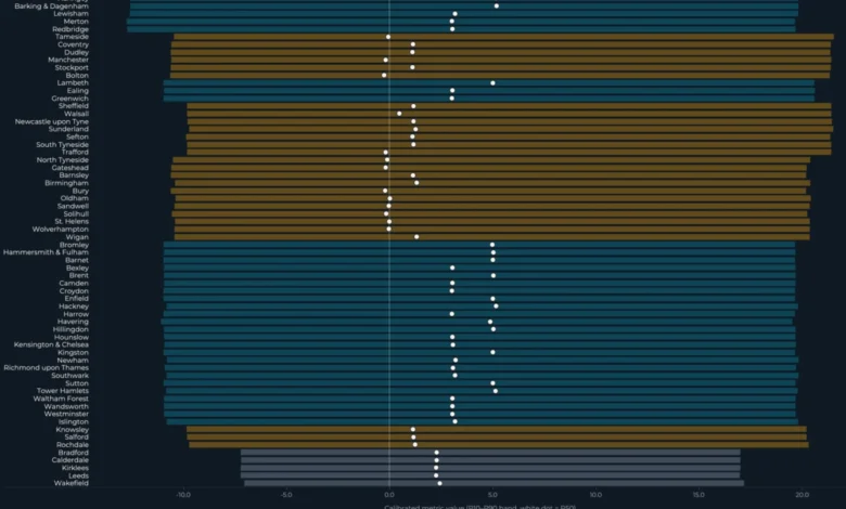
Figure 1: Interval Bands visually represents this finding. Each horizontal bar denotes an authority’s calibrated uncertainty interval (P10-P90), with the white dot indicating the calibrated median (P50). The inset clearly shows the scenario shocks as a percentage of the median band width, underscoring the dominance of uncertainty. The colors of the bars represent geographic tiers: teal for London, amber for Metropolitan boroughs, and slate for West Yorkshire.

The chart demonstrates that across the 64 authorities, the point estimate of each scenario nearly always resides within its respective uncertainty band. This reinforces the central finding: the impact of the modelled scenario shocks is less significant than the historical variability the model has already captured.
This echoes previous findings from Part 1 of the project, which established a statistically null correlation (r = -0.12, p = 0.35) between turnout change and volatility. The current analysis extends this pattern by revealing that scenario shocks are similarly overshadowed by the uncertainty surrounding them. The overarching lesson is that when the magnitude of a potential effect is comparable to or smaller than the surrounding noise, attempting to rank these effects can lead to a false sense of precision. The critical determinant of whether a result should be interpreted as a definitive signal or simply as context lies in the comparison of the effect size against the uncertainty width.
The dashboard, therefore, does not declare that "S3 wins." Instead, it highlights that S3 represents the scenario that most significantly perturbs the central estimate while still remaining comfortably within broad empirical uncertainty bounds. The term "wins" implies a definitive model choice between scenarios, which this analysis deliberately avoids. Instead, it quantifies how much one scenario might shift the central estimate relative to others, acknowledging that the uncertainty bands remain sufficiently wide to absorb these differences.
The data science takeaway here is crucial: always compare effect sizes to uncertainty width. A scenario shock that appears substantial in isolation can be rendered relatively small when measured against the historical error distribution.
Navigating the Dashboard: Geographic Patterns and Ranking Complexities
To better interpret the headline finding, the analysis presents two distinct views: a geographic map and a ranked list of authorities.
The map view visualizes the uncertainty footprint for a single scenario at a time. Here, color encodes the P50 (median) under the selected scenario, while the size of the marker represents the width of the uncertainty interval. Intriguingly, the widest uncertainty bands are not confined to London. Metropolitan boroughs in the North East, North West, and West Yorkshire exhibit interval widths comparable to the most concentrated clusters in London, suggesting that uncertainty is a widespread phenomenon across different types of authorities.
The rankings view makes the comparison between effect size and uncertainty particularly stark. Each row in this view displays three elements: the uncertainty bar (P10-P90), the median (P50) indicated by a white dot, and the scenario’s point estimate represented by an amber ring. In the majority of cases, the amber ring sits firmly within the uncertainty bar, underscoring that the scenario shock remains smaller than the historical uncertainty, even for authorities ranked highest.
When the rankings are sorted by P50 or scenario shock, the order of authorities may shift. However, the amber rings consistently remain within the bars, a visual testament to the pervasive influence of historical uncertainty. This highlights a critical aspect of reporting uncertain estimates: intervals must be presented alongside rankings. A ranked list without accompanying uncertainty bands can foster a false sense of precision, leading readers to believe the model is confident about the precise ordering of entities. When, as is the case here, the intervals overlap significantly across all levels of ranking, this perceived confidence is demonstrably unwarranted.

Two Asymmetric Scenarios: Design Lessons for Broader Application
Among the six modelled scenarios, two – S4 and S5 – exhibit distinct characteristics that offer valuable design lessons extending beyond the context of election modelling. Unlike S1, S2, and S3, which operate on a vote-share perturbation logic, S4 and S5 explore different mechanisms.
S4: The Power of Isolating a Single Mechanism
Scenario S4 probes a hypothesis prevalent in UK turnout literature: that elections in more deprived areas might experience shifts in voter turnout when local issues gain prominence. It applies a +3 percentage point turnout shock to authorities falling within the bottom three deciles (1-3) of the Index of Multiple Deprivation (IMD 2019). This shock affects 41 out of the 64 active authorities, with a notable concentration among Metropolitan and West Yorkshire authorities compared to London boroughs.
Crucially, the vote-share metrics (fragmentation, volatility, and swing concentration) remain unchanged from S0 under S4. This deliberate design choice – isolating turnout as the sole perturbation channel – makes the assumption directly falsifiable. If actual 2026 turnout shifts in IMD-1-to-3 authorities do not align with the projected +3pp range, the specific assumption regarding turnout fails without compromising the integrity of the vote-share analysis. In contrast, a scenario that simultaneously perturbs multiple mechanisms becomes significantly harder to diagnose if reality deviates from its projections, as it becomes unclear which assumption was responsible for the discrepancy.
S5: The Value of Documented Guardrails, Even When Inactive
Scenario S5 introduces a safeguard by capping the upper tail of London’s volatility_score at 39.45. This cap is derived from the empirical 90th percentile of historical London borough volatility observed across training and backtest periods. The cap is one-sided, exclusively applies to London, and constrains only the P90.
In the frozen model run, the maximum London S5 P90 was recorded at 16.70, which is only 42% of the cap, leaving a substantial 22.75 units of headroom. This means the cap did not bind; no authority exceeded the historical upper limit. Despite being inactive, S5 serves as a valuable guardrail. It demonstrates that the analyst considered a specific failure mode (excessive London volatility), parameterized a constraint based on historical data, and formally documented that this constraint was not activated. Removing the cap from documentation simply because it did not bind would erase the analytical decision-making process. The value lies in its inclusion, showcasing the consideration of potential extreme outcomes and the data-driven basis for the constraint.
Reproducibility and Acknowledged Limitations
The integrity of this analysis is underpinned by its commitment to reproducibility. The model is frozen, seeded, and hashed, ensuring that it can be precisely replicated from its repository. The src/civic_lens/scenario_model.py script, when run against the locked commit, yields identical outputs. This meticulous provenance is crucial for building trust in the findings.
Figure 4: Provenance illustrates this commitment, detailing the frozen date, model SHA, output hash, and random number generator (RNG) seed. The report of zero validation failures, zero ordering violations, and zero small-pool events further attests to the model’s robustness. The system is configured for 2,000 draws per scenario, per authority, and per metric, ensuring stable statistical estimates.
A significant acknowledged limitation pertains to the training window predating the substantial expansion of Reform UK in 2025-2026. Consequently, the model may potentially understate right-wing challenger volatility if Reform UK’s behavior at scale differs significantly from that of prior insurgent parties included in the historical data.

All underlying data sources are openly licensed, including election results from the DCLEAPIL v1.0 dataset (Leman 2025, CC BY-SA 4.0), turnout and 2022 cross-checks from the Commons Library local elections dataset (Open Parliament Licence v3.0), and deprivation and geography data from ONS / MHCLG (OGL v3). The project’s pipeline code, available on GitHub under the MIT license, ensures transparency and allows for derivative works with appropriate attribution and adherence to upstream licenses.
The data science takeaway regarding reproducibility is clear: a model’s trustworthiness is enhanced by its frozen, hashed, and reproducible outputs. Provenance is not an afterthought but an integral part of the analysis, and limitations should be as visible as the headline findings.
What Scenario Analysis Teaches Us Beyond Elections
The transferable skill derived from this project transcends the specific domain of election modelling. It lies in the construction of scenario systems where assumptions are transparent, uncertainty is rigorously calibrated against historical error, and effect sizes are consistently reported alongside the noise that invariably surrounds them. This pattern of analysis is applicable across diverse fields, including demand forecasting under price-change scenarios, public health policy stress testing, and risk modelling where regulatory shocks may be dwarfed by realized market volatility. The fundamental error to avoid is ranking scenarios without simultaneously presenting the uncertainty associated with them, a practice that inevitably leads to the creation of false precision.
The model presented here does not offer a definitive prediction of what will occur in May 2026. Instead, it identifies what outcomes would be considered surprising relative to the calibrated uncertainty. The analysis points to three key areas to monitor on election night and in the subsequent days:
- Magnitude of Volatility: Observing whether the
volatility_scorein specific authorities exceeds the P90 of its uncertainty band. - Party Fragmentation: Assessing if the
delta_fimetric for any authority surpasses its P90 uncertainty band. - Swing Concentration: Noting if the
swing_concentrationmetric for any authority exceeds its P90 uncertainty band.
The Post-Election Analysis: An Accuracy Audit
With the model now frozen, its hashes, RNG seed, and code commit remain unchanged until the election results are known. This stability ensures that the calibrated bands presented today will be the same bands against which the actual 2026 borough-level results will be tested.
The third installment of this series will provide a public accuracy audit, directly comparing the frozen scenario outputs against the realized election outcomes. This audit will report on coverage rates (i.e., whether the P10-P90 interval contained the actual result), mean absolute error, ranking quality, and any systematic misses. The acknowledged methodological caveat regarding Reform UK’s potential impact will be a key focus, serving as a critical test of the model’s predictive bands.
This commitment to a post-election audit is precisely what the freeze enables. The "three things to watch" outlined above are not rhetorical suggestions but concrete falsification criteria for an uncertainty model published before the data it purports to predict has materialized.
Ultimately, the most honest result from such an analysis is not a prediction but a clear warning about the limits of precision. While the modelled scenarios do shift the envelope of potential outcomes, the pervasive influence of historical uncertainty remains wider than the projected shocks.

For data scientists and analysts, this project offers a vital lesson: scenario analysis is most valuable when it deliberately resists the temptation to become a forecast, instead focusing on illuminating the landscape of possibility and the inherent uncertainties within it.
The full interactive dashboard is accessible on Tableau Public, and the project’s pipeline, scenario model code, calculated fields, and Tableau build guide are available as open-source resources on GitHub.
Obinna Iheanachor, the author of this analysis, is a Senior AI/Data Engineer and the founder of Wisabi Analytics, a UK-based consultancy specializing in data engineering and AI. He actively shares insights on production AI systems, data pipelines, and applied analytics through his X handle (@DataSenseiObi) and the Wisabi Analytics YouTube channel. Civic Lens is an open-source political data project hosted on GitHub.


