The UX Crisis in Mental Health: Why Trending Design Patterns are Failing Users in Distress

The digital mental health industry is currently navigating a severe and measurable engagement crisis, characterized by a staggering 95% abandonment rate among users within the first 30 days of installation. While the global mobile health (mHealth) market continues to expand, data indicates that the median 30-day retention rate for mental health applications has plummeted to just 3.3%. Even market leaders and "unicorns" in the wellness space are not immune, frequently losing up to 50% of their active user base within the first ten days of engagement. This collapse in retention is increasingly being attributed to a fundamental misalignment between modern User Interface (UI) trends and the specific cognitive needs of individuals experiencing psychological distress.

Research into user behavior suggests that many developers have prioritized visual innovation and "trend-chasing" at the expense of therapeutic utility. Kat Homan, a prominent figure in the design community, has introduced an evaluation framework aimed at helping designers determine whether visual and interaction patterns support or undermine the unique goals of mental health experiences. The core of the issue lies in a conflict of purpose: while mainstream UI trends are designed to capture attention and signal cutting-edge innovation, mental health applications must prioritize the reduction of cognitive strain, the fostering of trust, and the provision of a digital refuge.

The Chronology of the mHealth Retention Crisis
The evolution of mental health applications has moved through several distinct phases over the last two decades, each bringing new design challenges.

- The Digitization Phase (2010–2014): Early apps focused primarily on digitizing traditional therapy tools, such as mood journals and Cognitive Behavioral Therapy (CBT) worksheets. These were often utilitarian and lacked visual polish but maintained high functional clarity.
- The Wellness Boom (2015–2019): Following the success of platforms like Headspace and Calm, the industry shifted toward "lifestyle" aesthetics. This era introduced high-production-value illustrations and gamified elements to make mental health care feel less clinical.
- The Innovation Paradox (2020–Present): Triggered by the global pandemic, a surge in new mental health startups led to a "Dribbblisation" of the sector. Designers began adopting high-contrast Neo-brutalism, abstract iconography, and gesture-heavy navigation to stand out in a crowded market. However, this was the period where retention data began to show a sharp decline, as the "distressed user" was often forgotten in the pursuit of aesthetic awards.
Supporting Data: The High Cost of Cognitive Overload
Clinical research into the "distressed user" state reveals that individuals dealing with anxiety, depression, or burnout often suffer from reduced executive function. This means that tasks requiring decision-making, memory, or complex navigation become significantly more difficult. According to studies published in the Journal of Medical Internet Research (JMIR), even minor points of "cognitive friction"—such as an unlabeled icon or a non-standard swipe gesture—can trigger a "disengagement response" in a vulnerable user.

Data from app-store evidence and competitive product audits suggest that apps utilizing simple, linear interfaces see a 15–20% higher retention rate than those utilizing multi-layered dashboards. Furthermore, accessibility is no longer a peripheral concern; the World Health Organization (WHO) notes that over one billion people globally live with a mental disorder. This population disproportionately includes individuals with visual, motor, or cognitive impairments, making adherence to Web Content Accessibility Guidelines (WCAG) 2.2 a functional necessity rather than a design choice.

The Five Fronts of Design Conflict
The tension between trend-driven design and therapeutic usability manifests across five critical areas. Each area represents a point where a design decision can either facilitate healing or create a barrier to care.

1. Cognitive Friction and Navigation
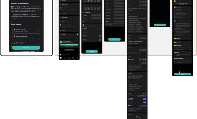
Modern trends often favor "minimalism" through hidden menus and gesture-only navigation. While these patterns look sleek, they require the user to "guess" rather than "recognize." For a user in the midst of a panic attack or a depressive episode, having to solve a navigation puzzle is an insurmountable barrier. Apps like Nonori have addressed this by utilizing linear, one-step-at-a-time flows that remove the need for the user to decide what to do next. Conversely, comprehensive tracking apps like Bearable offer immense power but risk overwhelming low-capacity users with dense, data-heavy dashboards.

2. Emotional Mismatch and Visual Tone
There is a growing body of evidence suggesting that users in distress prefer subtle, grounded aesthetics over bright, "cheerful" palettes. High-saturation colors and "happy" animations can feel dismissive or even physically uncomfortable to someone in a low mood. Emotional alignment occurs when the visual tone matches the user’s state. Platforms like Bear Room have successfully implemented "cozy" designs—using muted, earthy tones and soft greens—to create a sense of safety. A mismatch often occurs when apps celebrate a user’s "low mood" entry with confetti or bright alerts, which can erode trust instantly.

3. The Inconsistency Penalty
Mental health management relies heavily on routine. When an app introduces "novelty" for the sake of disruption, it breaks the user’s mental model. A predictable Information Architecture (IA) is a therapeutic feature. The PTSD Coach app, developed for trauma survivors, serves as a gold standard for stability. It avoids experimental interactions in favor of a rigid, reliable structure that users can navigate by muscle memory even when under extreme stress.

4. The Accessibility Gap
The trend toward "low-contrast" aesthetics (e.g., light gray text on white backgrounds) is directly exclusionary. In the mental health space, accessibility must be a foundational constraint. This includes ensuring a 4.5:1 contrast ratio for body text and providing large, easy-to-hit interactive targets for users who may have unsteady hands due to anxiety or medication side effects.

5. The Coercion Paradox
Engagement mechanics like "streaks" and "aggressive notifications" were designed for the entertainment and productivity industries. In a mental health context, these can become sources of guilt and shame. A "broken streak" can feel like a personal failure to a user with depression, potentially leading them to delete the app entirely. Ethical design in this space requires "forgiving" mechanics. For example, some apps now use "three-day streaks" that do not reset immediately upon a missed day, focusing on supporting the return rather than punishing the absence.

Practitioner Insights and Case Analysis
Industry experts are increasingly calling for a "radically contextual approach" to mHealth design. The consensus among clinical UI/UX specialists is that "the look has to answer to the moment."

In the development of the app Teeni, which supports parents of teenagers, designers introduced a "Quick Relief" button. This feature recognizes that a parent in a state of anger or frustration cannot navigate a complex resource library. The button initiates a "Hot Flow"—a dedicated, voice-enabled venting session—before transitioning the user to a "Cold Flow" for reflection. This state-sensitive design acknowledges that the user’s capacity changes based on their immediate emotional environment.

Similarly, the CALMzone app utilizes breathing animations that serve a dual purpose: they provide visual guidance while explicitly inviting the user to put their phone down. This represents a shift in the definition of "success" for mental health apps—moving away from maximized screen time toward maximized user regulation.

Implications for the Future of Digital Health
The stakes of this design crisis are global. With the WHO reporting a 25% increase in anxiety and depression cases over the last decade, the demand for digital support tools is at an all-time high. However, if these tools continue to follow the "attention economy" model of traditional apps, they will continue to fail the very people they are meant to serve.

The shift toward a "Support Economy" requires a new set of KPIs for design teams. Success should not be measured by "time spent in app" or "feature adoption," but by "reduction in user distress" and "ease of access during crisis." Kat Homan’s evaluation framework provides a necessary five-point check:

- Does this pattern lower the cognitive cost for a user in distress?
- Does the visual tone respect the user’s likely emotional state?
- Is the navigation predictable enough to become a routine?
- Does this choice exclude users with visual or cognitive needs?
- Does this mechanic motivate through support or pressure through guilt?
Conclusion
The ultimate goal of a mental health interface is not to be seen or admired for its trendiness, but for the support it provides to be felt. In an era of "Dribbble-ready" designs and flashy animations, the most innovative thing a mental health app can do is be a "quiet helper." By prioritizing refuge over innovation and stability over novelty, designers can begin to bridge the retention gap and turn digital tools into reliable partners in the journey toward mental well-being. Sustainable retention in this sector is not captured through attention-grabbing tactics; it is earned through a consistently respectful and helpful presence in a user’s most vulnerable moments.