The User Experience Imperative: How Removing Friction Through Intent-Based Design Drives E-commerce Conversion


The fundamental premise of modern user-interface design, popularized by industry veteran Steve Krug in his seminal work Don’t Make Me Think, centers on the psychological concept of "cognitive load." In the digital marketplace, every instance where a shopper must pause to decipher a label, calculate a unit price, or interpret a quantity selector represents a point of friction. When a user is forced to ask, "How many of these do I actually need?" or "What is the total value here?", they are no longer shopping; they are performing labor. According to Krug’s theory, each moment spent decoding an interface drains a "reservoir of goodwill," a finite pool of mental energy. Once that reservoir is depleted, the shopper abandons the site, often without ever reaching the checkout page.
The Psychology of Frictionless E-commerce
The correlation between site usability and conversion rates is well-documented in e-commerce analytics. Research from the Baymard Institute, which has tracked checkout usability for over a decade, suggests that the average e-commerce site can increase its conversion rate by 35.26% through better design alone. The primary culprit is not the price of the product, but the complexity of the purchase process.

When a consumer encounters a product page, their goal is to validate their need and initiate a transaction. If the interface requires them to perform mental gymnastics—such as converting ounces to servings, or boxes to cases—the "friction of uncertainty" sets in. This psychological barrier manifests as hesitation, and in the digital age, hesitation is the precursor to abandonment. By proactively removing these hurdles through intuitive design, retailers shift the focus from the act of navigation to the act of consumption.
Chronology of E-commerce Design Evolution
The evolution of e-commerce interfaces has moved through distinct phases over the past twenty-five years. In the early 2000s, the focus was primarily on functionality—simply getting a "Buy Now" button to work was considered a success. By the 2010s, as mobile penetration accelerated, the focus shifted toward "responsive design," ensuring that sites were legible across varying screen sizes.
We are currently in the era of "Intent-Based Design." This approach does not just present information; it anticipates the user’s intent before the user has even fully formulated the question. Modern brands are moving away from raw technical specifications and toward outcome-oriented labeling. This shift is not merely aesthetic; it is a tactical response to the shrinking attention spans of mobile-first consumers.
Case Studies in Eliminating Cognitive Load
Several brands have successfully implemented these principles by recontextualizing how they present quantity and utility.
Contextualizing Consumption: The Gush Model
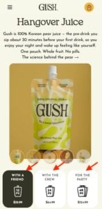
Gush, a beverage brand, has abandoned the traditional practice of listing unit counts as the primary variable. Instead, they frame their product quantities by the occasion: "With a Friend," "With the Crew," and "For the Party." By doing so, they eliminate the need for the customer to calculate how many pouches are required for a specific social scenario. The brand performs the math for the consumer, aligning the purchase with the user’s real-world intent. This reduces the time-to-decision, effectively shortening the path to purchase.
Clarity in Wholesale Logistics: Waju’s Quantity Selectors
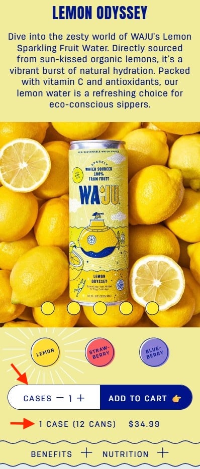
The beverage brand Waju addresses the common point of confusion regarding wholesale quantities by explicitly labeling their units as "Cases" while providing a secondary, highly visible descriptor—"1 case (12 cans)"—directly beneath the selector. By using a contrasting white background and clear typography, the site ensures that the user never has to second-guess the volume they are purchasing. This mitigates the risk of "cart shock," where a customer reaches the checkout only to realize they have ordered significantly more (or less) product than intended.
Outcome-Based Naming: The Blueland Strategy
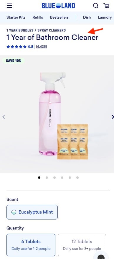
Blueland, a home goods brand, has redefined product naming by focusing on the "utility horizon." Rather than labeling a product as a "6-pack of cleaning tablets," they use the label "1 Year of Bathroom Cleaner." This shifts the value proposition from a raw quantity (which the user must divide by their personal usage rate) to a known outcome. The user does not need to estimate their usage frequency; the brand provides the estimate, thereby validating the purchase for the consumer instantly.
Visualizing Value: The Farmer’s Dog
The subscription service The Farmer’s Dog uses a visual-heavy approach to resolve the "amount-to-order" dilemma. By displaying three distinct bowl sizes, the brand provides an immediate, intuitive sense of volume. Crucially, they price the product on a "per-day" basis rather than a "per-box" basis. This aligns with how pet owners naturally think about their household budget. By including a clear note stating, "Contains two weeks of food," they close the loop on any lingering questions about the duration or value of the shipment.
Data-Driven Implications for Retailers
The implications for retailers are clear: usability is a competitive advantage. When a site minimizes the "Where do I click?" and "What does this mean?" inquiries, it increases the likelihood of completion. Data indicates that reducing the number of form fields and simplifying product options can reduce cart abandonment by as much as 20% in specific retail sectors.
Furthermore, these design choices have a compounding effect on customer lifetime value (CLV). A frictionless experience builds trust. When a user finds that a site respects their time and intelligence, they are statistically more likely to return for future purchases. This creates a cycle of brand loyalty that is difficult for competitors to disrupt, even with lower pricing.
Broader Impact on the Retail Landscape
The transition toward frictionless design is not merely a trend for direct-to-consumer (DTC) brands; it is becoming a standard requirement for all e-commerce platforms. As artificial intelligence and machine learning begin to influence interface design, we can expect to see more "dynamic UIs" that adjust based on user behavior. For instance, if a user lingers on a quantity selector, a modern interface might automatically pop up a helper text or a comparison chart to resolve the uncertainty.
However, the core challenge remains human-centric. Technology can facilitate the process, but the design must be rooted in an understanding of the user’s underlying goals. Retailers that fail to acknowledge this will find their "reservoir of goodwill" draining at an increasing rate as shoppers migrate toward platforms that offer a more streamlined, thought-free experience.

Conclusion
The "Don’t Make Me Think" philosophy remains as relevant today as it was when first published, perhaps even more so in an environment saturated with digital noise. By meticulously identifying where customers hesitate—whether it is calculating quantity, understanding shipping costs, or interpreting volume—retailers can remove the friction that kills conversion.
Success in the modern e-commerce landscape is not just about having the best product or the most competitive price. It is about being the most efficient partner in the shopper’s journey. By automating the mental math, providing clear visual cues, and labeling products by their intended outcome rather than their contents, brands can transform the shopping experience from a series of stressful decisions into a seamless, satisfying transaction. In the end, the most successful brands are those that allow the customer to reach the purchase button with the least amount of mental strain, proving that sometimes, the best interface is one that requires no thought at all.