Usability Research Reveals Why the Caret Icon Is the Gold Standard for Web Accordions and Why Split Menus Fail

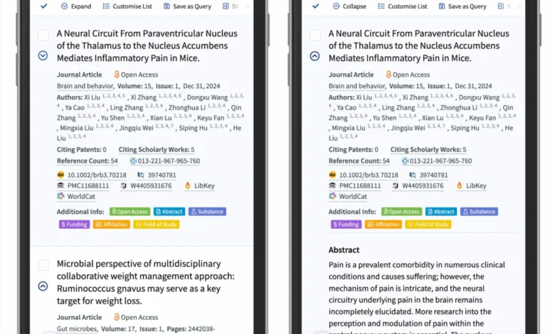
Web design standards continue to evolve, yet foundational interface elements like accordions and menus frequently suffer from poor usability choices. Recent comprehensive research conducted by the Nielsen Norman Group (NN/g) sheds light on a persistent friction point in digital design: how users interpret expansion icons. The study evaluates the effectiveness of various symbols—including carets, chevrons, arrows, plus-minus signs, and empty states—providing empirical evidence on user expectations. Furthermore, the findings deliver a stark warning against the implementation of split menus and mismatched target actions, offering web developers and UI/UX designers a clearer path toward intuitive interface architecture.
Background Context and Evolution of Accordion Navigation
Accordions have long served as a staple of responsive and space-efficient web design. By allowing content sections to collapse and expand on demand, they reduce cognitive load and prevent endless scrolling, particularly on mobile devices. However, the visual signifiers used to communicate this behavior have historically varied wildly across platforms and design systems.
Historically, designers relied on intuition rather than empirical data when selecting interface icons. Some opted for standard directional arrows, others for mathematical plus-and-minus signs, and many designed custom graphical indicators to match unique branding guidelines. This lack of standardization created fragmented user experiences. Users frequently found themselves guessing whether clicking a menu header would redirect them to a dedicated landing page, trigger a slide-out drawer, or simply toggle an accordion menu. Recognizing this widespread ambiguity, usability researchers set out to test user mental models and determine which visual cues align most accurately with intuitive digital behavior.
Main Findings: The Superiority of the Caret and the Dangers of Iconless Design

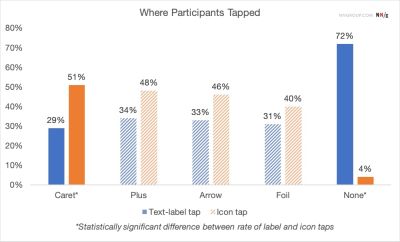
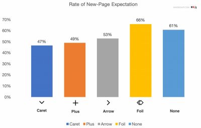
The NN/g research demonstrates that user expectations are heavily dictated by the presence and type of visual signifier attached to a menu item. When items are presented without any icon, users overwhelmingly assume that tapping the label will navigate them away from the current view to a new page. This behavior remains consistent regardless of contextual clues, proving that absence of visual feedback defaults user intent toward navigation rather than expansion.
Conversely, the study identified the caret—a simple triangle pointing downward or sideways—as the most reliable indicator of collapsible content. When interacting with carets, users immediately associate the symbol with an expanding drawer. Interestingly, eye-tracking and interaction data revealed that users target their clicks or taps more accurately on the caret icon itself when it takes this shape, compared to other symbols where interaction is split evenly between the icon and the adjacent text label.
The pitfall of custom icons quickly became apparent during testing. Users routinely misinterpret bespoke or heavily stylized graphics, mistaking them for decorative elements rather than interactive toggles. This failure of signifiers leads to repeated misclicks, user frustration, and abandoned site sessions.
Chronology and Methodology of the Usability Studies
The insights compiled in the recent studies represent the culmination of years of UX research observing real-world user interactions across desktop and mobile viewports.
In the initial stages of mobile-first web design, UI patterns frequently borrowed desktop paradigms, leading to cluttered navigation bars loaded with multi-directional arrows. As responsive design matured throughout the mid-2010s, design teams began experimenting with minimalist interfaces, often stripping away icons entirely to achieve a cleaner aesthetic. This minimalist shift inadvertently created a new wave of usability issues, as users could no longer distinguish between structural navigation links and interactive accordion triggers.

To resolve these conflicting patterns, recent qualitative and quantitative studies by usability institutions employed task-based user testing. Participants were asked to navigate complex e-commerce and informational websites while researchers recorded their click patterns, hesitation times, and verbalized expectations. The data consistently pointed to the cognitive friction caused by overloaded symbols and split-target layouts, prompting industry-wide calls to return to standardized, predictable interface patterns.
The Pitfalls of Split Menus and Overloaded Symbols
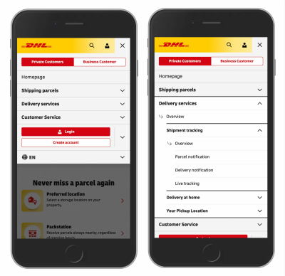
One of the most critical takeaways from the research is the condemnation of split menus. A split menu pattern typically assigns two distinct actions to a single menu row: the text label links the user to a category overview page, while the accompanying icon expands the accordion menu.
Usability testing revealed this pattern to be categorically harmful to the user experience. Users almost universally fail to mentally parse this dual functionality on first contact. Because human scanning patterns treat a menu item as a cohesive unit, forcing a split-action hit area leads to high error rates. Users attempting to open a menu frequently trigger unintended page navigations, while those seeking the main category page find themselves trapped in expanding accordions.
Major digital platforms, such as logistics giant DHL and various scholarly search engines like Lens.org, have successfully moved away from these confusing patterns. Best practices now dictate that main category items should uniformly trigger the accordion expansion, while direct access to category overview pages is handled cleanly via a dedicated link embedded inside the expanded menu list itself.
Furthermore, the study analyzed the limitations of alternative icons, such as the plus-minus (+/-) system and directional arrows. While these symbols are generally understood, they suffer from semantic overload. The plus sign, for instance, frequently signifies "add to cart," "save for later," "zoom in," or "create new." In multi-level navigation hierarchies where multiple sections remain open simultaneously, plus-minus indicators lose their clarity. Similarly, horizontal and vertical arrows are frequently conflated with scrolling actions, page jumping, or sequential pagination, introducing unnecessary ambiguity into what should be a straightforward toggle interaction.
Implications and Best Practices for Modern Web Design
The implications of these research findings offer clear, actionable directives for developers, product managers, and UI designers aiming to optimize digital accessibility and conversion rates.
First, simplicity remains paramount. Designers are advised to abandon complex, state-dependent arrow systems that rotate in multiple directions. Instead, the industry standard should default to a simple downward-facing caret for collapsed states, transitioning to an upward or sideways caret upon interaction.

Second, if an element is strictly a text link designed to take the user to a new URL, traditional conventions—specifically underlining the text—remain undefeated in usability testing. While underlines may occasionally clash with modern minimalist aesthetic trends, they communicate link affordance instantly across all demographic groups and accessibility profiles.
Finally, web architecture must prioritize unified hit areas. By eliminating split menus and ensuring that interaction zones behave predictably, organizations can significantly reduce bounce rates and cognitive friction. As the digital landscape continues to expand across diverse device form factors, adhering to empirically validated UX standards ensures that interfaces remain universally accessible, efficient, and intuitive for all users.