The landscape of modern web development is currently undergoing a period of rapid transformation, driven by a series of new CSS specifications and browser-native features that redefine how developers manage UI rendering, text manipulation, and layout control. From the implementation of the Custom Highlight API to the granular control offered by the lh unit and advancements in navigation state styling, these updates signify a shift toward a more declarative, browser-native approach to complex design challenges.
The Rise of the CSS Custom Highlight API
The CSS Custom Highlight API represents a fundamental shift in how developers handle text selection and annotation. Historically, web developers were limited to the browser’s default highlight styles, often resulting in inconsistent user experiences across different platforms. Sunkanmi Fafowora recently detailed the implementation of this API, which allows for dynamic, programmatic styling of arbitrary text ranges.
While the feature bears the "CSS" designation, the underlying logic is orchestrated through JavaScript. By creating Highlight objects and adding them to the CSS.highlights collection, developers can apply custom pseudo-element styles—such as ::highlight()—to specific segments of text. This capability is particularly significant for applications involving search functionality, collaborative writing tools, and syntax highlighting, as it removes the need for intrusive DOM manipulation. All major browser vendors have now reached a consensus on the implementation, providing a stable foundation for widespread adoption.
Advanced Image Rendering and Overflow Mechanics
A long-standing misconception regarding the <img> element has been addressed by recent research into "replaced content." Temani Afif demonstrated that the <img> element functions essentially as a container, where the actual image resource behaves as a sub-element that can overflow its host. This realization has significant implications for how developers manipulate image rendering.
By utilizing the content property in CSS, developers can now perform "image swapping" without modifying the underlying HTML structure. For instance, the syntax content: url(new-image.avif) allows for dynamic image replacement, while the image-set function enables responsive resolution switching directly through stylesheets. This technique offers a performance advantage by decoupling the image source from the structural layout, allowing for more efficient asset management in complex, high-traffic web environments.
Refined Typography: The Evolution of text-stroke
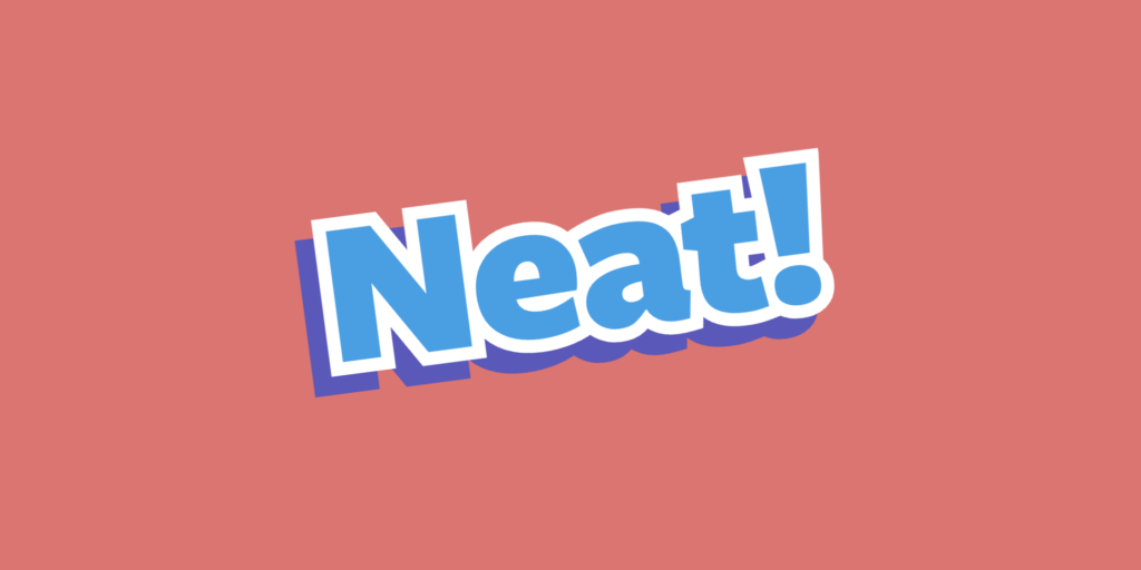
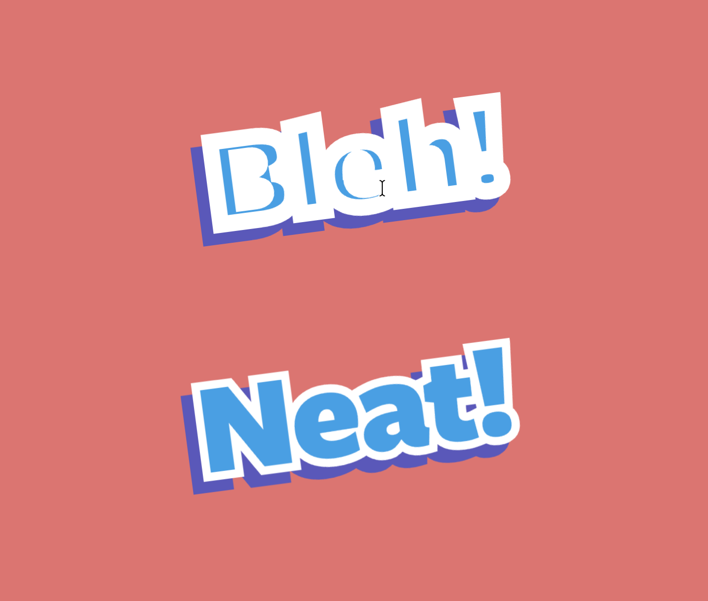
Typography remains a core challenge in web design, particularly when attempting to implement high-contrast visual effects. Tyler Sticka has highlighted a practical solution to the persistent issues surrounding the text-stroke property. Standard implementations of text-stroke are center-aligned, meaning that a stroke of a specific width occupies space both inside and outside the character glyph. This often results in a blurred or distorted appearance, as the inner half of the stroke overlaps with the text fill.
The solution lies in the paint-order property. While it does not alter the alignment of the stroke itself, it forces the browser to re-render the layers, ensuring that the text fill is drawn over the internal portion of the stroke. This prevents the "bleeding" effect common in stylized typography. Although the text-stroke property currently requires vendor-prefixed syntax (e.g., -webkit-text-stroke) to ensure cross-browser compatibility, industry experts view this as a necessary interim step toward a more standardized, robust typographic toolkit in the future of CSS.
Skeleton UIs and Responsive Layout Constraints
The quest for performant, accessible skeleton UIs—the temporary placeholder elements used during data fetching—has seen a resurgence in community-led innovation. Lea Verou, a prominent voice in CSS specification development, recently proposed a method for styling skeleton UIs that avoids the fragility of hard-coded dimensions. By leveraging text-decoration properties, transparent color values, and sophisticated mask filters, developers can create fluid placeholders that adapt to varying text lengths and container sizes.
The community reaction has been swift, with contributors proposing the use of box-decoration-break: clone to ensure that design tokens remain consistent across multiline elements. This trend highlights a broader industry movement toward "CSS-only" UI patterns that minimize reliance on heavy JavaScript libraries, thereby reducing the "layout shift" metrics that have become critical to modern SEO and user experience standards.
The Utility of the lh Unit and Scroll Axis Control
Ahmad Shadeed’s recent analysis of the lh unit—a relative length unit equal to the computed line-height of an element—has provided developers with a more precise tool for vertical rhythm. By enabling dimensions to be tied directly to typography, developers can ensure that elements like icons, decorative lines, or container heights remain perfectly synchronized with text flows, regardless of font size or scaling factors.
Parallel to these layout improvements is the introduction of scroll-axis-lock. Bramus, a developer advocate known for his contributions to the CSS Working Group, detailed how this property allows for more intuitive diagonal scrolling. By default, browser scroll containers generally favor a single axis. The new locking mechanism gives developers the power to enable simultaneous X and Y axis movement, which is essential for specialized data visualization dashboards, interactive maps, and creative scrolling experiences that were previously hindered by browser-level constraints.
Navigating the Future of Declarative Routing
Perhaps the most significant long-term development is the emergence of CSS navigation matching. This capability allows developers to write CSS rules that trigger based on the browser’s navigation state. By styling elements based on where a user is coming from or going to, developers can implement sophisticated "page transition" animations and state-specific UI highlights natively within the browser, rather than relying on complex JavaScript-based route managers.
This feature is currently in its early stages of browser integration, but its potential to streamline Single Page Application (SPA) development is immense. It suggests a future where the browser itself manages the state of transitions, significantly lowering the barrier to entry for building high-end, application-like experiences on the web.
Industry Implications and Conclusion
The current trajectory of CSS development indicates a clear intent: to empower developers with declarative, high-performance tools that replace previously imperative, script-heavy solutions. By moving functionality into the rendering engine, browser vendors are effectively optimizing the web for speed and accessibility.
However, this rapid evolution brings its own set of challenges. As these features continue to proliferate, the need for standardized testing and clear documentation becomes paramount. The ongoing discourse regarding the "worst" HTML elements—a recurring theme among web standards experts—serves as a reminder that as we add new capabilities, we must also refine and prune the legacy baggage that characterizes the modern web.
As of August 2026, the web development community remains in a state of high activity. With no major stable releases from the primary browser vendors (Chrome, Safari, Firefox) in the immediate two-week window, developers are taking this time to experiment with these new primitives. The shift toward native browser capabilities, from custom highlighting to navigation state styling, promises to make the web faster, more maintainable, and significantly more expressive for designers and engineers alike. As the industry looks toward the final quarter of the year, the consensus remains that the era of CSS as a simple styling language has definitively ended; it is now a powerful, programmatic layer that defines the very architecture of the digital experience.
Related posts: