Rethinking Dark Mode UX: Why Two-State Toggles Are Replacing Traditional Tri-State Controls

The evolution of web design has consistently trended toward minimalism and cognitive efficiency, yet certain UI patterns have remained stubbornly complex. Among these is the implementation of light and dark mode toggles. Traditionally, developers have provided users with a "tri-state" control—a selection offering "Light," "Dark," and "System" settings. However, recent discourse led by web standards expert Lea Verou suggests that this pattern is not only redundant but arguably detrimental to user experience. By advocating for a streamlined two-state approach, designers are challenging the status quo of how color schemes are managed on the modern web, prompting a broader conversation about system-level preferences versus site-specific overrides.
The Problem with Tri-State UI
For years, the standard approach to theme selection has been to present the user with a choice between three distinct states. This configuration forces users to navigate an extra layer of complexity, often requiring them to select "System" if they wish to defer to their operating system’s settings. Verou’s critique highlights that this creates unnecessary cognitive load. In a well-designed system, the "System" preference should be the default state. A user only needs to intervene when they wish to override that default.
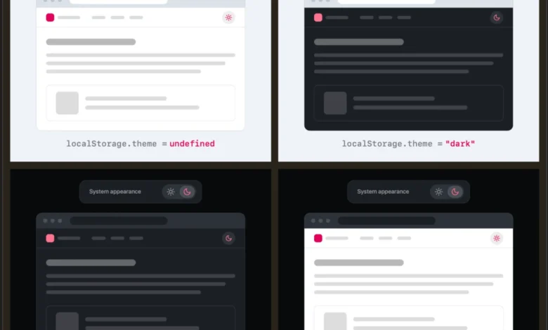
If a website defaults to the system setting, the user is already in their preferred mode. Should the user decide that the current aesthetic is unsatisfactory—perhaps preferring a dark interface on a sunny day despite the system’s light-mode preference—a simple two-state toggle ("Light" and "Dark") suffices. By clicking the toggle, the user creates an override. If they later wish to return to the system default, they are essentially reverting the override. This logic eliminates the need for a dedicated "System" button, which often occupies valuable real estate in navigation headers and mobile menus.
The Mechanics of Persistent Overrides
The technical implementation of this two-state model relies on the browser’s ability to detect system preferences via CSS media queries, specifically prefers-color-scheme. When a developer builds a site that respects this query, the initial experience is personalized by default.
When a user interacts with a two-state toggle, the site stores that choice in localStorage. This persistence ensures that the user’s preference is honored across future sessions. The argument for this approach is that theme switching is rarely a primary user goal. A visitor to a news site or a blog is there to consume content; the visual theme is a secondary, background preference. Therefore, the UI should be unobtrusive. By providing a binary toggle, developers minimize the number of options a user must process, adhering to the principle that "less UI is more" when the primary objective is content delivery.
Historical Context and Browser Evolution
The rise of the "System" preference is a relatively recent phenomenon in web history. Before major browsers and operating systems began exposing color scheme preferences through standardized APIs, websites were largely static, designed in either light or dark palettes by the author. As dark mode became a standard feature of macOS, Windows, iOS, and Android, browsers followed suit by reporting user preferences to websites.
However, this integration created a tension. As noted by industry observers like Chris Coleman, some users find it frustrating that their OS-wide preference dictates the appearance of every single website they visit. This has led to a situation where the "System" setting feels, for some, like a lack of agency. If browsers were to eventually offer granular, per-site color preferences at the browser level—moving the control out of the website’s DOM and into the user agent’s settings—the need for a site-specific "System" button would vanish entirely.
Supporting Data and User Behavior
Research into human-computer interaction (HCI) consistently demonstrates that excessive options can lead to "decision paralysis." In a web navigation context, every additional menu item or toggle increases the time it takes for a user to orient themselves.

Industry analysis suggests that the majority of users do not frequently toggle themes. Once a user establishes a preference—or chooses to stick with the system default—the control becomes "dead weight." By simplifying the UI to a binary switch, designers reduce the visual noise in the header. In mobile-responsive design, where space is at a premium, removing one state from a menu can be the difference between a clean interface and a cluttered one.
Expert Perspectives and Theoretical Scenarios
While the two-state model is gaining traction, there remain edge cases where three-state controls are deemed appropriate. Verou acknowledges that in specific, complex scenarios—such as a design tool that requires high-fidelity contrast control or an accessibility-focused application where a "high-contrast" mode is distinct from a standard "dark" mode—a more complex toggle might be necessary.
Furthermore, the discussion has raised questions about the "reset" behavior. If a user toggles to Dark mode and then wants to return to the System preference, does the UI provide a way to "unset" the override? The consensus among UX proponents is that if the goal is simplicity, the "System" state is implicitly handled by the absence of an override. If a user wants to revert, they should be able to toggle until the state aligns with their system preference, or clear their localStorage—an action that is rarely necessary for the average visitor.
Broader Implications for Web Standards
The shift toward two-state toggles is part of a larger trend of "invisible" design. Modern web development is increasingly moving toward systems that "just work." By relying on the prefers-color-scheme media query as the foundation, developers can build sites that are inherently respectful of the user’s environment.
The implication for web accessibility is also significant. By treating the system setting as the baseline, developers ensure that users with specific OS-level accessibility configurations—such as increased contrast or inverted colors—receive an experience that is already optimized for their needs without having to manually configure every website they visit.
Summary of Best Practices
For developers looking to refine their dark mode implementations, the current discourse suggests a three-step framework:
- Default to System: Always prioritize the
prefers-color-schemeCSS media query as the initial state. - Implement Binary Overrides: Use a simple toggle that allows the user to switch between "Light" and "Dark" only when they wish to deviate from the system default.
- Persist and Forget: Store the user’s choice in
localStorageto ensure continuity, but avoid cluttering the UI with a "System" button that serves only as a reset.
This approach aligns with the growing demand for interfaces that are responsive, accessible, and respectful of the user’s primary intent. As web standards continue to evolve, it is likely that the "System" option will become a standard background assumption rather than an active menu item. The move toward a two-state pattern is not merely a stylistic choice; it is an acknowledgment that in the modern web landscape, the most effective interface is one that effectively anticipates the user’s needs without demanding their attention.
As the industry continues to debate the merits of these patterns, the success of the two-state model will likely be measured by the reduction of friction in user journeys. By minimizing the cognitive dissonance caused by unnecessary options, developers can create more focused, enjoyable, and efficient digital experiences. The ongoing discussion serves as a reminder that even the smallest UI elements—such as a simple theme toggle—deserve the rigorous attention of design professionals to ensure they serve the user rather than the developer’s assumptions.