
In the height of the global COVID-19 pandemic, the dissemination of accurate, clear, and contextually complete information became a cornerstone of public health and national policy. However, the complexity of epidemiological data often led to significant friction between political narratives and journalistic reporting. A pivotal moment in this tension occurred in early August 2020, following a high-profile interview between then-President Donald Trump and Axios reporter Jonathan Swan. The subsequent media coverage, specifically by National Public Radio (NPR), raised critical questions about how data visualization can inadvertently obscure the reality of a crisis through the omission of broader comparative datasets.
The Intersection of Politics and Epidemiology: The Axios Interview
The catalyst for the debate was an interview aired on HBO on August 3, 2020, in which Jonathan Swan challenged President Trump on the escalating death toll in the United States. At that juncture, the U.S. had recorded approximately 160,000 deaths, a figure that led many health experts to label the American response as lagging behind other developed nations. During the exchange, the President asserted that the United States was "doing better than any other country" regarding COVID-19 mortality.
To support this claim, the President presented a series of charts focusing on the "case fatality ratio" (CFR)—the number of deaths divided by the number of confirmed infections. Swan countered by emphasizing "deaths per capita," which measures the number of deaths relative to the total population. The President famously dismissed this metric, stating, "You can’t do that," sparking a nationwide conversation on which statistical measures truly reflect the severity of an outbreak. Epidemiologists generally agree that both metrics are essential: CFR provides insight into the clinical severity and the effectiveness of healthcare interventions, while per capita rates indicate the overall impact of the virus on the general population.
NPR’s August 2020 Analysis: A Case Study in Data Visualization
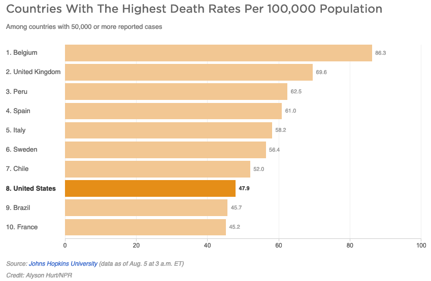
On August 5, 2020, NPR published an article titled "Charts: How the U.S. Ranks On COVID-19 Deaths Per Capita – And By Case Count," authored by Jessica Craig. The piece was intended to provide clarity following the Axios interview but eventually faced scrutiny for its presentation of data. The primary concern involved two specific charts that compared the U.S. to other countries that had reported 50,000 or more cases.
The first chart, focusing on per capita deaths, featured only 10 countries. In this limited visualization, the U.S. appeared to be performing better than several European counterparts, such as France, while trailing behind Brazil. However, critics pointed out that by the first week of August 2020, 45 countries had surpassed the 50,000-case threshold. By limiting the chart to a "Top 10" list, 35 relevant nations were omitted. Statistical analysis of the full dataset at the time revealed that 37 of the 44 other countries with more than 50,000 cases actually had lower per capita death rates than the United States. This phenomenon, often referred to as the "curse of the top 10," can create a skewed perception of performance by arbitrarily narrowing the field of comparison.
Understanding the Metrics: Case Fatality Ratio vs. Per Capita Mortality
To evaluate the accuracy of pandemic reporting, it is necessary to distinguish between the two primary metrics at the heart of the 2020 controversy.
Case Fatality Ratio (CFR)
The CFR is calculated by dividing the number of deaths by the number of confirmed cases. In August 2020, the U.S. CFR appeared relatively favorable compared to countries like the United Kingdom or Italy. However, experts noted that CFR is heavily influenced by testing capacity. A country that tests aggressively, identifying many mild or asymptomatic cases, will naturally have a lower CFR even if the total number of deaths is high. Because the U.S. had scaled up testing significantly by mid-2020, its CFR was lower than nations that were only testing the most severely ill patients.
Per Capita Mortality
The per capita death rate measures the number of deaths per 100,000 or 1,000,000 residents. This metric is widely considered the most "honest" representation of a pandemic’s toll because it is not dependent on a country’s testing volume. It answers the fundamental question: How many people in the population are dying from this disease? When viewed through this lens, the U.S. frequently ranked among the hardest-hit nations globally during the first year of the pandemic.
Chronology of the Data Debate
The timeline of this specific data controversy highlights the rapid pace of information exchange during the pandemic:
- August 3, 2020: The Axios on HBO interview airs. President Trump insists on using CFR to define success, while Jonathan Swan pushes for per capita mortality figures.
- August 4, 2020: Public health experts and fact-checkers across major networks (CNN, BBC, New York Times) analyze the interview, largely supporting Swan’s use of per capita data as a more accurate reflection of the "disease burden."
- August 5, 2020: NPR releases its chart-based analysis. While the article includes both metrics, the visual limitation to 10 countries draws criticism for potentially validating a misleading narrative of American "exceptionalism" in pandemic management.
- Late August 2020: Subsequent data from Johns Hopkins University and the World Health Organization (WHO) continues to show the U.S. leading the world in total deaths, reinforcing the need for comprehensive rather than "top-slice" data visualization.
The Misapplication of Epidemiological Terms
A secondary point of contention in the NPR report involved the definition of "disease burden." The article quoted Justin Lessler, an associate professor of epidemiology at Johns Hopkins University, stating that the per capita death rate is an indication of the "overall disease burden."
In clinical and public health contexts, "disease burden" is a specific term often measured in Disability-Adjusted Life Years (DALYs). This calculation combines years of life lost (YLL) due to premature mortality and years lived with disability (YLD). Critics argued that the NPR article conflated "proportional burden" with "overall burden." While the per capita rate shows the proportional impact, the total case count and death count represent the absolute magnitude of the crisis. Furthermore, the technical definition of disease burden involving long-term disability could not be accurately captured by 2020 mortality rates alone, as the long-term effects of "Long COVID" were only beginning to be understood.
Reactions from the Scientific and Journalistic Communities
The critique of NPR’s reporting underscores a broader challenge for journalists: the balance between being "even-handed" and being "accurate." In an effort to avoid appearing partisan, some media outlets may present data in a way that gives undue weight to misleading claims.
Data visualization experts, including those from the Perceptual Edge school of thought, emphasize that the goal of a chart should be to tell the "whole truth." By omitting 35 out of 45 comparable countries, the visualization failed to show that the U.S. was actually in the "middle of the pack" or worse, rather than at the top of the performance list. Scientific communicators argued that during a public health emergency, the "middle ground" in reporting is not always the most factual ground. If 80% of comparable nations are performing better than the U.S., a chart showing the U.S. in 3rd or 4th place out of 10 is statistically factual but contextually false.
Broader Impact and Implications for Future Reporting
The 2020 data dispute serves as a lasting lesson for the field of data journalism. The way information is framed—whether by selecting specific dates, thresholds, or a limited number of comparative subjects—can fundamentally alter public perception and, by extension, public compliance with health measures.
- Transparency in Filtering: When news outlets apply filters (such as "countries with 50,000+ cases"), they must explain why those filters are used and ensure the resulting visualization does not cherry-pick a narrative.
- The Responsibility of "Reliable Sources": Outlets like NPR carry a high level of public trust. When they produce misleading visualizations, it can provide ammunition for misinformation, as seen when political entities utilize such charts to deflect from broader systemic failures.
- Data Literacy: The pandemic highlighted a global deficit in data literacy. The debate between CFR and per capita rates demonstrated that even high-level officials and seasoned journalists can struggle to find a common language for statistical reality.
As the world moves beyond the acute phase of the COVID-19 pandemic, the analysis of these 2020 reports remains relevant. They serve as a reminder that in the age of information, the clarity of a chart is just as important as the accuracy of the numbers it contains. Misleading data, even when presented by reputable sources, can obscure the path to effective policy and informed citizenship. The ultimate goal of pandemic reporting must remain the presentation of a complete and unvarnished picture of the truth, regardless of the political implications.