

The anatomy of a great ads landing page is more than just pretty visuals; it’s a carefully crafted structure designed to convert visitors into customers. This guide dives deep into the essential components, from compelling headlines and value propositions to effective calls to action and mobile optimization. We’ll explore how to create a user-friendly experience that resonates with your target audience, ultimately driving higher conversion rates.
This comprehensive guide unpacks the secrets behind designing high-performing landing pages, covering everything from crafting persuasive copy to optimizing for different devices. Learn how to use data-driven insights to continuously refine your landing page and boost conversions.
Introduction to Landing Page Design
A landing page is a dedicated webpage designed specifically to capture leads or drive conversions for a particular marketing campaign. It’s not just another webpage on your website; it’s a highly focused, single-minded tool to achieve a specific goal, whether it’s collecting email addresses, generating sales, or promoting an event. Think of it as a carefully crafted funnel, designed to guide visitors toward a desired action.Landing pages are essential because they allow advertisers to isolate and optimize their message for a particular offer.
They allow for a focused, targeted approach to advertising, maximizing the chances of converting visitors into customers. They are often the crucial first step in a multi-faceted marketing strategy.
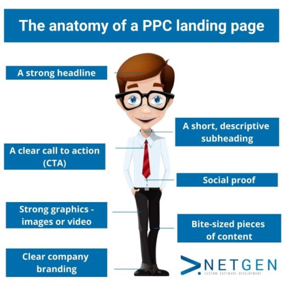
Essential Elements of a Successful Landing Page
Landing page design goes beyond simply presenting information. A successful landing page needs a carefully crafted structure and design elements to be effective. Crucial elements include a compelling headline that grabs attention immediately, a clear and concise value proposition that articulates the benefits for the visitor, a strong call-to-action (CTA) that prompts the desired action, and a visually appealing layout that is easy to navigate.
Visual hierarchy and clear, concise copy are critical for guiding the visitor’s eye and ensuring that the key message is understood at a glance.
Key Principles of Effective UX Design
User experience (UX) design principles are paramount for a landing page to perform optimally. A well-designed landing page is user-friendly, intuitive, and easily navigable. Visitors should be able to quickly understand the purpose of the page and the steps required to complete the desired action. Simplicity is key, avoiding unnecessary distractions and focusing on the core message. Mobile responsiveness is critical for ensuring the landing page adapts seamlessly to various devices and screen sizes.
Landing page design should ensure an optimal user experience across all platforms.
Crafting a killer landing page is crucial for ad campaigns. Understanding the elements of a great landing page is key, especially when targeting B2B audiences. For instance, recent insights from B2B PPC experts on how Google Search handles announcements, like those shared in this insightful piece, b2b ppc experts give their take on google search on announcements , highlight the importance of clear, concise messaging and a seamless user experience.
Ultimately, a well-structured landing page will maximize conversions, no matter the campaign focus.
Different Types of Landing Pages
The choice of landing page type depends heavily on the specific marketing goal. Different landing page types are tailored for distinct objectives, each with its unique design and structure.
| Landing Page Type | Purpose | Key Elements | Example |
|---|---|---|---|
| Lead Generation | Collecting contact information for future marketing efforts. | Clear form, compelling headline, value proposition emphasizing benefits. | Free ebook download, webinar registration. |
| Product Showcase | Highlighting a specific product or service and driving sales. | High-quality product images, detailed product descriptions, clear call to action. | New product launch, online store product page. |
| Event Promotion | Promoting an event and encouraging registration or attendance. | Event date, time, location, registration form, event description, compelling value proposition. | Webinar promotion, conference registration, workshop advertisement. |
Headline and Value Proposition
A landing page’s success hinges on capturing attention and driving conversions. A compelling headline and a clear value proposition are crucial to achieving this. These elements form the foundation upon which the entire page’s effectiveness rests, guiding visitors towards understanding the unique benefits and ultimately, taking action. The headline acts as the first impression, while the value proposition clarifies the immediate value for the visitor.Crafting a landing page that resonates with the target audience is paramount.
Crafting a killer landing page for your ads takes more than just pretty visuals. Think about the structure and content. To really nail the perfect page, ask yourself some crucial questions, like those in this helpful guide on transforming your blog posts: transform your blog posts 6 open ended questions thatll help you create better content.
Ultimately, understanding your audience’s needs and clearly presenting a compelling value proposition is key to a great ads landing page.
This involves understanding their needs and desires and presenting the solution in a concise and persuasive manner. This requires meticulous research and a deep understanding of the target market’s motivations and pain points.
Headline Importance
A captivating headline is the gateway to a successful landing page. It’s the first thing a visitor sees and forms their initial impression of the page’s content and value. A poorly written headline can lead to visitors quickly abandoning the page, resulting in lost conversions. A strong headline, on the other hand, immediately grabs attention and encourages further exploration.
Crafting a headline that accurately reflects the page’s content is essential.
Crafting a Strong Value Proposition, The anatomy of a great ads landing page
A well-defined value proposition clearly articulates the unique benefits a product or service offers to the target audience. It concisely highlights the solution to their problems and the value they gain by using it. A powerful value proposition is a key driver in encouraging conversions. It focuses on the benefits, not just the features, and speaks directly to the customer’s needs.
Headline Formats
Different headline formats can effectively communicate the core message to the target audience. Choosing the appropriate format depends on the specific product or service and the target audience.
| Format | Description | Example |
|---|---|---|
| Question-based | Poses a question that directly addresses a visitor’s pain point. | “Tired of slow website loading times?” |
| Benefit-driven | Highlights the positive outcomes or advantages of using the product or service. | “Boost your website traffic by 30% in 30 days!” |
| Problem-solution | Clearly identifies a problem and presents the product or service as the solution. | “Struggling with lead generation? Our platform helps you capture more qualified leads.” |
Value Proposition Examples
Here are some examples of effective value propositions for different products and services:
- For a productivity app: “Stop wasting time and boost your productivity with our easy-to-use app.”
- For a software as a service (SaaS) platform: “Streamline your workflow and reduce costs with our innovative SaaS platform.”
- For a marketing agency: “Generate more leads and increase your sales with our expert marketing strategies.”
Demonstrating Unique Selling Points (USPs)
Highlighting a product or service’s unique selling points (USPs) is crucial for differentiation and conversion. USPs set a product or service apart from competitors. Clearly showcasing these USPs on the landing page builds trust and reinforces the value proposition. This involves strategically positioning testimonials, case studies, and other supporting evidence to showcase the unique benefits. These elements are essential for building trust and demonstrating the value proposition’s validity.
Visual Hierarchy and Layout
Landing page design isn’t just about aesthetics; it’s about guiding the user’s eye and ensuring they effortlessly understand the value proposition. A well-structured visual hierarchy plays a crucial role in this process. It creates a clear path for the user, leading them smoothly from the headline to the call-to-action, ultimately boosting conversion rates.Effective landing pages use visual cues to prioritize information.
This means strategically positioning elements like headlines, value propositions, and calls to action to maximize their impact. The layout should be intuitive and user-friendly, enabling visitors to easily scan the page and grasp the core message.
Creating a Clear Visual Hierarchy
A clear visual hierarchy directs the user’s attention to the most important elements first. This involves using different font sizes, colors, and spacing to highlight crucial information. Large, bold headlines and strategically placed imagery create a strong visual emphasis, while smaller text and subtle colors support secondary information. The goal is to establish a visual hierarchy that naturally guides the user through the page.
By making the most important elements visually prominent, the landing page communicates its message more effectively.
The Role of Whitespace and Negative Space
Whitespace, or negative space, is not just empty space; it’s a crucial design element that enhances readability and aesthetics. Sufficient whitespace around text and images prevents the page from feeling cluttered and overwhelming. Properly distributed whitespace makes the page feel less dense, allowing users to easily scan and absorb information. It also improves the overall visual appeal and creates a sense of balance and harmony.
By strategically using whitespace, designers can highlight key elements and improve the user experience.
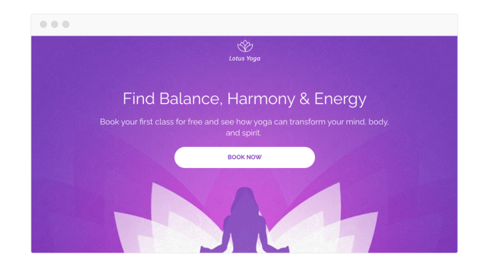
Importance of Imagery and Graphics
High-quality imagery and graphics significantly enhance the user experience and reinforce the message of the landing page. Images can help explain complex concepts, add personality to the brand, and create a more engaging experience. Relevant imagery, such as product shots or before-and-after examples, not only visually represent the product or service but also communicate its value proposition. A well-chosen image can communicate emotions, build trust, and create a stronger connection with the visitor.
For example, a professional headshot of a company spokesperson can instill trust, while a visually appealing product image can increase the desire to purchase.
Examples of Effective Layouts
The optimal layout depends on the specific type of landing page. Here’s a table illustrating effective layout examples for various landing page types:
| Landing Page Type | Layout Example |
|---|---|
| Lead Generation | Hero section with a compelling headline and clear call to action, followed by a concise form and social proof. |
| Product Landing Page | High-quality product images or videos, detailed product description, customer testimonials, and clear call to action. |
| Service Landing Page | Visual representation of the service process, customer success stories, and case studies, with clear benefits highlighted. |
| Event Landing Page | Event poster or image, schedule, speaker bios, registration form, and social media integration. |
Organizing Content with Visual Elements
Effective organization uses visual elements to break up large blocks of text and guide the user’s eye. For example, using icons to represent different features or benefits, creating visually appealing sections, and employing contrasting colors for headings and subheadings enhances readability and visual interest. These techniques can transform a landing page from a daunting wall of text into an engaging and easily navigable experience.
This strategy allows visitors to quickly understand the key value propositions and engage with the call to action.
Call to Action (CTA) Design
A compelling call to action (CTA) is the final, crucial step in the landing page conversion funnel. It’s the bridge between interest and action, the nudge that persuades visitors to take the desired next step. Without a well-designed CTA, all the effort invested in a visually appealing page and compelling copy can go to waste. A strong CTA is the key to turning visitors into customers.A successful CTA isn’t just about a button; it’s about strategically placed text and visual cues that guide users towards completing a specific task.
Effective CTAs understand the user’s needs and motivations, and they communicate a clear and concise next step. The better the CTA, the higher the chances of achieving the desired conversion rate.
Crucial Elements of an Effective CTA
A successful CTA is more than just a button; it’s a carefully crafted blend of design and psychology. The text, the button’s visual design, and its placement are all critical.
A killer ad landing page needs a compelling headline and clear call-to-action. But, sometimes, you have supporting documents like PDFs that you don’t want indexing by search engines. Learning how to properly hide noindex PDF files in WordPress, like using the right plugins or custom code ( how to hide noindex pdf files in wordpress ), is crucial for a clean and effective user experience.
Ultimately, focusing on the user’s journey and delivering a seamless experience will drive conversion rates on your ad landing page.
- Button Design: The button’s design is a key factor. It needs to stand out visually from the surrounding content, but it also needs to be easily clickable and accessible. Colors, fonts, and shapes play a role in highlighting the CTA. A vibrant, contrasting color, such as a bright orange or a deep teal, against a neutral background, is effective.
The shape should be simple and recognizable (e.g., a rectangle or a rounded rectangle), which enhances usability.
- Compelling Copy: The text of the CTA needs to be clear, concise, and action-oriented. Avoid jargon and complex language. Words like “Download Now,” “Learn More,” or “Get Started” create a sense of urgency and encourage immediate action. Using strong verbs, like “claim,” “unlock,” or “discover,” can be highly effective.
- Strategic Positioning: The CTA button’s placement is critical. It should be easily visible and accessible to the user, placed where the user’s eye naturally falls. It should be situated above the fold if possible, and on a page with minimal distractions. Avoid cluttering the page with multiple CTAs, instead focusing on a single, clear action for the user.
Different CTA Types and Their Applications
Different CTAs cater to different goals and user needs.
- “Learn More”: Suitable for educational resources, articles, or detailed product information. It’s best for guiding users through the sales funnel and encouraging further exploration.
- “Shop Now”: Ideal for e-commerce sites, promoting immediate purchases. It’s best placed prominently on product pages and in high-traffic areas.
- “Get a Quote”: Useful for services requiring customized offers. It’s ideal for businesses offering consulting, design, or other specialized services.
- “Sign Up”: Used for capturing leads or subscribers. It’s effective for building an email list, offering trials, or launching new products.
Optimizing CTAs for Different Audiences
Tailoring the CTA to the specific audience is crucial for maximizing conversions. Consider the target audience’s needs, motivations, and pain points.
- Consider your target audience’s demographics and psychographics. Tailor your language and tone to resonate with their values and preferences. A formal tone might work for a business-to-business (B2B) audience, while a casual tone could be more effective for a consumer-focused audience.
- Match the CTA to the content and the user’s journey. A user looking for a quick answer might respond better to a concise CTA than a more detailed one. A user at the later stages of the sales funnel might respond to a more direct call to action, such as “Buy Now.”
A/B Testing for CTA Optimization
A/B testing is a vital tool for refining CTA performance. By testing different variations of your CTA, you can identify which versions generate the highest conversion rates.
- Vary the button copy. Test different phrasing to see which resonates best with your audience. For instance, “Get Started” versus “Start Free Trial” might produce different results.
- Test different button colors. Colors can evoke different emotions and trigger different actions. Test different colors to see which stands out the most and encourages clicks.
- Test different button sizes and placement. The size and placement of the button can significantly affect visibility and usability.
Content Strategy and Messaging
Crafting a compelling landing page isn’t just about aesthetics; it’s about delivering a powerful message that resonates with your target audience. Effective content strategy is the key to converting visitors into customers. A well-defined message, tailored to the audience’s needs and desires, will drive engagement and ultimately, conversions.Clear, concise, and persuasive messaging is paramount. Avoid jargon and overly technical language that might confuse or alienate potential customers.
Focus on the benefits of your product or service, highlighting how it solves a problem or improves a situation for the user. This targeted approach will increase the likelihood of capturing their attention and fostering a genuine connection with your brand.
Crafting Concise and Persuasive Messaging
Conciseness is key. Long, rambling copy will lose readers. Use short, impactful sentences and paragraphs to deliver your message clearly and effectively. Your landing page copy should be persuasive, emphasizing the benefits and value proposition of your offering. Highlight how your product or service solves a problem, addresses a need, or enhances the user experience.
Persuasive Language Techniques
Leveraging persuasive language techniques enhances the impact of your message. Storytelling creates an emotional connection, making your brand relatable and memorable. Testimonials and social proof demonstrate the value of your product or service through the experiences of others. These techniques build trust and credibility, encouraging potential customers to take action.
Consistency in Branding and Messaging
Maintaining consistent branding and messaging across all advertising channels is critical. A unified brand identity creates a cohesive customer experience, strengthening brand recognition and recall. This consistent message reinforces your brand values and promises, building trust and encouraging customer loyalty.
Tailoring Messaging to Different Sales Funnel Stages
| Sales Funnel Stage | Messaging Focus | Example |
|---|---|---|
| Awareness | Introduce the problem and solution. Highlight benefits and address pain points. Focus on building interest. | “Are you struggling with [problem]? We have the solution.” |
| Consideration | Provide in-depth information about your product or service. Address potential objections and showcase value propositions. | “Learn how [product/service] helps you solve [problem] efficiently. See real-life examples of how we’ve helped others.” |
| Decision | Emphasize unique selling propositions (USPs) and competitive advantages. Offer clear calls to action and incentivize the purchase. | “Get [discount] on your first purchase. Claim your free trial today!” |
Incorporating Testimonials and Reviews
Testimonials and reviews are powerful tools for building trust and credibility. They showcase the real-life experiences of satisfied customers. Use high-quality, authentic testimonials to build confidence in your product or service. Integrate them strategically within your landing page copy, placing them in prominent locations like a dedicated section or directly within product descriptions.Example 1: Quote a testimonial directly within a product description, highlighting a specific feature or benefit.Example 2: Create a dedicated “Customer Reviews” section, showcasing multiple reviews with different customer perspectives.
Consider using star ratings to visually represent the positive feedback.
Mobile Responsiveness and Accessibility
A modern landing page must be more than just visually appealing; it needs to be accessible and usable across all devices. Ignoring mobile optimization means losing potential customers and diminishing your brand’s reach. A responsive design ensures a seamless experience for users navigating your page on smartphones, tablets, and other smaller screens. Furthermore, prioritizing accessibility guarantees your landing page is usable by individuals with diverse needs and disabilities.Mobile-first design principles, combined with thoughtful accessibility considerations, create a unified experience that converts visitors into customers.
This approach fosters inclusivity and strengthens your brand’s reputation for user-friendliness.
Importance of Mobile Optimization
Mobile devices now account for a significant portion of web traffic. A landing page that doesn’t adapt to different screen sizes can lead to a frustrating user experience, resulting in high bounce rates and lost conversions. A responsive design adjusts the layout and content dynamically to fit various screen resolutions, ensuring that users can easily browse, read, and engage with the content regardless of the device they use.
Creating a Mobile-Friendly Design
Maintaining a positive user experience on mobile requires careful consideration of design elements. The layout should be clean and intuitive, with easy-to-read text and clear call-to-actions. Images should be optimized for fast loading times, and forms should be designed for touch input. Avoid cluttered layouts and excessive use of pop-ups or overlays, which can disrupt the user flow.
A key element is ensuring buttons and interactive elements are large enough to be easily tapped on smaller screens.
Accessibility Considerations
Accessibility is crucial for creating a welcoming experience for all users. This includes providing alternative text for images, ensuring sufficient color contrast for readability, and using semantic HTML for structure. Users with visual impairments may rely on screen readers, so ensuring that content is structured logically and has clear labels is important. For example, using ARIA attributes can enhance the understanding of interactive elements for assistive technologies.
Users with motor impairments might require keyboard navigation, so ensuring all interactive elements are accessible via keyboard is a key consideration. Furthermore, providing captions or transcripts for videos and audio content helps to meet the needs of a broader audience.
Examples of Mobile-Friendly Layouts and Design Elements
A clean, uncluttered layout is key. Consider using a single column layout for mobile, and use large, clear buttons for easy navigation. Use a clear hierarchy for visual elements, employing headings, subheadings, and bullet points to structure the information. Use large, clear typography that’s easy to read on smaller screens. Implement clear and concise calls-to-action (CTAs).
Ensure forms are optimized for touch input, with large input fields and easily-identifiable submit buttons.
Best Practices for Optimizing for Devices and Browsers
Testing across various devices and browsers is essential to identify potential issues. Utilize responsive design techniques to ensure the page adapts seamlessly. Use a responsive framework like Bootstrap or Foundation to simplify the process. Ensure that the page loads quickly on all devices. This involves optimizing images and reducing HTTP requests.
Monitor and analyze user behavior across different devices to identify areas for improvement.
Analytics and Tracking
Landing page performance is a dynamic entity, constantly evolving based on user interactions and marketing efforts. Monitoring this performance is crucial for optimization and maximizing ROI. Robust analytics provide the insights needed to understand what’s working, what’s not, and how to adjust strategies for better results. Understanding user behavior and campaign effectiveness is directly tied to the success of a landing page.Comprehensive analytics allow you to identify areas for improvement, measure the impact of changes, and ultimately, drive better conversions.
This data-driven approach is essential for refining your landing page strategy, ensuring that it consistently meets the needs of your target audience. By understanding user behavior and campaign effectiveness, you can make informed decisions to improve conversion rates and optimize your marketing spend.
Significance of Analytics
Understanding user behavior on your landing page is critical to optimizing its effectiveness. Analytics provides a detailed view of how users interact with your page, from the moment they arrive to the final actions they take. This includes the time spent on each page element, the specific content that engages them, and the reasons behind any drop-offs or conversions.
It’s this wealth of data that enables data-driven adjustments, making your landing page more user-friendly and effective.
Key Metrics to Track
Understanding what to track is crucial to gleaning meaningful insights. Essential metrics include:
- Bounce Rate: The percentage of visitors who leave your landing page without interacting with any other page. A high bounce rate could indicate issues with the landing page’s relevance, design, or user experience. Analyzing bounce rates for specific segments of users, like those coming from particular ad campaigns, can pinpoint problematic elements and facilitate improvements.
- Conversion Rate: The percentage of visitors who complete the desired action (e.g., making a purchase, signing up for a newsletter). A low conversion rate can signal a need for improvement in the call-to-action, value proposition, or overall user experience.
- Time on Page: The average time visitors spend on your landing page. A low time on page may suggest that the content isn’t engaging or relevant to the user, or that the navigation is unclear. Monitoring this metric over time allows you to assess the impact of changes made to your page.
- Pages/Visit: The average number of pages a visitor views on your website. This provides insight into the overall user journey and whether the user finds value beyond the landing page. A high pages/visit metric often indicates successful content that drives deeper engagement.
- Click-Through Rate (CTR): The percentage of users who click on a specific link, such as a call-to-action button. Tracking CTR helps understand how effective your call-to-action and value proposition are. High CTR suggests strong engagement.
Using Tracking Tools
Various tools offer analytics capabilities, providing a structured approach to collecting and analyzing landing page data. Tools like Google Analytics, Hotjar, and VWO (Visual Website Optimizer) are commonly used. These tools provide detailed reports, allowing you to understand user behavior patterns and make informed adjustments. Understanding the capabilities of each tool is vital for maximizing its potential and achieving the desired insights.
Best Practices for Data Interpretation
Interpreting data requires a nuanced approach. Look for trends and patterns, correlating data from different sources to gain a holistic understanding. Isolate variables and consider external factors, such as seasonal changes or marketing campaigns, that might influence the data.
“Data-driven decisions lead to better outcomes.”
A consistent and structured approach to tracking and analysis will lead to meaningful insights. This ensures that your landing page is constantly evolving to meet the demands of your target audience.
Setting Up Tracking for Campaigns
Setting up tracking for different advertising campaigns involves specific configurations within analytics tools. Each campaign should have unique tracking parameters that allow you to distinguish the source of traffic and measure its effectiveness.
- UTM Parameters: UTM parameters are crucial for tracking traffic from different sources. They allow you to identify the specific campaign, source, medium, and content that brought the user to your landing page. This detailed data helps to measure the performance of each individual advertising campaign.
- Custom Events: Custom events allow you to track specific actions on your landing page that aren’t standard metrics, like a user filling out a form or downloading a resource. This gives you a more comprehensive view of user interactions.
- A/B Testing: This is a critical component of tracking campaign performance. A/B testing allows you to compare different versions of your landing page to see which performs better in terms of conversion rates. This systematic approach is vital for continuous improvement.
A/B Testing and Optimization: The Anatomy Of A Great Ads Landing Page

Landing page optimization is an ongoing process, not a one-time fix. A/B testing is the key to understanding what resonates with your audience and consistently improving conversion rates. It’s a crucial element for achieving optimal results and staying ahead of the competition.A/B testing allows you to systematically compare different versions of your landing page elements to identify which variations perform best.
By rigorously testing various aspects, from headlines to call-to-actions and visuals, you can pinpoint the elements that drive the highest conversion rates. This data-driven approach ensures your landing page is continuously evolving to maximize its effectiveness.
Importance of A/B Testing
A/B testing is essential for understanding user behavior and preferences on your landing page. It helps identify what elements are most engaging and effective in converting visitors into customers. This iterative process of testing and refining leads to significant improvements in conversion rates and overall campaign performance.
Methods for A/B Testing
A/B testing involves systematically varying different elements of your landing page. These include headlines, call-to-actions, visuals, and even the layout itself. Tools like Google Optimize, VWO, and Optimizely facilitate this process by allowing you to create variations and track the performance of each version. The methodology involves a controlled experiment where traffic is split between different versions of the landing page to assess the impact on key metrics like conversion rates, click-through rates, and time spent on page.
Testing Headlines, CTAs, and Visuals
Testing headlines is crucial as they are the first point of contact for visitors. A compelling headline can significantly influence whether a visitor engages with the rest of the page. Similarly, call-to-actions (CTAs) are critical as they directly prompt users to take the desired action. Testing different CTA button colors, wording, and placement can dramatically affect conversions.
Visuals, such as images and videos, play a significant role in attracting attention and conveying your message effectively. Testing different visual elements can greatly improve user engagement and conversion rates.
Data-Driven Insights for Improvement
Data-driven insights are critical for understanding which variations resonate best with your target audience. Analyze the data from your A/B tests to identify patterns and trends in user behavior. This analysis should guide your decisions on optimizing the landing page, leading to higher conversion rates. For example, a particular headline or image might consistently outperform others, indicating a clear preference among users.
Examples of A/B Test Results and Impact
A company testing different headlines for a landing page promoting a new software subscription found that a headline emphasizing the software’s time-saving benefits resulted in a 25% increase in conversions compared to the original headline. Another example involves a retailer testing different call-to-action button colors. Changing the button from blue to green increased click-through rates by 15%.
Implementing a Continuous Improvement Process
A structured process for continuous improvement is essential for landing page optimization. This process should include:
- Defining clear goals and metrics: Establishing specific, measurable, achievable, relevant, and time-bound (SMART) goals is crucial for focusing A/B testing efforts.
- Identifying areas for improvement: Analyze existing landing page data to identify areas for potential optimization, such as headlines, CTAs, and visuals.
- Creating hypotheses and variations: Formulate specific hypotheses about what changes might improve the landing page. Create multiple variations to test these hypotheses.
- Implementing and tracking tests: Implement A/B tests using appropriate tools and track key metrics such as conversion rates, bounce rates, and click-through rates.
- Analyzing results and iterating: Analyze the results of each test and use the data to inform future iterations of the landing page. Identify the winning variations and incorporate them into the final design.
By implementing this structured approach, you can ensure your landing page remains optimized for maximum conversion rates. Continuous monitoring and improvement are essential for achieving lasting results.
Final Review
In conclusion, building a successful landing page requires a holistic approach, considering all aspects from design and layout to user experience and analytics. By understanding the “anatomy” of a great landing page, you’ll equip yourself with the knowledge to create high-converting pages that effectively engage visitors and drive results. The key takeaway? Continuous optimization, based on data analysis, is essential for sustained success.


