

How to easily serve scaled images in WordPress is crucial for website performance and user experience. Large images can slow down your site, leading to frustrated visitors. This guide will walk you through optimizing images for different screen sizes, using plugins and code, and understanding responsive image strategies. Learn how to transform your image workflow and unlock a faster, more user-friendly WordPress site.
From understanding image formats to implementing responsive image techniques, this comprehensive guide covers everything you need to know about scaling images in WordPress. We’ll delve into optimization techniques, popular plugins, and even code-based solutions, providing you with the knowledge and tools to tackle any image scaling challenge. Let’s dive in!
Introduction to Scaled Images in WordPress: How To Easily Serve Scaled Images In WordPress
Optimized images are crucial for any WordPress website. They significantly impact both user experience and website performance. Scaled images, properly sized and formatted, play a pivotal role in achieving this balance. They ensure that images load quickly, reducing page load times, and enhance the visual appeal of your site across different devices and screen sizes.By understanding the nuances of image scaling, you can tailor your images to specific contexts and optimize your website for maximum efficiency.
This involves careful consideration of image formats, resolutions, and dimensions to ensure optimal display without sacrificing quality. A well-scaled image strategy is an investment in a faster, more responsive, and ultimately more user-friendly website.
Importance of Scaled Images for Website Performance
Properly scaled images are vital for a fast-loading website. Large, unoptimized images can significantly increase page load times, hindering user experience and negatively impacting search engine rankings. By scaling images to appropriate sizes for different devices and contexts, you reduce the file size without compromising visual quality, leading to quicker loading times and improved user satisfaction.
Different Image Formats and Their Suitability for Scaling
Various image formats cater to different needs and scaling requirements. JPEG (Joint Photographic Experts Group) is commonly used for photographs and images with smooth gradients. It compresses images effectively, making it suitable for scaling, but lossy compression can lead to quality degradation when significantly resized. PNG (Portable Network Graphics) is better for graphics, logos, and images with sharp lines and text.
It supports lossless compression, preserving image quality during scaling. WebP, a modern format, offers superior compression compared to both JPEG and PNG, preserving image quality while reducing file size. It’s ideal for achieving optimal scaling with minimal loss of quality.
Impact of Improper Image Scaling on Website Speed and Responsiveness
Poor image scaling can severely affect website performance. Unoptimized images, particularly large ones, increase the time it takes for a page to load, resulting in a poor user experience. Users might abandon the site if loading times are excessively long. Slow loading times can also negatively impact search engine rankings, reducing visibility and traffic. Mobile users are particularly sensitive to slow loading times, and improper image scaling is a common cause of frustrating mobile experiences.
A meticulously planned image scaling strategy is an investment in a faster, more responsive, and ultimately more user-friendly website.
Choosing the Right Image Scaling Technique
Various techniques are available for scaling images, each with advantages and disadvantages. One common approach involves using image editing software or plugins to resize images to specific dimensions. Another method involves using responsive image techniques, which dynamically adjust images based on the user’s device and screen size. This adaptive approach ensures optimal display across various devices without compromising quality.
Responsive images, especially those utilizing formats like WebP, are crucial for enhancing website performance and user experience.
Example of Image Optimization
Imagine a website showcasing high-resolution product images. Without proper scaling, these large images could significantly increase page load times. By using responsive image techniques and WebP format, the website can serve smaller, optimized versions of these images based on the user’s device. This reduces page load times, enhances user experience, and ensures a smoother, faster browsing experience for users on various devices.
WordPress Image Optimization Techniques
Optimizing images in WordPress is crucial for website performance and user experience. Large, unoptimized images can significantly slow down page load times, leading to a poor user experience and negatively impacting search engine rankings. Efficient image optimization techniques are essential for a fast and responsive website.Image optimization encompasses a range of strategies, from choosing the right file format to using responsive image techniques and image compression.
By implementing these techniques, you can significantly improve the performance of your WordPress site.
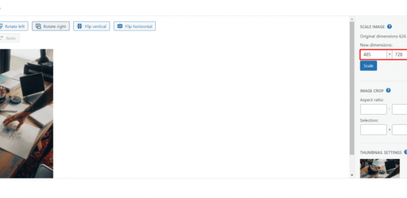
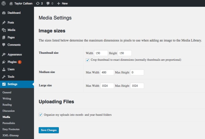
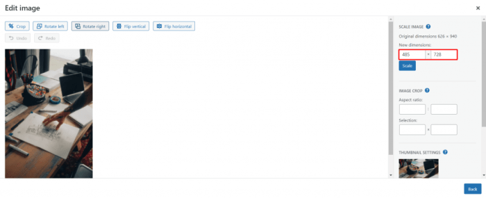
Image Resizing and Cropping
Image resizing and cropping are fundamental steps in optimizing images for different devices and screen sizes. Resizing reduces the file size of an image without sacrificing visual quality. Cropping removes unnecessary portions of an image, further optimizing file size and ensuring the image fits its intended space. Proper resizing and cropping are critical for maintaining visual appeal while enhancing page load speed.
Optimizing image display in WordPress is key for a smooth user experience. One crucial aspect is serving scaled images efficiently. Plugins can handle this easily. Knowing how to disable overflow in WordPress can also improve your site’s responsiveness. how to disable overflow in WordPress can help with that.
Ultimately, these techniques, combined with optimized image sizes, contribute to a fast and visually appealing website.
Responsive Image Techniques in WordPress
Responsive image techniques in WordPress are essential for displaying images correctly on various devices and screen sizes. WordPress offers built-in functionalities and plugins that automatically adjust image sizes based on the user’s device, browser, and screen resolution. This approach eliminates the need for multiple image versions for different screen sizes, leading to improved performance and reduced bandwidth usage.
Image Compression and Quality Settings
Image compression significantly reduces the file size of an image without compromising its visual quality. Various compression techniques, like lossy and lossless compression, are available. Lossy compression results in a smaller file size but may slightly degrade image quality, while lossless compression maintains the original image quality. Choosing the appropriate compression level is crucial for achieving the best balance between file size reduction and image quality.Quality settings also play a vital role in image optimization.
Adjusting the quality settings can reduce file size without a noticeable loss in visual clarity. It’s important to find the optimal balance between file size and quality.
Comparison of Image Optimization Plugins
Numerous plugins offer image optimization capabilities for WordPress. Choosing the right plugin depends on your specific needs and technical expertise. Comparing different plugins helps you select the best option for your website.
| Plugin Name | Features | Pricing | User Reviews |
|---|---|---|---|
| ShortPixel Image Optimizer | Lossy and lossless compression, responsive images, lazy loading | Free and paid plans | Generally positive, highlighting speed improvements and ease of use |
| Smush Image Compression and Optimization | Lossy and lossless compression, image resizing, responsive images | Free and paid plans | Widely used, with many users praising its performance and features |
| WP Smush.it | Lossy and lossless compression, resizing, background optimization | Free and paid plans | Known for its ability to reduce image sizes significantly, with positive user feedback |
Automatic Image Scaling with Plugins
Image optimization plugins automate the process of scaling images for different screen sizes. They analyze images, automatically resize them, and apply compression, optimizing image display on various devices. This significantly simplifies the image optimization process.
Implementing Scaled Images with WordPress Plugins
WordPress plugins offer a streamlined approach to managing scaled images, automating the resizing process and significantly reducing manual effort. These tools often integrate seamlessly with existing image optimization strategies, enhancing website performance by delivering optimized images tailored to different screen sizes. This approach ensures faster loading times, improving user experience and search engine rankings.Plugins provide a user-friendly interface for handling various image dimensions and formats, enabling users to fine-tune settings and achieve desired results.
They typically support a range of image formats and can be customized to accommodate specific website needs, ensuring images are displayed optimally across different devices and screen resolutions.
Popular WordPress Plugins for Scaled Images
Several plugins excel at managing image scaling in WordPress. These include, but are not limited to, ShortPixel, EWWW Image Optimizer, and Optimole. Each plugin offers unique features and functionalities, allowing users to select the best fit for their specific requirements. Consider factors such as image optimization capabilities, resizing options, and integration with other plugins when making your selection.
Installation and Configuration of Image Scaling Plugins
Installing and configuring image scaling plugins is generally straightforward. Most plugins offer clear instructions and user-friendly interfaces. The installation process typically involves downloading the plugin from the WordPress repository, activating it, and then configuring its settings to match your needs. Detailed instructions for each plugin can be found on their respective websites or through online tutorials.
Automatic Resizing of Images Based on Screen Size
Most plugins support automatic resizing of images based on screen size. This crucial feature dynamically adjusts image dimensions to fit different screen resolutions, preventing images from appearing too large or small. This ensures a consistent visual experience across a wide array of devices and screen sizes.
Pros and Cons of Using Plugins for Image Scaling
| Pros | Cons |
|---|---|
| Ease of use and automation | Potential for increased plugin load time if not carefully selected |
| Reduced manual resizing effort | Increased complexity for beginners who are unfamiliar with technical image settings |
| Improved website performance | Potential conflicts with other plugins or themes |
| Support for various image formats | Need for plugin maintenance and updates |
Using ShortPixel for Image Optimization (Step-by-Step)
This plugin provides comprehensive image optimization, including resizing, and is a popular choice for improving website performance.
Install and activate the ShortPixel plugin.
Access the ShortPixel settings in your WordPress dashboard.
Configure the desired image optimization settings.
Upload your images.
Optimizing image display in WordPress is key for a fast website. Scaling images efficiently is crucial, and there are various plugins to help. However, sometimes extraneous elements like emojis can unexpectedly impact image loading times. To ensure smooth image delivery, consider a method like using a plugin that automatically resizes images to the correct dimensions for different screen sizes.
Knowing how to disable emojis in WordPress, as outlined in this guide how to disable emojis in wordpress , can also contribute to a more streamlined website experience and potentially faster image loading. This is a great practice for achieving optimal image serving in WordPress.
ShortPixel will automatically resize images to optimal dimensions based on the settings you have configured.
Review the optimized images and adjust settings as needed.
Optimizing image sizes for WordPress is crucial for site speed. A great way to easily serve scaled images is by using plugins like ShortPixel. This ensures your images load quickly, which is key for user experience. Meanwhile, it’s inspiring to see companies like clicta digital agency expands to open a new office in Littleton to meet the rising demand for growth marketing services , demonstrating how focusing on efficiency and scalability can lead to significant growth.
This ultimately benefits their clients by improving website performance, which directly relates back to serving scaled images effectively.
Code-Based Image Scaling Solutions
Taking the manual approach to image resizing in WordPress can be cumbersome and inefficient, especially when dealing with a large number of images or complex layouts. Code-based solutions provide a more flexible and powerful way to scale images dynamically, allowing for tailored resizing based on specific needs. This approach gives you granular control over image dimensions and aspect ratios, often exceeding the capabilities of image optimization plugins.WordPress functions like `wp_get_attachment_image` provide a foundation for dynamically resizing images.
By combining these functions with conditional logic and custom code, you can achieve sophisticated scaling strategies. This approach is especially useful when you need to adjust image sizes for different screen sizes or layout variations. Furthermore, this approach allows for greater control over the image’s final dimensions, aspect ratios, and quality, ensuring that your images are displayed optimally across different devices and contexts.
Customizing Image Sizes for Specific Layouts and Themes
Dynamic image resizing allows for tailor-made solutions for specific layout needs. For example, you can resize images differently for blog posts, featured images, or within custom theme elements. This level of customization enables you to maintain a consistent design across your site while optimizing image display. The code can be integrated directly into your theme’s functions.php file or through custom functions.
This enables you to apply unique resizing logic to different areas of your site, ensuring images always match their intended display area.
Dynamic Resizing Based on Screen Width
Media queries and conditional logic can be employed to resize images based on the screen width of the visitor’s device. This is crucial for responsive design, as it ensures that images are displayed at an appropriate size for different screen resolutions, preventing distortion or excessive loading times. This approach leverages the power of media queries to provide a dynamic experience for the user, ensuring images always look their best, no matter the device.
For instance, you might use JavaScript to adjust the image size when the screen width changes.
WordPress Functions for Image Scaling
The `wp_get_attachment_image` function is a cornerstone for handling image resizing within WordPress. This function allows you to retrieve and display images, with the ability to specify dimensions. Combining this with conditional logic and custom sizing allows for dynamic scaling. For example, within a custom theme, you could modify `wp_get_attachment_image` to load images based on screen size, using JavaScript or server-side PHP functions.
Code Snippets for Dynamic Resizing
Here are a few examples of code snippets to dynamically resize images based on screen width:“`PHP// Example 1: Basic resizing based on screen widthfunction my_custom_image_resize($width, $height, $image_src) if (is_active_sidebar(‘sidebar-1’)) // Resize for sidebar $width = 300; $height = 200; return wp_get_attachment_image_src($image_src, array($width, $height));// Example 2: Resizing for different screen sizes using media queriesfunction responsive_image_resize($src, $width, $height) $img_width = get_theme_mod(‘image_width’, 600); if (wp_is_mobile()) $img_width = 300; return wp_get_attachment_image_src($src, array($img_width, $height));“`These examples demonstrate how to leverage conditional logic and theme customization to adapt image sizes.
This technique is particularly useful for adapting image sizes to different screen sizes and layouts.
Pros and Cons of Code-Based Methods
Code-based image scaling offers greater flexibility and control compared to plugins. You can fine-tune your resizing logic to match specific requirements, ensuring images are always displayed perfectly. However, implementing and maintaining this code can be more complex, requiring a deeper understanding of WordPress functions and PHP. This complexity could be a disadvantage for users less familiar with code.
The code also needs to be meticulously tested to ensure compatibility with different themes and configurations.
Code Examples Table
| Code Snippet | Parameter | Description | Output |
|---|---|---|---|
wp_get_attachment_image( $attachment_id, 'thumbnail' ); |
$attachment_id, 'thumbnail' |
Retrieves and displays the thumbnail version of an image. | Displays a thumbnail image. |
wp_get_attachment_image_src( $attachment_id, 'full' ); |
$attachment_id, 'full' |
Returns the source URL of the original image. | Returns the URL of the original image. |
wp_get_attachment_image_src($attachment_id, array(200, 150)); |
$attachment_id, array(200, 150) |
Retrieves the URL of the image with specified dimensions. | Returns the URL of an image resized to 200 pixels wide and 150 pixels high. |
Responsive Image Strategies in WordPress Themes
WordPress themes are crucial for a visually appealing and user-friendly website. A key aspect of modern web design is responsiveness, allowing content to adapt seamlessly to various screen sizes, from tiny mobile phones to large desktop monitors. This adaptability demands efficient image handling, and effective responsive image strategies within themes are essential for optimal performance and a positive user experience.Responsive images aren’t just about displaying images correctly on different devices; they’re also about delivering the
- right* image size for the
- right* device, preventing excessive loading times. This approach conserves bandwidth and improves page load speeds, a significant factor in search engine rankings and user satisfaction.
Understanding `srcset` and `sizes` Attributes, How to easily serve scaled images in wordpress
The `srcset` and `sizes` attributes are fundamental to responsive image delivery in HTML. The `srcset` attribute specifies multiple image sources with different resolutions, allowing the browser to select the most appropriate one based on the user’s device. The `sizes` attribute, in turn, provides information about the image’s intended size on the page, helping the browser make a more informed choice about the best `srcset` image.These attributes work together to dynamically serve the optimal image size, ensuring the best possible visual experience for every user.
Using the `picture` Element for Advanced Optimization
The ` ` element is a more sophisticated approach to handling responsive images. It allows for a more complex configuration, enabling themes to deliver different images for different media types (like retina displays) and using various image formats (WebP, AVIF) for better compression and quality. This gives developers more control over the image selection process, making it easier to optimize for diverse user needs.
Implementing Responsive Images in Custom Themes
Integrating responsive image support into custom themes requires careful consideration of how images are handled within the template files. Themes should use functions like `wp_get_attachment_image_srcset()` and `wp_get_attachment_image_sizes()` to retrieve the appropriate image sources, then incorporate these values into the `srcset` and `sizes` attributes within the HTML markup. This approach ensures the image optimization is handled seamlessly within the theme’s existing structure.
Example of Responsive Image Markup
“`html

“`
This example showcases the basic structure of `srcset` and `sizes` attributes. The `srcset` specifies different image sizes with their respective widths, while the `sizes` attribute provides a media query for different screen sizes. The browser will use the appropriate image based on the viewport width. The image will take up 100% of the available width for screens narrower than 600px, otherwise, it will be 600px wide.
Advanced Image Optimization Techniques
Optimizing images for the web goes beyond simply resizing them. Advanced techniques focus on delivering high-quality visuals while minimizing file sizes and ensuring fast loading times across various devices. This involves strategic choices about image formats, clever caching strategies, and a deep understanding of how different devices interact with images.
Image optimization is crucial for a positive user experience. Slow-loading images can frustrate visitors and negatively impact search engine rankings. Employing the right techniques can dramatically improve page performance, making your website faster and more user-friendly.
Generating Multiple Image Sizes
Creating different image sizes for various devices (mobile, tablet, desktop) is a fundamental aspect of responsive design. This ensures optimal visual quality without sacrificing loading speed. By pre-generating optimized versions tailored to specific screen sizes, you can reduce the overall image size on your site. This is often done using image editing software or plugins that allow you to automatically create different sizes from a single source image.
Image Formats for Different Situations
Choosing the right image format is critical for balancing image quality and file size. JPEG is ideal for photographs, where compression is acceptable for preserving visual quality. PNG excels for graphics with sharp lines and solid colors, where lossless compression maintains detail. WebP, a newer format, offers a good balance of quality and compression, often outperforming both JPEG and PNG in file size reduction.
Use WebP wherever possible; it’s supported by modern browsers and offers better performance.
Image Caching and Delivery Networks
Caching and Content Delivery Networks (CDNs) are essential for boosting image loading speeds. Caching involves storing frequently accessed images on intermediary servers closer to users. This reduces the distance data has to travel, decreasing loading times. CDNs further enhance this by distributing copies of your images across a global network of servers. This ensures that users are served images from the closest server, improving response times and reducing latency.
Optimizing Image Loading Times with a CDN
Integrating a CDN into your WordPress setup is a powerful way to speed up image loading times. When a user requests an image, the CDN serves it from a server geographically close to the user, drastically reducing the time it takes to display the image. This results in a faster and more responsive user experience, particularly for users in different parts of the world.
Tools like Cloudflare, Amazon CloudFront, and others are commonly used for this purpose.
Importance of Image Formats and Their Impact
The chosen image format directly affects both image quality and loading times. JPEGs, with their lossy compression, can yield smaller file sizes but might reduce image quality. PNGs, lossless, retain detail but are typically larger in size. WebP, a more recent format, often achieves smaller sizes than JPEGs or PNGs without significant quality loss. Selecting the appropriate format is vital for delivering optimal performance.
Lazy Loading for Images
Lazy loading is a technique that delays the loading of images until they are about to come into view. This significantly improves initial page load times, as the browser doesn’t have to download unnecessary images immediately. Lazy loading is implemented via plugins or theme code, which instructs the browser to load images only when they are needed. This leads to faster initial page load times, which is essential for keeping users engaged.
Troubleshooting Scaled Images in WordPress
Serving scaled images efficiently is crucial for a fast and responsive website. However, issues can arise. This section delves into common problems and provides practical steps for resolving them. Knowing how to diagnose and fix image loading problems can significantly improve user experience.
Troubleshooting scaled images involves a multifaceted approach. It’s not just about the image itself; the interplay between the image, the server, the theme, and the browser can all contribute to problems. Effective troubleshooting requires methodical investigation and a keen eye for detail.
Common Image Loading Issues
Various factors can cause scaled images to load incorrectly or not at all. These include problems with the image files themselves, issues with server configurations, and compatibility problems with WordPress themes or plugins. Understanding these potential problems is the first step toward effective troubleshooting.
- Incorrect Image Dimensions: Images might not scale as expected if the dimensions are incorrectly specified in the WordPress settings or the theme’s code. This can lead to distorted or improperly sized images on different screen sizes.
- Broken or Missing Image Files: Corrupted or deleted image files can lead to missing image placeholders or a complete failure to display the image. This often results from accidental file deletions or server errors.
- Caching Issues: WordPress caches images to improve performance. However, outdated or corrupted cache files can prevent the display of correctly scaled images. A misconfigured cache plugin can also lead to issues.
- Theme or Plugin Conflicts: Incompatibilities between WordPress themes and plugins can disrupt image loading. This can manifest as incorrect scaling, broken images, or unexpected errors.
- Server Configuration Problems: Issues with the web server, such as incorrect file permissions or limitations in handling image requests, can cause image loading problems. For instance, the server might not have the correct permissions to serve the images, or the server might be overloaded.
Troubleshooting Steps
A systematic approach to troubleshooting is essential. This involves checking the image files, reviewing the server logs, and verifying compatibility with the theme and plugins. The flowchart below guides you through these steps.
| Step | Action | Expected Result | Next Steps |
|---|---|---|---|
| 1 | Verify Image File Integrity: Check the image files for corruption or missing files. | Images are intact and accessible. | Proceed to Step 2. |
| 2 | Check Server Logs: Examine server logs for any error messages related to image requests. | Logs indicate no errors related to image serving. | Proceed to Step 3. |
| 3 | Review Theme and Plugin Compatibility: Verify compatibility between the current theme and plugins. | No conflicts are detected. | Proceed to Step 4. |
| 4 | Check Image Scaling Settings: Confirm proper scaling settings within the theme or WordPress itself. | Scaling settings are correct and applicable. | If the issue persists, consult theme documentation or seek support from the theme developer. |
Identifying and Fixing Broken Images
Broken images often indicate issues with the file paths or server access. Inspecting the HTML source code for the affected page can reveal broken links or incorrect image URLs. Also, consider checking the image’s location in the file system to ensure it hasn’t been moved or deleted.
Optimizing Image Loading within Themes
Theme-specific image loading issues may arise due to improper use of responsive image techniques. Review the theme’s code for image handling, ensuring correct use of media queries and image sizes. Optimizing image sizes for different screen resolutions and devices is vital for performance.
Epilogue
In conclusion, serving scaled images efficiently in WordPress is a multifaceted process that involves understanding image formats, optimization techniques, and leveraging WordPress plugins or code. By following the strategies Artikeld in this guide, you can significantly improve your website’s performance and user experience. Remember to choose the approach that best suits your technical skills and website needs. From plugins to responsive image strategies, the options are diverse and empowering.
Your WordPress site will thank you for it!


