
Common website navigation mistakes are surprisingly frequent, often leading to frustrated users and lost conversions. This comprehensive guide explores the pitfalls of poor navigation, highlighting how intuitive design can transform a website from confusing to captivating. We’ll delve into everything from menu structure to mobile-friendliness, and even the crucial role of calls-to-action and search functionality.
From cluttered menus to inaccessible elements, this post will unpack the reasons behind these mistakes, demonstrating how to create a user-friendly experience. We’ll provide practical examples, comparing effective and ineffective designs, and offering actionable advice for improvement.
Introduction to Website Navigation Mistakes
Website navigation is the cornerstone of a user-friendly online experience. Poor navigation can lead to frustrated users abandoning a site, impacting conversion rates and overall brand perception. A well-designed navigation system ensures users can easily find the information they need, leading to increased engagement and satisfaction. A clear and logical structure helps visitors understand the site’s content and purpose, making it easy to browse and explore.Effective navigation goes beyond just having links; it’s about creating a seamless and intuitive path for users to achieve their goals.
This involves careful consideration of the site’s structure, the placement of links, and the overall visual design. A poorly structured site can be confusing and overwhelming, driving visitors away. This guide will delve into common website navigation pitfalls and illustrate how to create a user-friendly experience. Understanding these mistakes is crucial for crafting a website that effectively guides users and keeps them engaged.
Common Navigation Issues
Users frequently encounter frustration due to poor navigation, hindering their ability to find the desired content. This often stems from unclear sitemaps, inconsistent labeling, and hidden or poorly placed navigation elements. These issues can lead to a significant decline in user engagement and potentially affect business objectives.
Navigation Structure
A well-structured navigation system mirrors the site’s content organization. This means that the placement and hierarchy of links should reflect the logical flow of information. A poorly structured navigation system, on the other hand, often lacks a clear hierarchy, making it difficult for users to find their way around. Imagine a website with a disorganized menu that doesn’t logically group related topics.
Users will likely struggle to find the specific information they seek. For instance, a category for “Electronics” might be nested under “Home Appliances,” which is a sub-category of “Home Improvement.” This is confusing and disorienting for the user.
Information Architecture
Effective information architecture is crucial for clear website navigation. It involves organizing content in a way that makes sense to users. Websites with poorly organized information architecture can cause significant problems for users. A site that fails to categorize products logically, for example, or doesn’t provide clear labels for sections, can be incredibly frustrating for visitors. Consider a website selling clothing.
If the “men’s” section is buried deep within the site, while the “women’s” section is prominently featured, this might signal a bias in the site’s design. This is a common pitfall.
Visual Hierarchy
Visual hierarchy refers to how elements on a page are arranged to guide the user’s eye. This includes the use of fonts, colors, and spacing. A website with a poor visual hierarchy can confuse users and make it hard to find what they’re looking for. A website that uses similar fonts and colors for all its navigation links, without any clear visual distinctions, will be difficult to navigate.
| Feature | Good Example | Bad Example |
|---|---|---|
| Navigation Structure | A website with a clear menu bar that groups related products or services logically. | A website with a cluttered menu bar, where links are jumbled together without any apparent order. |
| Information Architecture | A website that organizes its content into logical categories and subcategories, reflecting the site’s purpose. | A website that has a confusing organizational structure, where products or services are difficult to find. |
| Visual Hierarchy | A website that uses different font sizes, colors, and spacing to highlight important elements and guide the user’s eye. | A website that uses similar fonts and colors for all its navigation elements, making it hard to distinguish between important and less important information. |
Common Navigation Structure Errors
Website navigation is the cornerstone of a user-friendly experience. A well-designed navigation system allows users to easily find the information they need, increasing engagement and ultimately driving conversions. However, poor navigation structures can quickly frustrate users and damage a website’s effectiveness. This section delves into common navigation structure errors, emphasizing the importance of logical grouping, consistent design, and a clear hierarchy.Poorly structured menus can lead to a confusing user experience.
When users struggle to find what they need, they’re likely to abandon the site. This is a critical area for improvement, as a clear navigation system directly impacts user satisfaction and the overall success of the website.
Multi-Level Menus
Deeply nested menus with multiple levels can overwhelm users. They quickly lose track of their position within the site’s structure, making it difficult to find the desired content. A user’s journey becomes fragmented, and the site’s value proposition is diluted. This is particularly problematic for sites with extensive content or complex products. Consider the experience of trying to navigate a website with multiple layers of sub-menus; it quickly becomes cumbersome and disorienting.
A good rule of thumb is to limit the number of menu levels to three. If more levels are necessary, consider alternative methods such as search functionality or a more intuitive organizational scheme.
Unclear Hierarchy
Inconsistent or unclear hierarchy in the navigation structure can also lead to a poor user experience. Users expect a logical progression from broad categories to more specific content. If the hierarchy is not well-defined, users may feel lost and unable to locate the desired information. A lack of clarity in the hierarchical structure of a website can frustrate users and negatively impact the overall user experience.
For instance, if a “Products” menu item leads to a page displaying various product categories, but these categories aren’t clearly grouped under broader product types, the structure is unclear and less effective.
Logical Grouping of Content
Logical grouping of website content is essential for effective navigation. Categorizing content into meaningful groups helps users understand the site’s structure and find relevant information. Users expect a logical arrangement of content, making it easier to find what they need. Imagine a website selling electronics. If the navigation doesn’t group items like “Cameras,” “Laptops,” and “Smartphones” under a broader “Technology” category, it becomes difficult to locate products within the broader category.
Inconsistent Navigation Styles
Inconsistency in navigation styles across different pages creates a disjointed user experience. Users expect a consistent interface to navigate the website. If the navigation structure or design varies from page to page, users may become confused and disoriented. Imagine a user who is accustomed to a particular navigation pattern. If a website suddenly changes the navigation structure on a subsequent page, it could lead to confusion and a negative user experience.
Maintaining a consistent look and feel across the entire site enhances the user experience.
Menu Structure Analysis
This table provides a comparative analysis of different menu structures, highlighting their advantages and disadvantages.
| Menu Structure | Pros | Cons |
|---|---|---|
| Dropdown Menu | Compact, saves space on the screen, easy to access subcategories. | Can become cluttered if too many items are nested, and not easily accessible on mobile devices. |
| Accordion Menu | Ideal for extensive content, easy to manage. | Can appear visually heavy, and not suitable for small screens. |
| Horizontal Tab Menu | Clear visual hierarchy, suitable for broad categories. | Can become unwieldy with numerous categories, potentially causing horizontal scrolling. |
Information Architecture and Navigation
A website’s information architecture (IA) is the underlying structure that dictates how content is organized and accessed. Effective IA is crucial for user experience, ensuring that visitors can easily find the information they need. Poor IA, on the other hand, can lead to frustration and abandonment. A well-structured website, with clear navigation pathways, leads to higher engagement and conversions.A strong IA is more than just a collection of pages; it’s a carefully crafted map that guides users through the digital landscape.
It dictates how content is categorized, how different sections relate to each other, and ultimately, how easily users can achieve their goals on the site. A well-designed IA anticipates user needs and preferences, leading to a positive user experience.
Impact of Poor Information Architecture on User Experience
Poor IA manifests in several ways, negatively impacting the user experience. Users might struggle to find specific information, get lost in a maze of confusing links, or become overwhelmed by the sheer volume of content. This disorientation can lead to frustration and abandonment, ultimately affecting the website’s overall effectiveness. In short, a poorly designed IA can damage credibility and drive away potential customers.
Role of Sitemaps in Navigation
Sitemaps are visual representations of a website’s structure. They act as a roadmap, showing how different pages are interconnected and how users can navigate between them. A well-designed sitemap makes it easy for users to grasp the overall structure of the website, allowing them to find what they need quickly and efficiently. They are essential for both users and search engines, providing a clear view of the site’s organization.
Effective and Ineffective Sitemap Examples
A good sitemap clearly shows the hierarchy of pages. For instance, a site selling electronics might have a sitemap showing categories like “Laptops,” “Smartphones,” “Accessories,” with subcategories beneath each. This structure allows users to easily locate specific products. In contrast, an ineffective sitemap might present a flat structure, with all pages listed in a single, unorganized list.
This makes it difficult for users to understand the relationships between different sections. Another example of an ineffective sitemap is one that lacks clarity, with ambiguous categories or overlapping content.
Comparison of Information Architecture Models
Different models for structuring information architecture exist, each with its own strengths and weaknesses. The hierarchical model, like a tree, organizes content in a top-down fashion. This is common for e-commerce sites, with broad categories leading to more specific subcategories. The sequential model, used in step-by-step guides or tutorials, organizes content in a linear fashion. Sequential models are good for processes that must be followed in a specific order.
The matrix model is like a grid, useful when multiple categories apply to a piece of content, common in knowledge bases or technical documentation. Finally, the relational model, which links content based on associations and connections, works well for complex ideas or projects where connections between concepts are key.
Visual Hierarchy and Navigation Design
A well-designed website prioritizes user experience, and visual hierarchy plays a crucial role in guiding users through the site. Clear visual cues help users quickly understand the structure and navigate to the desired content. By strategically using color, font size, and spacing, designers can create a clear path for users, minimizing confusion and maximizing engagement.Effective visual hierarchy enhances the user journey by allowing them to effortlessly scan and locate information.
This structured approach not only improves navigation but also contributes to a more aesthetically pleasing and user-friendly website.
Visual Cues and Their Impact
Visual cues, such as color, font size, and spacing, significantly impact how users perceive and interact with website content. These elements create a visual hierarchy that guides users through the website, making navigation intuitive and efficient.
- Color is a powerful tool in creating visual hierarchy. Using contrasting colors for headings, links, and important elements helps draw the user’s eye to key information. For example, a vibrant blue for links can clearly distinguish them from body text, while a darker shade of blue for active links highlights the user’s current location. Conversely, using similar colors for related elements can create a sense of cohesion and belonging.
- Font size and style contribute to a visual hierarchy. Larger font sizes for headings and subheadings make them more prominent, directing the user’s attention. Different font weights (bold, italic) can also emphasize specific text, such as important instructions or call-to-action buttons. Choosing legible fonts that are appropriate for the overall website design and brand identity enhances the user experience.
- Whitespace, or spacing, is crucial for readability and visual clarity. Appropriate spacing between elements, such as paragraphs, headings, and images, creates visual breathing room and avoids a cluttered look. Strategic use of negative space can also draw focus to specific elements. For instance, a large image or graphic with minimal text around it directs the user’s attention to the image itself, making it a focal point.
Creating a Clear Visual Hierarchy
A clear visual hierarchy enhances the user experience by making it easier for users to scan the page and locate the information they need. It guides the eye from the most important elements to the less important ones, effectively organizing the content.
Poor website navigation can really hurt your site’s traffic, right? It’s like trying to find a needle in a haystack. Think about how crucial influencer outreach in content marketing influencer outreach in content marketing can be for driving traffic. But even with great influencer collaborations, a confusing website layout can still leave visitors frustrated and heading for the exit.
Clear and intuitive navigation is key for a positive user experience, and ultimately, for driving business.
- Prioritize content based on importance. Headings, key information, and call-to-action buttons should be visually prominent to guide the user’s focus. This often involves using larger font sizes, contrasting colors, and strategic placement.
- Use a consistent visual language throughout the website. A consistent style for headings, paragraphs, and other elements creates a cohesive visual structure, making it easier for users to navigate the site. Consistency in color schemes, font choices, and spacing ensures a unified aesthetic and improves the overall user experience.
- Use visual cues to emphasize key elements. For example, using bold text, highlighting important words, and employing contrasting colors can guide the user’s eye to essential information. Icons and illustrations can also play a significant role in drawing attention to particular areas.
Visual Cues and User Experience
This table illustrates the relationship between visual cues and their impact on user experience. A well-defined visual hierarchy leads to a more positive user experience.
| Visual Cue | Impact on User Experience |
|---|---|
| Large, bold headings | Improved readability and clear identification of important sections |
| Contrasting colors for links and buttons | Easy identification and navigation of links and call-to-action elements |
| Sufficient whitespace around elements | Improved readability and reduced visual clutter |
| Consistent font style and size | Creates a cohesive visual language, enhancing brand identity and user experience |
| Strategic use of icons and images | Visual cues to highlight content, improving comprehension and user engagement |
Mobile-Friendly Navigation: Common Website Navigation Mistakes
Modern websites must prioritize mobile users, and navigation is crucial for a positive mobile experience. A poorly designed mobile navigation system can lead to frustration, lost customers, and decreased conversions. Responsive design principles are essential for creating a seamless experience across various screen sizes.Mobile navigation differs significantly from desktop navigation due to the smaller screen size and touch-based interaction.
Users often need to tap or swipe to interact with elements, making the design of the navigation crucial for ease of use. Understanding these nuances is critical to developing a user-friendly and effective mobile navigation experience.
Responsive Design for Navigation
Responsive design ensures that the website’s layout and navigation adjust dynamically to fit different screen sizes, from large desktops to small mobile devices. This adaptability is paramount for providing a consistent and intuitive user experience across all platforms. Using flexible layouts and fluid grids allows the website to adapt seamlessly, maintaining a clear hierarchy and functionality on all devices.
The use of media queries in CSS is a core component of responsive design, allowing for tailored styles based on the screen’s width and resolution.
Mobile Navigation Challenges
Mobile devices present unique navigation challenges. Limited screen real estate forces a more concise and focused design. The touch interface requires intuitive tap targets and simple interactions. Navigating complex information structures effectively on a small screen demands careful planning. Users might need more visual cues to quickly find what they need, and the interaction design must consider the constraints of a touch-based interface.
Mobile-Specific Navigation Best Practices
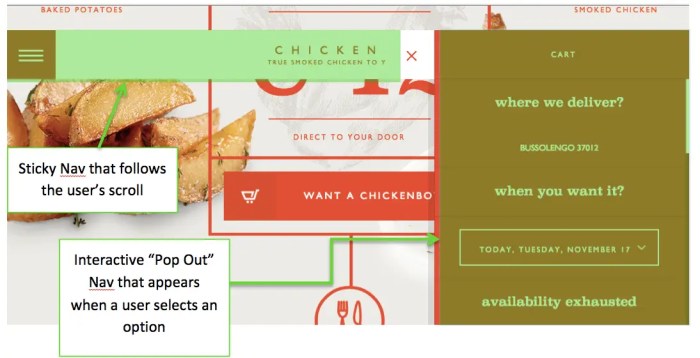
Effective mobile navigation is characterized by simplicity and clarity. Using a hamburger menu (three horizontal lines) for toggling secondary navigation is a common and widely accepted practice. This allows for compact display on smaller screens while still providing access to all necessary pages. Clear visual hierarchy, employing contrasting colors and appropriate spacing, is also essential. This ensures that links and controls are easily identifiable.
The use of concise labels for links is crucial for quick and easy understanding.
Examples of Well-Designed Mobile Navigation
A well-designed mobile navigation example would use a hamburger menu that expands to reveal a clear and organized list of site sections. Links would be spaced appropriately and use easily distinguishable text and colors. This design would prioritize quick access to essential pages and information. The navigation would respond seamlessly to screen size changes, adjusting its display appropriately for both portrait and landscape orientations.
For instance, a website selling clothing would display a menu with sections like “Shop,” “About Us,” and “Contact Us.”
Ugh, clunky website navigation is a real drag, isn’t it? Poorly designed menus and confusing layouts can drive visitors away faster than a poorly written Facebook ad copy. Want to see how to craft better results Facebook ads to target the right audience? Check out this guide on better results facebook ads. Ultimately, a smooth, intuitive navigation experience is key to keeping users engaged and encouraging conversions – just like a well-crafted ad campaign.
Examples of Poorly Designed Mobile Navigation
Conversely, a poorly designed mobile navigation system might use a cluttered layout with overlapping links. Labels would be vague or difficult to read. The hamburger menu might not respond correctly to taps, or the links may be too small to tap accurately. This could result in a frustrating user experience. A website for a travel agency with a mobile menu that only shows the main categories, such as “Flights,” “Hotels,” “Cars,” without sub-menus or detailed information is a poor example.
The user would struggle to access specific destinations or options.
Search Functionality and Navigation
A robust search function is crucial for any website aiming to provide a seamless user experience. It empowers users to quickly locate specific information without navigating through extensive menus and pages, ultimately improving user satisfaction and conversion rates. Effective search integration is not just about having a search bar; it’s about seamlessly blending the search feature with the overall website navigation structure.A well-designed search function anticipates user needs and helps them find precisely what they’re looking for.
This reduces frustration and encourages exploration of the site’s content. Integrating search with navigation enhances discoverability and simplifies the user journey.
Significance of a Robust Search Function
A strong search function allows users to find specific content efficiently. Users are more likely to engage with a website if they can easily locate the information they need. This efficiency translates into improved user satisfaction and potentially higher conversion rates. A well-designed search can also identify hidden opportunities within the site’s content. This is especially important for large websites with extensive content.
Effective Search Integration with Navigation
Search integration should be intuitive and seamlessly integrated into the website’s navigation. The search bar should be prominently displayed and easily accessible from any page. This ensures that users can initiate a search from any point within the site, eliminating the need to navigate back to a dedicated search page.
Importance of Clear Search Results Presentation
Clear search results are paramount to a successful search function. A user-friendly presentation of search results is critical to guiding users to the desired information. This involves presenting results in a concise and easily digestible format, with clear categorization and filtering options. Users should be able to quickly identify relevant results, understand their context, and easily navigate to the specific content they’re seeking.

Ugh, clunky navigation is a website killer. Poorly designed menus and confusing pathways can frustrate visitors and torpedo your conversion rates. Learning how to optimize your website’s structure is key for success. Understanding how users interact with your site is crucial, and the conversion funnel survival guide will help you understand how to build a smooth journey for your customers, so you can avoid these common navigation snags.
Focusing on a seamless user experience will directly affect how well your site performs.
For example, if a user searches for “best hiking trails,” the results should clearly categorize trails by location, difficulty, and other relevant factors. This allows users to quickly narrow down their search and find the perfect trail for their needs.
Effective Search Results Page Design
A well-designed search results page should prioritize clarity and user-friendliness. The results should be presented in a structured format, with relevant information readily available. For example, the results could include the title of the page, a brief snippet of the content, and the page URL. The use of clear visual cues, such as highlighting s in the search results, helps users identify relevant results quickly.
Furthermore, enabling filtering options, such as sorting results by date or relevance, can greatly improve the user experience. Implementing pagination allows users to navigate through extensive search results without overwhelming them. A search results page should ideally provide a means to refine the search based on initial results, thereby providing additional options for finding the desired content.
For example, a user searching for “Italian restaurants” might be able to filter results further by cuisine type, price range, or location.
Call-to-Action Placement and Navigation
Clear and compelling calls to action (CTAs) are crucial for guiding users towards desired outcomes on a website. They act as signposts, directing visitors to specific actions like purchasing a product, signing up for a newsletter, or contacting support. Effective CTAs are more than just buttons; they are carefully crafted prompts that resonate with user intent.Effective website navigation relies on seamlessly integrating CTAs within the overall structure.
Strategic placement ensures that the call to action is readily apparent and encourages user engagement. A well-placed CTA can significantly influence user behavior, leading to higher conversion rates and a more successful online experience.
Importance of Clear Calls to Action
CTAs are essential for guiding users towards desired outcomes. They explicitly communicate the next step, prompting visitors to take the intended action. Ambiguous or poorly defined CTAs can lead to confusion and decreased engagement. Clearly articulated CTAs, on the other hand, provide a clear path forward, improving user experience and increasing conversion rates. They should be tailored to the specific context and the user’s needs.
Optimal Placement of Calls to Action within Navigation, Common website navigation mistakes
The placement of a CTA within the website’s navigation structure is paramount. Ideally, CTAs should be visible and accessible without requiring extensive scrolling or searching. This placement should be strategically aligned with the user’s journey, ensuring the CTA appears at the opportune moment. Considering the user’s expected actions and the context of the page is key to effective CTA placement.
Impact of Well-Placed Calls to Action on User Behavior
Well-placed CTAs can significantly influence user behavior. By presenting the desired action prominently and conveniently, website owners can encourage users to complete the intended task. A clear and visible CTA can reduce the cognitive load on the user, making the next step more intuitive and engaging. This leads to increased conversion rates and a more efficient user experience.
The CTA should be aligned with the user’s context and goals.
Call-to-Action Placement Examples
| Call-to-Action Placement | Effectiveness |
|---|---|
| Homepage Hero Section: Prominent CTA button directing users to a key offer. | High. Immediately visible and attention-grabbing. |
| Product Page: “Add to Cart” button prominently displayed alongside product details. | High. Encourages immediate purchase decision. |
| Footer: Subscription form or contact information. | Moderate. Accessible but less prominent than other placements. |
| Navigation Bar: “Shop Now” button within the main menu. | High. Provides easy access throughout the site. |
| Pop-up modal (used sparingly): Limited-time offer or discount. | Moderate. Can be disruptive if not used judiciously. |
Accessibility Considerations in Navigation

Website navigation should be designed with inclusivity in mind, ensuring equal access for all users, regardless of their abilities or disabilities. A well-designed navigation system is not only crucial for a positive user experience but also essential for compliance with accessibility standards and ethical practices. This includes those with visual impairments, motor disabilities, cognitive differences, or temporary limitations.Accessible navigation is more than just a matter of good design; it’s a fundamental aspect of creating a website that truly serves everyone.
It involves thoughtful planning, understanding diverse needs, and employing best practices. These considerations will be explored in depth to ensure your navigation is inclusive and usable by everyone.
Importance of Accessible Navigation
Accessible navigation is critical for inclusivity and user experience. Users with disabilities, such as visual impairments, motor impairments, or cognitive differences, rely on assistive technologies like screen readers to interact with websites. Navigation that is not accessible makes these technologies ineffective, creating a significant barrier to access. Furthermore, non-disabled users may encounter temporary limitations like injuries or situations where keyboard navigation is preferred.
Best Practices for Creating Accessible Navigation
Implementing accessibility in navigation requires a multi-faceted approach. The following are crucial best practices:
- Keyboard Navigation: Ensure all interactive elements, including navigation links, can be activated and navigated solely through the keyboard. This allows users relying on keyboards, or those with limited mobility, to fully utilize the website without mouse interaction.
- Screen Reader Compatibility: Navigation elements should have descriptive text (alternative text) that accurately conveys the purpose and function of each link or element. This allows screen readers to accurately inform users about the content they are navigating to. For example, using “Contact Us” instead of just “Contact” provides more context. Avoid using generic terms like “link” or “button” in the alternative text.
The content of the link itself should be used.
- Semantic HTML: Utilize semantic HTML elements like `


