
Three interface designs to inspire you, exploring the fascinating world of user experience. From desktop to mobile, we’ll dissect the key principles of good interface design, examining usability, accessibility, and aesthetics. This journey unveils three distinct design styles – minimalist, material, and flat – and how they affect user emotions and interactions. We’ll also explore innovative concepts, accessibility considerations, and future trends, providing a comprehensive look at creating compelling interfaces.
This exploration goes beyond simple aesthetics, delving into the psychology behind user interactions and the practical implications of each design choice. We’ll analyze common user pain points, examining different interaction models, and highlighting the crucial role of feedback loops. By comparing successful applications, understanding the impact of context, and examining innovative designs, we aim to empower you with the knowledge to create interfaces that not only look good but also feel intuitive and user-friendly.
Introduction to Interface Design
Interface design is the art and science of creating user-friendly and visually appealing interactions between humans and digital systems. It encompasses everything from the layout of buttons and menus to the overall aesthetic of a website or application. A well-designed interface significantly impacts user experience, making tasks easier, more enjoyable, and ultimately, more efficient. Poorly designed interfaces, on the other hand, can frustrate users, leading to abandonment and negative impressions of the product or service.
Examples of User Interfaces
This section presents three distinct examples of user interfaces across different platforms, highlighting the diversity of interface design. These examples showcase how interfaces can be adapted to suit the specific needs of the platform and target audience.
- Desktop Interface: A desktop operating system like macOS or Windows presents a graphical interface with windows, icons, and menus for interacting with files, applications, and system settings. The interface typically emphasizes intuitive navigation and organization of data. The arrangement of icons, folders, and menus is crucial for efficiency, allowing users to quickly locate and interact with specific elements.
The use of familiar metaphors like “trash can” and “documents” simplifies the user’s understanding of the system’s functionality. A good example of a well-designed desktop interface is one that prioritizes visual clarity, allowing users to swiftly locate files and perform tasks without excessive effort.
- Mobile Interface: Mobile applications, designed for touch-screen interaction, prioritize concise information and streamlined navigation. The interface emphasizes simplicity, with limited screen real estate, prompting the use of icons, and interactive elements to minimize complexity. For instance, mobile banking apps typically feature a streamlined dashboard for quick access to key information. Another important consideration is responsiveness, as mobile interfaces must adapt to various screen sizes and orientations.
- Web Interface: Web interfaces are dynamic and often require complex interactions. They commonly involve elements such as menus, forms, and interactive maps. The primary objective of a well-designed web interface is to present information effectively and guide users through processes intuitively. For example, an e-commerce website must provide clear navigation, product display, and secure payment options. The visual elements are important for attracting and engaging users.
They are also responsible for conveying information clearly and compellingly to the users.
Key Principles of Good Interface Design
Effective interface design hinges on several key principles that influence user experience. These principles ensure the interface is usable, accessible, and aesthetically pleasing.
- Usability: A usable interface is intuitive and straightforward. Users should be able to accomplish tasks efficiently and with minimal effort. Key aspects include clear navigation, well-defined controls, and concise feedback mechanisms. This translates to a positive user experience.
- Accessibility: An accessible interface is usable by individuals with diverse abilities and needs, including those with disabilities. This involves designing interfaces that can be navigated using assistive technologies and complying with accessibility guidelines. Examples include providing alternative text for images and using keyboard-accessible controls.
- Aesthetics: Aesthetics play a crucial role in creating a positive and memorable experience. An aesthetically pleasing interface is visually appealing and creates a sense of harmony and order. This includes factors such as color palettes, typography, and layout. A well-considered aesthetic elevates the user experience beyond mere functionality.
Influence on User Experience
The principles of usability, accessibility, and aesthetics collectively influence user experience. A well-designed interface enhances user satisfaction, boosts efficiency, and fosters a positive interaction with the product or service. For example, a user-friendly interface reduces the time needed to complete a task, enhancing overall productivity.
Comparison of Interface Examples
This table compares and contrasts the three examples, focusing on their strengths and weaknesses.
| Feature | Desktop Interface | Mobile Interface | Web Interface |
|---|---|---|---|
| Strengths | Intuitive navigation, rich visual elements, desktop space allows more complex interactions | Ease of use, touch-optimized controls, responsiveness across devices | Flexibility, dynamic content, ability to present complex information |
| Weaknesses | Can be cluttered, not optimized for touchscreens, may require significant screen space | Limited screen space, may not be as detailed as desktop or web, less flexibility in complex interactions | Can be slow to load, accessibility concerns, may not be optimized for all devices |
Interface Design Inspiration
Interface design is crucial for user experience. A well-designed interface can significantly impact how users interact with and perceive a product. Different design styles evoke different emotions and can greatly influence user engagement and satisfaction. Understanding these styles and their effects is key to creating effective and impactful interfaces.
Exploring Design Styles
Various design styles shape the look and feel of interfaces. Three prominent styles are minimalist, material, and flat design. Each style carries its own aesthetic and emotional implications, which significantly affect user interaction.
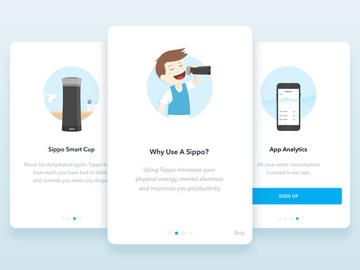
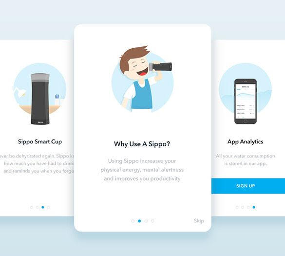
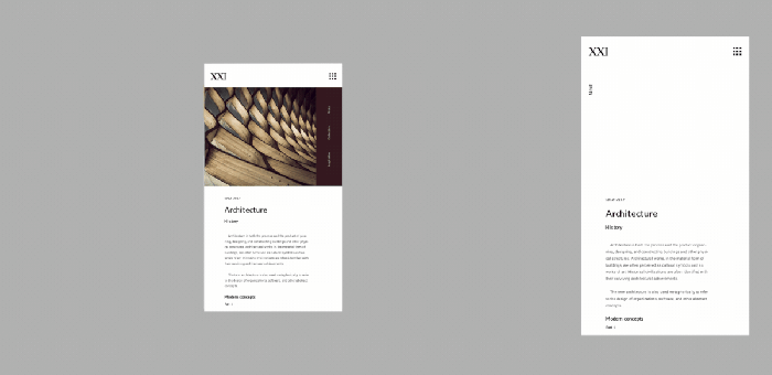
Minimalist Design, Three interface designs to inspire you
Minimalist design prioritizes simplicity and clarity. It emphasizes clean lines, uncluttered layouts, and a focus on essential elements. This approach often creates a sense of calmness, sophistication, and elegance. Users appreciate the uncluttered nature of minimalist designs, finding them easy to navigate and visually appealing.
Material Design
Material design, inspired by physical materials, incorporates visual cues like shadows, depth, and textures to create a tactile and engaging experience. The use of these visual cues provides a sense of realism and enhances the user’s interaction with the interface. This style often evokes feelings of authenticity, approachability, and modernity.
Flat Design
Flat design emphasizes simplicity and clarity through the elimination of visual effects. This approach results in a clean and modern aesthetic, conveying a sense of simplicity and modernity. Flat designs are often preferred for their clarity and visual simplicity.
Emotional Impact of Design Styles
The emotional impact of a design style stems from its visual elements and the overall impression it conveys. Minimalist designs evoke calmness and sophistication, material designs foster a sense of realism and engagement, and flat designs convey clarity and modernity.
Looking for some fresh interface design inspiration? Three standout designs really caught my eye recently. But, before diving into those, remember that high-quality images are crucial for a good online presence. Check out these 12 tips to optimize your school’s images for better web design, social media, and SEO, 12 tips to optimize your schools images for better web design social media and seo.
Ultimately, these visually appealing interfaces, combined with well-optimized visuals, will truly elevate your online presence.
Application Examples
Several successful applications exemplify each design style. Examples of minimalist designs include operating systems like macOS and certain mobile apps. Material design is prominent in Google’s products, such as Android and Google apps. Flat design is prevalent in many web applications and software, often aiming for a clean and modern appearance.
Contextual Factors
The effectiveness of a design style depends heavily on the context in which it’s used. A minimalist design might not be suitable for a complex application requiring multiple interactive elements. Similarly, material design might not be appropriate for a website requiring a quick and streamlined user experience.
Design Style Analysis
| Design Style | Emotional Impact | Application Examples | Contextual Factors |
|---|---|---|---|
| Minimalist | Calm, sophisticated, elegant | macOS, certain mobile apps | Suitable for applications requiring a clean, uncluttered interface; less effective for complex interactions. |
| Material Design | Authentic, approachable, modern | Android, Google apps | Effective for applications needing a tangible and engaging experience; may be less suitable for applications emphasizing simplicity. |
| Flat Design | Clear, modern, simple | Many web applications, software | Excellent for websites and applications prioritizing clarity and simplicity; might not be ideal for apps demanding complex visual cues. |
Analyzing User Interactions
Interface design isn’t just about aesthetics; it’s fundamentally about understanding and responding to user behavior. Effective interfaces anticipate user needs, minimize frustration, and ultimately enhance the user experience. This section dives into the crucial aspect of analyzing user interactions, exploring how design choices impact user behavior, common pain points, and different interaction models.Understanding how users interact with an interface is paramount to crafting a successful design.
By carefully observing user behavior and anticipating potential challenges, designers can create interfaces that are intuitive, efficient, and enjoyable to use. This analysis goes beyond surface-level aesthetics to delve into the underlying principles that drive user engagement and satisfaction.
User Behavior and Interface Design
User behavior is significantly influenced by the interface design. A well-designed interface guides users naturally toward their goals, making tasks easier and more enjoyable. Conversely, a poorly designed interface can lead to frustration, errors, and abandonment. Factors like layout, color schemes, typography, and the overall aesthetic contribute to the overall user experience. For example, a cluttered interface with excessive visual elements can overwhelm users, while a minimalist design that emphasizes clarity and simplicity can enhance focus and efficiency.
Common User Pain Points
Users frequently encounter pain points in interfaces that stem from poor design choices. These pain points often include a lack of clear instructions, confusing navigation, inaccessible functionalities, or a lack of feedback. For instance, a user might struggle to find specific information within a complex website structure, or they might be unable to complete a transaction due to unclear error messages.
Another common pain point is the inability to undo actions, leading to potential data loss.
Interaction Models
Interaction models dictate how users engage with an interface. They range from direct manipulation using graphical elements to command-line interfaces relying on text-based commands. Understanding these models is crucial for creating intuitive and effective interfaces. Different models cater to different user needs and task complexities, making careful selection crucial for optimal usability.
Feedback Loops
Feedback loops are essential for successful interface design. They provide users with real-time information about their actions, ensuring a sense of control and progress. Without proper feedback, users can become disoriented and lose confidence in the interface. Effective feedback loops acknowledge user input, validate actions, and guide users through tasks. For instance, a progress bar during a file upload provides feedback on the task’s progress.
Interaction Models: Strengths and Weaknesses
| Interaction Model | Strengths | Weaknesses |
|---|---|---|
| Command-line | High precision, fast for experienced users, often highly customizable. | Steep learning curve, difficult for novice users, can be hard to visualize actions. |
| Graphical | Intuitive, easy to learn, visually appealing, allows for direct manipulation. | Can be slower for complex tasks, sometimes less precise than command-line. |
| Touch-based | Natural for mobile devices, intuitive for users familiar with touchscreens, allows for gestures. | Can be less precise than mouse-based interactions, limited by screen size. |
Innovative Interface Concepts
Pushing the boundaries of user interaction, innovative interface designs are emerging that go beyond traditional methods. These designs aim to enhance user experience, improve efficiency, and address specific user needs in unique and often unexpected ways. This exploration delves into three such concepts, highlighting their unique approaches and comparing them to conventional methods.
Exploring Novel Interface Designs
Innovative interfaces are not simply about aesthetics; they are about fundamentally altering how users interact with technology. These new designs aim to make tasks easier, more intuitive, and more engaging, addressing specific user pain points. The key is to understand the user’s needs and craft interfaces that meet those needs in creative and effective ways.
Three Innovative Interface Designs
This section introduces three distinct interface design concepts that challenge conventional paradigms. Each design addresses a specific user need and employs a unique approach to interaction.
- Haptic Feedback Interface for Blind Users: This interface leverages haptic feedback to provide a tangible representation of digital information. Instead of relying solely on visual cues, users can “feel” their way through menus, documents, and other digital content. This design directly addresses the critical need for alternative access methods for visually impaired individuals, empowering them to navigate digital spaces independently. The underlying technology relies on advanced vibration patterns and tactile feedback mechanisms.
These are combined to translate information into a tactile language for users. Conventional interfaces rely primarily on visual displays and auditory cues, often excluding visually impaired users from full participation. This new design aims to bridge that gap and provide inclusivity.
- Predictive Interface for Mobile Gaming: This interface dynamically adapts to the user’s actions and preferences in a mobile gaming context. By anticipating the player’s next move, the interface preloads necessary resources and provides seamless transitions, reducing lag and improving responsiveness. This is particularly crucial for fast-paced games. This design tackles the problem of lag and latency in mobile gaming, enhancing the overall gaming experience.
The technology utilizes machine learning algorithms to analyze player behavior and predict future actions, optimizing resource allocation and reducing processing time. Conventional mobile interfaces often rely on a static layout, leading to delays and frustrations during fast-paced gameplay. The predictive interface offers a dynamic and responsive alternative.
- Immersive Interface for Collaborative Virtual Environments: This interface design aims to create a fully immersive and interactive virtual environment for collaborative work. Users can interact with virtual objects, share information, and engage in discussions in a three-dimensional space, fostering greater engagement and understanding. This innovative design addresses the need for enhanced communication and collaboration in remote settings, especially in fields like architecture or engineering.
The underlying technology relies on advanced 3D modeling, real-time rendering, and sophisticated tracking systems to capture and process user interactions within the virtual environment. Traditional video conferencing relies on two-dimensional interfaces, limiting interaction and the sense of presence. This new design enhances communication and collaboration through a more immersive experience.
Comparison of Innovative Designs to Conventional Approaches
| Design | User Need Addressed | Technology/Principle | Comparison to Conventional Designs |
|---|---|---|---|
| Haptic Feedback Interface for Blind Users | Alternative access for visually impaired users | Haptic feedback, vibration patterns | Conventional interfaces rely on visual cues, while this design provides a tactile alternative. |
| Predictive Interface for Mobile Gaming | Reduced lag and improved responsiveness in mobile gaming | Machine learning, predictive algorithms | Conventional interfaces often have static layouts, leading to delays, while this design anticipates user actions. |
| Immersive Interface for Collaborative Virtual Environments | Enhanced communication and collaboration in remote settings | 3D modeling, real-time rendering, tracking systems | Traditional video conferencing relies on 2D interfaces, limiting interaction and the sense of presence. |
Accessibility Considerations
Creating interfaces that are usable by everyone, regardless of ability, is paramount. Accessibility is not just a matter of compliance; it’s a fundamental principle of good design. By considering the needs of users with disabilities, we create more inclusive and engaging experiences for all. This includes users with visual, auditory, motor, cognitive, and neurological differences.Inclusive design goes beyond simply meeting legal requirements; it’s about proactively considering the diversity of human experience.
This approach results in interfaces that are intuitive, adaptable, and ultimately, more effective for everyone. This ensures a positive user experience for a wider audience, which in turn leads to greater user satisfaction and engagement.
Key Accessibility Features
Accessibility features are critical for providing equitable access to interfaces. These features ensure that users with disabilities can interact with the system effectively and efficiently. Implementing these features requires a conscious effort during the design process. Understanding the needs of diverse users is vital for successful implementation.
- Screen Readers: Screen readers are software applications that translate on-screen text into audio or braille. They allow visually impaired users to navigate and interact with interfaces by “reading” the content aloud. These tools are essential for providing access to information and functionality, allowing users to effectively interact with digital content. They provide a crucial way to experience content for users who cannot visually perceive it.
Examples include JAWS, NVDA, and VoiceOver.
- Keyboard Navigation: Designing for keyboard navigation allows users who cannot use a mouse or trackpad to interact with the interface. This is crucial for users with limited or no fine motor control. All interactive elements, such as buttons, links, and form fields, must be accessible via the keyboard. This ensures that users can control the interface with only a keyboard, creating an alternative way for them to interact with the application.
- Alternative Text for Images (Alt Text): Alt text provides a textual description of images for screen readers. This allows visually impaired users to understand the content and context of images. It’s vital for ensuring that users get a complete understanding of the content. High-quality alt text accurately reflects the image’s purpose and helps search engines understand the image’s content.
Legal and Ethical Implications
Many jurisdictions have accessibility laws that mandate certain standards for web and software accessibility. These laws aim to ensure that individuals with disabilities have equal access to information and services. Non-compliance can lead to legal repercussions. Beyond legal obligations, inclusive design is ethically imperative.
Accessibility is a moral imperative. It’s about recognizing and respecting the inherent value and dignity of all individuals, regardless of their abilities.
Failing to create accessible interfaces can result in significant disadvantages for users with disabilities. It can also limit the potential reach and impact of the product or service. Creating inclusive designs demonstrates a commitment to social responsibility.
Accessibility Feature Impact on User Groups
The following table demonstrates the positive impact of various accessibility features on different user groups:
| Accessibility Feature | Visual Impairment | Motor Impairment | Cognitive Impairment | Neurological Impairment |
|---|---|---|---|---|
| Screen Readers | High | Medium | High | Medium |
| Keyboard Navigation | High | High | Medium | High |
| Alt Text | High | Low | High | Medium |
| Clear and Concise Language | Medium | Low | High | Medium |
Note: High indicates significant positive impact; Medium indicates moderate positive impact; Low indicates minimal positive impact. The impact varies depending on the specific implementation and the individual user’s needs.
Visual Hierarchy and Information Architecture
Visual hierarchy is crucial for guiding user attention and ensuring an intuitive user experience. A well-designed interface prioritizes information based on its importance, allowing users to quickly scan and understand the content. Effective information architecture, in turn, organizes content logically, making it easy for users to find what they need. This combination of visual hierarchy and information architecture creates a seamless and user-friendly interface.A well-structured interface isn’t just aesthetically pleasing; it’s strategically organized to support user tasks.
The placement of elements, size, color, and other visual cues all contribute to the hierarchy. This is achieved by using principles of information architecture, like grouping related information, establishing clear navigation, and using intuitive labeling. These combined principles ensure a positive and efficient user experience.
Visual Hierarchy in User Interface Design
Visual hierarchy in a user interface (UI) is the arrangement of elements to guide the user’s eye. This prioritization of elements is critical to usability. Larger, bolder fonts, brighter colors, and strategically placed emphasis on specific elements attract the user’s attention to the most important information first. This approach helps users scan the interface quickly and understand the content’s structure.
A strong visual hierarchy reduces cognitive load, making it easier for users to find what they need. The visual hierarchy influences the user’s understanding and navigation of the interface, enabling them to process information efficiently.
Principles of Information Architecture
Information architecture (IA) focuses on organizing and structuring information within a website or application. It aims to create a logical and intuitive system for users to find what they need. Clear labeling, logical grouping of related content, and a well-defined navigation system are fundamental to effective IA. This process ensures that users can easily navigate through the interface, locate specific information, and accomplish their tasks efficiently.
Clear categorization, hierarchical structure, and intuitive navigation are key aspects of strong IA.
I’ve been exploring some seriously inspiring interface designs lately. From sleek minimalism to vibrant, interactive experiences, there’s so much to learn. Understanding the core elements of successful design is key, which is why I wanted to highlight 2 key ingredients for success evergreen content explained – you’ll find a great overview of how to create content that consistently performs well in 2 key ingredients for success evergreen content explained.
Ultimately, these designs are great examples of how those ingredients translate into a positive user experience, and will keep you inspired as you build your own interface projects.
Layout Structures
Layout structures significantly impact the overall user experience. Different structures cater to various content types and user needs. The choice of layout depends on the specific interface’s purpose and the content it needs to convey.
Three interface designs can really spark your creativity, but a strong content strategy is key to making those designs truly shine. For example, consider the 8 important content strategy goals to consider, like user engagement and SEO optimization. Ultimately, the best interface designs need content that resonates with users, so thinking about those goals is crucial. And when you blend those great design ideas with a smart content strategy, you’ll truly create something special.
- Grid-based layouts use a system of rows and columns to arrange elements. This approach is highly versatile and offers a clean, organized structure. It promotes consistency and allows for easy modification and adaptation to different screen sizes.
- Modular layouts break down the interface into self-contained modules. These modules can be rearranged or resized, offering flexibility and adaptability to diverse content. This approach allows for more dynamic and flexible design, ideal for applications requiring frequent updates.
- Hierarchical layouts arrange content in a tree-like structure. This approach is well-suited for displaying complex information, such as categories and subcategories. This structure allows users to explore various levels of information efficiently.
Examples of Well-Organized and Poorly Organized Interfaces
A well-organized interface intuitively guides the user’s attention to critical elements. Navigation is clear, and content is logically grouped. A poorly organized interface, on the other hand, is confusing and disorienting, making it difficult for users to find what they need. The difference in usability is stark, highlighting the importance of careful planning and design.
| Layout Structure | Suitability for Content Type | Description |
|---|---|---|
| Grid-based | Websites, e-commerce platforms, blogs | Consistent, structured, adaptable to various screen sizes |
| Modular | Applications, dashboards, content management systems | Flexible, adaptable, allows for dynamic content updates |
| Hierarchical | Knowledge bases, documentation, websites with complex categories | Shows relationships between different levels of information |
Mobile Interface Design

Mobile interface design is a crucial aspect of user experience, particularly in today’s world where smartphones and tablets are ubiquitous. Designing intuitive and engaging interfaces for these devices requires a unique set of considerations compared to desktop interfaces. The smaller screens, varying form factors, and limited input methods necessitate careful planning and execution to ensure a seamless and enjoyable user journey.
This section dives into the specific challenges and strategies involved in creating effective mobile interfaces.
Unique Challenges of Mobile Interface Design
Mobile interfaces face several unique challenges that distinguish them from their desktop counterparts. Limited screen real estate forces designers to prioritize essential information and streamline interactions. Touch-based input introduces a different interaction paradigm compared to mouse-based input, necessitating intuitive tap targets and clear visual cues. Battery life and data usage are also significant factors that impact the design and functionality of mobile apps.
These constraints demand a focus on efficient resource utilization and streamlined workflows.
Adapting to Different Screen Sizes and Form Factors
Mobile devices come in various sizes and form factors, from compact smartphones to larger tablets. Effective mobile interface design must adapt to these diverse screen sizes. This adaptation involves responsive design principles, ensuring that the interface remains usable and aesthetically pleasing across different devices. Fluid layouts, scalable graphics, and dynamic content adjustments are crucial to provide a consistent user experience.
Examples of Successful Mobile Apps and Their Design Elements
Numerous successful mobile apps have demonstrated effective design principles. For instance, the interface of apps like Instagram leverages a clean, intuitive layout with a focus on visual storytelling. The design prioritizes visual engagement, quick access to essential features, and a smooth user flow. Similarly, apps like Spotify exemplify the importance of personalized recommendations and streamlined music discovery, showcasing how thoughtful design can improve user engagement.
These examples highlight the crucial role of visual hierarchy, clear navigation, and seamless user flow in creating a successful mobile app.
Optimizing Mobile Interface Performance
Performance is paramount for a positive user experience on mobile devices. Efficient loading times are essential to maintain user engagement. Optimized images, streamlined code, and effective caching strategies are key components of achieving optimal performance. By prioritizing loading times, developers ensure that users don’t experience frustrating delays, and the app remains responsive to their actions. Furthermore, careful consideration of network conditions and device capabilities can further enhance performance.
Table Comparing Mobile Interface Design for Different Screen Sizes
| Screen Size | Key Considerations | Design Strategies |
|---|---|---|
| Smartphones | Limited screen real estate, touch-based input, one-handed usability. | Prioritize essential information, use intuitive tap targets, implement quick access to common actions, and optimize for single-hand use. |
| Tablets | Larger screen, potential for more complex layouts, more space for detailed content. | Allow for more detailed content and complex interactions. Consider more extensive use of gestures, and offer more options for zooming and panning. |
Future Trends in Interface Design: Three Interface Designs To Inspire You
The landscape of interface design is constantly evolving, driven by advancements in technology and changing user expectations. Emerging technologies like augmented reality (AR) and virtual reality (VR) are poised to revolutionize how we interact with digital experiences. This exploration delves into the exciting future of interface design, examining emerging technologies, futuristic concepts, and potential impacts on user interaction.
Emerging Technologies Impacting Interface Design
Interface design is being reshaped by innovative technologies. Augmented reality (AR) overlays digital information onto the real world, enhancing our perception of physical spaces. Virtual reality (VR) immerses users in entirely simulated environments, opening new avenues for interactive experiences. These technologies are blurring the lines between the physical and digital realms, leading to more engaging and intuitive interfaces.
Machine learning (ML) and artificial intelligence (AI) are also contributing, enabling interfaces to adapt to individual user needs and preferences in real-time. This personalization and proactive assistance are key aspects driving future design.
Futuristic Interface Concepts
Numerous concepts are emerging for future interfaces. Imagine interactive displays that respond to subtle hand gestures or eye movements, offering seamless and natural interactions. Smart homes could feature intuitive voice-activated systems, enabling users to control their environments with simple verbal commands. Personalized holographic displays could project information directly onto surfaces, creating immersive and customized experiences. Furthermore, interfaces could learn from user behavior, adjusting themselves dynamically to meet specific needs and preferences, making interactions more efficient and effective.
Predictions for Future Design Trends
Several design trends are anticipated. The move towards more intuitive and natural interactions will continue. Interfaces will become increasingly context-aware, adapting to the user’s environment and situation. Accessibility will become a primary consideration, ensuring inclusivity for users with diverse needs and abilities. Sustainability will also play a crucial role in interface design, with interfaces becoming more energy-efficient and environmentally friendly.
Potential Impact on User Interaction
These emerging technologies will profoundly impact user interaction. Users will experience a heightened sense of immersion and personalization. Interactions will become more natural and intuitive, reducing the cognitive load required to use interfaces. AR and VR will enable users to interact with digital content in ways previously unimaginable, opening new possibilities for learning, entertainment, and collaboration. Furthermore, the ability of interfaces to learn and adapt will lead to more personalized and tailored experiences, enhancing user satisfaction and engagement.
Table of Future Interface Design Trends and Applications
| Trend | Potential Application |
|---|---|
| Augmented Reality (AR) | Interactive wayfinding, product visualization, remote collaboration, and enhanced training experiences. |
| Virtual Reality (VR) | Immersive gaming, virtual tourism, remote education, and therapeutic applications. |
| Natural User Interfaces (NUIs) | Gesture recognition, voice commands, and eye tracking for intuitive interaction with devices. |
| Personalized and Adaptive Interfaces | Dynamically adjusting content and layout based on user preferences and context. |
| Context-Aware Interfaces | Providing relevant information and services based on the user’s location, activity, and time of day. |
End of Discussion
In conclusion, crafting interfaces that resonate with users is a multifaceted process. By understanding the principles of usability, accessibility, and aesthetics, you can create interfaces that are both visually appealing and functionally intuitive. This exploration has highlighted the significance of considering various design styles, user interactions, and innovative concepts. By acknowledging the importance of accessibility and future trends, we can continue to shape the future of interface design.
Remember, a well-designed interface is more than just a pretty picture; it’s a powerful tool for enhancing user experience.


